
css动画效果
css动画效果主要有
- bounce(跳动)、flash(闪光)、pulse(脉冲)、rubber band(橡皮筋)、shake(抖动)、swing(摇摆)、wobble(摇摆不定)
- fade(淡入或淡出)
- flip(翻转)
- rotate(旋转)
- slide(滑动)
- zoom(放大或缩小)
animation-direction 属性指定是向前播放、向后播放还是交替播放动画。
animation-direction 属性可接受以下值:normal - 动画正常播放(向前)。默认值reverse - 动画以反方向播放(向后)alternate - 动画先向前播放,然后向后alternate-reverse - 动画先向后播放,然后向前
@keyframes规则
如果您在 @keyframes 规则中指定了 CSS 样式,动画将在特定时间逐渐从当前样式更改为新样式。
要使动画生效,必须将动画绑定到某个元素。
将 "example" 动画绑定到 <div> 元素。动画将持续 4 秒钟,同时将 <div> 元素的背景颜色从 "red" 逐渐改为 "yellow":
<!DOCTYPE html>
<html lang="en">
<head>
    <meta charset="UTF-8">
    <meta http-equiv="X-UA-Compatible" content="IE=edge">
    <meta name="viewport" content="width=device-width, initial-scale=1.0">
    <title>Document</title>
    <style>
@keyframes example {
  from {background-color: red;}
  to {background-color: yellow;}
}
div {
  width: 100px;
  height: 100px;
  background-color: red;

  animation:example 4s infinite;
}
    </style>
</head>
<body>
    <div></div>
</body>
</html>

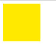
通过使用 "from" 和 "to"(代表 0%(开始)和 100%(完成)),我们设置了样式何时改变。
您也可以使用百分比值。通过使用百分比,您可以根据需要添加任意多个样式更改。
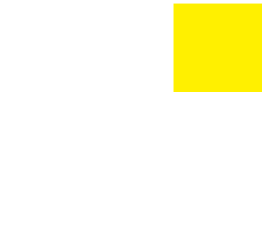
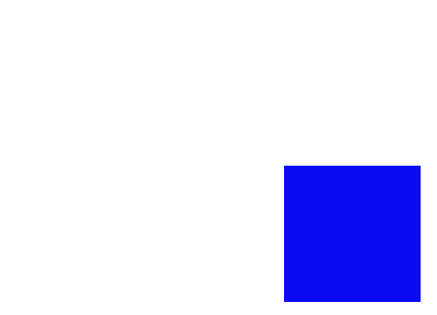
下面的例子将在动画完成 25%,完成 50% 以及动画完成 100% 时更改 <div> 元素的背景颜色:
<!DOCTYPE html>
<html lang="en">
<head>
    <meta charset="UTF-8">
    <meta http-equiv="X-UA-Compatible" content="IE=edge">
    <meta name="viewport" content="width=device-width, initial-scale=1.0">
    <title>Document</title>
    <style>
@keyframes example {
  0%   {background-color: red;}
  25%  {background-color: yellow;}
  50%  {background-color: blue;}
  100% {background-color: green;}
}
div {
  width: 100px;
  height: 100px;
  background-color: red;

  animation:example 4s infinite;
}
    </style>
</head>
<body>
    <div></div>
</body>
</html>
在动画完成期间完成的不同时间不同过程效果不一样开始为红色,到达25%时变成黄色到达50%时变成蓝色最后25%变成绿色
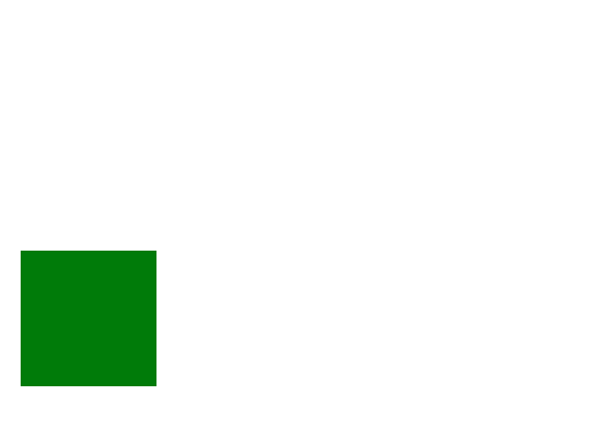
给div就加一个相对定位,给每一个颜色添加一个相对位置
<!DOCTYPE html>
<html lang="en">
<head>
    <meta charset="UTF-8">
    <meta http-equiv="X-UA-Compatible" content="IE=edge">
    <meta name="viewport" content="width=device-width, initial-scale=1.0">
    <title>Document</title>
    <style>
      div {
      animation-delay: 2s;    延时两秒后开始播放
      animation-delay: -2s; 已将播放了两秒

        position: relative;
        width: 100px;
       height: 100px;
      animation:example 4s infinite;
}
@keyframes example {
  0%   {background-color:red; left:0px; top:0px;}
  25%  {background-color:yellow; left:200px; top:0px;}
  50%  {background-color:blue; left:200px; top:200px;}
  75%  {background-color:green; left:0px; top:200px;}
  100% {background-color:red; left:0px; top:0px;}
}

    </style>
</head>
<body>
    <div></div>
</body>
</html>


 浙公网安备 33010602011771号