

鸿蒙应用开发之ArkUI框架基础布局(一)
基础布局
1. 线性布局(Colum/Row)
1.1 基本概念
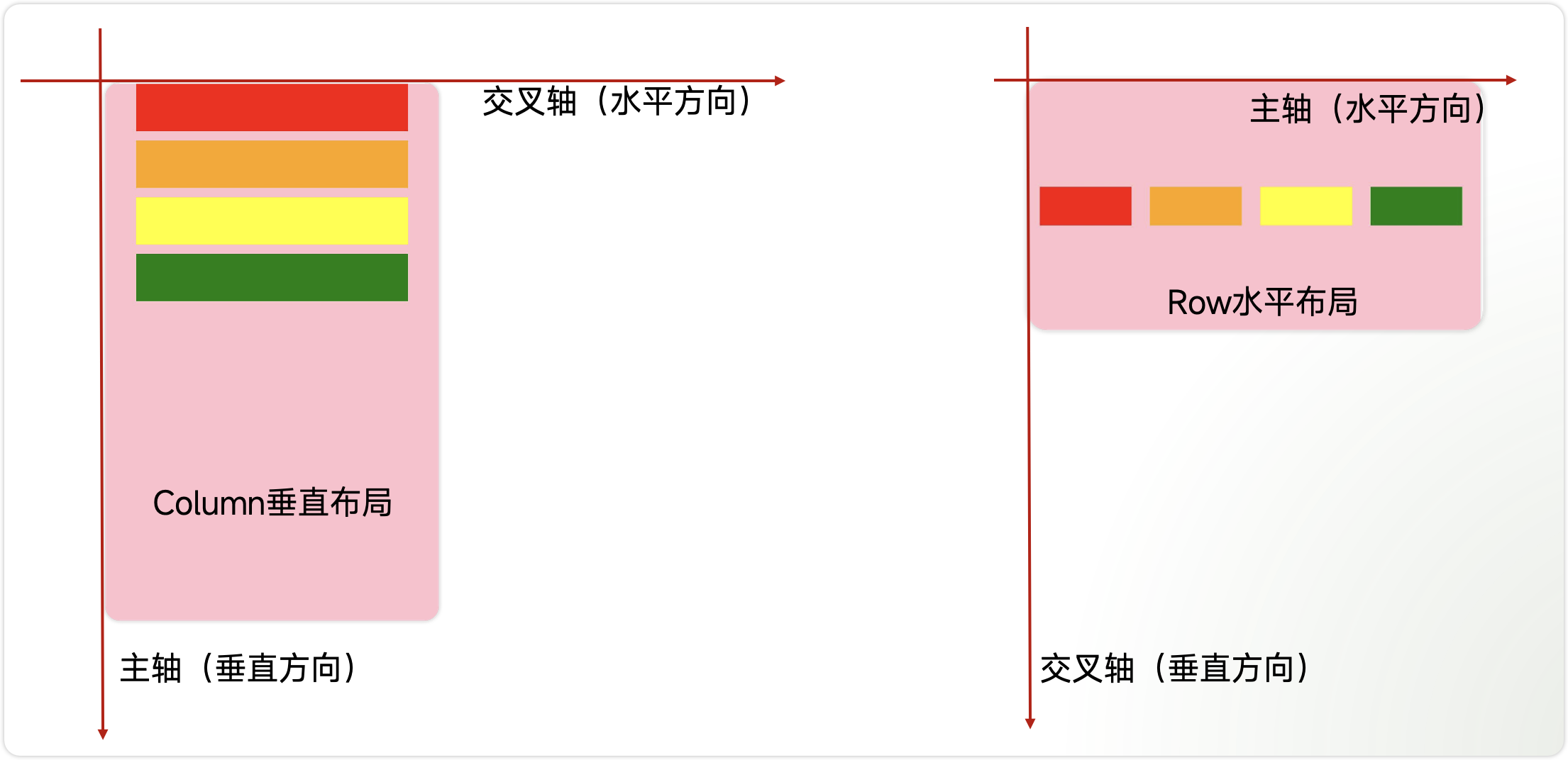
线性布局是开发中最常用的布局,通过线性容器Row和Column构建。其子元素在线性方向上(水平方向和垂直方向)依次排列。
● Column:容器内子元素按照垂直方向排列。
● Row:容器内子元素按照水平方向排列。
主轴和交叉轴
● 主轴:线性布局在布局方向上的轴线称为主轴,Column主轴为垂直方向,Row主轴为水平方向。
● 交叉轴:垂直于主轴方向的轴线称为交叉轴,Column交叉轴为水平方向,Row交叉轴为垂直方向。
1.2 子元素的排列间距
通过{ space: 25 }用来设置布局元素在排列方向上的间距。
● Column 垂直方向的间距
如下图所示,Column垂直排列了4个元素,他们之间的间距为20。
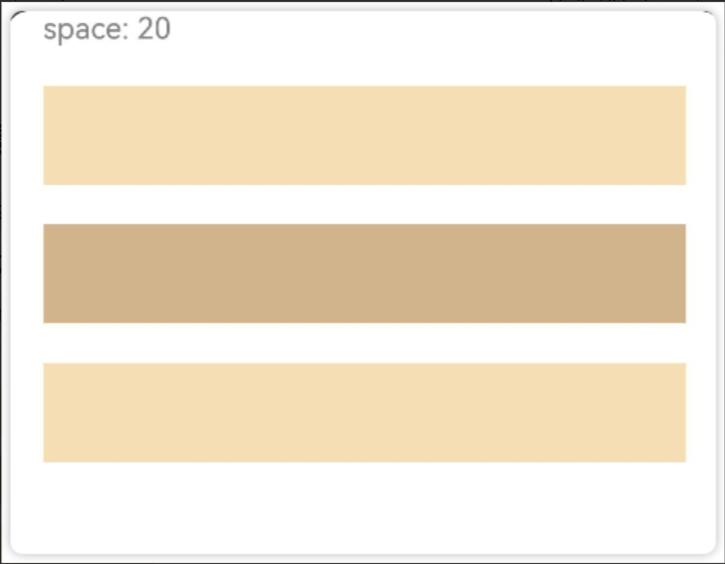
实现上图效果的代码如下:
Column({ space: 20 }) {
  Text('space: 20').fontSize(15).fontColor(Color.Gray).width('90%')
  Row().width('90%').height(50).backgroundColor(0xF5DEB3)
  Row().width('90%').height(50).backgroundColor(0xD2B48C)
  Row().width('90%').height(50).backgroundColor(0xF5DEB3)
}.width('100%')
● Row 水平方向上的间距
如图所示,水平方向上排列了4个元素,他们之间的间距是35
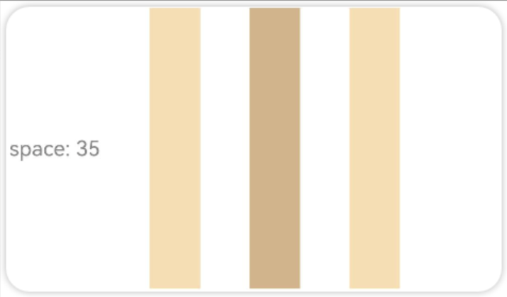
实现上述效果的代码如下:
Row({ space: 35 }) {
  Text('space: 35').fontSize(15).fontColor(Color.Gray)
  Row().width('10%').height(200).backgroundColor(0xF5DEB3)
  Row().width('10%').height(200).backgroundColor(0xD2B48C)
  Row().width('10%').height(200).backgroundColor(0xF5DEB3)
}.width('100%')
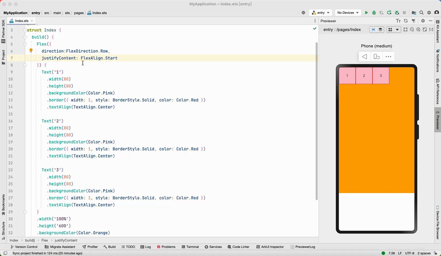
1.3 Column 主轴排列方式
Column布局通过调用justifyContent属性设置布局子元素在主轴上的排列方式。一共有6种排列方式
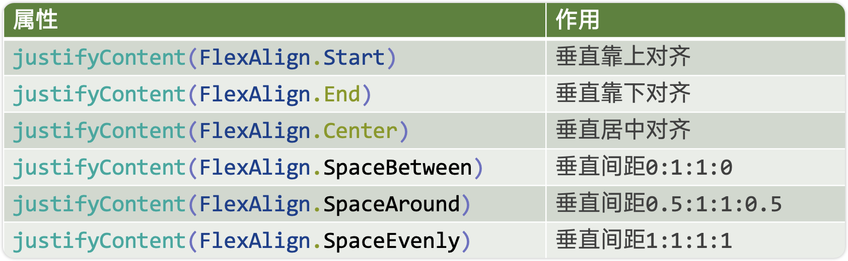
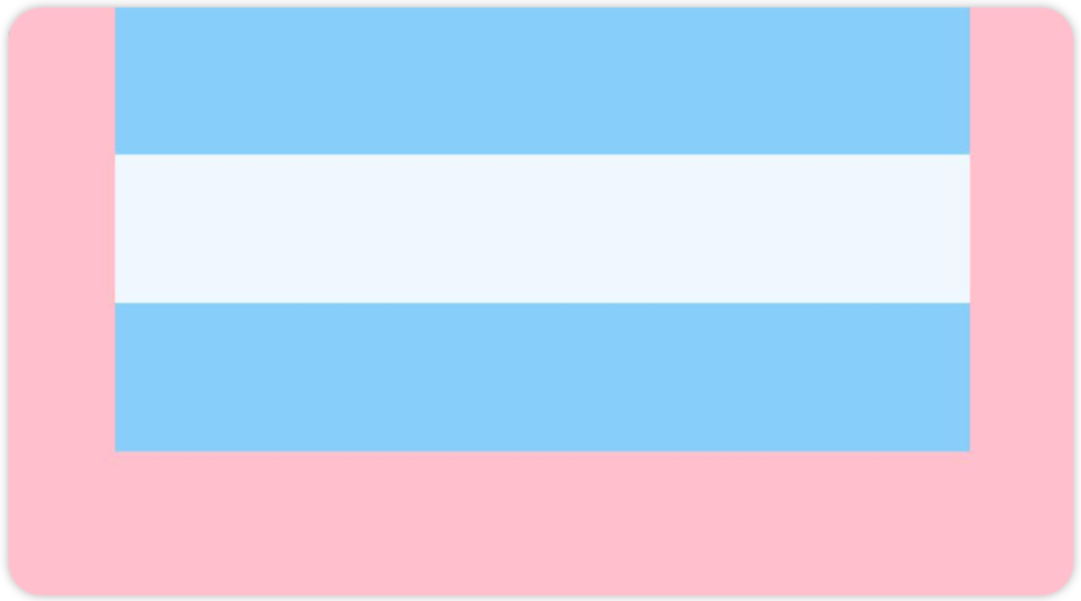
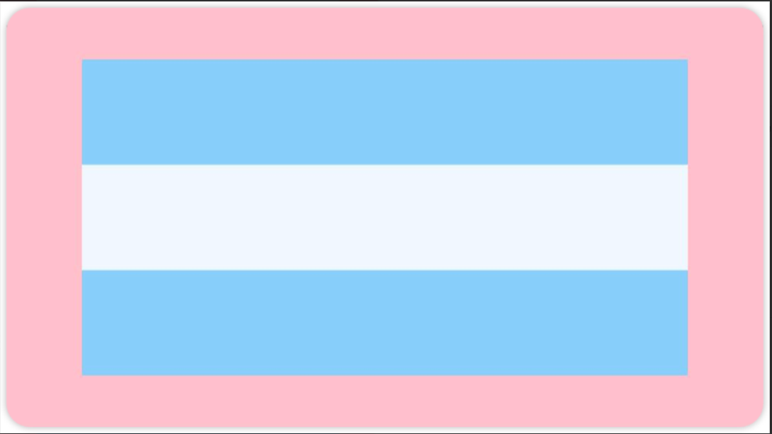
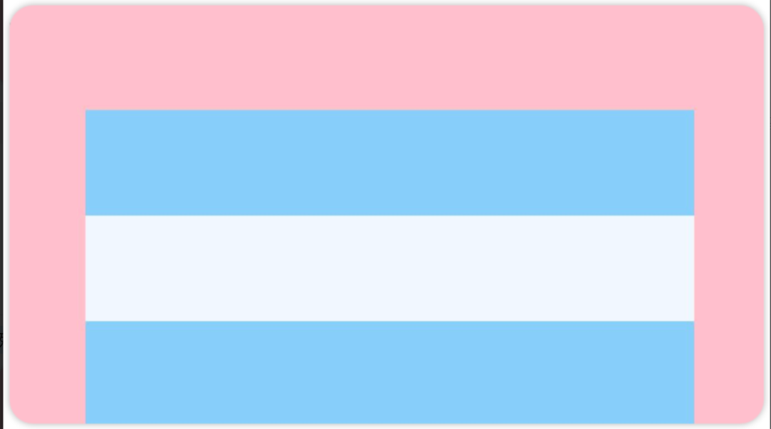
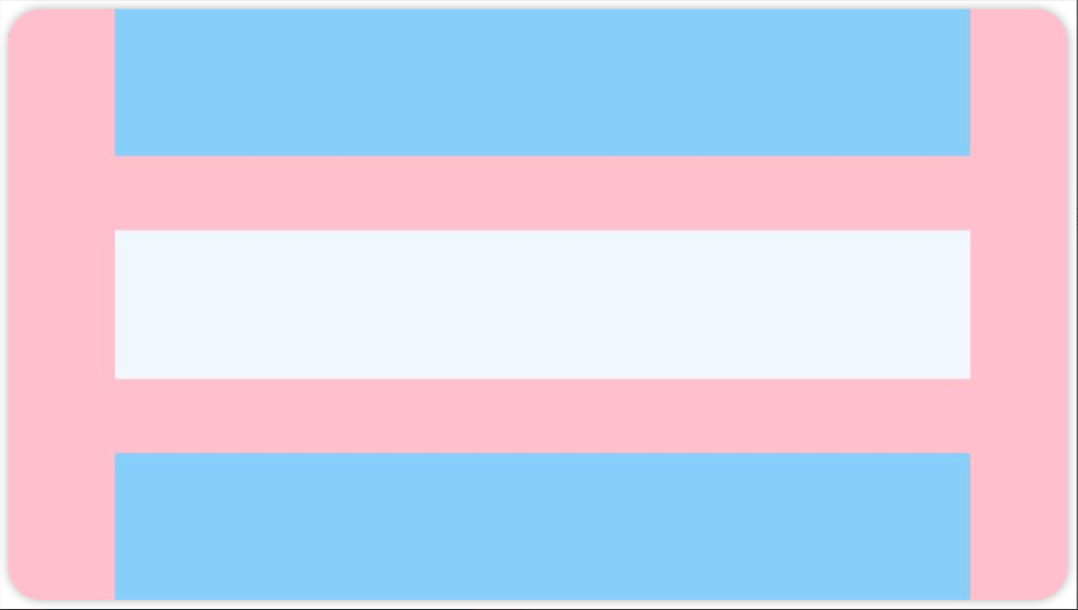
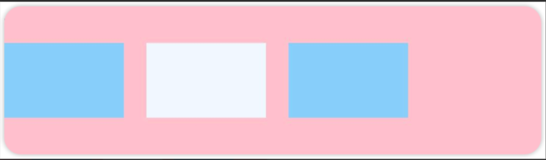
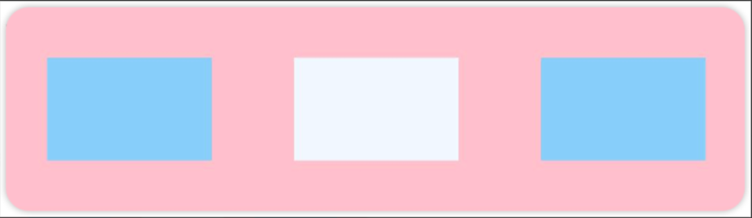
先看前三种对齐方式:如下图所示,分别是垂直靠上对齐、垂直居中对齐、垂直考下对齐。
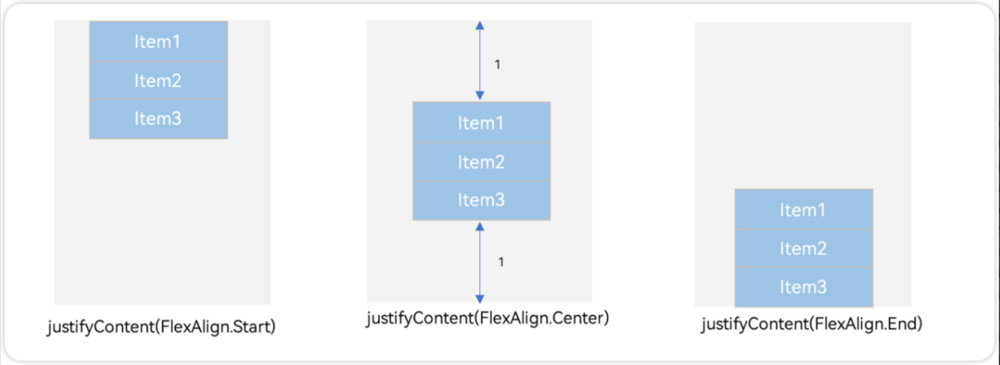
例1:如图所示,垂直靠上对齐(为了演示方便,我把最外层的背景换成了品红Color.Pink)
Column() {
      Row().width('80%').height(50).backgroundColor('#87CEFA')
      Row().width('80%').height(50).backgroundColor('#F0F8FF')
      Row().width('80%').height(50).backgroundColor('#87CEFA')
    }
    .width('100%').height(500).backgroundColor(Color.Pink)
    .justifyContent(FlexAlign.Start)
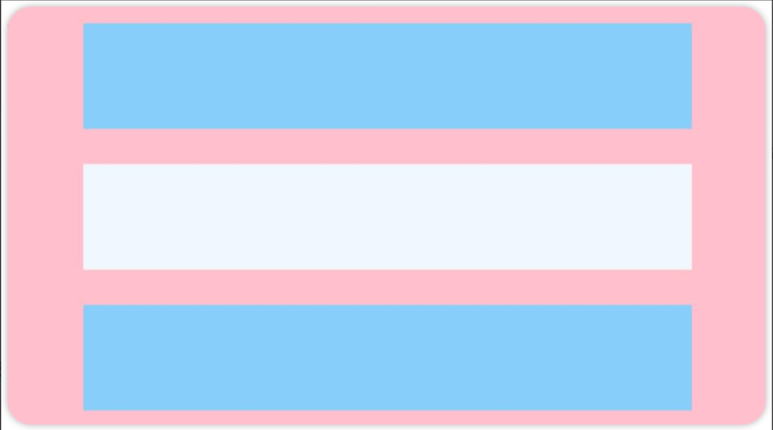
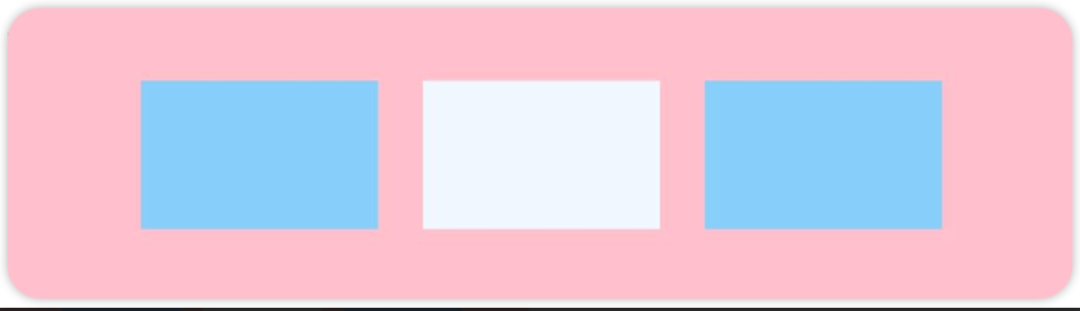
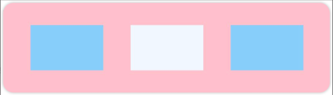
例2:如图所示,垂直居中对齐
Column() {
      Row().width('80%').height(50).backgroundColor('#87CEFA')
      Row().width('80%').height(50).backgroundColor('#F0F8FF')
      Row().width('80%').height(50).backgroundColor('#87CEFA')
    }
    .width('100%').height(500).backgroundColor(Color.Pink)
    .justifyContent(FlexAlign.Center)
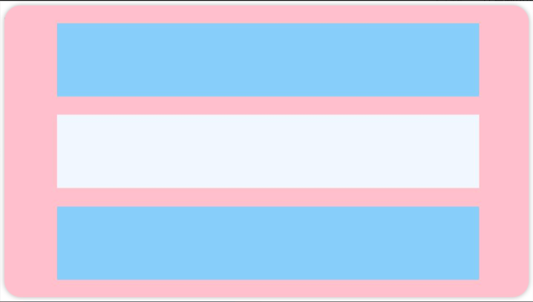
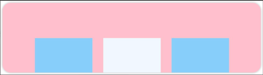
例3:如下图所示,垂直靠下对齐
Column() {
      Row().width('80%').height(50).backgroundColor('#87CEFA')
      Row().width('80%').height(50).backgroundColor('#F0F8FF')
      Row().width('80%').height(50).backgroundColor('#87CEFA')
    }
    .width('100%').height(500).backgroundColor(Color.Pink)
    .justifyContent(FlexAlign.End)
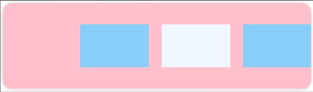
再看后三种对齐方式,可以按照比例设置布局内子元素的间距,如图所示
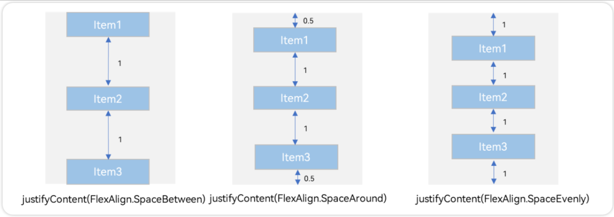
例4:按照0:1:1:0设置布局内子元素的间距
 Column() {
      Row().width('80%').height(50).backgroundColor('#87CEFA')
      Row().width('80%').height(50).backgroundColor('#F0F8FF')
      Row().width('80%').height(50).backgroundColor('#87CEFA')
    }
    .width('100%').height(500).backgroundColor(Color.Pink)
    .justifyContent(FlexAlign.SpaceBetween)
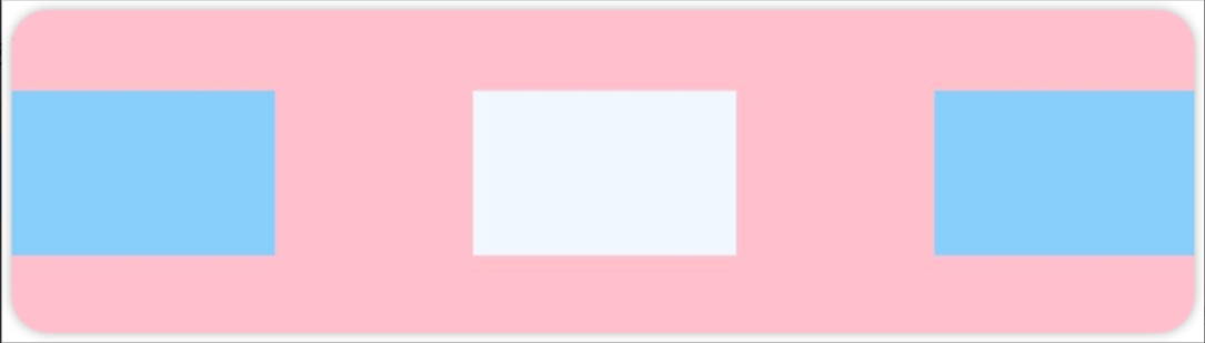
例5:按照0.5:1:1:0.5设置布局内子元素的间距
Column() {
      Row().width('80%').height(50).backgroundColor('#87CEFA')
      Row().width('80%').height(50).backgroundColor('#F0F8FF')
      Row().width('80%').height(50).backgroundColor('#87CEFA')
    }
    .width('100%').height(500).backgroundColor(Color.Pink)
    .justifyContent(FlexAlign.SpaceAround)
例6:按照1:1:1:1设置布局内子元素的间距
Column() {
      Row().width('80%').height(50).backgroundColor('#87CEFA')
      Row().width('80%').height(50).backgroundColor('#F0F8FF')
      Row().width('80%').height(50).backgroundColor('#87CEFA')
    }
    .width('100%').height(500).backgroundColor(Color.Pink)
    .justifyContent(FlexAlign.SpaceEvenly)
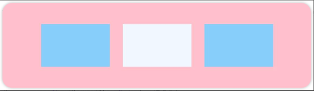
1.4 Column 交叉轴排列方式
Column的主轴是垂直方向,交叉轴垂直于主轴,所以交叉轴就是水平方向;通过 alignItems属性设置子元素在交叉轴上的对齐方式。
例1:Colum 子元素水平靠左对齐
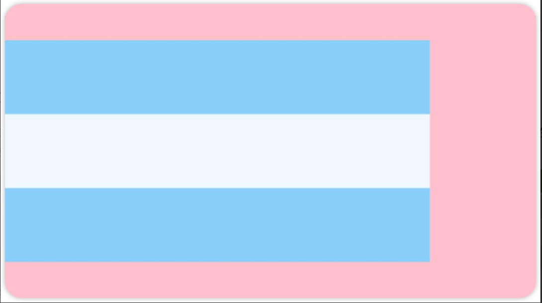
Column() {
      Row().width('80%').height(50).backgroundColor('#87CEFA')
      Row().width('80%').height(50).backgroundColor('#F0F8FF')
      Row().width('80%').height(50).backgroundColor('#87CEFA')
    }
    .width('100%').height(200).backgroundColor(Color.Pink)
    .justifyContent(FlexAlign.Center)
    .alignItems(HorizontalAlign.Start)	//水平靠左
例2:Colum 子元素水平靠右对齐
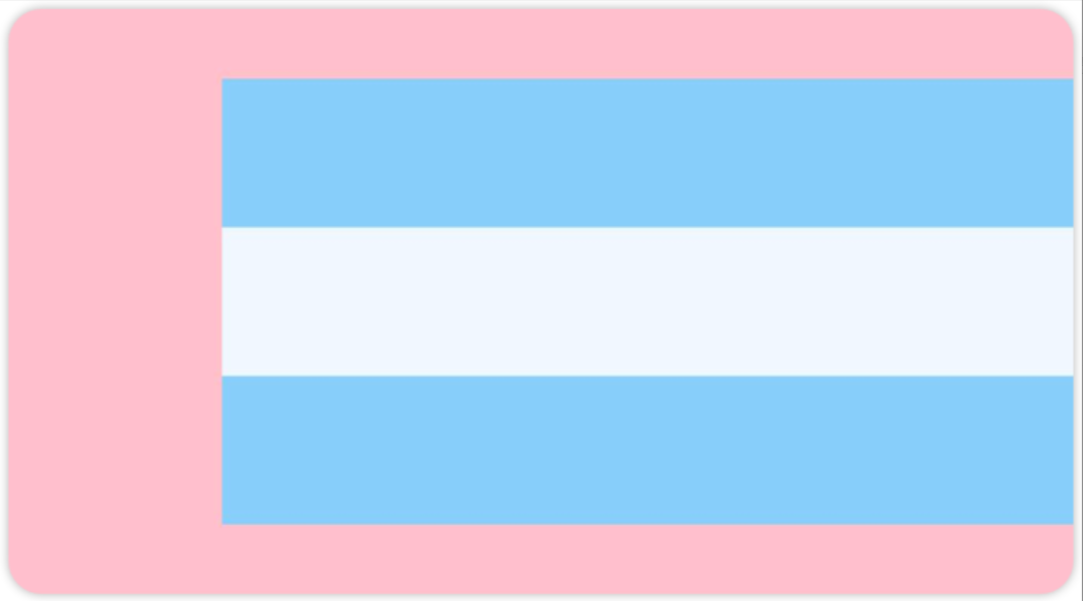
Column() {
      Row().width('80%').height(50).backgroundColor('#87CEFA')
      Row().width('80%').height(50).backgroundColor('#F0F8FF')
      Row().width('80%').height(50).backgroundColor('#87CEFA')
    }
    .width('100%').height(200).backgroundColor(Color.Pink)
    .justifyContent(FlexAlign.Center)
    .alignItems(HorizontalAlign.End)	//水平靠右
例3:Colum 子元素水平居中对齐
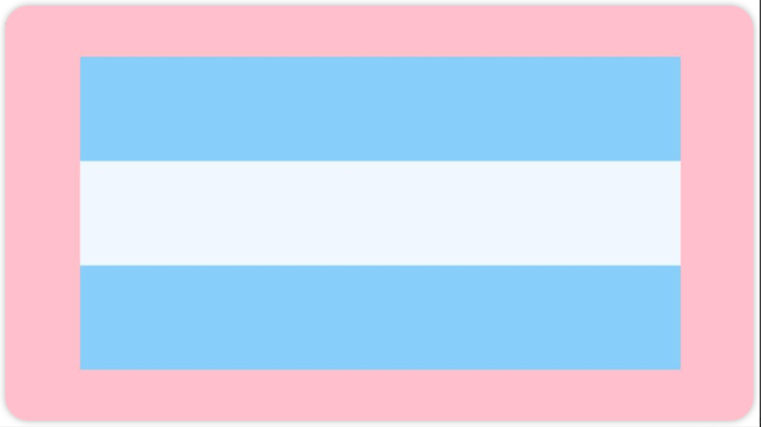
Column() {
      Row().width('80%').height(50).backgroundColor('#87CEFA')
      Row().width('80%').height(50).backgroundColor('#F0F8FF')
      Row().width('80%').height(50).backgroundColor('#87CEFA')
    }
    .width('100%').height(200).backgroundColor(Color.Pink)
    .justifyContent(FlexAlign.Center)
    .alignItems(HorizontalAlign.Center)
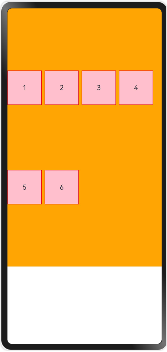
1.5 Row 主轴排列方式
Row容器内子元素在水平方向上的排列图

例1:水平靠左对齐
Row({ space: 15 }) {
      Column().width(80).height(50).backgroundColor('#87CEFA')
      Column().width(80).height(50).backgroundColor('#F0F8FF')
      Column().width(80).height(50).backgroundColor('#87CEFA')
    }
    .width('100%').height(100).backgroundColor(Color.Pink)
    .justifyContent(FlexAlign.Start)
例2:水平靠居中对齐
Row({ space: 15 }) {
      Column().width(80).height(50).backgroundColor('#87CEFA')
      Column().width(80).height(50).backgroundColor('#F0F8FF')
      Column().width(80).height(50).backgroundColor('#87CEFA')
    }
    .width('100%').height(100).backgroundColor(Color.Pink)
    .justifyContent(FlexAlign.Center)
例3:水平靠右对齐
Row({ space: 15 }) {
      Column().width(80).height(50).backgroundColor('#87CEFA')
      Column().width(80).height(50).backgroundColor('#F0F8FF')
      Column().width(80).height(50).backgroundColor('#87CEFA')
    }
    .width('100%').height(100).backgroundColor(Color.Pink)
    .justifyContent(FlexAlign.End)
例4:水平方向按照0:1:1:0设置排列间距
Row({ space: 15 }) {
      Column().width(80).height(50).backgroundColor('#87CEFA')
      Column().width(80).height(50).backgroundColor('#F0F8FF')
      Column().width(80).height(50).backgroundColor('#87CEFA')
    }
    .width('100%').height(100).backgroundColor(Color.Pink)
    .justifyContent(FlexAlign.SpaceBetween)
例5:水平方向按照0.5:1:1:0.5设置排列间距
Row({ space: 15 }) {
      Column().width(80).height(50).backgroundColor('#87CEFA')
      Column().width(80).height(50).backgroundColor('#F0F8FF')
      Column().width(80).height(50).backgroundColor('#87CEFA')
    }
    .width('100%').height(100).backgroundColor(Color.Pink)
    .justifyContent(FlexAlign.SpaceAround)
例6:水平方向按照1:1:1:1设置间距
Row({ space: 15 }) {
      Column().width(80).height(50).backgroundColor('#87CEFA')
      Column().width(80).height(50).backgroundColor('#F0F8FF')
      Column().width(80).height(50).backgroundColor('#87CEFA')
    }
    .width('100%').height(100).backgroundColor(Color.Pink)
    .justifyContent(FlexAlign.SpaceEvenly)
1.6 Row 交叉轴排列方式
Row的主轴是水平方向,交叉轴垂直于主轴,所以交叉轴就是垂直方向;通过 alignItems属性设置子元素在交叉轴上的对齐方式。

例1:Row 子元素垂直靠上对齐

Row({ space: 15 }) {
      Column().width(80).height(50).backgroundColor('#87CEFA')
      Column().width(80).height(50).backgroundColor('#F0F8FF')
      Column().width(80).height(50).backgroundColor('#87CEFA')
    }
    .width('100%').height(100).backgroundColor(Color.Pink)
    .justifyContent(FlexAlign.Center)
    .alignItems(VerticalAlign.Top)  //水平靠上
例2:Row 子元素垂直靠下对齐
Row({ space: 15 }) {
      Column().width(80).height(50).backgroundColor('#87CEFA')
      Column().width(80).height(50).backgroundColor('#F0F8FF')
      Column().width(80).height(50).backgroundColor('#87CEFA')
    }
    .width('100%').height(100).backgroundColor(Color.Pink)
    .justifyContent(FlexAlign.Center)
    .alignItems(VerticalAlign.Bottom)  //水平靠下
例3:Colum 子元素垂直居中对齐
Row({ space: 15 }) {
      Column().width(80).height(50).backgroundColor('#87CEFA')
      Column().width(80).height(50).backgroundColor('#F0F8FF')
      Column().width(80).height(50).backgroundColor('#87CEFA')
    }
    .width('100%').height(100).backgroundColor(Color.Pink)
    .justifyContent(FlexAlign.Center)
    .alignItems(VerticalAlign.Center)  //水平靠下
1.7 空白填充
在线性布局下,常用空白填充组件Blank,在容器主轴方向自动填充空白空间,达到自适应拉伸效果。Row和Column作为容器,只需要添加宽高为百分比,当屏幕宽高发生变化时,会产生自适应效果。
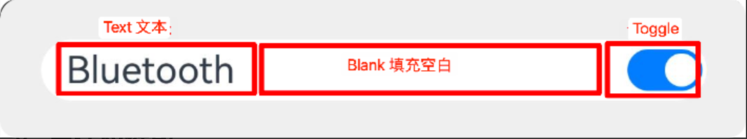
Column() {
      Row() {
        Text('Bluetooth').fontSize(18)
        Blank()
        Toggle({ type: ToggleType.Switch, isOn: true })
      }
      .backgroundColor(0xFFFFFF).borderRadius(15).width('100%')
      .padding(12)
    }
    .width('100%').backgroundColor(0xEFEFEF).padding(20)
1.8 自适应缩放
父容器尺寸确定时,使用 layoutWeight()属性 设置子元素和兄弟元素在主轴上的权重,忽略元素本身尺寸设置,使它们在任意尺寸的设备下自适应占满剩余空间。
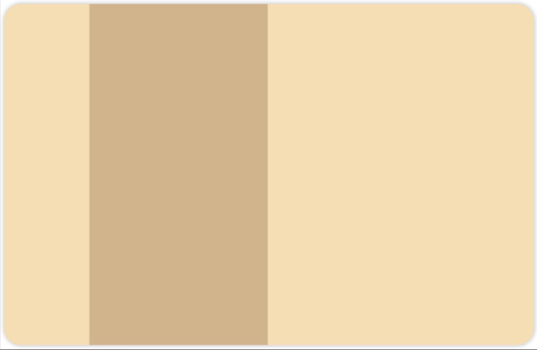
Column() {
  Row() {
    Text('1').backgroundColor(0xF5DEB3).height('100%').layoutWeight(1).textAlign(TextAlign.Center)
    Text('2').backgroundColor(0xD2B48C).height('100%').layoutWeight(2).textAlign(TextAlign.Center)
    Text('3').backgroundColor(0xF5DEB3).height('100%').layoutWeight(3).textAlign(TextAlign.Center)
  }.backgroundColor(0xffd306).height('30%').width('100%')
}
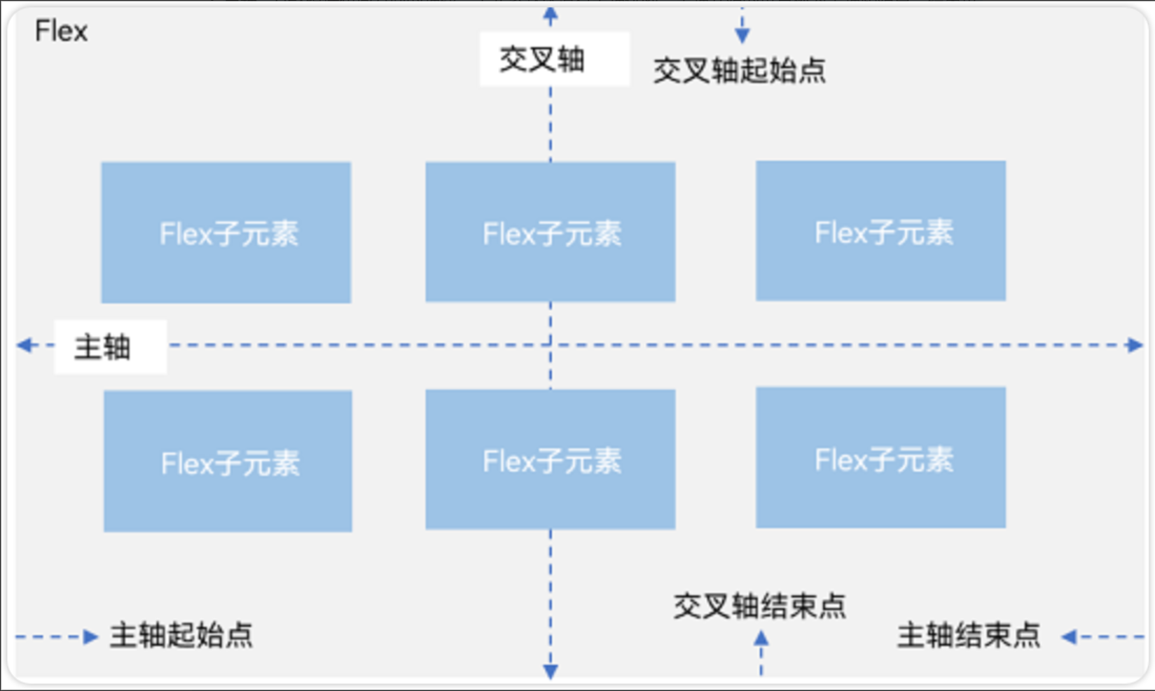
2.弹性布局(Flex)
2.1 基本概念
弹性布局和线性布局很多基本概念都是相同的,也分为主轴和交叉轴,线性布局能做的弹性布局都能做。但是弹性布局有一个特殊的效果,就是组件可以换行显示。
● 主轴:Flex组件布局方向的轴线,子元素默认沿着主轴排列。主轴开始的位置称为主轴起始点,结束位置称为主轴结束点。
● 交叉轴:垂直于主轴方向的轴线。交叉轴开始的位置称为交叉轴起始点,结束位置称为交叉轴结束点。
2.2 布局方向
在Flex弹性布局中,通过direction参数设置主轴为水平方向。默认为水平排列。
Flex({direction:FlexDirection.Row}) 水平从左往右排列
Flex({direction:FlexDirection.RowReverse}) 水平从右往左排列
Flex({direction:FlexDirection.Column}) 垂直从上到下排列
Flex({direction:FlexDirection.ColumnReverse}) 垂直从下到上排列
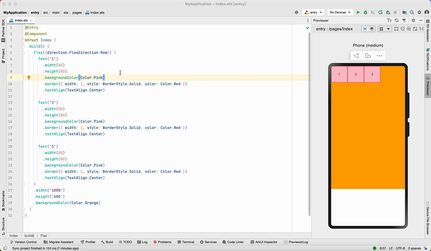
@Entry
@Component
struct BlankPage {
  build() {
    Flex({
      direction: FlexDirection.Row
    }) {
      Text("1").width(50).height(50).backgroundColor(Color.Pink)
      Text("2").width(50).height(50).backgroundColor(Color.Orange)
      Text("3").width(50).height(50).backgroundColor(Color.Brown)
    }
  }
}
2.3 对齐方式
弹性布局的对齐方式参考线性布局,justifyContent()用于设置主轴对齐方式、alignItems()用于设置交叉轴对齐方式。
Flex({
  direction:FlexDirection.Row,				//主轴方向:水平排列
  justifyContent: FlexAlign.SpaceEvenly,	//主轴方向对齐方式:平均分配间隙
  alignItems:ItemAlign.Center					//交叉轴对齐方式:居中
})
2.4 布局换行
当主轴方向上的子组件比较多时,可以让组件换行显示,同时还可以控制组件之间的间距、以及对其方式。需要用到下面几个参数实现。
● 使用wrap参数实现布局换行;
○ wrap: FlexWrap.Wrap 组件换行
○ wrap: FlexWrap.NoWrap, //换行显示
● 通过alignContent参数设置子元素各行在交叉轴上内组件对齐方式。
○ alignContent: FlexAlign.Start 交叉轴开始对齐
○ alignContent: FlexAlign.End 交叉轴结束对齐
○ alignContent: FlexAlign.SpaceBetween 交叉轴按照0:1:1:0 分配剩余空间
○ alignContent: FlexAlign.SpaceAround 交叉轴按照0.5:1:1:0.5 分配剩余空间
○ alignContent: FlexAlign.SpaceEvenly 交叉轴按照1:1:1:1 分配剩余空间
● 使用space设置子组件之间的间距;
○ main: LengthMetrics.px(20), //主轴方向组件间距
○ cross: LengthMetrics.px(20) //交叉轴方向组件简介
 Flex({
      direction: FlexDirection.Row, //主轴水平排列
      justifyContent: FlexAlign.Start, //主轴方向对齐方式,从左往右
      wrap: FlexWrap.Wrap, //换行显示
      alignContent: FlexAlign.SpaceEvenly, //交叉轴对齐方式,在换行时才有效。
      space: {
        main: LengthMetrics.px(20),   //主轴方向组件间距
        cross: LengthMetrics.px(20)   //交叉轴方向组件简介
      },
    }) {
   //...
}
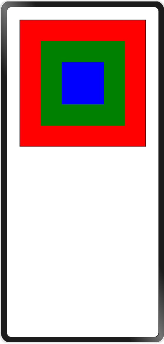
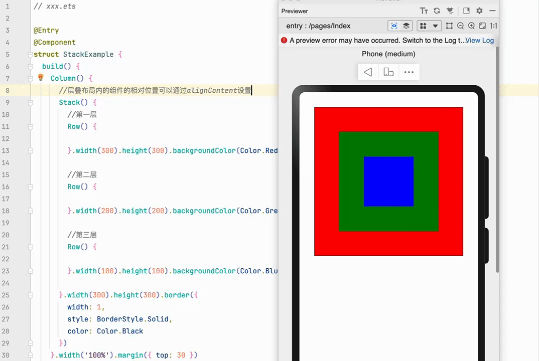
3. 层叠布局(Stack)
3.1 基本概念
层叠布局容器中的子元素依次入栈,后一个子元素覆盖前一个子元素上,子元素可以叠加,也可以设置位置。
如下图所示:第1层是红色、第2层是绿色、第3层是蓝色
// xxx.ets

@Entry
@Component
struct StackExample {
  build() {
    Column() {
      //层叠布局内的组件的相对位置可以通过alignContent设置
      Stack({ alignContent: Alignment.TopEnd }) {
        //第一层
        Row() {
          Text('Text1').fontColor(Color.White)
        }.width(300).height(300)
        .backgroundColor(Color.Red)
        .alignItems(VerticalAlign.Bottom)


        //第二层
        Row() {
          Text('Text2').fontColor(Color.White)
        }.width(200).height(200)
        .backgroundColor(Color.Green)
        .alignItems(VerticalAlign.Bottom)


        //第三层
        Row() {
          Text('Text3').fontColor(Color.White)
        }.width(100).height(100)
        .backgroundColor(Color.Blue)
        .alignItems(VerticalAlign.Bottom)

      }.width(300).height(300).border({
        width: 1,
        style: BorderStyle.Solid,
        color: Color.Black
      })
    }.width('100%').margin({ top: 30 })

  }
}
3.2 对齐方式
在Stack层叠布局中子元素的对齐方式,通过alignContent参数实现。如图下图,支持九种对齐方式。
 Stack({ alignContent: Alignment.Start }){
   ...
 }
3.3 Z序控制
Stack容器中兄弟组件显示层级关系可以通过Z序控制的zIndex属性改变。zIndex值越大,显示层级越高,即zIndex值大的组件会覆盖在zIndex值小的组件上方。
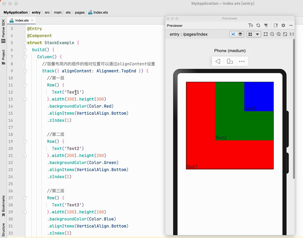
// xxx.ets

@Entry
@Component
struct StackExample {
  build() {
    Column() {
      //层叠布局内的组件的相对位置可以通过alignContent设置
      Stack({alignContent:Alignment.TopEnd}) {
        //第一层
        Row() {
          Text('Text1')
        }.width(300).height(300).backgroundColor(Color.Red)
          .alignItems(VerticalAlign.Bottom)
          .zIndex(1)

        //第二层
        Row() {
          Text('Text2')
        }.width(200).height(200).backgroundColor(Color.Green)
          .alignItems(VerticalAlign.Bottom)
          .zIndex(2)

        //第三层
        Row() {

        }.width(100).height(100).backgroundColor(Color.Blue)
          .alignItems(VerticalAlign.Bottom)
          .zIndex(3)

      }.width(300).height(300).border({
        width: 1,
        style: BorderStyle.Solid,
        color: Color.Black
      })
    }.width('100%').margin({ top: 30 })
  }
}

 浙公网安备 33010602011771号