


前言
此篇博客讲解Modifier修饰符的使用,Modifier修饰符的作用是快速的修改组件的显示大小、边距、边框、背景颜色、剪裁、点击、旋转、偏移、滚动、焦点等等,Modifier在Compose的全部组件上都有存在,需要熟练的掌握。另外Modifier是可以被扩展函数扩展的,所以此篇博客只举例通用的Modifier,不举例只在某些组件下才能使用的Modifier修饰符(例如Box(align属性)与constraintlayout(constrainAs方法))。
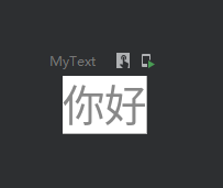
设置背景
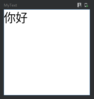
设置背景颜色
代码:
    @Preview
    @Composable
    fun MyText() {
        Text(
            text = "你好",
            color = Color.Gray,
            modifier = Modifier.background(Color.White)
        )
    }
效果图:
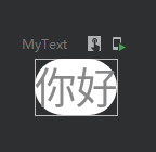
设置圆角背景
    @Preview
    @Composable
    fun MyText() {
        Text(
            text = "你好",
            color = Color.Gray,
            modifier = Modifier.background(Color.White, shape = RoundedCornerShape(10.dp))
        )
    }
效果图:
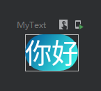
渐变色背景
代码
    @Preview
    @Composable
    fun MyText() {
        val colors = listOf(Color(0xFF005599),Color(0xFF3FFFED))
        Text(
            text = "你好",
            color = Color.White,
            modifier = Modifier.background(brush = Brush.linearGradient(colors),//设置线性渐变效果
                shape = RoundedCornerShape(10.dp),
                alpha = 1f)//设置透明度
        )
    }
效果图
设置宽高
设置指定宽高
代码
    @Preview
    @Composable
    fun MyText() {
        Text(
            text = "你好",
            color = Color.White,
            modifier = Modifier
                .width(100.dp)
                .height(100.dp)
        )
    }
效果:
填满宽高
代码
    @Preview
    @Composable
    fun MyText() {
        Column(
            modifier = Modifier
                .width(100.dp)
                .height(100.dp)
                .background(Color.Black)
        ) {
            Text(
                text = "你好",
                color = Color.Black,
                modifier = Modifier
                    .background(Color.White)
                    .fillMaxSize()//填满宽高
            )
        }
    }
效果图:
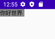
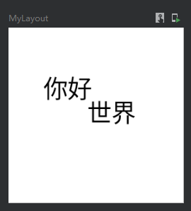
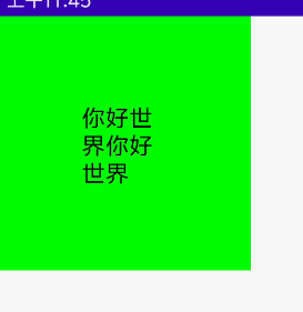
自适应子组件高宽
IntrinsicSize.Min 这个是关键
    @Preview
    @Composable
    fun MyText() {
        Box(
            modifier = Modifier
                .width(IntrinsicSize.Min)
                .height(IntrinsicSize.Min)
                .background(Color.Gray)
        ) {
            Text(
                text = "你好世界",
                modifier = Modifier.width(60.dp)
            )
        }
    }
效果图:
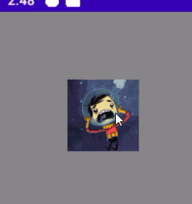
也可以使用wrapContentSize来实现此功能,wrapContentSize会自适应内容大小
Image(painter = painterResource(id = R.mipmap.ic_test_0), contentDescription = null, modifier = Modifier.wrapContentSize())按比例填充宽高
代码:
    @Preview
    @Composable
    fun MyText() {
        Column(
            modifier = Modifier
                .width(100.dp)
                .height(100.dp)
                .background(Color.Black)
        ) {
            Text(
                text = "你好",
                color = Color.Black,
                modifier = Modifier
                    .background(Color.White)
                    .fillMaxSize(0.5f)//以50%比例填满宽高
            )
        }
    }
效果:
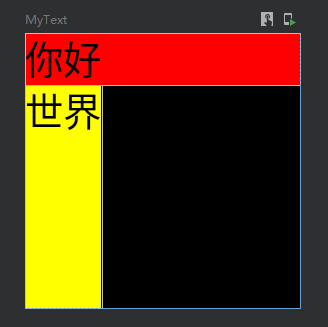
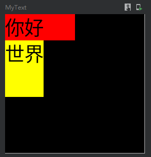
填满宽度或者高度
代码
    @Preview
    @Composable
    fun MyText() {
        Column(
            modifier = Modifier
                .width(100.dp)
                .height(100.dp)
                .background(Color.Black)
        ) {
            Text(
                text = "你好",
                color = Color.Black,
                modifier = Modifier
                    .background(Color.Red)
                    .fillMaxWidth() //填满宽度
            )
            Text(
                text = "世界",
                color = Color.Black,
                modifier = Modifier
                    .background(Color.Yellow)
                    .fillMaxHeight() //填满高度
            )
        }
    }
效果:
按比例填充宽度与高度
代码
    @Preview
    @Composable
    fun MyText() {
        Column(
            modifier = Modifier
                .width(100.dp)
                .height(100.dp)
                .background(Color.Black)
        ) {
            Text(
                text = "你好",
                color = Color.Black,
                modifier = Modifier
                    .background(Color.Red)
                    .fillMaxWidth(0.5f) //填满宽度
            )
            Text(
                text = "世界",
                color = Color.Black,
                modifier = Modifier
                    .background(Color.Yellow)
                    .fillMaxHeight(0.5f) //填满高度
            )
        }
    }
效果图:
默认最小宽高
    @Preview
    @Composable
    fun MyText() {
        Text(
            text = "你好",
            color = Color.Black,
            modifier = Modifier
                .background(Color.Red)
                .defaultMinSize(minWidth = 50.dp, minHeight = 50.dp)
        )
    }
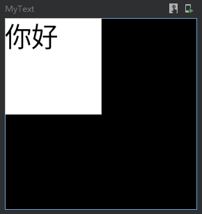
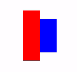
无视父类容器大小强制设置高度与宽度
requiredHeight与requiredWidth
代码:
Box(modifier = Modifier.fillMaxSize()){
//父容器只设置100高度
Row(modifier = Modifier.size(width = 100.dp, height = 100.dp).align(Alignment.Center)) {
//这边使用requiredHeight并且设置150dp,让下面的子元素突破父容器高度
Spacer(modifier = Modifier.requiredHeight(150.dp).width(50.dp).background(color = Color.Red))
//这边同样设置150高度作为对比,实际上这个子元素高度是无法突破父容器的限制
Spacer(modifier = Modifier.size(width = 50.dp, height = 150.dp).background(color = Color.Blue))
}
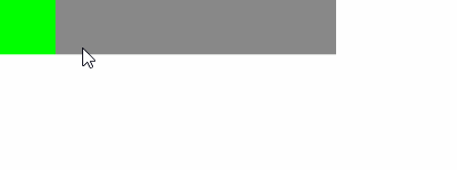
}效果图:
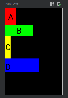
设置边距
代码
    @Preview
    @Composable
    fun MyText() {
        Column(
            modifier = Modifier
                .width(100.dp)
                .height(150.dp)
                .background(Color.Black)
        ) {
            Text(
                text = "A",
                color = Color.Black,
                modifier = Modifier
                    .background(Color.Red)
                    .padding(5.dp) //设置全部边距
            )

            Text(
                text = "B",
                color = Color.Black,
                modifier = Modifier
                    .background(Color.Green)
                    .padding(horizontal = 20.dp) //设置横向边距
            )

            Text(
                text = "C",
                color = Color.Black,
                modifier = Modifier
                    .background(Color.Yellow)
                    .padding(vertical = 10.dp) //设置竖向边距
            )

            Text(
                text = "D",
                color = Color.Black,
                modifier = Modifier
                    .background(Color.Blue)
                    .padding(0.dp,5.dp,50.dp,0.dp) //设置指定方向边距
            )
        }
    }
效果图:
设置边框
一共有三种重载方法
fun Modifier.border(border: BorderStroke, shape: Shape = RectangleShape) = border(width = border.width, brush = border.brush, shape = shape)

fun Modifier.border(width: Dp, color: Color, shape: Shape = RectangleShape) = border(width, SolidColor(color), shape)

fun Modifier.border(width: Dp, brush: Brush, shape: Shape): Modifier
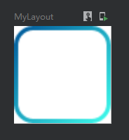
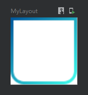
第一种实现渐变色边框
使用代码:
    @Preview
    @Composable
    fun MyLayout() {
        val colors = listOf(Color(0xFF005599), Color(0xFF3FFFED))
        Column(
            modifier = Modifier
                .width(25.dp)
                .height(25.dp)
                .background(Color.White)
                .border(  //设置渐变边框
                    border = BorderStroke(1.dp, Brush.linearGradient(colors)), //设置边框粗细与边框渐变色
                    shape = RoundedCornerShape(5.dp) //圆角形状
                )
        ){ }
    }
效果图:
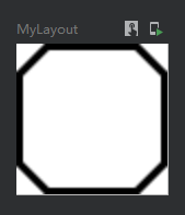
第二种实现单色边框
代码:
    @Preview
    @Composable
    fun MyLayout() {
        Column(
            modifier = Modifier
                .width(25.dp)
                .height(25.dp)
                .background(Color.White)
                .border(
                    width = 1.dp, //设置边框粗细
                    color = Color(0xFF000000), //边框颜色
                    shape = CutCornerShape (5.dp,5.dp,5.dp,5.dp) //切角矩形形状
                )
        ){ }
    }
效果图:
第三种实现渐变色边框
其实与第一种差不多,只是没有了BorderStroke包装
代码:
    @Preview
    @Composable
    fun MyLayout() {
        val colors = listOf(Color(0xFF005599), Color(0xFF3FFFED))
        Column(
            modifier = Modifier
                .width(25.dp)
                .height(25.dp)
                .background(Color.White)
                .border(
                    width = 1.dp,
                    brush = Brush.linearGradient(colors),
                    shape = RoundedCornerShape(0.dp,0.dp,5.dp,5.dp)
                )
        ){ }
    }
效果图:
偏移位置
offset这个偏移是偏移自身这个组件
代码:
    @Preview
    @Composable
    fun MyLayout() {
        Column(
            modifier = Modifier
                .width(100.dp)
                .height(100.dp)
                .background(Color.White)
        ){
            Text(text = "你好", color = Color.Black,
                //相对偏移 这个修改会根据布局方向自动调整水平偏移量(应该是为了阿拉伯语设计的):
                //当布局方向为从左到右时,正x偏移量会将内容向右移动,当布局方向为从右到左时,正x偏移量会将内容向左移动。
                modifier = Modifier.offset(x = 20.dp,y = 25.dp))

            Text(text = "世界", color = Color.Black,
                //绝对偏移 这个修改将不考虑布局方向:正的x偏移总是将内容向右移动
                modifier = Modifier.absoluteOffset(x = 45.dp,y = 20.dp))
        }
    }
效果图:
缩放
代码:
    @Preview
    @Composable
    fun MyScale() {
        val scale = remember {
            mutableStateOf(1.5f)
        }
        Column(
            modifier = Modifier
                .fillMaxSize()
                .background(Color.Gray)
        ) {
            //默认
            Image(
                painter = painterResource(id = R.mipmap.ic_logo),
                contentDescription = null,
            )
            //比例缩放
            Image(
                painter = painterResource(id = R.mipmap.ic_logo),
                contentDescription = null,
                modifier = Modifier
                    .padding(top = 30.dp, start = 30.dp)
                    .scale(scale.value) //放大1.5倍
            )
            //指定宽高缩放
            Image(
                painter = painterResource(id = R.mipmap.ic_logo),
                contentDescription = null,
                modifier = Modifier
                    .padding(top = 70.dp, start = 90.dp)
                    .scale(3f,2f) //宽高缩放
            )
        }
    }
效果图:
旋转
代码:
    @Preview
    @Composable
    fun MyRotate() {
        val rotate = remember { mutableStateOf(180f) }
        Column(
            modifier = Modifier
                .width(300.dp)
                .height(300.dp)
                .background(Color.Gray)
        ) {
            Image(
                painter = painterResource(id = R.mipmap.ic_logo),
                contentDescription = null,
                modifier = Modifier
                    .padding(100.dp)
                    .rotate(rotate.value) //设置旋转
            )
        }
    }
效果图:
旋转与偏移位置的组合
请注意,Modifier一直强调组合的位置不同会出现不同的效果。如果你想实现旋转与拖动功能,那么旋转一定要在前面,否则会出现拖动的时候,实际移动的X轴与Y轴出现相反的问题。
@Composable
fun rotationAndOffset(){
    val rotation = remember { mutableStateOf(0f) }
    val offsetX = remember { mutableStateOf(0f) }
    val offsetY = remember { mutableStateOf(0f) }
    AsyncImage(
        model = if (mIsUrl.value) mUrl.value else mFile.value,
        contentDescription = null,
        modifier = Modifier
            .rotate(rotation.value) //rotate一定要在前面
            .offset { IntOffset(offsetX.value.roundToInt(), offsetY.value.roundToInt()) }
    )
}
输入操作(点击、双击、长按、拖动、滑动、触控、滚动)
单指操作_单击、按下、双击、长按、触控
    @OptIn(ExperimentalFoundationApi::class)
    @Preview
    @Composable
    fun MyClick() {
        val isEnableClick = remember {
            mutableStateOf(true)
        }

        Column(
            modifier = Modifier
                .width(100.dp)
                .height(150.dp)
                .background(Color.Black)
        ) {
            //方式一 单击监听
            Text(
                text = "A",
                color = Color.Black,
                modifier = Modifier
                    .background(Color.White)
                    .clickable(isEnableClick.value) { //设置点击
                        Log.e("zh", "A单击")
                    }
            )
            //方式二 组合性点击
            Text(
                text = "B",
                color = Color.Black,
                modifier = Modifier
                    .background(Color.White)
                    .combinedClickable( //注意!此Api是实验性的
                        onClick = {
                            Log.e("zh", "B单击")

                        },
                        onDoubleClick = {
                            Log.e("zh", "B双击")

                        },
                        onLongClick = {
                            Log.e("zh", "B长按")

                        }
                    )
            )
            //方式三 输入监听
            Text(
                text = "C",
                color = Color.Black,
                modifier = Modifier
                    .background(Color.White)
                    .pointerInput(Unit) {

                    detectTapGestures(
                        onPress = {
                            Log.e("zh", "C按下")
                        },
                        onDoubleTap = {
                            Log.e("zh", "C双击")
                        },
                        onLongPress = {
                            Log.e("zh", "C长按")
                        },
                        onTap = {
                            Log.e("zh", "C触控")
                        }
                    )
                }
            )
        }
    }
多指操作_缩放、旋转、拖动
双指缩放
    @Preview
    @Composable
    fun MyScale() {
        val scale = remember {
            mutableStateOf(1f)
        }
        Column(
            modifier = Modifier
                .width(300.dp)
                .height(300.dp)
                .background(Color.Gray)
        ) {
            //多点触控
            Image(
                painter = painterResource(id = R.mipmap.ic_logo),
                contentDescription = null,
                modifier = Modifier
                    .padding(100.dp)
                    .scale(scale.value)
                    .transformable(state = TransformableState { zoomChange, panChange, rotationChange ->
                        scale.value *= zoomChange
                        Log.e("zh", "缩放 ${zoomChange}" )
                        Log.e("zh", "坐标 ${panChange}")
                        Log.e("zh", "旋转 ${rotationChange}" )
                    })
            )
        }
    }
效果图:
双指旋转
代码:
    @Preview
    @Composable
    fun MyRotate() {
        val rotate = remember { mutableStateOf(0f) }
        Box(
            modifier = Modifier
                .width(300.dp)
                .height(300.dp)
                .background(Color.Gray),
            contentAlignment = Alignment.Center

        ) {
            Image(
                painter = painterResource(id = R.mipmap.ic_logo),
                contentDescription = null,
                modifier = Modifier
                    .fillMaxSize(0.5f)
                    .rotate(rotate.value) //设置旋转
                    .transformable(state = TransformableState { zoomChange, panChange, rotationChange ->
                        Log.e("zh", "缩放 ${zoomChange}" )
                        Log.e("zh", "坐标 ${panChange}")
                        rotate.value += rotationChange //旋转变化
                        Log.e("zh", "旋转 ${rotationChange}" )
                    })
            )
        }
    }
效果图:

双指拖动
    @Preview
    @Composable
    fun MyOffset() {
        val offsetX = remember { mutableStateOf(0f) }
        val offsetY = remember { mutableStateOf(0f) }
        Box(
            modifier = Modifier
                .width(300.dp)
                .height(300.dp)
                .background(Color.Gray),
            contentAlignment = Alignment.Center

        ) {
            Image(
                painter = painterResource(id = R.mipmap.ic_logo),
                contentDescription = null,
                modifier = Modifier
                    .fillMaxSize(0.5f)
                    .offset { IntOffset(offsetX.value.roundToInt(), offsetY.value.roundToInt()) } //设置偏移
                    .transformable(state = TransformableState { zoomChange, panChange, rotationChange ->
                        Log.e("zh", "缩放 ${zoomChange}" )
                        Log.e("zh", "坐标 ${panChange}")
                        offsetX.value += panChange.x
                        offsetY.value += panChange.y
                        Log.e("zh", "旋转 ${rotationChange}" )
                    })
            )
        }
    }
效果图:

双指多操作组合
同时拖动、旋转、缩放
代码
@Preview
    @Composable
    fun MyCombination() {
        val scale  = remember { mutableStateOf(1f) }
        val offsetX = remember { mutableStateOf(0f) }
        val offsetY = remember { mutableStateOf(0f) }
        val rotation = remember { mutableStateOf(0f) }
        Box(
            modifier = Modifier
                .width(300.dp)
                .height(300.dp)
                .background(Color.Gray),
            contentAlignment = Alignment.Center

        ) {
            Image(
                painter = painterResource(id = R.mipmap.ic_logo),
                contentDescription = null,
                modifier = Modifier
                    .fillMaxSize(0.5f)
                    .graphicsLayer{
                        scaleX = scale.value
                        scaleY = scale.value
                        translationX = offsetX.value
                        translationY = offsetY.value
                        rotationZ = rotation.value
                    }
                    .transformable(state = TransformableState { zoomChange, panChange, rotationChange ->
                        scale.value *= zoomChange
                        offsetX.value += panChange.x
                        offsetY.value += panChange.y
                        rotation.value += rotationChange
                    })
            )
        }
    }
效果图:
单指拖动
单方向拖动
如果你发现拖动会超出父类布局,但是你希望不超出父类布局,请参考博客下面的 “让子组件不超出当前父组件范围” 内容
    @Preview
    @Composable
    fun MyImage() {
        var offset = remember { mutableStateOf(0f) }
        Column(
            modifier = Modifier
                .width(200.dp)
                .height(200.dp)
                .background(Color.Gray)
        ) {
            Image(
                painter = painterResource(id = R.mipmap.ic_logo),
                contentDescription = null,
                contentScale = ContentScale.None,
                modifier = Modifier
                    .draggable(state = rememberDraggableState() { //设置拖动
                        offset.value += it
                    }, orientation = Orientation.Vertical) //设置方向 还能设置横向Orientation.Horizontal
                    .offset { IntOffset(0, offset.value.roundToInt()) }
            )
        }
    }
效果图:
双方向拖动
    @Preview
    @Composable
    fun MyImage() {
        val offsetX = remember { mutableStateOf(0f) }
        val offsetY = remember { mutableStateOf(0f) }
        Column(
            modifier = Modifier
                .width(200.dp)
                .height(200.dp)
                .background(color = Color.Gray)

        ) {
            Image(
                painter = painterResource(id = R.mipmap.ic_logo),
                contentDescription = null,
                modifier = Modifier
                    .offset { IntOffset(offsetX.value.roundToInt(), offsetY.value.roundToInt()) }
                    .pointerInput(Unit) {
                        //检测拖动手势
                        detectDragGestures { change, dragAmount ->
                            Log.e("zh", "MyImage:检测拖动 当前指针输入数据 = ${change} ")
                            Log.e("zh", "MyImage:检测拖动 每次偏移量 = ${dragAmount} ")
                            offsetX.value += dragAmount.x
                            offsetY.value += dragAmount.y
                        }
                    }
            )
        }
    }
效果图:
左右滑动
代码
@OptIn(ExperimentalMaterialApi::class)
@Composable
fun APage() {
    //滑块的宽度
    val slidingBlockWidth = 50.dp
    //滑动的最大宽度
    val bgWidthDp = 300.dp
    //这里是可以滑动的最大距离
    val slidingMaxWidthPx = LocalDensity.current.run { (bgWidthDp - slidingBlockWidth).toPx() }
    //这里创建一个map,map的第一个值是关闭距离位置与对应key,第二个值是开启距离位置与对应key
    val anchors = mapOf(
        0f to "close",
        slidingMaxWidthPx to "open"
    )

    var swipeableState = rememberSwipeableState(initialValue = "close")

    Box(modifier = Modifier
        .width(bgWidthDp)
        .height(slidingBlockWidth)
        .background(Color.Gray)) {

        Box(
            modifier = Modifier
                .offset { //请注意,offset位置一定要在swipeable的上面,否则会出现无法滑动的问题
                    //整体移动
                    IntOffset(swipeableState.offset.value.toInt(), 0)
                }
                .swipeable(
                    state = swipeableState,
                    anchors = anchors,
                    orientation = Orientation.Horizontal, //移动的方向
                    thresholds = { from, to ->
                        //从关闭到开启状态时,滑块移动超过30%距离自动吸附到开启状态
                        if (from == "close") {
                            FractionalThreshold(0.3f)
                        } else {
                            //从开启状态到关闭状态时,滑块移动超过50%才会自动吸附到关闭状态
                            FractionalThreshold(0.5f)
                        }
                    }

                )
                .width(slidingBlockWidth) //这个一定要在swipeable下面
                .height(slidingBlockWidth) //这个一定要在swipeable下面
                .background(Color.Green) //这个一定要在swipeable下面

        )
    }
}
滑动效果图
设置可滚动
横竖两个方向的滚动
代码:
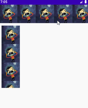
    @Preview
    @Composable
    fun MyScroll() {
        Column(modifier = Modifier.fillMaxSize()) {
            //Row横向排列滚动
            Row(
                modifier = Modifier
                    .fillMaxWidth()
                    .horizontalScroll(rememberScrollState()) //设置横向滚动
            ) {
                for (i in 1..10) {
                    Image(
                        painter = painterResource(id = R.mipmap.ic_logo),
                        contentDescription = null,
                    )
                }
            }
            //Column竖向排列滚动
            Column(
                modifier = Modifier
                    .padding(10.dp)
                    .height(250.dp)
                    .verticalScroll(rememberScrollState()) //设置竖向滚动
            ) {
                for (i in 1..10) {
                    Image(
                        painter = painterResource(id = R.mipmap.ic_logo),
                        contentDescription = null,
                    )
                }
            }
        }
效果图:
监听滚动偏移量、滚动位置与滚动位置跳转操作
代码
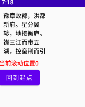
    @Preview
    @Composable
    fun MyScroll() {
        val state = rememberScrollState()
        val position = remember {
            derivedStateOf {
                state.value
            }
        }
        val scope = rememberCoroutineScope() //这个是在Composable调用协程的一种方式

        Column() {
            Text(
                text = "豫章故郡,洪都新府。星分翼轸,地接衡庐。" +
                        "襟三江而带五湖,控蛮荆而引瓯越。" +
                        "物华天宝,龙光射牛斗之墟;" +
                        "人杰地灵,徐孺下陈蕃之榻。" +
                        "雄州雾列,俊采星驰。" +
                        "台隍枕夷夏之交,宾主尽东南之美。" +
                        "都督阎公之雅望,棨戟遥临;" +
                        "宇文新州之懿范,襜帷暂驻。" +
                        "十旬休假,胜友如云;" +
                        "千里逢迎,高朋满座。" +
                        "腾蛟起凤,孟学士之词宗;" +
                        "紫电青霜,王将军之武库。" +
                        "家君作宰,路出名区;" +
                        "童子何知,躬逢胜饯。",
                modifier = Modifier
                    .padding(10.dp)
                    .width(100.dp)
                    .height(100.dp)
                    //监听滚动位置
                    .scrollable(state = rememberScrollableState(consumeScrollDelta = {
                        Log.e("zh", "当前滚动偏移量:${it}")
                        it
                    }), orientation = Orientation.Vertical)
                    .verticalScroll(state)
            )

            Text(
                color = Color.Red,
                text = "当前滚动位置${position.value}",
            )

            Button(onClick = {
                scope.launch {
                    state.scrollTo(0)
                }
            }) {
                Text(text = "回到起点")
            }
        }
    }
效果图:
指针输入
指针输入监听,与上面各色方法类似
代码:
    @Preview
    @Composable
    fun MyPointerInput() {
        Box(
            modifier = Modifier
                .width(300.dp)
                .height(300.dp)
                .background(Color.Gray)
        ) {
            Text(
                text = "你好",
                color = Color.Black,
                modifier = Modifier
                    .align(Alignment.Center)
                    .fillMaxSize(0.5f)
                    .background(color = Color.Green)
                    .pointerInput(Unit) {
                        /**
                         * 下面的只能存在一个手势Gestures方法,多了后续的手势方法会不执行,这边是方便观看全部贴出来
                         */
                        detectDragGestures { change, dragAmount ->
                            Log.e("zh", "检测拖动手势: change = $change \n dragAmount = $dragAmount")
                        }
                        detectDragGesturesAfterLongPress { change, dragAmount ->
                            Log.e("zh", "检测长按后的拖拽手势:  change = $change \n dragAmount = $dragAmount")
                        }
                        detectTapGestures {
                            /**
                             * 检测轻按、双击和长按手势,检测到时分别调用onTap、onDoubleTap和onLongPress。当检测到按压和pressgestuscope时调用onPress。
                             * tryAwaitRelease PressGestureScope。awaitRelease可以用来检测指针何时被释放或手势何时被取消。
                             * 第一个向下的指针和最后一个向上的指针被消耗,
                             * 在长按的情况下,检测到长按后的所有更改都被消耗。
                             */
                            Log.e("zh", "检测触控:  Offset = $it \n")
                        }
                        detectTapGestures(
                            onTap = {
                                Log.e("zh", "单击: Offset = $it \n")
                            },
                            onDoubleTap = {
                                Log.e("zh", "双击: Offset = $it \n")
                            },
                            onLongPress = {
                                Log.e("zh", "长按: Offset = $it \n")
                            },
                            onPress = {
                                Log.e("zh", "按下: Offset = $it \n")
                            })

                        detectTransformGestures { centroid, pan, zoom, rotation ->
                            Log.e("zh", "旋转、平移和缩放的手势检测器:  centroid = $centroid \n pan = $pan \n zoom = $zoom rotation = $rotation")

                        }
                        detectHorizontalDragGestures { change, dragAmount ->
                            Log.e("zh", "检测水平拖动手势:  change = $change \n dragAmount = $dragAmount")
                        }
                        detectVerticalDragGestures { change, dragAmount ->
                            Log.e("zh", "检测垂直拖动手势:  change = $change \n dragAmount = $dragAmount")
                        }
                    }
            )
        }
    }
点击效果
效果图
代码
override fun onCreate(savedInstanceState: Bundle?) {
    super.onCreate(savedInstanceState)
    setContent {
        Row(
            verticalAlignment = Alignment.CenterVertically,
            modifier = Modifier
                .padding(top = 100.dp)
                .fillMaxSize()
        ) {
            //默认点击效果
            Image(
                painter = painterResource(id = R.mipmap.ic_test_0),
                contentDescription = null,
                modifier = Modifier
                    .clickable {
                        Toast
                            .makeText(this@DemoActivity, "点击0>默认点击效果", Toast.LENGTH_SHORT)
                            .show()
                    })

            //涟漪点击效果,关键代码是rememberRipple
            val interactionSource1 = remember {
                MutableInteractionSource()
            }
            Image(
                painter = painterResource(id = R.mipmap.ic_test_1),
                contentDescription = null,
                modifier = Modifier
                    .clickable(onClick = {
                        Toast
                            .makeText(this@DemoActivity, "点击1>涟漪点击效果", Toast.LENGTH_SHORT)
                            .show()
                    }, indication = rememberRipple(), interactionSource = interactionSource1))

            //通过修改背景颜色实现自定义点击效果
            val interactionSource2 = remember {
                MutableInteractionSource()
            }
            val bgColor = if (interactionSource2.collectIsPressedAsState().value) Color.Blue else Color.Transparent
            Image(
                painter = painterResource(id = R.mipmap.ic_test_2),
                contentDescription = null,
                modifier = Modifier
                    .clickable(onClick = {
                        Toast
                            .makeText(
                                this@DemoActivity,
                                "点击2>通过修改背景颜色实现自定义点击效果",
                                Toast.LENGTH_SHORT
                            )
                            .show()
                    }, indication = null, interactionSource = interactionSource2)
                    .background(bgColor))

            //取消点击效果
            val interactionSource3 = remember {
                MutableInteractionSource()
            }
            Image(
                painter = painterResource(id = R.mipmap.ic_test_3),
                contentDescription = null,
                modifier = Modifier
                    .clickable(onClick = {
                        Toast
                            .makeText(this@DemoActivity, "点击3>取消点击效果", Toast.LENGTH_SHORT)
                            .show()
                    }, indication = null, interactionSource = interactionSource3))
        }
    }
}
graphicsLayer
graphicsLayer可用于对内容应用效果,如缩放、旋转、不透明度、阴影和剪切。当你的层属性由androidx. composition .runtime. state或动画值支持时,最好使用这个版本,因为读取块中的状态只会导致层属性更新,而不会触发重新组合和重新布局。
代码:
    @Preview
    @Composable
    fun MyGraphicsLayer() {
        Box(
            modifier = Modifier
                .width(300.dp)
                .height(300.dp)
                .background(Color.Gray)
        ) {
            Text(
                text = "你好",
                color = Color.Black,
                modifier = Modifier
                    .align(Alignment.Center)
                    .fillMaxSize(0.5f)
                    .background(color = Color.Green)
                    .graphicsLayer{
                        //绘制区域的水平比例尺。默认值为“1”
                        scaleX = 1f
                        //绘制区域的垂直比例尺。默认值为“1”。
                        scaleY = 1f
                        //绘制区域的alpha。设置为“1”以外的值将导致绘制的内容是半透明的,设置为“0”将使其完全不可见。默认值为' 1 ',取值范围为' 0 ' ~ ' 1 '。
                        alpha = 1f
                        //该层相对于其左边界的水平像素偏移量。默认值为' 0 '。
                        translationX = 0f
                        //该层相对于其上边界的垂直像素偏移量。默认值为' 0 '
                        translationY = 0f
                        //以像素为单位设置阴影的仰角。默认值为“0”,且不能为负值
                        shadowElevation = 0f
                        //范围阴影颜色
                        ambientShadowColor = Color(0xFFFF0000)
                        //点阴影颜色
                        spotShadowColor = Color(0xFFFF0000)
                        //X轴旋转角度
                        rotationX = 0f
                        //Y轴旋转角度
                        rotationY= 0f
                        //Z轴旋转角度
                        rotationZ = 0f
                        //观察相机视角距离
                        cameraDistance = 0f
                        //旋转or缩放的中心点
                        transformOrigin =  TransformOrigin.Center
                        transformOrigin =  TransformOrigin(0.1f,0.1f)
                        //形状
                        shape = RectangleShape
                        //设置为' true '将内容剪辑到[shape]。默认值为' false '
                        clip = false
                        //渲染效果,比如下面设置的模糊效果
                        renderEffect = BlurEffect(20f, 0.5f, TileMode.Clamp)
                    }
            )
        }
    }
裁剪
clip的裁剪
代码:
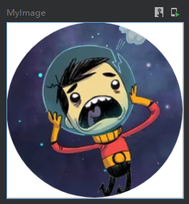
    @Preview
    @Composable
    fun MyImage() {
        Column(
            modifier = Modifier
                .width(100.dp)
                .height(100.dp)
                .background(Color.White)
                //clip的剪裁是对当前组件的内部内容进行裁剪,这里使用了CircleShape圆形进行裁剪.
                //也可以使用RectangleShape 或者 RoundedCornerShape() 矩形进行裁剪
                .clip(shape = CircleShape)

        ) {
            Image(
                painter = painterResource(id = R.mipmap.ic_logo),
                contentDescription = null,
                modifier = Modifier.fillMaxSize()
            )
        }
    }
效果图:
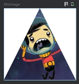
上面是使用常用形状裁剪,这里在举例一个自定义形状的裁剪方式,如下使用path绘制了一个三角形进行裁剪
代码:
    /**
     * 裁剪三角形
     */
    @Preview
    @Composable
    fun MyImage() {
        val customShape = object : Shape {
            override fun createOutline(size: Size, layoutDirection: LayoutDirection, density: Density): Outline {
                val path = Path()
                path.moveTo(size.width/2, 0f)
                path.lineTo(0f,size.height)
                path.lineTo(size.width,size.height)
                path.close()
                val outline = Outline.Generic(path)
                return outline
            }
        }
        Column(
            modifier = Modifier
                .width(100.dp)
                .height(100.dp)
                .background(Color.White)
                .clip(shape = customShape)

        ) {
            Image(
                painter = painterResource(id = R.mipmap.ic_logo),
                contentDescription = null,
                modifier = Modifier.fillMaxSize()
            )
        }
    }
效果图:
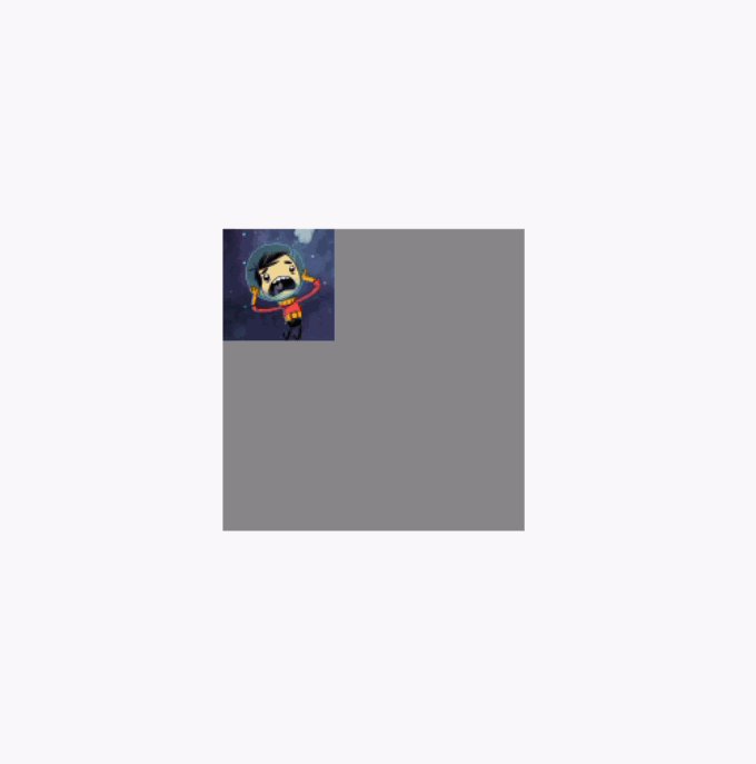
让子组件不超出当前父组件范围
clipToBounds 按照指定的边界裁切内容。强制限制当前布局下的子组件不允许超出到外部。另外这个属性与clip属性无关联。
反面例子代码,下面的代码中注释了clipToBounds
    @Preview
    @Composable
    fun MyImage() {
        var offset  =  remember { mutableStateOf(0f) }
        //必须在套一个布局设置最大范围的父类布局,以展示下面的Image在拖动的时候超出的效果
        Column(modifier = Modifier.fillMaxSize().padding(200.dp)) {
            Column(
                modifier = Modifier
                    .width(200.dp)
                    .height(200.dp)
                    .background(Color.Gray) //这里设置背景色为灰色,以观察布局的大小
//                .clipToBounds()

            ) {
                Image(
                    painter = painterResource(id = R.mipmap.ic_logo),
                    contentDescription = null,
                    contentScale = ContentScale.None,
                    modifier = Modifier
                        .draggable(state = rememberDraggableState() {
                            offset.value += it
                        }, orientation = Orientation.Horizontal)
                        .offset { IntOffset(offset.value.roundToInt(), 0) }
                )
            }
        }
    }
反面例子效果图,图片在拖动的时候可以超出布局范围:
调用clipToBounds 后的效果图(代码就不重复贴了,直接将clipToBounds 注释取消就行):
模糊
注意!blur这个api需要Android版本12 31 API的设备上才能生效
代码:
    @Preview
    @Composable
    fun MyBlur() {
        Box(
            modifier = Modifier
                .width(300.dp)
                .height(300.dp)
                .background(Color.Gray)
        ) {
            Image(
                painter = painterResource(id = R.mipmap.ic_logo),
                contentDescription = null,
                modifier = Modifier
                    .align(Alignment.Center)
                    //注意blur这个api需要Android 12 31 API 才能生效
                    .blur(radius = 10.dp, edgeTreatment = BlurredEdgeTreatment.Rectangle) //设置模糊
            )
        }
    }
效果图:
BlurredEdgeTreatment.Rectangle 是矩形边缘清晰中间模糊
BlurredEdgeTreatment.Unbounded 无边界模糊的效果图:
透明度
代码
    @Preview
    @Composable
    fun MyAlpha() {
        Box(
            modifier = Modifier
                .width(300.dp)
                .height(300.dp)
                .background(Color.Gray)
        ) {
            Image(
                painter = painterResource(id = R.mipmap.ic_logo),
                contentDescription = null,
                modifier = Modifier
                    .align(Alignment.Center)
                    .alpha(0.1f) //设置透明度
            )
        }
    }
效果图:
绘制阴影
注意!shadow这个api需要Android版本10的设备上才能生效
请注意!shadow的使用也是有顺序的,建议放到background前面
代码
    @Preview
    @Composable
    fun MyShadow() {
        Box(
            modifier = Modifier
                .width(300.dp)
                .height(300.dp)
                .background(Color.White)
        ) {
            Image(
                painter = painterResource(id = R.mipmap.ic_logo),
                contentDescription = null,
                modifier = Modifier
                    .align(Alignment.Center)
                    .shadow( //设置阴影,调用此api需要设备Android版本为10
                        elevation = 50.dp, //隐藏长度
                        shape = RectangleShape, //阴影形状
                        ambientColor = Color.Red, //环境颜色
                        spotColor = Color.Red, //阴影颜色
                        clip = true //是否跟随裁剪形状改变阴影形状
                    )
            )
        }
    }
效果图:
绘制
drawBehind绘制,将增加的绘制内容显示到组件图层的最下层
代码:
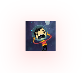
    @Preview
    @Composable
    fun MyDrawBehind() {
        Box(
            modifier = Modifier
                .width(300.dp)
                .height(300.dp)
                .background(Color.White)
        ) {
            Image(
                painter = painterResource(id = R.mipmap.ic_logo),
                contentDescription = null,
                modifier = Modifier
                    .align(Alignment.Center)
                    .drawBehind { //绘制到最下面的图层
                        val radius = size.width / 3
                        val centerOffset = Offset(size.width, 0f)
                        drawCircle(
                            color = Color.Red,
                            radius = radius,
                            center = centerOffset,
                            style = Fill
                        )
                    }
            )
        }
    }
在下面的效果图里,可以看到红圈在图片的下层:
drawWithContent 人为控制绘制内容的顺序
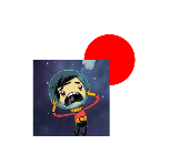
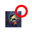
    @Preview
    @Composable
    fun MyDrawWithContent() {
        Box(
            modifier = Modifier
                .width(300.dp)
                .height(300.dp)
                .background(Color.White)
        ) {
            Image(
                painter = painterResource(id = R.mipmap.ic_logo),
                contentDescription = null,
                modifier = Modifier
                    .align(Alignment.Center)
                    .drawWithContent {
                        /*
                        drawContent()是理解drawWithContent的关键
                        drawContent这个是这个组件本身需要绘制的内容。
                        控制这个方法的位置你就可以控制绘制的顺序。
                         */
                        drawContent()
                        val radius = size.width / 3
                        val centerOffset = Offset(size.width, 0f)
                        drawCircle(
                            color = Color.Red,
                            radius = radius,
                            center = centerOffset,
                            style = Stroke(25f)
                        )
                    }
            )
        }
    }
因为代码中是先绘制了drawContent()然后在绘制圆环,所以下面的效果图圆环在图片的上层:
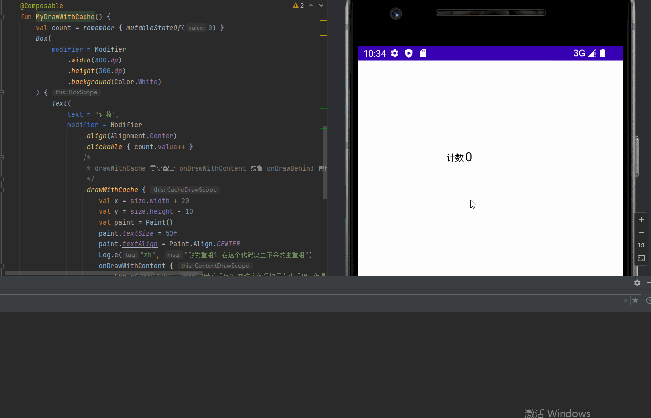
drawWithCache 提供缓存数据避免重组的绘制方式
代码
    @Preview
    @Composable
    fun MyDrawWithCache() {
        val count = remember { mutableStateOf(0) }
        Box(
            modifier = Modifier
                .width(300.dp)
                .height(300.dp)
                .background(Color.White)
        ) {
            Text(
                text = "计数",
                modifier = Modifier
                    .align(Alignment.Center)
                    .clickable { count.value++ }
                    /*
                     * drawWithCache 需要配合 onDrawWithContent 或者 onDrawBehind 使用
                     */
                    .drawWithCache {
                        val x = size.width + 20
                        val y = size.height - 10
                        val paint = Paint()
                        paint.textSize = 50f
                        paint.textAlign = Paint.Align.CENTER
                        Log.e("zh", "触发重组1 在这个代码块里不会发生重组")
                        onDrawWithContent {
                            Log.e("zh", "触发重组2 在这个代码块里发生重组,但是请注意mutableStateOf的数据也要放到这个代码块中")
                            drawIntoCanvas { canvas ->
                                canvas.nativeCanvas.drawText("${count.value}", x, y, paint)
                            }
                            drawContent()
                        }
                    }
            )
        }
    }
效果图:
Painter绘制
绘制图形
代码:
    @Preview
    @Composable
    fun MyPaint() {
        Box(
            modifier = Modifier
                .width(100.dp)
                .height(100.dp)
                .background(Color.White)
        ) {
            Text(
                text = "你好",
                modifier = Modifier
                    .align(Alignment.Center)
                    .paint(painter = object : Painter() {
                        override val intrinsicSize: Size
                            get() = Size(50f, 50f)

                        override fun DrawScope.onDraw() {
                            drawLine(
                                color = Color.Red,
                                Offset(0f, 0f),
                                Offset(size.width, size.height),
                                strokeWidth = 10f
                            )
                        }
                    })
            )
        }
    }
效果图:
绘制图像
有一些人会利用这个来绘制组件的背景,的确可以但是个人认为不太妥当...
代码:
    @Preview
    @Composable
    fun MyPaint() {
        Box(
            modifier = Modifier
                .width(300.dp)
                .height(300.dp)
                .background(Color.White)
        ) {
            Text(
                text = "你好",
                color = Color.White,
                modifier = Modifier
                    .align(Alignment.Center)
                    .paint(painterResource(id = R.mipmap.ic_logo))
            )
        }
    }
效果图:
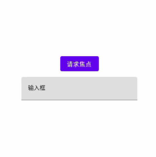
焦点监听
下面使用TextField输入框来监听焦点的获取
override fun onCreate(savedInstanceState: Bundle?) {
    super.onCreate(savedInstanceState)
    setContent {
        Box(modifier = Modifier.fillMaxSize()){
            TextField(value = "输入框", onValueChange = {}, modifier = Modifier.onFocusChanged {
                val text = if (it.isFocused) "获得焦点" else "失去焦点"
                Log.e("zh", "${text}")
            }.align(Alignment.Center))
        }
    }
}
焦点的获取与清除
效果图
代码
override fun onCreate(savedInstanceState: Bundle?) {
super.onCreate(savedInstanceState)
setContent {
val hasFocus = remember { mutableStateOf(false) }
val focusRequester = remember { FocusRequester() }
val focusManager = LocalFocusManager.current
Box(modifier = Modifier.fillMaxSize()){
TextField(value = "输入框", onValueChange = {}, modifier = Modifier
.focusRequester(focusRequester)
.onFocusChanged {
hasFocus.value = it.isFocused
val text = if (it.isFocused) "获得焦点" else "失去焦点"
Log.e("zh", "${text}")
}
.align(Alignment.Center))
//这边创建按键来控制上面输入框的焦点获取
Button(
modifier = Modifier.padding(bottom = 120.dp).align(Alignment.Center),
onClick = {
if (!hasFocus.value) {
focusRequester.requestFocus() //获取焦点
} else{
focusManager.clearFocus() //清空焦点
}
}
) {
Text(if (!hasFocus.value) "请求焦点" else "取消焦点")
}
}
}
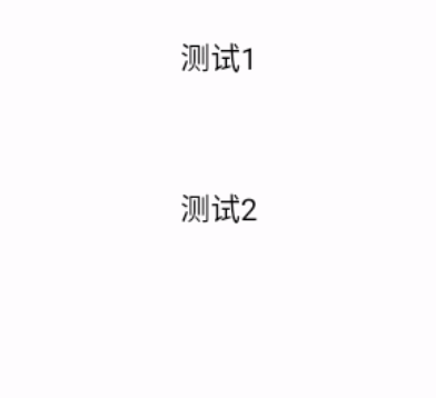
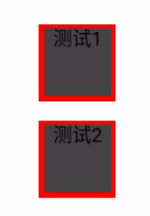
}自定义焦点选中效果
代码
override fun onCreate(savedInstanceState: Bundle?) {
    super.onCreate(savedInstanceState)
    setContent {
        val interactionSource = remember { MutableInteractionSource() }
        val bg1Color = remember { mutableStateOf(Color.Transparent) }
        //collectIsFocusedAsState为焦点状态
        if (interactionSource.collectIsFocusedAsState().value){
            bg1Color.value = Color(0xFF6FFFFF)
        } else {
            bg1Color.value = Color.Transparent
        }

        Column(
            horizontalAlignment = Alignment.CenterHorizontally,
            modifier = Modifier
                .padding(top = 100.dp)
                .fillMaxSize()
        ) {
            Text(
                text = "测试1",
                fontSize = 20.sp,
                textAlign = TextAlign.Center,
                modifier = Modifier
                    .size(100.dp, 100.dp)
                    .background(color = bg1Color.value, shape = RoundedCornerShape(40.dp))
                    //需要在clickable上设置interactionSource与indication
                    .clickable(
                        interactionSource = interactionSource,
                        indication = null,
                        onClick = {

                        })
            )
            //默认的自带焦点,作为对比
            Text(
                text = "测试2",
                fontSize = 20.sp,
                textAlign = TextAlign.Center,
                modifier = Modifier
                    .size(100.dp, 100.dp)
                    .clickable(onClick = {

                    })
            )
        }
    }
}
效果图
禁用焦点功能
代码
setContent {
    Column(
        horizontalAlignment = Alignment.CenterHorizontally,
        modifier = Modifier
            .padding(top = 100.dp)
            .fillMaxSize()
    ) {
        Text(text = "测试2", textAlign = TextAlign.Center,modifier = Modifier.size(100.dp, 100.dp).focusProperties{
            //canFocus设置为false可以禁用焦点
            canFocus = false
        }.clickable {
        })
    }
}
组合顺序的影响
Modifier的方法组合顺序是会影响到组件的实际效果的,这里使用两段代码演示(可以根据下面2代码看到点击范围发生了改变):
代码1:
    @Preview
    @Composable
    fun MyText() {
        Text(
            text = "你好世界你好世界",
            color = Color.Black,
            modifier = Modifier
                .background(Color.Green)
                .size(150.dp)
                .clickable { //点击在前
                    Log.e("zh", "MyGraphicsLayer: ")
                }
                .padding(50.dp) //padding在后
        )
    }
效果图:
代码2:
    @Preview
    @Composable
    fun MyText() {
        Text(
            text = "你好世界你好世界",
            color = Color.Black,
            modifier = Modifier
                .background(Color.Green)
                .size(150.dp)
                .padding(50.dp) //padding在前
                .clickable { //点击在后
                    Log.e("zh", "MyGraphicsLayer: ")
                }
        )
    }
效果图:

多个Modifier组合
下面的代码种,分别创建了backgroundModifier 与 borderModifier, 并且使用then将他们组合
代码:
    @Preview
    @Composable
    fun MyText() {
        val backgroundModifier = Modifier
            .background(Color.Green)
            .fillMaxSize(0.2f)

        val borderModifier = Modifier
            .border(
                width = 1.dp, //设置边框粗细
                color = Color(0xFF000000), //边框颜色
                shape = RoundedCornerShape(5.dp) //切角矩形形状
            )

        Column {
            Text(
                text = "A",
                color = Color.Black,
                textAlign = TextAlign.Center,
                modifier = Modifier
                    .then(backgroundModifier)
                    .then(borderModifier)
                    .clickable {
                        Log.e("zh", "点击A")
                    }
            )
            Text(
                text = "B",
                color = Color.Black,
                textAlign = TextAlign.Center,
                modifier = Modifier
                    .then(backgroundModifier)
                    .then(borderModifier)
                    .clickable {
                        Log.e("zh", "点击B")
                    }
            )

        }
    }
扩展Modifier函数
kotlin是支持扩展函数的,所以Modifier也能进行函数扩展,使其可以进行一些风格与功能封装,减少重复代码。
组件风格扩展的例子(一个简单的例子)
假设,现在有一个文本风格有统一的背景与边框,现在希望减少重复代码,我们就可以以下面的方式实现Modifier扩展函数,达到随处使用的目的。
扩展函数代码
then是接续函数,代表myStyle这个函数还可以拼接其他的Modifier的函数
fun Modifier.myStyle() = this.then(
    this.padding(10.dp)
    .background(color = Color.DarkGray, shape = RoundedCornerShape(5.dp))
    .border(5.dp, Color.Red)
)
使用函数代码
Column(
    horizontalAlignment = Alignment.CenterHorizontally,
    modifier = Modifier
        .padding(top = 100.dp)
        .fillMaxSize()
) {
    Text(
        text = "测试1",
        fontSize = 20.sp,
        textAlign = TextAlign.Center,
        modifier = Modifier
            .size(100.dp, 100.dp)
            .myStyle()
    )
    Text(
        text = "测试2",
        fontSize = 20.sp,
        textAlign = TextAlign.Center,
        modifier = Modifier
            .size(100.dp, 100.dp)
            .myStyle()
    )
}
效果图
扩展支持compose的例子
上面的例子非常简单,只是封装了常规的Modifier函数。 但是实际开发中,我们有需求封装各色状态,逻辑等等情况,以达到扩展实现动画效果、焦点选中、按下效果的功能。
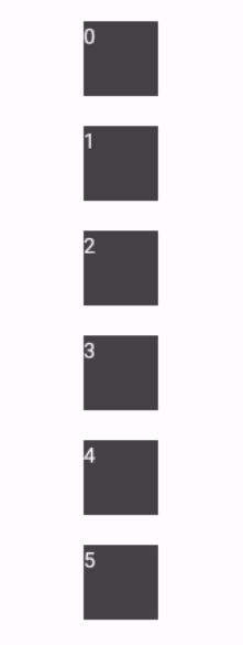
实现按下、焦点、鼠标悬浮组件缩放的扩展例子
扩展函数代码
下面关键的是composed函数,这个函数可以让以在compose函数里一样调用,remember状态管理、附带效应等等代码
/**
 * 点击和焦点、鼠标悬停的缩放效果
 */
fun Modifier.clickAndFocusHoveredScale(focusedAndHoveredScale: Float, pressedScale: Float, onClick: () -> Unit) =
    this.composed(
        factory = {
            //创建一个缩放效果
            val scale = remember {
                mutableStateOf(1f)
            }
            val interactionSource = remember {
                MutableInteractionSource()
            }
            if (interactionSource.collectIsFocusedAsState().value || interactionSource.collectIsHoveredAsState().value) {
                //当正在焦点状态与鼠标悬停状态时,这里改变scale的数值
                scale.value = focusedAndHoveredScale
            } else if (interactionSource.collectIsPressedAsState().value) {
                //当按下状态时,这里改变scale的数值
                scale.value = pressedScale
            } else {
                //没有状态默认恢复原来的大小
                scale.value = 1.0f
            }
            return@composed Modifier
                .scale(scale.value)
                .clickable(interactionSource, indication = null, onClick = onClick)
        },
    )
使用函数代码
Column(
    horizontalAlignment = Alignment.CenterHorizontally,
    modifier = Modifier
        .padding(top = 100.dp)
        .fillMaxSize()
) {
    (0..5).forEach {
        Text("${it}", color = Color.White, modifier = Modifier.padding(10.dp)
            .size(50.dp)
            .clickAndFocusHoveredScale(1.3f, 0.7f) {
                    //点击

            }
            .background(color = Color.DarkGray)
        )
    }
}
效果图
End
本文来自博客园,作者:观心静 ,转载请注明原文链接:https://www.cnblogs.com/guanxinjing/p/16807477.html

 浙公网安备 33010602011771号