CSS3 flexbox弹性布局实例
常用例子
1.居中对齐
<!DOCTYPE html>

<head>
    <meta charset="utf-8">

    <style type="text/css">
        .flex-container{
            padding:0;
            margin:0;
            list-style:none;
            display:-webkit-box;
            display:-moz-box;
            display:-ms-flexbox;
            display:-webkit-flex;
            display:flex;
            -webkit-flex-flow:row nowrap;
            justify-content:space-around;
        }
        .flex-item{
            background:tomato;
            padding:5px;
            width:200px;
            height:150px;
            margin-top:10px;
            line-height:150px;
            color:white;
            font-weight:bold;
            font-size:3em;
            text-align:center
        }

    </style>
</head>
<body>
<ul class="flex-container">
   <li class="flex-item">1</li>
    <li class="flex-item">2</li>
    <li class="flex-item">3</li>
    <li class="flex-item">4</li>
    <li class="flex-item">5</li>
    <li class="flex-item">6</li>

</ul>
</body>
</html>
效果:

2.自适应导航
<!DOCTYPE html>

<head>
    <meta charset="utf-8">

    <style type="text/css">
        .navigation{
            list-style:none;
            margin:0;
            background:deepskyblue;
            display:-webkit-box;
            display:-moz-box;
            display:-ms-flexbox;
            display:-webkit-flex;
            display:flex;
            -webkit-flex-flow:row wrap;
            justify-content:flex-end
        }
        .navigation a{
            text-decoration:none;
            display:block;
            padding:1em;
            color:white
        }
        .navigation a:hover{
            background:#00AEE8
        }
        @media all and (max-width:800px){
            .navigation{justify-content:space-around}
        }
        @media all and (max-width:600px){
            .navigation{
                -webkit-flex-flow:column wrap;
                padding:0
            }
            .navigation a{
                text-align:center;
                padding:10px;
                border-top:1px solid rgba(255,255,255,0.3);
                border-bottom:1px solid rgba(0,0,0,0.1)}
            .navigation li:last-of-type a{border-bottom:none}
        }


    </style>
</head>
<body>
<ul class="navigation">
    <li><a href="#">Home</a></li>
    <li><a href="#">About</a></li>
    <li><a href="#">Products</a></li>
    <li><a href="#">Contact</a></li>
</ul>
</body>
</html>
效果:

/* Large */
.navigation {
  display: flex;
  flex-flow: row wrap;
  /* This aligns items to the end line on main-axis */
  justify-content: flex-end;
}

/* Medium screens */
@media all and (max-width: 800px) {
  .navigation {
    /* When on medium sized screens, we center it by evenly distributing empty space around items */
    justify-content: space-around;
  }
}

/* Small screens */
@media all and (max-width: 500px) {
  .navigation {
    /* On small screens, we are no longer using row direction but column */
    flex-direction: column;
  }
}
3.常见3栏移动优先布局
- 设置子元素从左到右,超出换行(flex-flow:row wrap;)。
- 默认情况下所有子元素拓展比例为1(flex-grow:1),伸缩比例为100%(flex-basis:100%)。
- 大于800px时,.main的拓展比例为2.伸缩值为0(flex-basis:0px),并且侧栏aside-1排列在第一位,main在第二位,aside-2在第三位。
- 大于600时。.aside元素的拓展比例为1(flex-grow:1),伸缩比例为auto(flex-basis:auto)。
<!DOCTYPE html>

<head>
    <meta charset="utf-8">

    <style type="text/css">
        .wrapper{
            display:-webkit-box;
            display:-moz-box;
            display:-ms-flexbox;
            display:-webkit-flex;
            display:flex;
            -webkit-flex-flow:row wrap;
            font-weight:bold;
            text-align:center
        }
        .wrapper > *{padding:10px;flex:1 100%}
        .header{background:tomato}
        .footer{background:lightgreen}
        .main{text-align:left;background:deepskyblue}
        .aside-1{background:gold}
        .aside-2{background:hotpink}
        @media all and (min-width:600px){.aside{flex:1 auto}
        }
         @media all and (min-width:800px){.main{flex:2 0px}
            .aside-1{order:1}
            .main{order:2}
            .aside-2{order:3}
            .footer{order:4}
        }

    </style>
</head>
<body>
<div class="wrapper">
    <header class="header">Header</header>
    <article class="main">
        <p>Pellentesque habitant morbi tristique senectus et netus et malesuada fames ac turpis egestas. Vestibulum tortor quam, feugiat vitae, ultricies eget, tempor sit amet, ante. Donec eu libero sit amet quam egestas semper. Aenean ultricies mi vitae est. Mauris placerat eleifend leo.</p>
    </article>
    <aside class="aside aside-1">Aside 1</aside>
    <aside class="aside aside-2">Aside 2</aside>
    <footer class="footer">Footer</footer>
</div>
</body>
</html>
效果:

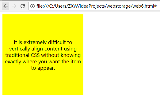
垂直居中对齐
<!DOCTYPE html>

<head>
    <meta charset="utf-8">

    <style type="text/css">
        著作权归作者所有。
        商业转载请联系作者获得授权,非商业转载请注明出处。
        链接:http://caibaojian.com/flexbox-example.html
                                 来源:http://caibaojian.com

                                           body {
                                               display: -webkit-flex;
                                               display: flex;
                                               flex-flow: column;

                                               -webkit-align-items: center;
                                               align-items: center;
                                               -webkit-justify-content: center;
                                               justify-content: center;

                                               width: 100%;
                                               height: 100%;
                                               background: lightgrey;
                                           }

        .content {
            /* also making content into a flex box so we can also vertically center its content */
            display: -webkit-flex;
            display: flex;
            -webkit-flex-flow: column;
            flex-flow: column;

            -webkit-justify-content: center;
            justify-content: center;
            text-align: center;

            width: 250px;
            height: 250px;
            padding: 7px;

            background: yellow;
        }

    </style>
</head>
<body>
<form>
    <body>
    <div class="content">
        <p>It is extremely difficult to vertically align content using traditional CSS without knowing exactly where you want the item to appear.
            </p>
    </div>
    </body>
</form>
</body>
</html>
博客帖子的典型页面布局
<!DOCTYPE html>

<head>
    <meta charset="utf-8">

    <style type="text/css">
        .post {
            display: flex;
            flex-flow: column wrap;
        }
        .post-meta {
            display: flex;
            flex-flow: row wrap;
            order: 1;
        }
        .post-body {
            order: 3;
        }
        .post-comments {
            order: 4;
        }
        .comments-count {
            margin-left: auto;
        }
        .post-image {
            order: 2;
            align-self: center;
        }

    </style>
</head>
<body>
<div class="post">
    <h1>This is my first blog post</h1>
    <div class="post-meta">
        <div class="author">Alex Cheng</div>
        <div class="datetime">2014-07-02 10:10 am</div>
        <div class="comments-count">2 comments</div>
    </div>
    <div class="post-body">
        My first blog post.

    </div>
    <div class="post-image">
        <img src="http://placehold.it/500x200&text=1">
    </div>
    <div class="post-comments">
        <h3>Comments</h3>
        <ul>

            <li><div class="author">Bob</div><div>This is a good post.</div></li>
            <li><div class="autho">David</div><div>Good post.</div></li>

        </ul>
    </div>
</div>
</body>
</html>

2017-08-23 23:25:48
越努力越幸运

 浙公网安备 33010602011771号