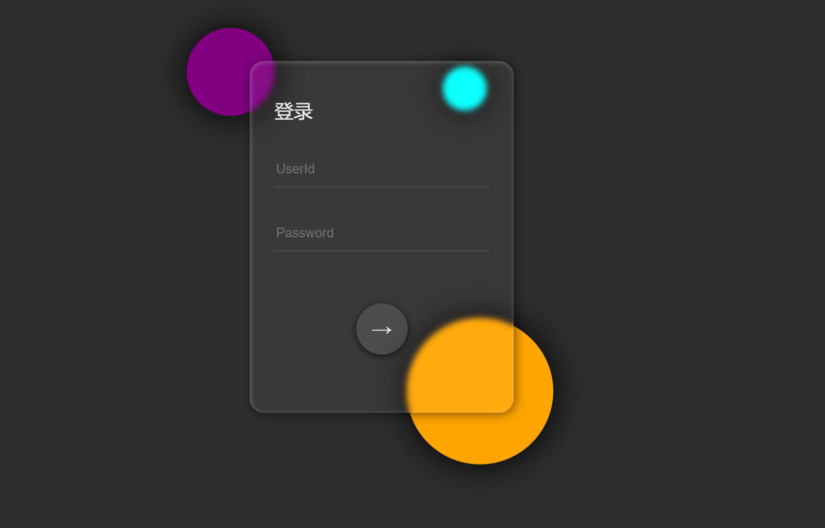
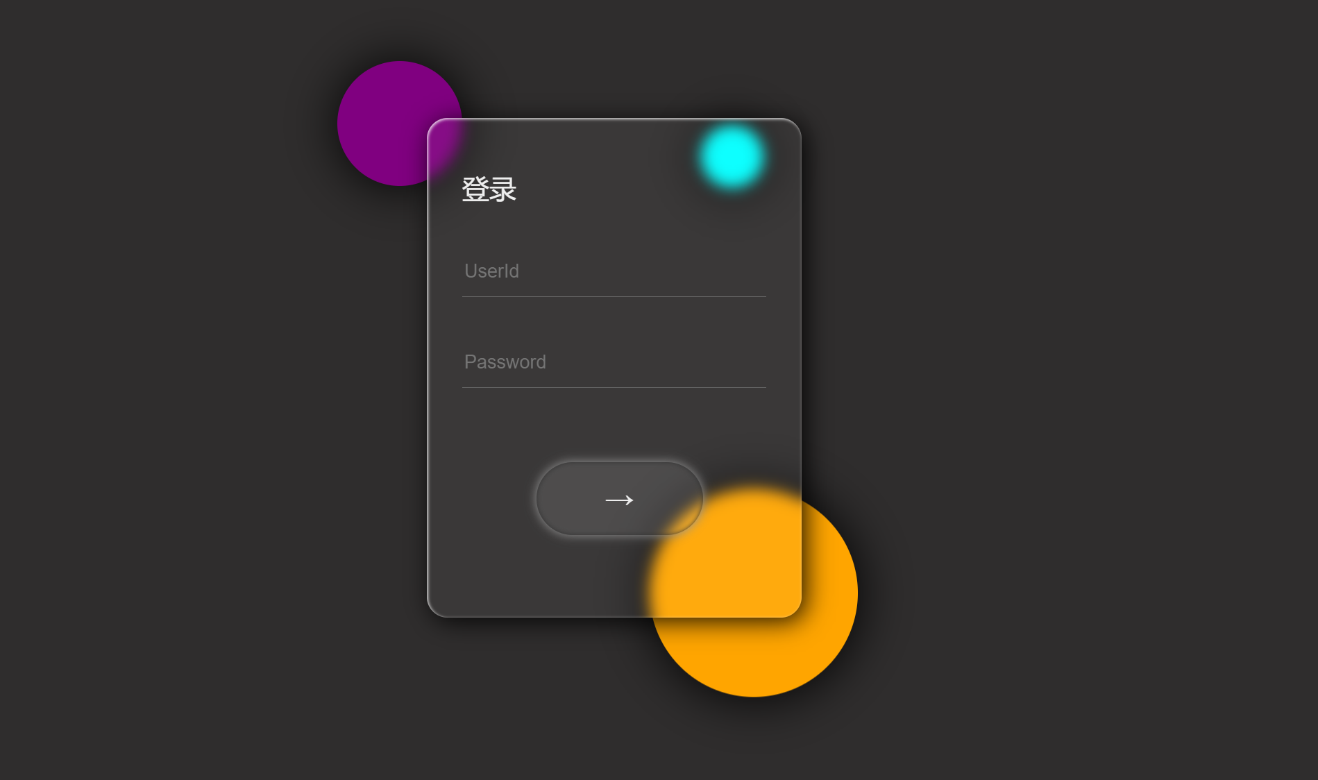
一个玻璃模糊登录页面
代码部分
<!DOCTYPE html>
<html lang="en">
<head>
    <meta charset="UTF-8">
    <meta name="viewport" content="width=device-width, initial-scale=1.0">
    <title>Document</title>
</head>
<body style="background-color: #2f2d2d;">
    <div class="center">
        <div class="bg">
            <span></span>
            <span></span>
            <span></span>
        </div>
        <div class="glass">
            <div class="text">登录</div>
            <input type="text" placeholder="UserId">
            <input type="password" placeholder="Password">
            <button>→</button>
        </div>
    </div>
</body>
</html>
<style>
     body, html {
        height: 100%;
        margin: 0;
    }
    /* 先常见一个居中的容器 */
    .center {
        position: relative;/*该元素的位置将基于其正常的文档流位置进行定位*/
        width: 800px;
        height: 800px;
        margin: 0 auto;
    }
    /* 新建放置表单元素的盒子 */
    .glass{
        position: absolute;/*绝对位置*/
        width: 360px;
        height: 480px;
        top: 160px;
        left: 220px;
        border-radius: 20px;
        color: #eee;
        background: rgba(255, 255, 255,0.05);
        /* 设置模糊和阴影 */
        backdrop-filter: blur(4px);
        box-shadow: inset 1px 1px 6px rgba(255, 255, 255, 0.3),
        2px 2px 15px rgba(0,0,0,0.5);
        animation: am3 ease-out 1s 0.2s backwards;
        transition: all 0.5s ease;

    }
    /* 新建背景盒子 */
    .bg{
        /* 使用绝对位置 */
        position: absolute;
        width: 800px;
        height: 800px;
        top: 0;
        left: 0;
        animation: am2 ease-out 1s;
    }
    /* 设置数据框 */
    input {
        /* 设置输入框透明 隐藏背景和轮廓 */
        background: transparent;
        outline: none;
        /* 只留底边 */
        border: none;
        border-bottom: 1px solid #666;
        /* 调整位置 */
        width: 80%;
        height: 45px;
        color: #eee;
        font-size: 18px;
        margin-left: 34px;
        margin-top: 40px;
    }
    /* 设置文本的位置 */
    .text{
        display: inline-block;
        font-size: 26px;
        margin-left: 34px;
        margin-top: 50px;
    }
    /* 设置按钮 */
    button{
        border: none;
        width: 70px;
        height: 70px;
        border-radius: 50%;
        color: #eee;
        font-weight: bold;
        font-size: 28px;
        margin-left: 145px;
        margin-top: 71px;
        cursor: pointer;
        background: rgba(255, 255, 255, 0.1);
        box-shadow: 0px 2px 10px #111;
        transition: all 0.4s ease;
    }
    span{
        background: #fff;
        position: absolute;
        top: 117px;
        left: 143px;
        width: 120px;
        height: 120px;
        border-radius: 50%;
        box-shadow: 1px 1px 50px #000;
    }
    span:nth-child(1){
        top: 117px;
        left: 134px;
        width: 120px;
        height: 120px;
        background: purple;
        /* 添加动画 */
        animation: am1 ease-in-out 3s infinite alternate;
    }
    span:nth-child(2){
        top: 518px;
        left: 434px;
        width: 200px;
        height: 200px;
        background: orange;
        animation: am1 ease-in-out 4s infinite alternate-reverse;
    }
    span:nth-child(3){
        top: 196px;
        left: 483px;
        width: 60px;
        height: 60px;
        background: cyan;
        animation: am1 ease-in-out 2.5s 0.5s infinite alternate;
    }
    @keyframes am1{
        0% { transform: translateY(0);}
        100% { transform: translateY(-30px);}
    }
    @keyframes am2{
        0% { transform: scale(0,0) rotateZ(60deg);}
        100% { transform: scale(1,1) rotateZ(0);}
    }
    @keyframes am3{
        0% { transform: translateY(8px);opacity:0;}
        100% { transform: translateY(0);opacity:1;}
    }
    .glass:hover{
        box-shadow: inset 1px 1px 3px rgba(255, 255, 255, 0.9),
                    4px 4px 25px rgba(0,0,0,0.9);
        backdrop-filter: blur(7px);
    }
    button:hover{
        width: 160px;
        border-radius: 70px;
        margin-left: 105px;
        box-shadow: 0px 0px 10px #999,inset 0px 0px 5px #333;
    }
</style>
效果
本文来自博客园,作者:厚礼蝎,转载请注明原文链接:https://www.cnblogs.com/guangdelw/p/17997381

 浙公网安备 33010602011771号