matplotlib_summary
Matplotlib
Matplotlib tutorials: https://matplotlib.org/3.3.1/tutorials/index.html
This serves as a cheat sheet for Matplotlib, a 2d plotting library for Python.
Not a total beginner? Jump straight down to the examples or get the jupyter notebook file. Also, the official example library is pretty sweet.
Installation
If you don't already have it installed, do so using Pip or Anaconda:
$ pip install matplotlib
or
$ conda install matplotlib
If you have any issues with installation, there are other options. Check out the official installation guide.
Index
1. Prepare Data
NumPy is probably your best friend for that. Check out my CheatSheet here
2. Plots
Creating plots
| Operator | Description | Documentation |
|---|---|---|
fig = plt.figures() |
a container that contains all plot elements | link |
| Operator | Description | Documentation |
|---|---|---|
fig.add_axes()a = fig.add_subplot(222) |
Initializes subplot A subplot is an axes on a grid system row-col-num, see examples |
link link |
fig, b = plt.subplots(nrows=3, nclos=2) |
Adds subplot | link |
ax = plt.subplots(2, 2) |
Creates subplot | link |
Axes are very useful for subplots. See example here
After configuring your plot, you must use plt.show() to make it visible
Plotting
| Operator | Description | Documentation |
|---|---|---|
lines = plt.plot(x,y) |
Plot data connected by lines | link |
plt.scatter(x,y) |
Creates a scatterplot, unconnected data points | link |
plt.bar(xvalue, data , width, color...) |
simple vertical bar chart | link |
plt.barh(yvalue, data, width, color...) |
simple horizontal bar | link |
plt.hist(x, y) |
Plots a histogram | link |
plt.boxplot(x,y) |
Box and Whisker plot | |
plt.violinplot(x, y) |
Creates violin plot | link |
ax.fill(x, y, color='lightblue')ax.fill_between(x,y,color='yellow') |
Fill area under/between plots | link |
For more advanced box plots, start here
| Operator | Description | Documentation |
|---|---|---|
fig, ax = plt.subplots()im = ax.imshow(img, cmap, vmin...) |
Colormapped or RGB arrays | link |
Suggestions?
| Operator | Description | Documentation |
|---|---|---|
plt.savefig('pic.png') |
Saves plot/figure to image | link |
plt.savefig('transparentback.png', transparent=True) |
Saves transparent plot/figure to image | see above |
Customization
| Operator | Description | Documentation |
|---|---|---|
plt.plot(x, y, color='lightblue')plt.plot(x, y, alpha = 0.4) |
colors plot to color blue | link |
plt.colorbar(mappable, orientation='horizontal') |
mappable: the Image, Contourset etc to which colorbar applies |
link |
Markers (see examples)
| Operator | Description | Documentation |
|---|---|---|
plt.plot(x, y, marker='*') |
adds * for every data point |
link |
plt.scatter(x, y, marker='.') |
adds . for every data point | see above |
| Operator | Description | Documentation |
|---|---|---|
plt.plot(x, y, linewidth=2) |
Sets line width | link |
plt.plot(x, y, ls='solid') |
Sets linestyle, ls can be ommitted, see 2 below |
see above |
plt.plot(x, y, ls='--') |
Sets linestyle, ls can be ommitted, see below |
see above |
plt.plot(x,y,'--', x**2, y**2, '-.') |
Lines are '--' and '_.', see example | see above |
plt.setp(lines,color='red',linewidth=2) |
Sets properties of plot lines |
link |
| Operator | Description | Documentation |
|---|---|---|
plt.text(1, 1,'Example Text',style='italic') |
Places text at coordinates 1/1 | link |
ax.annotate('some annotation', xy=(10, 10)) |
Annotate the point with coordinatesxy with text s |
link |
plt.title(r'$delta_i=20$', fontsize=10) |
Mathtext | link |
Limits, Legends/Labels , Layout
Limits
| Operator | Description | Documentation |
|---|---|---|
plt.xlim(0, 7) |
Sets x-axis to display 0 - 7 | link |
plt.ylim(-0.5, 9) |
Sets y-axis to display -0.5 - 9 | link |
ax.set(xlim=[0, 7], ylim=[-0.5, 9])ax.set_xlim(0, 7) |
Sets limits | link link |
plt.margins(x=1.0, y=1.0) |
Set margins: add padding to a plot, values 0 - 1 | |
plt.axis('equal') |
Set the aspect ratio of the plot to 1 |
Legends/Labels
| Operator | Description | Documentation |
|---|---|---|
plt.title('just a title') |
Sets title of plot | link |
plt.xlabel('x-axis') |
Sets label next to x-axis | link |
plt.ylabel('y-axis') |
Sets label next to y-axis | link |
ax.set(title='axis', ylabel='Y-Axis', xlabel='X-Axis') |
Set title and axis labels | link |
ax.legend(loc='best') |
No overlapping plot elements | link |
Ticks
| Operator | Description | Documentation |
|---|---|---|
plt.xticks(x, labels, rotation='vertical') |
Set ticks, example | link |
ax.xaxis.set(ticks=range(1,5), ticklabels=[3,100,-12,"foo"]) |
Set x-ticks | link |
ax.tick_params(axis='y', direction='inout', length=10) |
Make y-ticks longer and go in and out | link |
Examples
Basics
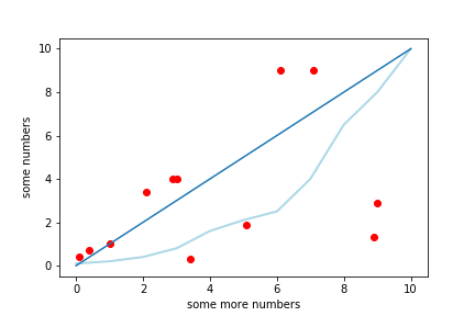
import matplotlib.pyplot as plt

x = [1, 2.1, 0.4, 8.9, 7.1, 0.1, 3, 5.1, 6.1, 3.4, 2.9, 9]
y = [1, 3.4, 0.7, 1.3, 9, 0.4, 4, 1.9, 9, 0.3, 4.0, 2.9]
plt.scatter(x,y, color='red')

w = [0.1, 0.2, 0.4, 0.8, 1.6, 2.1, 2.5, 4, 6.5, 8, 10]
z = [0, 1, 2, 3, 4, 5, 6, 7, 8, 9, 10]
plt.plot(z, w, color='lightblue', linewidth=2)

c = [0,1,2,3,4, 5, 6, 7, 8, 9, 10]
plt.plot(c)

plt.ylabel('some numbers')
plt.xlabel('some more numbers')
plt.show()
import matplotlib.pyplot as plt
import numpy as np

x = np.random.rand(10)
y = np.random.rand(10)

plt.plot(x,y,'--', x**2, y**2,'-.')
plt.savefig('lines.png')
plt.show()
!

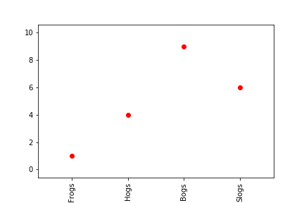
import matplotlib.pyplot as plt


x = [1, 2, 3, 4]
y = [1, 4, 9, 6]
labels = ['Frogs', 'Hogs', 'Bogs', 'Slogs']

plt.plot(x, y, 'ro')
# You can specify a rotation for the tick labels in degrees or with keywords.
plt.xticks(x, labels, rotation='vertical')
# Pad margins so that markers don't get clipped by the axes
plt.margins(0.2)
plt.savefig('ticks.png')
plt.show()
Subplotting Examples
import matplotlib.pyplot as plt

x = [0.5, 0.6, 0.8, 1.2, 2.0, 3.0]
y = [10, 15, 20, 25, 30, 35]
z = [1, 2, 3, 4]
w = [10, 20, 30, 40]

fig = plt.figure()
ax =  fig.add_subplot(111)
ax.plot(x, y, color='lightblue', linewidth=3)
ax.scatter([2,3.4,4, 5.5],
               [5,10,12, 15],
               color='black',
               marker='^')
ax.set_xlim(0, 6.5)

ax2 =  fig.add_subplot(222)
ax2.plot(z, w, color='lightgreen', linewidth=3)
ax2.scatter([3,5,7],
               [5,15,25],
               color='red',
               marker='*')
ax2.set_xlim(1, 7.5)

plt.savefig('mediumplot.png')
plt.show()

Thanks to this guy for this good example
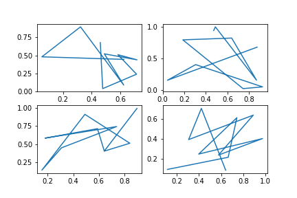
import numpy as np
import matplotlib.pyplot as plt

# First way #

x = np.random.rand(10)
y = np.random.rand(10)

figure1 = plt.plot(x,y)

# Second way #

x1 = np.random.rand(10)
x2 = np.random.rand(10)
x3 = np.random.rand(10)
x4 = np.random.rand(10)
y1 = np.random.rand(10)
y2 = np.random.rand(10)
y3 = np.random.rand(10)
y4 = np.random.rand(10)

figure2, ((ax1, ax2), (ax3, ax4)) = plt.subplots(2, 2)
ax1.plot(x1,y1)
ax2.plot(x2,y2)
ax3.plot(x3,y3)
ax4.plot(x4,y4)

plt.show()
If you haven't used NumPy before, check out my cheat sheet

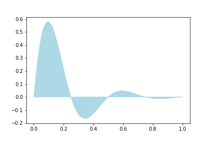
import numpy as np
import matplotlib.pyplot as plt

x = np.linspace(0, 1, 500)
y = np.sin(4 * np.pi * x) * np.exp(-5 * x)

fig, ax = plt.subplots()

ax.fill(x, y, color='lightblue')
plt.show()
Advanced
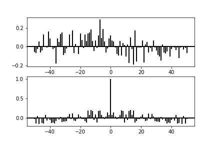
Taken from official docs
import matplotlib.pyplot as plt
import numpy as np


np.random.seed(0)

x, y = np.random.randn(2, 100)
fig = plt.figure()
ax1 = fig.add_subplot(211)
ax1.xcorr(x, y, usevlines=True, maxlags=50, normed=True, lw=2)
ax1.grid(True)
ax1.axhline(0, color='black', lw=2)

ax2 = fig.add_subplot(212, sharex=ax1)
ax2.acorr(x, usevlines=True, normed=True, maxlags=50, lw=2)
ax2.grid(True)
ax2.axhline(0, color='black', lw=2)

plt.show()
Sources: Datacamp, Official Docs and [Quandl](https://s3.amazonaws.com/quandl-static-content/Documents/Quandl+-+Pandas,+SciPy,+NumPy+Cheat+Sheet.pdf

 浙公网安备 33010602011771号