CSS子盒子居中对齐
这个问题是面试常考点,以下收集了一些常用的居中方法🌴。
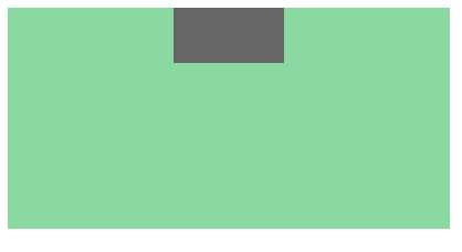
1 水平居中
- 子元素定宽,左右margin为auto,margin的auto不能在垂直方向上居中,垂直方向上知道父盒子高度可以设置margin。
<div class="father">
  <div class= "soon">
  </div>
</div>
.father{
   width: 400px;
   height: 200px;
   background-color: red;
}

.soon{
  width: 100px;
  height: 50px;
  background-color: green;
  margin: 0 auto;
}
2 水平垂直居中
- 利用定位(推荐)
.father{
   position:relative;
   width: 400px;
   height: 200px;
   background-color: #8c8c;
}
.soon{
  position:absolute;
  top:50%;
  left:50%;
  margin-top:-25px;
  margin-left:-50px;
  width: 100px;
  height: 50px;
  background-color: #666;
}
3 flax布局(弹性布局)
- flex布局相对简单,很适合移动端,pc端有兼容性问题。
.father{
   display: flex;              // flex布局
   justify-content: center;    // 主轴上居中
   align-items: center;        // 侧轴上居中
   width: 400px;
   height: 200px;
   background-color: #8c8c;
}
.soon{
  width: 100px;
  height: 50px;
  background-color: #666;
}

 浙公网安备 33010602011771号