


Rust Slint实现白天黑夜、暗黑高亮模式切换开关源码分享 - 实践
Rust Slint实现金属表盘源码分享
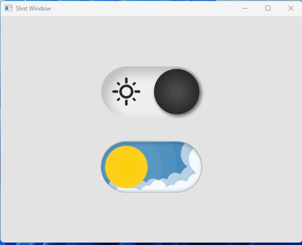
一、效果展示
二、源码分享
1、工程搭建
参考我这篇博文Rust 使用Slint库开发UI界面工程搭建详细教程
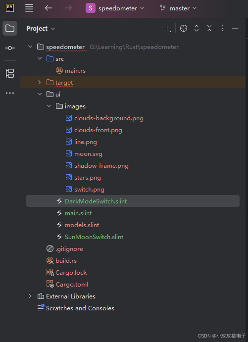
2、工程结构
3、main.rs
use slint::{PlatformError};
slint::include_modules!();
fn main() ->Result<(), PlatformError>{
  let app: MainWindow  = MainWindow::new()?;
  let weak: slint::Weak<MainWindow> = app.as_weak();
    app.global::<DataAdapter>().on_btn_clicked({
      let weak = weak.clone();
      move |text|{
      if let Some(strong) = weak.upgrade(){
      let adapter = strong.global::<DataAdapter>();
        }
        }
        });
        let _ = app.run();
        Ok(())
        }
4、main.slint
import { AboutSlint, VerticalBox, LineEdit, HorizontalBox, Button, GroupBox, GridBox,
ComboBox, Spinner, Slider, ListView, Palette, ProgressIndicator, CheckBox, Switch } from "std-widgets.slint";
import { DataAdapter} from "models.slint";
export { DataAdapter}
import { DarkModeSwitch } from "DarkModeSwitch.slint";
import { SunMoonSwitch } from "SunMoonSwitch.slint";
export component MainWindow inherits Window {
preferred-width: 600px;
preferred-height: 450px;
background: #e3e3e3;
in-out property <int> transform-rotation;
  DarkModeSwitch {
  x: 200px;
  y: 100px;
  }
  SunMoonSwitch {
  x: 200px;
  y: 250px;
  }
  }
5、DarkModeSwitch.slint
// Copyright © SixtyFPS GmbH <info@slint.dev>
  // SPDX-License-Identifier: MIT
  component RayThick {
  in-out property colorize <=> i.colorize;
    width: 0px;
    height: 0px;
    in-out property <angle > transform-rotation <=> i.rotation-angle;
      i := Image {
      property <length> sizeMultiplier: 0.3px;
        width: self.source.width * sizeMultiplier * 0.8;
        height: self.source.height * sizeMultiplier;
        source: @image-url("images/line.png");
        }
        }
        component RayThin {
        in-out property colorize <=> i.colorize;
          width: 0px;
          height: 0px;
          in-out property <angle > transform-rotation <=> i.rotation-angle;
            i := Image {
            property <length> sizeMultiplier: 0.25px;
              width: self.source.width * sizeMultiplier * 0.6;
              height: self.source.height * sizeMultiplier;
              source: @image-url("images/line.png");
              }
              }
              component SunIcon {
              property <int> rays: 4;
                property <length> sun-size: 28px;
                  property <length> gap: 8px;
                    in property <brush> color: black;
                      width: 80px;
                      height: self.width;
                      in-out property <float> transform-scale;
                        Rectangle {
                        width: 0px;
                        height: 0px;
                        Rectangle {
                        width: sun-size;
                        height: self.width;
                        border-radius: self.width / 2;
                        background: transparent;
                        border-color: root.color;
                        border-width: 5px;
                        }
                        for i in rays: RayThick {
                        x: (sun-size / 2 + gap) * self.transform-rotation.cos();
                        y: (sun-size / 2 + gap) * self.transform-rotation.sin();
                        colorize: root.color;
                        transform-rotation: i * 360deg / rays;
                        }
                        for i in rays: RayThin {
                        x: (sun-size / 2 + gap) * self.transform-rotation.cos();
                        y: (sun-size / 2 + gap) * self.transform-rotation.sin();
                        colorize: root.color;
                        transform-rotation: i * (360deg / rays) + 45deg;
                        }
                        }
                        }
                        enum TTheme { light, dark }
                        export component DarkModeSwitch {
                        property <TTheme> theme: TTheme.light;
                          width: 200px;
                          height: 100px;
                          frame :=Image {
                          x: 0;
                          y: 0;
                          source: @image-url("images/switch.png");
                          }
                          sun := SunIcon {
                          x: 10px;
                          }
                          frameBacker := Rectangle {
                          width: parent.width;
                          height: parent.height;
                          background: transparent;
                          border-radius: self.height / 2;
                          }
                          moon := Image {
                          x: parent.width - self.width - 30px;
                          width: 50px;
                          height: 50px;
                          source: @image-url("images/moon.svg");
                          }
                          thumb := Rectangle {
                          y: (parent.height - self.height) / 2;
                          width: 90px;
                          height: self.width;
                          border-radius: self.width / 2;
                          drop-shadow-offset-x: 3px;
                          drop-shadow-offset-y: 3px;
                          drop-shadow-color: black.transparentize(30%);
                          drop-shadow-blur: 10px;
                          }
                          TouchArea {
                          clicked => {
                          if root.theme == TTheme.light {
                          root.theme = TTheme.dark;
                          } else {
                          root.theme = TTheme.light;
                          }
                          }
                          }
                          states [
                          darkMode when root.theme == TTheme.dark: {
                          thumb.x: thumb.y;
                          thumb.background: @radial-gradient(circle,#b0b0b0 0%, #cccccc 70%, #e9e9e9 100%);
                          frameBacker.background: #2A2A2A;
                          moon.rotation-angle: -20deg;
                          sun.color: #fc7a10;
                          sun.transform-scale: 0.8;
                          in {
                          animate thumb.x, thumb.background, frameBacker.background, sun.color {
                          duration: 200ms;
                          easing: ease-out-sine;
                          }
                          animate moon.rotation-angle, sun.transform-scale {
                          duration: 1200ms;
                          easing: ease-out-elastic;
                          }
                          }
                          }
                          lightMode when root.theme == TTheme.light: {
                          thumb.x: frame.width - thumb.width - thumb.y;
                          thumb.background:  @radial-gradient(circle,#515151 0%, #242424 80%, #191919 100%);
                          frameBacker.background: transparent;
                          moon.rotation-angle: 20deg;
                          sun.color: #2A2A2A;
                          sun.transform-scale: 1;
                          in {
                          animate thumb.x, thumb.background, frameBacker.background, moon.rotation-angle {
                          duration: 200ms;
                          easing: ease-out-sine;
                          }
                          animate sun.transform-scale {
                          duration: 1200ms;
                          easing: ease-out-elastic;
                          }
                          animate sun.color {
                          duration: 1000ms;
                          }
                          }
                          }
                          ]
                          }
6、SunMoonSwitch.slint
// Copyright © SixtyFPS GmbH <info@slint.dev>
  // SPDX-License-Identifier: MIT
  global Utils {
  public pure function MapRange(value: length, inMin: length, inMax: length, outMin: length, outMax: length) -> length {
  return clamp(outMin, (value - inMin) * (outMax - outMin) / (inMax - inMin) + outMin, outMax);
  }
  }
  component SunMoonThumb {
  in property <length> thumb-position: 50px;
    Rectangle {
    width: 200px;
    height: 100px;
    border-radius: self.height / 2;
    clip: true;
    Rectangle {
    width: 0px;
    height: 0px;
    x: root.thumb-position;
    Rectangle {
    width: 260px;
    height: self.width;
    background: white;
    border-radius: self.width / 2;
    opacity: 0.05;
    }
    Rectangle {
    width: 200px;
    height: self.width;
    background: white;
    border-radius: self.width / 2;
    opacity: 0.05;
    }
    Rectangle {
    width: 140px;
    height: self.width;
    background: white;
    border-radius: self.width / 2;
    opacity: 0.05;
    }
    clipper :=Rectangle {
    width: 85px;
    height: self.width;
    border-radius: self.width / 2;
    clip: true;
    sun := Rectangle {
    width: 85px;
    height: self.width;
    background: @radial-gradient(circle,#ffce08 0%, #fdd224 80%, #fce37f 100%);
    border-radius: self.width / 2;
    }
    moon := Rectangle {
    x: Utils.MapRange(root.thumb-position, 50px, 100px, 85px, 0px);
    width: 85px;
    height: self.width;
    background: @radial-gradient(circle,#bcbcbc 0%, #e7e7e7 80%, #ffffff 100%);
    border-radius: self.width / 2;
    }
    }
    }
    }
    }
    enum Theme { day, night }
    export component SunMoonSwitch {
    property <Theme> theme: Theme.night;
      width: 200px;
      height: 100px;
      frameBacker := Rectangle {
      width: parent.width;
      height: parent.height;
      background: #1e2232;
      border-radius: self.height / 2;
      }
      Rectangle {
      width: parent.width;
      height: parent.height;
      clip: true;
      border-radius: self.height / 2;
      clouds-background :=Image {
      x: 14px;
      y: -6px;
      width: 202px;
      source: @image-url("images/clouds-background.png");
      }
      clouds-foreground := Image {
      x: 30px;
      y: 5px;
      width: 202px;
      source: @image-url("images/clouds-front.png");
      }
      stars := Image {
      x: 15px;
      y: 15px;
      width: 80px;
      source: @image-url("images/stars.png");
      }
      }
      Image {
      x: -1px;
      width: 202px;
      source: @image-url("images/shadow-frame.png");
      }
      thumb := SunMoonThumb {
      }
      TouchArea {
      clicked => {
      if root.theme == Theme.day {
      root.theme = Theme.night;
      } else {
      root.theme = Theme.day;
      }
      }
      }
      states [
      nightMode when root.theme == Theme.night: {
      thumb.thumb-position: root.width - thumb.width - 50px;
      frameBacker.background: #1e2232;
      clouds-background.y: 120px;
      clouds-foreground.y: 120px;
      in {
      animate frameBacker.background, stars.y, stars.opacity {
      easing: ease-out-sine;
      duration: 200ms;
      }
      animate thumb.thumb-position {
      easing: cubic-bezier(0.61, 0.21, 0.68, 1.22);
      duration: 300ms;
      }
      animate clouds-background.y, clouds-foreground.y {
      easing: ease-in-sine;
      duration: 150ms;
      }
      }
      }
      dayMode when root.theme == Theme.day: {
      thumb.thumb-position:  50px;
      frameBacker.background: #3d85ba;
      stars.y: - 60px;
      stars.opacity: 0.4;
      in {
      animate frameBacker.background, stars.y, stars.opacity {
      easing: ease-out-sine;
      duration: 200ms;
      }
      animate thumb.thumb-position {
      easing: cubic-bezier(0.61, 0.21, 0.68, 1.22);
      duration: 300ms;
      }
      animate clouds-background.y {
      easing: ease-out-sine;
      duration: 300ms;
      }
      animate clouds-foreground.y {
      easing: cubic-bezier(0.61, 0.21, 0.68, 1.22);
      duration: 350ms;
      }
      }
      }
      ]
      }
7、图片资源
文章顶部下载
三、Slint库介绍
Slint(原名SixtyFPS)是一个轻量级、高性能的用户界面(UI)工具包,专为嵌入式系统、桌面应用和跨平台开发设计。它采用声明式UI编程模型,支持Rust、C++和JavaScript等语言,强调资源高效、低延迟和易用性。Slint的核心目标是简化UI开发,尤其适合资源受限环境(如微控制器)或需要高性能渲染的场景。
1、Slint的核心特性
- 声明式UI设计:使用类似QML的语法定义UI元素,代码简洁易读。UI逻辑与业务逻辑分离,提高开发效率。
- 跨平台支持:原生支持Linux、Windows、macOS,以及嵌入式平台(如Raspberry Pi、微控制器),无需额外适配。
- 高性能优化:渲染引擎针对低功耗设备优化,帧率可达 60 f p s 60fps 60fps以上,内存占用极小(通常低于几MB)。
- 响应式编程:内置数据绑定机制,UI自动更新响应状态变化,减少手动事件处理。
- 工具链完善:提供Slint语言编译器(slintc)和IDE插件,支持实时预览和热重载。
2、在Rust中使用Slint
在Rust项目中集成Slint简单高效:
- 安装依赖:通过Cargo添加
slintcrate。在Cargo.toml中添加:[dependencies] slint = "1.13.1" # 使用最新稳定版本 - 基本工作流:
- 定义UI:使用
slint!宏编写声明式UI代码。 - 编译UI:Slint编译器(slintc)将
.slint文件编译为Rust代码。 - 集成逻辑:在Rust中绑定数据和事件处理。
- 定义UI:使用
- 优势:Rust的内存安全和并发特性与Slint结合,提升UI可靠性和性能,避免常见错误如空指针或数据竞争。
3、简单示例:创建一个窗口
以下是一个基础的“Hello World”示例,展示如何在Rust中定义并运行一个Slint UI。代码结构清晰:
use slint::slint;
slint! {
// 定义UI组件
export component MainWindow inherits Window {
// 添加文本元素
Text {
text: "Hello, Slint!";
color: blue;
font-size: 24px;
}
}
}
fn main() {
// 创建并运行窗口
let window = MainWindow::new().unwrap();
window.run().unwrap();
}- 解释:
slint!宏内嵌UI定义,使用类似HTML的语法。export component定义可重用的UI组件,继承自Window。Text元素显示文本,属性如color和font-size可动态绑定。main函数初始化并运行UI,错误处理简单(unwrap用于演示,实际应更健壮)。
4、适用场景和优势
- 嵌入式系统:低内存占用(可优化至几百KB),适合IoT设备或车载系统。
- 桌面应用:跨平台一致性,无需Web技术栈,性能优于Electron等框架。
- 开发效率:声明式语法减少样板代码,调试工具(如Slint Viewer)加速迭代。
- 与其他库对比:相比GTK或Qt,Slint更轻量;相比Web框架,它提供原生性能和更少依赖。
- 社区支持:开源项目(Apache 2.0许可证),活跃社区提供文档和示例。
5、学习资源
- 官方文档:Slint Book 提供详细教程和API参考。
- 示例项目:GitHub仓库有丰富案例,如计算器或仪表盘应用。
- 最佳实践:建议从简单UI开始,逐步集成复杂逻辑,利用数据绑定优化性能。


 浙公网安备 33010602011771号