Cluster Analysis in Python
聚类
数据是么有标签的,属于无监督学习
使用scipy包中的函数
hierarchical clustering
-
层次聚类/系统聚类
-
linkage:聚合距离函数
-
fcluster:层次聚类函数
-
dendrogram()
原理
计算样本之间的距离。每次将距离最近的点合并到同一个类。然后,再计算类与类之间的距离,将距离最近的类合并为一个大类。不停的合并,直到合成了一个类。其中类与类的距离的计算方法有:最短距离法,最长距离法,中间距离法,类平均法等。比如最短距离法,将类与类的距离定义为类与类之间样本的最短距离
scipy实现
- linkage()h函数实现层次聚类,
- dendrogram()函数能够根据聚类的结果画出层次树,
- fcluster()函数能够提取出聚类的结果(可以根据临界值返回聚类结果,或者根据聚类数返回聚类结果
- 通过seaborn进行可视化展示
linkage()
- 聚合函数
scipy.cluster.hierarchy.linkage(y, method='single', metric='euclidean', optimal_ordering=False)
参数
- y:可以是1维压缩向量(距离向量),也可以是2维观测向量(坐标矩阵)。若y是1维压缩向量,则y必须是n个初始观测值的组合,n是坐标矩阵中成对的观测值
- method:簇间度量方法,包括single,complete,ward等
- metric:样本间距离度量,包括欧氏距离,切比雪夫距离等知乎
dendrogram()
- 层次聚类树函数
或者叫做谱系图
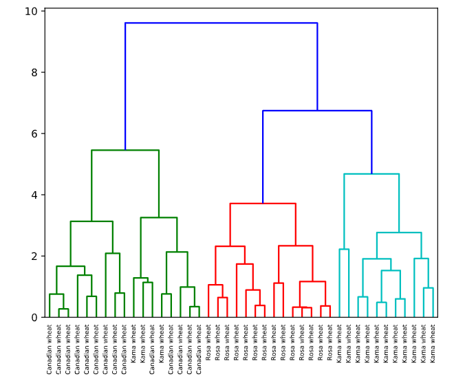
The dendrogram illustrates how each cluster is composed by drawing a U-shaped link between a non-singleton cluster and its children. The top of the U-link indicates a cluster merge. The two legs of the U-link indicate which clusters were merged. The length of the two legs of the U-link represents the distance between the child clusters. It is also the cophenetic distance between original observations in the two children clusters.
可以通过谱系图选择聚类数量
复现
# Perform the necessary imports
from scipy.cluster.hierarchy import linkage, dendrogram
import matplotlib.pyplot as plt
from scipy.cluster.hierarchy import fcluster
# Calculate the linkage: mergings
mergings = linkage(samples,method='complete')

# Plot the dendrogram, using varieties as labels
dendrogram(mergings,
           labels=varieties,
           leaf_rotation=90,
           leaf_font_size=6,
)
plt.show()
# Use fcluster to extract labels: labels
labels = fcluster(mergings, 6, criterion='distance')

# Create a DataFrame with labels and varieties as columns: df
df = pd.DataFrame({'labels': labels, 'varieties': varieties})

# Create crosstab: ct
ct = pd.crosstab(df['labels'], df['varieties'])

# Display ct
print(ct)

##<script.py> output:
    varieties  Canadian wheat  Kama wheat  Rosa wheat
    labels
    1                      14           3           0
    2                       0           0          14
    3                       0          11           0
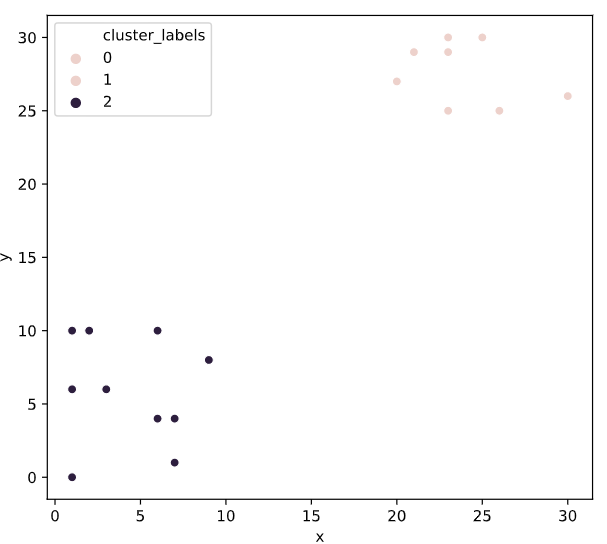
# Import linkage and fcluster functions
from scipy.cluster.hierarchy import linkage, fcluster

# Use the linkage() function to compute distances
Z = linkage(df, 'ward')

# Generate cluster labels
df['cluster_labels'] = fcluster(Z, 2, criterion='maxclust')

# Plot the points with seaborn
sns.scatterplot(x='x', y='y', hue='cluster_labels', data=df)
plt.show()
系统聚类的缺陷
这个容我想想
timeit
timeit模块可以用来测试小段代码的运行时间
%timeit()
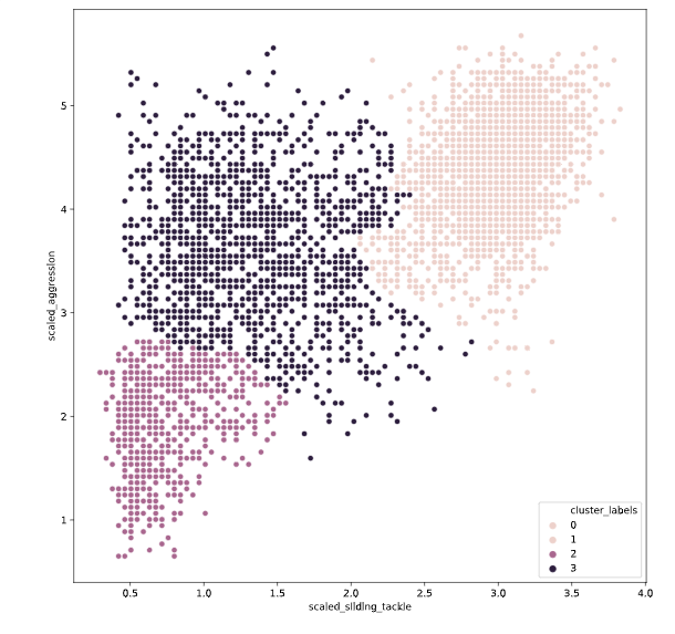
# Fit the data into a hierarchical clustering algorithm
distance_matrix = linkage(fifa[['scaled_sliding_tackle', 'scaled_aggression']], 'ward')
# Fit the data into a hierarchical clustering algorithm
distance_matrix = linkage(fifa[['scaled_sliding_tackle', 'scaled_aggression']], 'ward')

# Assign cluster labels to each row of data
fifa['cluster_labels'] =fcluster(distance_matrix , 3, criterion='maxclust')
# Display cluster centers of each cluster
print(fifa[['scaled_sliding_tackle', 'scaled_aggression', 'cluster_labels']].groupby('cluster_labels').mean())
# Create a scatter plot through seaborn
sns.scatterplot(x='scaled_sliding_tackle', y='scaled_aggression', hue='cluster_labels', data=fifa)
plt.show()
kmeans
均值聚类
- 使用vq函数将样本数据中的每个样本点分配给一个中心点,形成n个聚类vq
- whiten:白化预处理是一种常见的数据预处理方法,作用是去除样本数据的冗余信息
Normalize a group of observations on a per feature basis.
原理and步骤
- 是随机选取K个对象作为初始的聚类中心,
- 计算每个对象与各个种子聚类中心之间的距离,把每个对象分配给距离它最近的聚类中心,
- 聚类中心以及分配给它们的对象就代表一个聚类,
- 每分配一个样本,聚类的聚类中心会根据聚类中现有的对象被重新计算。这个过程将不断重复直到满足某个终止条件,
- 终止条件可以是没有(或最小数目)对象被重新分配给不同的聚类,没有(或最小数目)聚类中心再发生变化,误差平方和局部最小。
数学推导
-
对于一组没有标签的数据集X
\(X=\left[\begin{array}{c}{x^{(1)}} \\ {x^{(2)}} \\ {\vdots} \\ {x^{(m)}}\end{array}\right]\) -
把这个数据集分成\(k\)个簇\(C_{k}\),\(C=C_{1}, C_{2}, \dots, C_{k}\)
-
最小化的损失函数为,也就是即便函数distortion
达到最小即为收敛
\(E=\sum_{i=1}^{k} \sum_{x \in C_{i}}\left\|x-\mu_{i}\right\|^{2}\) -
其中\(\mu_{i}\)为簇\(C_{i}\)的中心点:
\(\mu_{i}=\frac{1}{\left|C_{i}\right|} \sum_{x \in C i} x\) -
找到最优聚类簇,需要对每一个解进行遍历,因此,k-means使用贪心算法对每个解进行遍历
-
1.在样本中随机选取\(k\)个样本点充当各个簇的中心点\(\left\{\mu_{1}, \mu_{2}, \dots, \mu_{k}\right\}\)
-
2.计算所有样本点与各个簇中心之间的距离 \(\operatorname{dist}\left(x^{(i)}, \mu_{j}\right)\),然后把样本点划入最近的簇中\(x^{(i)} \in \mu_{\text {nearest}}\)
-
3.根据簇中已有的样本点,重新计算簇中心
\(\mu_{i}:=\partial g(x) 1\left|C_{i}\right| \sum_{x \in C i} x\)
-
重复步骤2,3
-
通俗理解
- 1.首先输入k的值,即我们希望将数据集经过聚类得到k个分组。
- 2.从数据集中随机选择k个数据点作为初始大哥(质心,Centroid)
- 3.对集合中每一个小弟,计算与每一个大哥的距离(距离的含义后面会讲),离哪个大哥距离近,就跟定哪个大哥。
- 4.这时每一个大哥手下都聚集了一票小弟,这时候召开人民代表大会,每一群选出新的大哥(其实是通过算法选出新的质心)。
- 5.如果新大哥和老大哥之间的距离小于某一个设置的阈值(表示重新计算的质心的位置变化不大,趋于稳定,或者说收敛),可以认为我们进行的聚类已经达到期望的结果,算法终止。
- 6.如果新大哥和老大哥距离变化很大,需要迭代3~5步骤
😄hahahh,这个理解真的不错,被安排的明明白白的CSDN
缺点
- 对于分类个数k需要人为凭经验确定
- 聚类效果受初始化聚类中心影响很大
复现
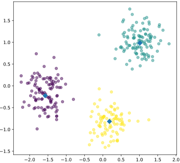
# Import pyplot
from matplotlib import pyplot as plt

# Assign the columns of new_points: xs and ys
xs = new_points[:,0]
ys = new_points[:,1]

# Make a scatter plot of xs and ys, using labels to define the colors
plt.scatter(xs, ys, c=labels, alpha=0.5)

# Assign the cluster centers: centroids
centroids = model.cluster_centers_

# Assign the columns of centroids: centroids_x, centroids_y
centroids_x = centroids[:,0]
centroids_y = centroids[:,1]

# Make a scatter plot of centroids_x and centroids_y
plt.scatter(centroids_x, centroids_y, marker='D', s=50)
plt.show()
# Import the kmeans and vq functions
from scipy.cluster.vq import kmeans, vq
# Generate cluster centers
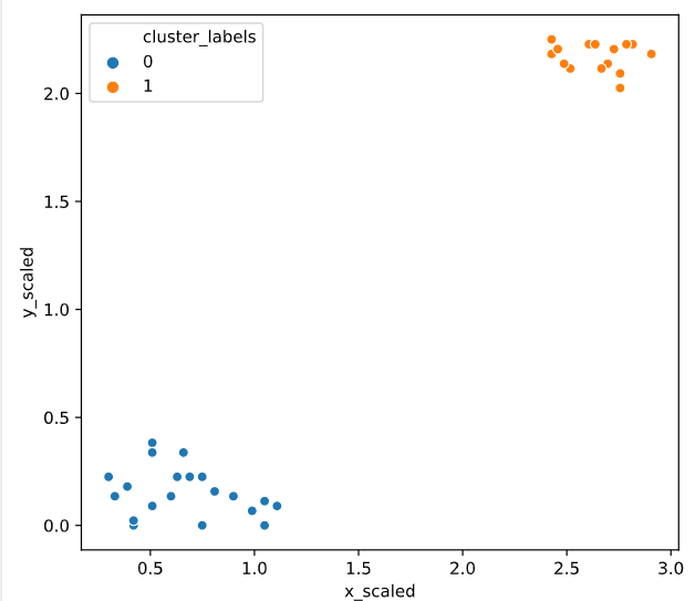
cluster_centers, distortion = kmeans(comic_con[['x_scaled', 'y_scaled']], 2)
# Assign cluster labels
comic_con['cluster_labels'], distortion_list = vq(comic_con[['x_scaled', 'y_scaled']], cluster_centers)
# Plot clusters
sns.scatterplot(x='x_scaled', y='y_scaled',
hue='cluster_labels', data = comic_con)
plt.show()
聚类评估指标
inertias
- inertias是K均值模型对象的属性,表示样本距离最近的聚类中心的总和,它是作为在没有真实分类结果标签下的非监督式评估指标。该值越小越好,值越小证明样本在类间的分布越集中,即类内的距离越小
ks = range(1, 6)
inertias = []
# 选择最优分类指标
for k in ks:
    # Create a KMeans instance with k clusters: model
    model=KMeans(n_clusters=k)

    # Fit model to samples
    model.fit(samples)

    # Append the inertia to the list of inertias
    inertias.append(model.inertia_)

# Plot ks vs inertias
plt.plot(ks, inertias, '-o')
plt.xlabel('number of clusters, k')
plt.ylabel('inertia')
plt.xticks(ks)
plt.show()
crosstab()
pandas 中的交叉列表取值
# Create a KMeans model with 3 clusters: model
model = KMeans(n_clusters=3)

# Use fit_predict to fit model and obtain cluster labels: labels
labels = model.fit_predict(samples)

# Create a DataFrame with labels and varieties as columns: df
df = pd.DataFrame({'labels': labels, 'varieties': varieties})
print(df)
# Create crosstab: ct
ct = pd.crosstab(df['labels'],df['varieties'])

# Display ct
print(ct)

###out
    labels       varieties
0         2      Kama wheat
1         2      Kama wheat
2         2      Kama wheat
3         2      Kama wheat
4         2      Kama wheat
..      ...             ...
205       0  Canadian wheat
206       0  Canadian wheat
207       0  Canadian wheat
208       0  Canadian wheat
209       0  Canadian wheat

[210 rows x 2 columns]
varieties  Canadian wheat  Kama wheat  Rosa wheat
labels
0                      68           9           0
1                       0           1          60
2                       2          60          10
crosstab可以按照表格的形式直观的展示聚类结果
妙啊~
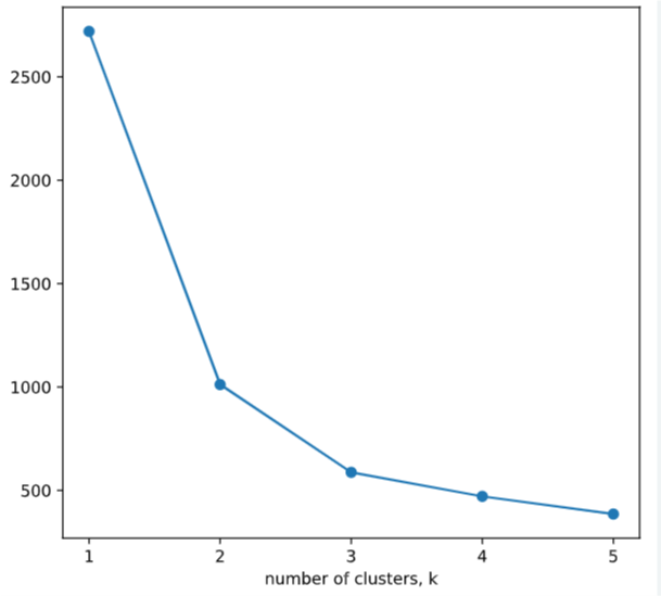
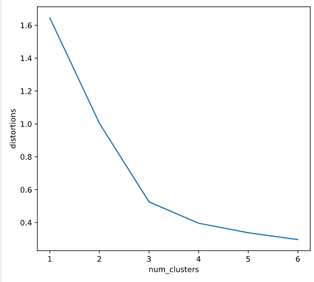
确定聚类数
distortions = []
num_clusters = range(1, 7)

# Create a list of distortions from the kmeans function
for i in num_clusters:
    cluster_centers, distortion = kmeans(comic_con[['x_scaled', 'y_scaled']], i)
    distortions.append(distortion)

# Create a data frame with two lists - num_clusters, distortions
elbow_plot = pd.DataFrame({'num_clusters': num_clusters, 'distortions': distortions})

# Creat a line plot of num_clusters and distortions
sns.lineplot(x='num_clusters', y='distortions', data = elbow_plot)
plt.xticks(num_clusters)
plt.show()
提高聚类精度之标准化数据
- 结合管道函数的一个小demo
# Import pandas
import pandas as pd
# Perform the necessary imports
from sklearn.pipeline import make_pipeline
from sklearn.preprocessing import StandardScaler
from sklearn.cluster import KMeans

# Create scaler: scaler
scaler = StandardScaler()

# Create KMeans instance: kmeans
kmeans = KMeans(n_clusters=4)

# Create pipeline: pipeline
pipeline = make_pipeline(scaler, kmeans)

# Fit the pipeline to samples
pipeline.fit(samples)

# Calculate the cluster labels: labels
labels = pipeline.predict(samples)

# Create a DataFrame with labels and species as columns: df
df = pd.DataFrame({'labels': labels, 'species': species})

# Create crosstab: ct
ct = pd.crosstab(df['labels'], df['species'])

# Display ct
print(ct)


<script.py> output:
    species  Bream  Pike  Roach  Smelt
    labels
    0            0     0      0     13
    1           33     0      1      0
    2            0    17      0      0
    3            1     0     19      1
# Import kmeans and vq functions
from scipy.cluster.vq import kmeans, vq

# Compute cluster centers
centroids,_ = kmeans(df, 2)

# Assign cluster labels
df['cluster_labels'], _ = vq(df, centroids)

# Plot the points with seaborn
sns.scatterplot(x='x', y='y', hue='cluster_labels', data=df)
plt.show()
# Import the whiten function
from scipy.cluster.vq import whiten

goals_for = [4,3,2,3,1,1,2,0,1,4]

# Use the whiten() function to standardize the data
scaled_data =whiten(goals_for)
print(scaled_data)

<script.py> output:
    [3.07692308 2.30769231 1.53846154 2.30769231 0.76923077 0.76923077
     1.53846154 0.         0.76923077 3.07692308]
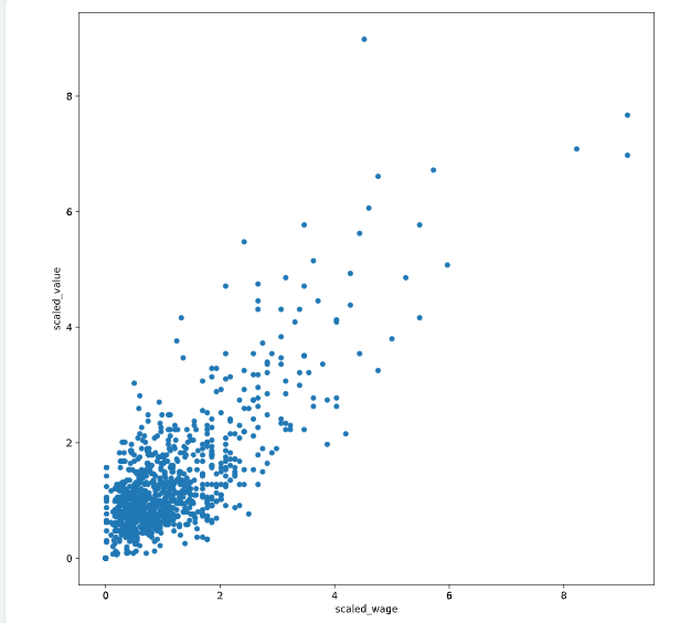
fifa数据集的一个小demo
# Scale wage and value
fifa['scaled_wage'] = whiten(fifa['eur_wage'])
fifa['scaled_value'] = whiten(fifa['eur_value'])

# Plot the two columns in a scatter plot
fifa.plot(x='scaled_wage', y='scaled_value', kind = 'scatter')
plt.show()

# Check mean and standard deviation of scaled values
print(fifa[['scaled_wage', 'scaled_value']].describe())

<script.py> output:
           scaled_wage  scaled_value
    count      1000.00       1000.00
    mean          1.12          1.31
    std           1.00          1.00
    min           0.00          0.00
    25%           0.47          0.73
    50%           0.85          1.02
    75%           1.41          1.54
    max           9.11          8.98
聚类可视化
matplotlib
# Import the pyplot class
from matplotlib import pyplot as plt
# Define a colors dictionary for clusters
colors = {1:'red', 2:'blue'}
# Plot a scatter plot
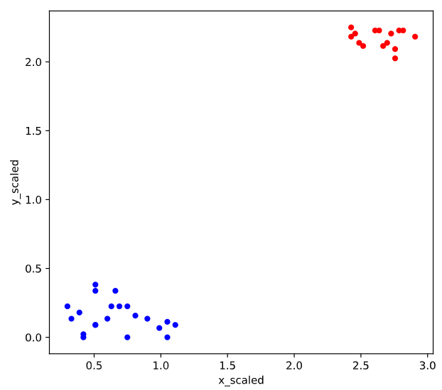
comic_con.plot.scatter(x = 'x_scaled',
y = 'y_scaled',
c = comic_con['cluster_labels'].apply(lambda x: colors[x]))
plt.show()
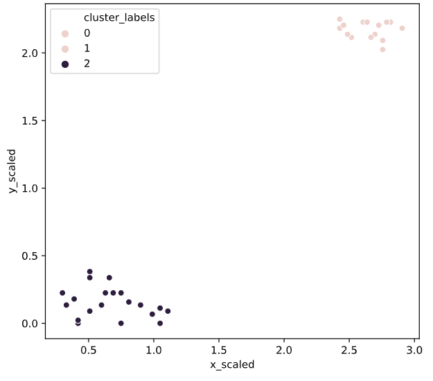
seaborn
http://seaborn.pydata.org/tutorial.html
Seaborn 要求原始数据的输入类型为 pandas 的 Dataframe 或 Numpy 数组,画图函数有以下几种形式:
# Import the seaborn module
import seaborn as sns

# Plot a scatter plot using seaborn
sns.scatterplot(x='x_scaled',
                y='y_scaled',
                hue='cluster_labels',
                data = comic_con)
plt.show()
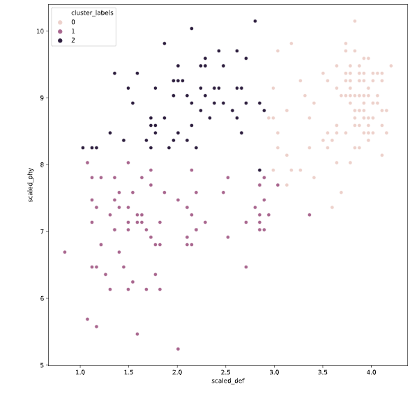
seed
设置种子对random的影响
# Set up a random seed in numpy
random.seed([1000,2000])

# Fit the data into a k-means algorithm
cluster_centers,_ = kmeans(fifa[['scaled_def', 'scaled_phy']], 3)

# Assign cluster labels
fifa['cluster_labels'], _ = vq(fifa[['scaled_def', 'scaled_phy']], cluster_centers)

# Display cluster centers
print(fifa[['scaled_def', 'scaled_phy', 'cluster_labels']].groupby('cluster_labels').mean())

# Create a scatter plot through seaborn
sns.scatterplot(x='scaled_def', y='scaled_phy', hue='cluster_labels', data=fifa)
plt.show()
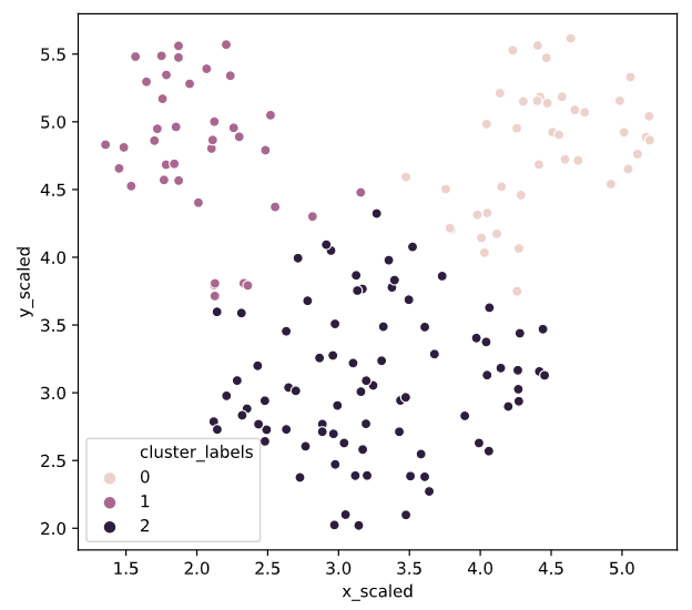
Uniform clustering patterns
vq
# Import the kmeans and vq functions
from scipy.cluster.vq import kmeans, vq

# Generate cluster centers
cluster_centers, distortion = kmeans(mouse[['x_scaled', 'y_scaled']], 3)

# Assign cluster labels
mouse['cluster_labels'], distortion_list = vq(mouse[['x_scaled', 'y_scaled']], cluster_centers)

# Plot clusters
sns.scatterplot(x='x_scaled', y='y_scaled',
                hue='cluster_labels', data = mouse)
plt.show()
实际应用
使用k-means给图形色彩分类
所有的图像都由像素组成,每个像素代表图像中的一个点
每个像素是由红绿蓝三原色组成是每个值在0-255之间
因此可以使用聚类算法给图形色彩进行分类
There are broadly three steps to find the dominant colors in an image:
Extract RGB values into three lists.
Perform k-means clustering on scaled RGB values.
Display the colors of cluster centers.datacamp
# Import image class of matplotlib
import matplotlib.image as img

# Read batman image and print dimensions
batman_image = img.imread('batman.jpg')
print(batman_image.shape)

# Store RGB values of all pixels in lists r, g and b
for row in batman_image:
    for temp_r, temp_g, temp_b in row:
        r.append(temp_r)
        g.append(temp_g)
        b.append(temp_b)

<script.py> output:
    (57, 90, 3)
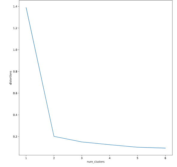
distortions = []
num_clusters = range(1, 7)

# Create a list of distortions from the kmeans function
for i in num_clusters:
    cluster_centers, distortion = kmeans(batman_df[['scaled_red', 'scaled_blue', 'scaled_green']], i)
    distortions.append(distortion)

# Create a data frame with two lists, num_clusters and distortions
elbow_plot = pd.DataFrame({'num_clusters': num_clusters, 'distortions': distortions})

# Create a line plot of num_clusters and distortions
sns.lineplot(x='num_clusters', y='distortions', data = elbow_plot)
plt.xticks(num_clusters)
plt.show()
# Get standard deviations of each color
r_std, g_std, b_std = batman_df[['red', 'green', 'blue']].std()

for cluster_center in cluster_centers:
    scaled_r, scaled_g, scaled_b = cluster_center
    # Convert each standardized value to scaled value
    colors.append((
        scaled_r * r_std / 255,
        scaled_g * g_std / 255,
        scaled_b * b_std / 255
    ))

# Display colors of cluster centers
plt.imshow([colors])
plt.show()

Document clustering
文本聚类
补充一点点NLP的知识
1.在处理数据的时候,首先要对数据进行清洗
比如去掉数据的标点符号情感词,还有类似the,is,are这种词
2.确定词语在每个文档中的重要性根据TF-IDF矩阵
3.对TD-IDF进行分类
4.找到每一类文档中的高频词汇
5.把文本转化为词条
token:词条
文本词语矩阵一般是稀疏矩阵
scipy包里面的kmeans是不支持matrix的,因此可以使用todense()进行矩阵转化
6.之后需要处理一些超链接情感词等
# Import TfidfVectorizer class from sklearn
from sklearn.feature_extraction.text import TfidfVectorizer
# Import TfidfVectorizer class from sklearn
from sklearn.feature_extraction.text import TfidfVectorizer

# Initialize TfidfVectorizer
tfidf_vectorizer = TfidfVectorizer(max_df=0.75, max_features=50,
                                   min_df=0.1, tokenizer=remove_noise)

# Use the .fit_transform() method on the list plots
tfidf_matrix = tfidf_vectorizer.fit_transform(plots)

num_clusters = 2

# Generate cluster centers through the kmeans function
cluster_centers, distortion = kmeans(tfidf_matrix.todense(), num_clusters)

# Generate terms from the tfidf_vectorizer object
terms = tfidf_vectorizer.get_feature_names()

for i in range(num_clusters):
    # Sort the terms and print top 3 terms
    center_terms = dict(zip(terms, list(cluster_centers[i])))
    sorted_terms = sorted(center_terms, key=center_terms.get, reverse=True)
    print(sorted_terms[:3])

<script.py> output:
    ['father', 'back', 'one']
    ['police', 'man', 'killed']
这个小 栗子我先放在这里,大致意思是通过文本聚类筛选词频最高的词
TF-IDF
在信息检索中,tf-idf(词频-逆文档频率)是一种统计方法,用以评估一个单词在一个文档集合或语料库中的重要程度。经常被用作信息检索、文本挖掘以及用户模型的权重因素。tf-idf的值会随着单词在文档中出现的次数的增加而增大,也会随着单词在语料库中出现的次数的增多而减小。tf-idf是如今最流行的词频加权方案之一。
tf-idf的各种改进版本经常被搜索引擎用作在给定用户查询时对文档的相关性进行评分和排序的主要工具。tf-idf可以成功地用于各种主题字段的停用词过滤,包括文本摘要和分类。
TF-IDF实际上是:TF * IDF。主要思想是:如果某个词或短语在一篇文章中出现的频率高(即TF高),并且在其他文章中很少出现(即IDF高),则认为此词或者短语具有很好的类别区分能力,适合用来分类。通俗理解TF-IDF就是:TF刻画了词语t对某篇文档的重要性,IDF刻画了词语t对整个文档集的重要性。简书
TF
TF(Term Frequency,词频)
TF(Term Frequency,词频)表示一个给定词语t在一篇给定文档d中出现的频率。TF越高,则词语t对文档d来说越重要,TF越低,则词语t对文档d来说越不重要。那是否可以以TF作为文本相似度评价标准呢?答案是不行的,举个例子,常用的中文词语如“我”,“了”,“是”等,在给定的一篇中文文档中出现的频率是很高的,但这些中文词几乎在每篇文档中都具有非常高的词频,如果以TF作为文本相似度评价标准,那么几乎每篇文档都能被命中。
对于在某一文档 \(d_j\) 里的词语 \(t_i\) 来说,\(t_i\) 的词频可表示为:
\(\mathrm{tf}_{\mathrm{i}, \mathrm{j}}=\frac{n_{i, j}}{\sum_{k} n_{k, j}}\)
IDF(Inverse Document Frequency,逆向文件频率)
IDF(Inverse Document Frequency,逆向文件频率)的主要思想是:如果包含词语t的文档越少,则IDF越大,说明词语t在整个文档集层面上具有很好的类别区分能力。IDF说明了什么问题呢?还是举个例子,常用的中文词语如“我”,“了”,“是”等在每篇文档中几乎具有非常高的词频,那么对于整个文档集而言,这些词都是不重要的。对于整个文档集而言,评价词语重要性的标准就是IDF。
某一特定词语的IDF,可以由总文件数除以包含该词语的文件数,再将得到的商取对数得到
\(\operatorname{idf}_{\mathbf{i}}=\log \frac{|D|}{\left|\left\{j: t_{i} \in d_{j}\right\}\right|}\)
其中 |D| 是语料库中所有文档总数,分母是包含词语 \(t_i\) 的所有文档数
对IDF的理解:语料库的文档总数实际上是一个词分布的可能性大小,n篇文档,有n种可能。包含词\(t_i\)的文档数m,表示词\(t_i\)的真实分布有m个“可能”。那么log(n/m) = log(n) - log(m)就可以表示词\(t_i\)在m篇文档中的出现,导致的词\(t_i\)分布可能性的减少(即信息增益),这个值越小,表示词\(t_i\)分布越散,我们认为一个词越集中出现在某一类文档,它对这类文档的分类越有贡献,那么当一个词分布太散了,那他对文档归类的作用也不那么大了。简书
多特征分类
视频中讲了两个方法进行降维
1.因子分析
2.特征缩减
# Print the size of the clusters
print(fifa.groupby('cluster_labels')['ID'].count())

# Print the mean value of wages in each cluster
print(fifa.groupby('cluster_labels')['eur_wage'].mean())

<script.py> output:
    cluster_labels
    0     83
    1    107
    2     60
    Name: ID, dtype: int64
    cluster_labels
    0   132108.43
    1   130308.41
    2   117583.33
    Name: eur_wage, dtype: float64
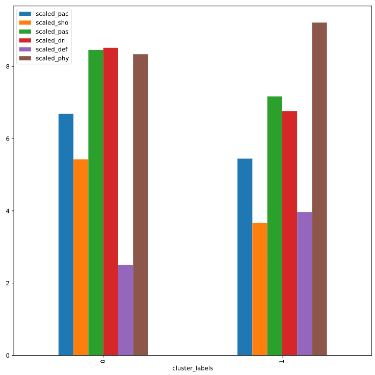
# Create centroids with kmeans for 2 clusters
cluster_centers,_ = kmeans(fifa[scaled_features], 2)

# Assign cluster labels and print cluster centers
fifa['cluster_labels'], _ = vq(fifa[scaled_features], cluster_centers)
print(fifa.groupby('cluster_labels')[scaled_features].mean())

# Plot cluster centers to visualize clusters
fifa.groupby('cluster_labels')[scaled_features].mean().plot(legend=True, kind='bar')
plt.show()

# Get the name column of top 5 players in each cluster
for cluster in fifa['cluster_labels'].unique():
    print(cluster, fifa[fifa['cluster_labels'] == cluster]['name'].values[:5])

<script.py> output:
                    scaled_pac  scaled_sho  scaled_pas  scaled_dri  scaled_def  \
    cluster_labels
    0                     6.68        5.43        8.46        8.51        2.50
    1                     5.44        3.66        7.17        6.76        3.97

                    scaled_phy
    cluster_labels
    0                     8.34
    1                     9.21
    0 ['Cristiano Ronaldo' 'L. Messi' 'Neymar' 'L. Suárez' 'M. Neuer']
    1 ['Sergio Ramos' 'G. Chiellini' 'D. Godín' 'Thiago Silva' 'M. Hummels']
视频的最后老师讲了一句话很好practice,practice
,practice
哈哈,加油,kmeans我已经实现了和BOA算法结合,分类效果比k-means基本算法强一点,但是与pso优化的kmeans差远了,主要思路是优化初始聚类中心

 浙公网安备 33010602011771号