jquery——整屏滚动
从这里下载了滚轮事件插件:https://github.com/jquery/jquery-mousewheel
函数节流:js中有些事件的触发频率非常高,在短时间内多次触发执行绑定函数,比如mousemove()然而这并不是我们想要的效果,解决方法就是通过使用定时器来减少触发的次数,实现函数节流。
我做了一个这样的页面:
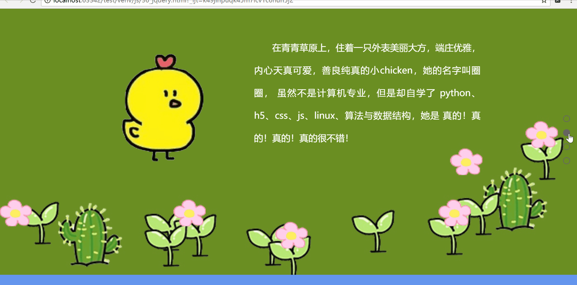
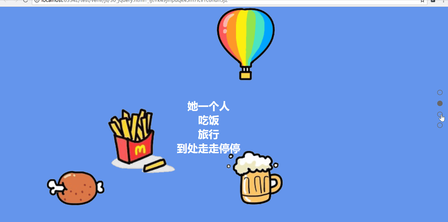
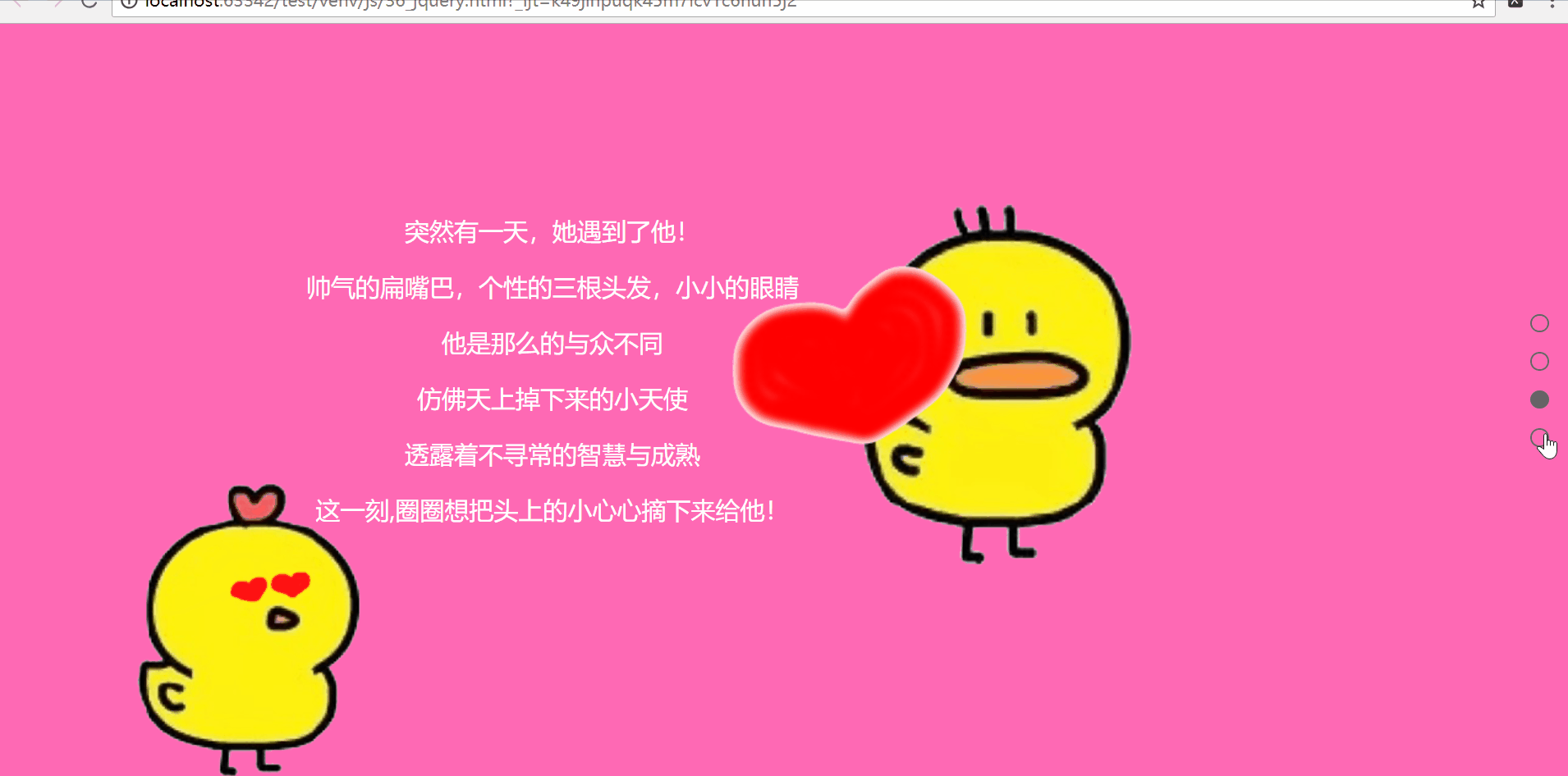
<!DOCTYPE html>
<html lang="en">
<head>
    <meta charset="UTF-8">
    <title>整页滚动</title>
    <link rel="stylesheet" type="text/css" href="1.css">
    <script type="text/javascript" src="jquery-1.12.4.min.js"></script>
    <script type="text/javascript" src="jquery.mousewheel.js"></script>
    <script type="text/javascript">
        $(function(){
            var nowscreen = 0;
            var $h = $(window).height();
            var $points = $('.points li');
            var $pages = $('.pages');
            var len =$('.pages').length;
            var timer = null;

            $pages.eq(0).addClass('moving');
            $pages.css({height:$h});
            //-1 是向下滑动,1是 像上滑动
            $(window).mousewheel(function (event,dat) {

                clearTimeout(timer);

                timer=setTimeout(function () {
                    if(dat==-1)
                    {
                        nowscreen++;
                        if(nowscreen>len-1){
                            nowscreen = len-1;
                        }
                    }
                    else{
                        nowscreen--;
                        if(nowscreen<0)
                        {
                            nowscreen = 0;
                        }
                    }
                    $('.pages_con').animate({top:-$h*nowscreen},300);

                    $points.eq(nowscreen).addClass('active').
                    siblings().removeClass('active');

                    $pages.eq(nowscreen).addClass('moving').
                    siblings().removeClass('moving');
                },200);
            });

            $points.click(function () {
                $(this).addClass('active').siblings().removeClass('active');
                $('.pages_con').animate({top:-$h*$(this).index()},300);
                $pages.eq($(this).index()).addClass('moving').
                    siblings().removeClass('moving');
            })

        })
    </script>
</head>
<body>
    <div class="pages_con">

        <div class="pages page1">
            <div class="main_con">
                <div class="left_img"><img src="images/chicken.png" alt="chicken"></div>
                <div class="right_info">
                    在青青草原上,住着一只外表美丽大方,端庄优雅,
                    内心天真可爱,善良纯真的小chicken,她的名字叫圈圈,
                    虽然不是计算机专业,但是却自学了
                    python、h5、css、js、linux、算法与数据结构,她是
                    真的!真的!真的!真的很不错!
                </div>
            </div>
        </div>

        <div class="pages page2">
            <div class="main_con">
                <div class="left_img1"><img src="images/eat1.png" alt="food"></div>
                <div class="left_img2"><img src="images/eat2.png" alt="food"></div>
                <div class="left_img3"><img src="images/travel1.png" alt="travel"></div>
                <div class="left_img4"><img src="images/travel2.png" alt="travel"></div>
                <div class="info2">
                    她一个人<br>吃饭<br>旅行<br>到处走走停停
                </div>
            </div>
        </div>

        <div class="pages page3">
            <div class="main_con">
                <div class="duck"><img src="images/duck.png" alt="duck"></div>
                <div class="info3">
                    <p>突然有一天,她遇到了他!<br></p>
                    <p>帅气的扁嘴巴,个性的三根头发,小小的眼睛<br></p>
                    <p>他是那么的与众不同</p>
                    <p>仿佛天上掉下来的小天使<br></p>
                    <p>透露着不寻常的智慧与成熟<br></p>
                    <p> 这一刻,圈圈想把头上的小心心摘下来给他!</p>
                </div>
                <div class="heart"><img src="images/heart.png" alt="heart"></div>
                <div class="me"><img src="images/me.png" alt="me"></div>
            </div>
        </div>

        <div class="pages page4">
            <div class="main_con">
                <div class="end_img1"><img src="images/duck_02.png" alt="duck"></div>
                <div class="end_img2"><img src="images/chicken.png" alt="chicken"></div>
                <div class="end">
                    最后,两只可爱的小东西幸福的生活在了一起
                </div>
                <div class="ending">ending...</div>
                <div class="paint paint1"><img src="images/flower.png" alt="love"></div>
                <div class="paint paint2"><img src="images/flower.png" alt="love"></div>
                <div class="paint paint3"><img src="images/flower.png" alt="love"></div>
                <div class="paint paint4"><img src="images/flower.png" alt="love"></div>
                <div class="paint paint5"><img src="images/flower.png" alt="love"></div>
                <div class="paint paint6"><img src="images/flower.png" alt="love"></div>
            </div>
        </div>
    </div>

    <ul class="points">
        <li class="active"></li>
        <li></li>
        <li></li>
        <li></li>
    </ul>
</body>
</html>
css:
body, ul{
    margin: 0;
    padding:0;
}

ul{
    list-style: none;
}

.pages_con{
    position: fixed;
    left:0;
    top:0;
    width:100%;
    overflow:hidden;
}
.pages{
    position:relative;
}
.page1{background:url("images/background.jpg")top center no-repeat; background-size:cover;}
.page2{background-color: cornflowerblue}
.page3{background-color: hotpink}
.page4{background-color: salmon}

.main_con{

    width:1262px;
    height:615px;
    /*position:relative;*/
    /*left:50%;*/
    /*top:50%;*/
    /*margin-left:631px;*/
    /*margin-top:-307px;*/
}

.main_con .left_img{

    width:320px;
    height:360px;
    float:left;
    position:relative;
    left: 80px;
    top:90px;
    opacity: 0;
    filter:alpha(opacity=0);
    transition:all 1000ms ease 300ms;
}

.moving .main_con .left_img{
    left:236px;
    opacity: 1;
    filter:alpha(opacity=100);
}

.main_con .right_info{

    width:500px;
    height:300px;
    margin-top:50px;
    float:right;
    font-family: "Microsoft YaHei UI";
    font-size:20px;
    line-height: 50px;
    color:#fff;
    text-indent:2em;
    text-align:justify;
    position: relative;
    left:-50px;
    top:38px;
    opacity: 0;
    filter:alpha(opacity=0);
    transition:all 1000ms ease 300ms;
}

.moving .main_con .right_info{
    left:-200px;
    opacity: 1;
    filter:alpha(opacity=1);
}

.main_con .left_img1{
    width:200px;
    height:200px;
    position: relative;
    left:0;
    top:0;
    transition:all 5000ms ease 300ms;
}

.moving .main_con .left_img1{
    left:121px;
    top:464px;
}

.main_con .left_img2{
    width:200px;
    height:200px;
    position: relative;
    left:200px;
    top:-200px;
    transition:all 5000ms ease 300ms;
}

.moving .main_con .left_img2{
    left:308px;
    top:80px;
}

.main_con .left_img3{
    width:200px;
    height:200px;
    position: relative;
    left:400px;
    top:-400px;
    transition:all 5000ms ease 300ms;
}

.moving .main_con .left_img3{
    left:627px;
    top:-15px;
}

.main_con .left_img4{
    width:200px;
    height:200px;
    position: relative;
    left:945px;
    top:-293px;
    transition:all 5000ms ease 300ms;
}

.moving .main_con .left_img4{
    left:600px;
    top:-600px;
}

.main_con .info2{
    width:500px;
    height:200px;
    position: relative;
    left:344px;
    top:-539px;
    font: bold 30px/40px 'Microsoft YaHei UI';
    color:#fff;
    text-align: center;
    opacity: 0;
    filter:alpha(opacity=0);
    transition:all 1000ms ease 300ms;
}

.moving .main_con .info2{
    opacity: 1;
    filter: alpha(opacity=1);
}

.main_con .me{
    width:300px;
    height: 300px;
    position: relative;
    left:-93px;
    top:-433px;
    transition:all 1000ms ease 300ms;
}

.moving .main_con .me{
    left:79px;
}

.main_con .heart{
    width:200px;
    height:150px;
    position: relative;
    left:400px;
    top:-9px;
    transition:all 5000ms ease 300ms;
}

.moving .main_con .heart{
    top:-426px;
    left:591px;
}

.main_con .duck{
    width:233px;
    height:300px;
    position: relative;
    left:918px;
    top:141px;
    transition:all 1000ms ease 300ms;
}

.moving .main_con .duck{
    left:695px;
    transition:all 1000ms ease 300ms;
}

.main_con .info3{
    width:400px;
    height:300px;

    position: relative;
    left:250px;
    top:-164px;
    transition:all 1000ms ease 300ms;

}

.info3 p{
    font-size: 20px;
    font-family: "Microsoft YaHei UI";
    text-align: center;
    color:#fff;
}

.main_con .end_img1{
    width:200px;
    height:200px;
    position: relative;
    left:719px;
    top:70px;
    transition:all 1000ms ease 300ms;
}

.moving .main_con .end_img1{
    left:548px;
}

.main_con .end_img2{
    width:200px;
    height:200px;
    position: relative;
    left:190px;
    top:-110px;
    transition:all 1000ms ease 300ms;
}

.moving .main_con .end_img2{
    left:325px;
}

.main_con .end{
    width:600px;
    height:50px;
    position: relative;
    left:386px;
    top:-18px;
    font-family: "Microsoft YaHei UI";
    font-size:20px;
    line-height: 50px;
    color:#fff;
    transition:all 1000ms ease 300ms;
}

.main_con .ending{
    width:600px;
    height:50px;
    position: relative;
    left:386px;
    top:0px;
    font-family: "Microsoft YaHei UI";
    font-size:20px;
    line-height: 50px;
    color:#fff;
}

.main_con .paint{
    width:200px;
    height:200px;
    position: relative;
    transition:all 4000ms ease 300ms;
}
.main_con .paint1{
    left:841px;
    top:-126px;
}

.moving .main_con .paint1{
    transform: rotate(500deg);
}

.main_con .paint2{
    left:12px;
    top:-683px;
}

.moving .main_con .paint2{
    transform: rotate(500deg);
}

.main_con .paint3{
    left:147px;
    top:-643px;
}

.moving .main_con .paint3{
    transform: rotate(500deg);
}

.main_con .paint4{
    left:98px;
    top:-716px;
}

.moving .main_con .paint4{
    transform: rotate(600deg);
}

.main_con .paint5{
    left:799px;
    top:-1226px;
}

.moving .main_con .paint5{
    transform: rotate(600deg);
}

.main_con .paint6{
    left:500px;
    top:-1080px;
}

.moving .main_con .paint6{
    transform: rotate(500deg);
}

.points{
    width:16px;
    height:176px;
    position: fixed;
    right:20px;
    top:50%;
    margin-top: -88px;
}

.points li{
    width:13px;
    height:13px;
    margin:16px 0;
    border-radius: 50%;
    border:1px solid #666;
    /*鼠标放上去会出现手形*/
    cursor:pointer;
}
.points li.active{
    background-color: #666;
}
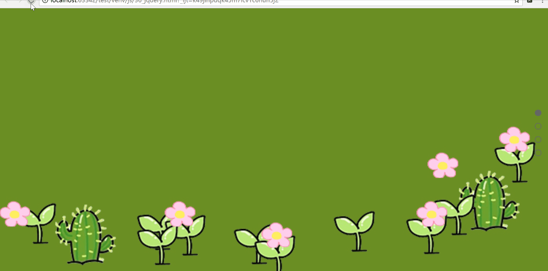
效果展示:(这几个页面放在一个gif里太大了,所以只能分成四个gif展示)
总结:
过程中遇到一个问题,在用position定位的时候我算好了left和top,但是每次出来的效果都和我想的不一样,每个特效的left和top值我都是用谷歌浏览器的开发者模式调试出来的,这花费了很长时间。今天研究了一下发现是我用错了position!
在给元素定位的时候,父级使用position:relative;子级使用position:absolute;这样就不会出现上面的问题了。如果子级使用的是position:relative就意味着同级的div在定位之后该位置的占用会影响接下来的left和top,总之之后的position就不只是根据父级元素而定的了。
上面的代码没有改,还是用的position:relative;不过下一次可不能再犯这个错误了!

 浙公网安备 33010602011771号