div+css实现导航示意箭头
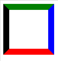
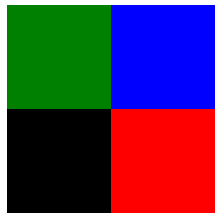
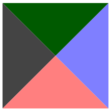
1、Div的宽高为100
 1 <!DOCTYPE html>
 2 <html xmlns="http://www.w3.org/1999/xhtml">
 3 <head>
 4     <meta http-equiv="Content-Type" content="text/html; charset=utf-8" />
 5     <title></title>
 6     <style type="text/css">
 7         div
 8         {
 9             border-color: green blue red black;
10             border-style: solid;
11             border-width: 16px;
12             height: 100px;
13             width: 100px;
14         }
15     </style>
16 </head>
17 <body>
18     <div></div>
19 </body>
20 </html>
显示效果:
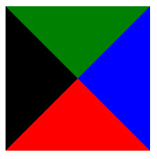
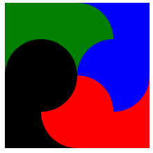
2、将宽高均设置为0
 1 <!DOCTYPE html>
 2 <html xmlns="http://www.w3.org/1999/xhtml">
 3 <head>
 4     <meta http-equiv="Content-Type" content="text/html; charset=utf-8" />
 5     <title></title>
 6     <style type="text/css">
 7         div
 8         {
 9             border-color: green blue red black;
10             border-style: solid;
11             border-width: 80px;
12             height: 0px;
13             width: 0px;
14         }
15     </style>
16 </head>
17 <body>
18     <div></div>
19 </body>
20 </html>
显示效果:
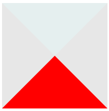
3、只显示下面的▲
-
半透明示意
 1 <!DOCTYPE html>
 2 <html xmlns="http://www.w3.org/1999/xhtml">
 3 <head>
 4     <meta http-equiv="Content-Type" content="text/html; charset=utf-8" />
 5     <title></title>
 6     <style type="text/css">
 7         div
 8         {
 9             border-color: rgba(0,100,100,0.1) rgba(20,20,20,0.1) red;
10             border-style: solid;
11             border-width: 80px;
12             height: 0px;
13             width: 0px;
14         }
15     </style>
16 </head>
17 <body>
18     <div></div>
19 </body>
20 </html>
显示效果:
-
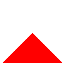
设置为全透明
 1 <!DOCTYPE html>
 2 <html xmlns="http://www.w3.org/1999/xhtml">
 3 <head>
 4     <meta http-equiv="Content-Type" content="text/html; charset=utf-8" />
 5     <title></title>
 6     <style type="text/css">
 7         div
 8         {
 9             border-color: rgba(0,0,0,0) rgba(0,0,0,0) red;
10             border-style: solid;
11             border-width: 80px;
12             height: 0px;
13             width: 0px;
14         }
15     </style>
16 </head>
17 <body>
18     <div></div>
19 </body>
20 </html>
显示效果:
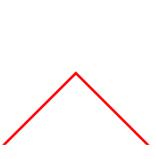
4、通过2个▲的重叠实现导航示意符号Λ
 1 <!DOCTYPE html>
 2 <html xmlns="http://www.w3.org/1999/xhtml">
 3 <head>
 4     <meta http-equiv="Content-Type" content="text/html; charset=utf-8" />
 5     <title></title>
 6     <style type="text/css">
 7         div.one
 8         {
 9             border-color: rgba(0,0,0,0) rgba(0,0,0,0) red;/*这里为导航符号颜色*/
10             border-style: solid;
11             border-width: 80px;
12             height: 0px;
13             width: 0px;
14             position:absolute;
15         }
16     div.two
17         {
18             border-color: rgba(0,0,0,0) rgba(0,0,0,0) white;/*这里为背景色*/
19             border-style: solid;
20             border-width: 80px;
21             height: 0px;
22             width: 0px;
23             position:absolute;
24             margin-top:4px;/*需要一个偏移量*/
25         }
26     </style>
27 </head>
28 <body>
29     <div class="one"></div>
30     <div class="two"></div>
31 </body>
32 </html>
显示效果:
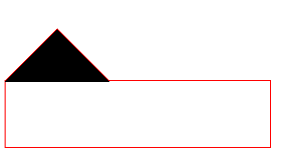
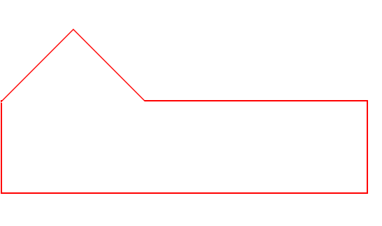
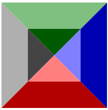
5、与下方的DIV组合
 1 <!DOCTYPE html>
 2 <html xmlns="http://www.w3.org/1999/xhtml">
 3 <head>
 4     <meta http-equiv="Content-Type" content="text/html; charset=utf-8" />
 5     <title></title>
 6     <style type="text/css">
 7         div.one
 8         {
 9             border-color: rgba(0,0,0,0) rgba(0,0,0,0) red;
10             border-style: solid;
11             border-width: 80px;
12             height: 0px;
13             width: 0px;
14             position:absolute;
15         }
16     div.two
17         {
18             border-color: rgba(0,0,0,0) rgba(0,0,0,0) black;/*black不是背景色,便于观察*/
19             border-style: solid;
20             border-width: 80px;
21             height: 0px;
22             width: 0px;
23             position:absolute;
24             margin-top:2px;
25             z-index:1;
26         }
27       div.three{
28          position:absolute;
29          width:400px;
30          height:100px;
31          border:2px solid red;/*需要设置边界宽度*/
32          margin-top:158px
33       }
34     </style>
35 </head>
36 <body>
37
38     <div class="one"></div>
39     <div class="two"></div>
40     <div class="three"></div>
41
42 </body>
43 </html>
便于观察的黑色背景:
改为背景色"白色"后显示效果:
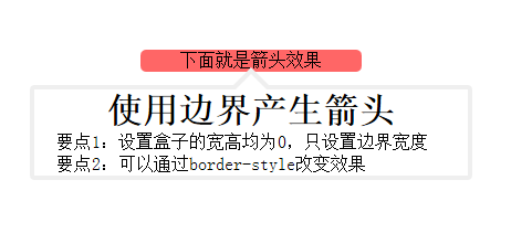
6、完整的小例子
 1 <!DOCTYPE html>
 2 <html xmlns="http://www.w3.org/1999/xhtml">
 3 <head>
 4     <meta http-equiv="Content-Type" content="text/html; charset=utf-8" />
 5     <title></title>
 6     <style>
 7         *
 8         {
 9             margin: 0px;
10             padding: 0px;
11         }
12
13         #show
14         {
15             margin: 10px auto;
16             position: absolute;
17             top: 50px;
18             left: 50px;
19             text-align: center;
20         }
21
22         #some
23         {
24             width: 200px;
25             margin-left: 100px;
26             text-align: center;
27             position: absolute;
28             background-color: rgba(255, 0, 0,0.6);
29             border-radius: 5px;
30         }
31
32         #info
33         {
34             width: 400px;
35             height: 300px;
36             position: absolute;
37         }
38
39         #outarrow
40         {
41             border-color: transparent transparent #efefef;
42             border-style: solid;
43             border-width: 16px;
44             height: 0;
45             width: 0;
46             position: absolute;
47             top: 0px;
48             left: 184px;
49         }
50
51         #innerarrow
52         {
53             border-color: transparent transparent white;
54             border-style: solid;
55             border-width: 16px;
56             height: 0;
57             width: 0;
58             position: absolute;
59             top: 0px;
60             left: 184px;
61             margin-top: 6px;
62         }
63
64         #content
65         {
66             border: 4px solid;
67             border-radius: 4px;
68             border-color: #efefef;
69             width: 400px;
70             margin: 32px auto 0px;
71             -moz-box-sizing: border-box;
72             -webkit-box-sizing: border-box;
73             box-sizing: border-box;
74         }
75
76             #content p
77             {
78                 text-align: left;
79                 text-indent: 20px;
80             }
81     </style>
82
83 </head>
84 <body>
85     <div id="show">
86         <div id="some">下面就是箭头效果</div>
87         <div id="info">
88             <div id="outarrow"></div>
89             <div id="innerarrow"></div>
90             <div id="content">
91                 <h1>使用边界产生箭头</h1>
92                 <p>要点1:设置盒子的宽高均为0,只设置边界宽度</p>
93                 <p>要点2:可以通过border-style改变效果</p>
94             </div>
95         </div>
96     </div>
97 </body>
98 </html>
显示效果:
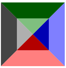
7、改变border-style 有趣的效果
 1   <!DOCTYPE html>
 2   <html xmlns="http://www.w3.org/1999/xhtml">
 3   <head>
 4       <meta http-equiv="Content-Type" content="text/html; charset=utf-8" />
 5       <title></title>
 6       <style type="text/css">
 7           div
 8           {
 9              border-color: green blue red black;
10              border-style: dotted;/*除了solid,可以试试dotted,dashed;grooved等*/
11              border-width: 80px;
12              height: 0px;
13              width: 0px;
14          }
15      </style>
16  </head>
17  <body>
18      <div></div>
19  </body>
20  </html>
|
dotted |
dashed | groove |
 |
 |
 |
|
outset |
inset | ridge |
 |
 |
 |
青春是孤独的旅行[Stay hungry,Stdy foolish]

 浙公网安备 33010602011771号