python数据可视化编程实战
课程代码地址:
https://github.com/driws/python-data-visualiztion-cookbook/tree/master/3367OS_02_Code
环境准备
虚拟环境

matplotlib文档


axex: 设置坐标轴边界和表面的颜色、坐标刻度值大小和网格的显示
backend: 设置目标暑促TkAgg和GTKAgg
figure: 控制dpi、边界颜色、图形大小、和子区( subplot)设置
font: 字体集(font family)、字体大小和样式设置
grid: 设置网格颜色和线性
legend: 设置图例和其中的文本的显示
line: 设置线条(颜色、线型、宽度等)和标记
patch: 是填充2D空间的图形对象,如多边形和圆。控制线宽、颜色和抗锯齿设置等。
savefig: 可以对保存的图形进行单独设置。例如,设置渲染的文件的背景为白色。
verbose: 设置matplotlib在执行期间信息输出,如silent、helpful、debug和debug-annoying。
xticks和yticks: 为x,y轴的主刻度和次刻度设置颜色、大小、方向,以及标签大小。
api
matplotlib.figure
实验
体验
#1
from matplotlib  import pyplot as  plt
x = range(2,26,2)
y = [15,13,14.5,17,20,25,26,26,24,22,18,15]
plt.figure(figsize=(20,8),dpi=80)
plt.rc("lines", linewidth=2, color='g')
plt.plot(x, y)
plt.xticks(range(2,25))
plt.show()

#2 饼图
import numpy  as np
from matplotlib  import pyplot as  plt
t = np.arange(0.0, 1.0, 0.01)
s = np.sin(2 * np.pi * t)
plt.rcParams['lines.color'] = 'r'
plt.plot(t, s)
c  = np.cos(2 * np.pi * t)
plt.rcParams['lines.linewidth'] = '3'
plt.plot(t,c)
plt.show()


#3 正反余弦
import numpy  as np
t = np.arange(0.0, 1.0, 0.01)
s = np.sin(2 * np.pi * t)
plt.rcParams['lines.color'] = 'r'
plt.plot(t, s)
c = np.cos(2 * np.pi * t)
plt.rcParams['lines.linewidth'] = '3'
plt.plot(t,c)
plt.show()
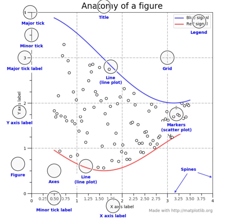
基础知识
Figure
Figure对象 一张画板
import matplotlib.pyplot as plt
fig = plt.figure()
Axes轴
轴,大概意思是在画布上Figure 有多个区域,每个区域是一个图形,即一个坐标轴
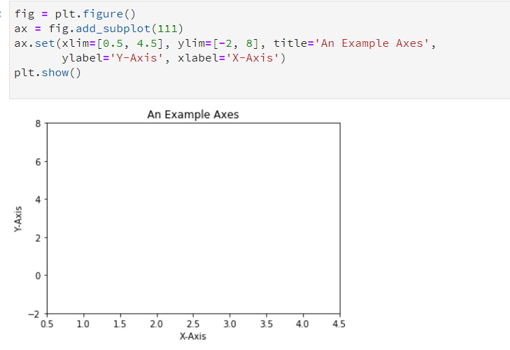
fig = plt.figure()
ax = fig.add_subplot(111)
ax.set(xlim=[0.5, 4.5], ylim=[-2, 8], title='An Example Axes',
       ylabel='Y-Axis', xlabel='X-Axis')
plt.show()
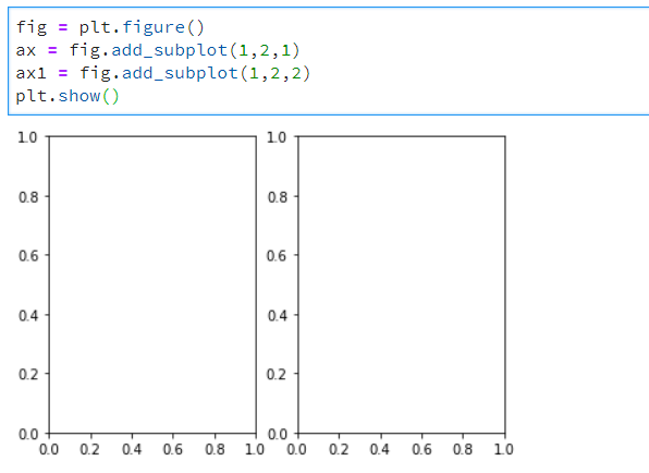

##1
fig = plt.figure()
ax = fig.add_subplot(1,2,1)  ##表示一行俩列里第一个坐标轴  左右排列   默认得画布大小
ax1 = fig.add_subplot(1,2,2) ##表示一行俩列里第二个坐标轴
plt.show()

#2
fig = plt.figure()
ax = fig.add_subplot(2,1,1)  ##表示二行1列里第一个坐标轴 上下排列   默认得画布大小
ax1 = fig.add_subplot(2,1,2)  ##表示二行1列里第二个坐标轴
plt.show()
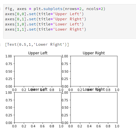
更简单得做法:
fig, axes = plt.subplots(nrows=2, ncols=2)
axes[0,0].set(title='Upper Left')
axes[0,1].set(title='Upper Right')
axes[1,0].set(title='Lower Left')
axes[1,1].set(title='Lower Right')
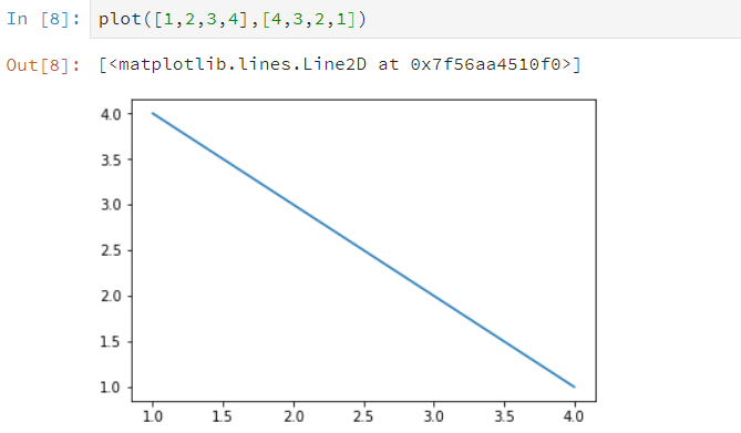
##手工画
plt.plot([1, 2, 3, 4], [10, 20, 25, 30], color='red', linewidth=3)
plt.xlim(0.5, 4.5)
plt.show()
参考:https://blog.csdn.net/qq_34859482/article/details/80617391
https://www.cnblogs.com/zhizhan/p/5615947.html
书籍案例
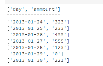
读取CSV
###############
cat  ch02-data.csv
"day","ammount"
2013-01-24,323
2013-01-25,233
2013-01-26,433
2013-01-27,555
2013-01-28,123
2013-01-29,0
2013-01-30,221
########################


import csv

filename = '/home/jupyterlab/cookbook/02/ch02-data.csv'

data = []
try:
    with open(filename) as f:
        reader = csv.reader(f)
        c = 0
        for row in reader:
            if c == 0:
                header = row
            else:
                data.append(row)
            c += 1
except csv.Error as e:
    print("Error reading CSV file at line %s: %s" % (reader.line_num, e))
    sys.exit(-1)

if header:
    print(header)
    print('==================')

for datarow in data:
    print(datarow)
读取excel 文件
从定宽文件中读取数据
###
head  -10 ch02-fixed-width-1M.data
161322597 0386544351896 0042
296411327 6945080785634 2301
164726383 4090941067228 5553
575768002 4862349192103 5643
483535208 6007251611732 4649
050291308 8263754667453 9141
207152670 3984356804116 9532
427053180 1466959270421 5338
316700885 9726131532544 4920
138359697 3286515244210 7400
###

import struct
import string

mask='9s14s5s'  ##定义将要读取的字符串格式,掩码格式
parse = struct.Struct(mask).unpack_from
print('formatstring {!r}, record size: {}'.format(mask, struct.calcsize(mask)))
datafile = '/home/jupyterlab/cookbook/02/ch02-fixed-width-1M.data'

with open(datafile, 'r') as f:
    i = 0
    for line in f:
        if i < 30:
            fields = line.split()
            print('fields: ', [field.strip() for field in fields])
            i = i+1
        else:
            break

读取json
https://developer.github.com/v3/activity/events/#list-public-events
import requests

url = 'https://api.github.com/events'
r = requests.get(url)
json_obj = r.json()

repos = set() # we want just unique urls
for entry in json_obj:
    try:
        repos.add(entry['repo']['url'])
    except KeyError as e:
        print("No key %s. Skipping..." % (e))

from pprint import pprint
pprint(repos)
#######################显示
{'https://api.github.com/repos/Hong1008/freelec-springboot2-webservice',
 'https://api.github.com/repos/Nice-Festival/nice-festival-backend',
 'https://api.github.com/repos/OurHealthcareHK/api',
 'https://api.github.com/repos/SkavenNoises/SynthRevolution',
 'https://api.github.com/repos/TQRG/Slide',
 'https://api.github.com/repos/actengage/patriotpoll',
 'https://api.github.com/repos/ahmad-elkhawaldeh/ICS2OR-Unit0-03-HTML',
 'https://api.github.com/repos/cjdenio/cjdenio.github.io',
 'https://api.github.com/repos/cris-Duarte/asisapp',
 'https://api.github.com/repos/devhub-blue-sea/org-public-empty-repo-eu-north-1',
 'https://api.github.com/repos/dginelli/repairnator-experiments-jkali-one-failing-test',
 'https://api.github.com/repos/esozen2012/python-dictionaries-readme-ds-apply-000',
 'https://api.github.com/repos/gywgithub/TypeScriptExamples',
 'https://api.github.com/repos/hknqp/test',
 'https://api.github.com/repos/hodersolutions/a1jobs-2.0',
 'https://api.github.com/repos/ikding/ikding.github.io',
 'https://api.github.com/repos/jaebradley/nba-stats-client',
 'https://api.github.com/repos/joshwnj/react-visibility-sensor',
 'https://api.github.com/repos/leewp14/android_kernel_samsung_smdk4412',
 'https://api.github.com/repos/necromancyonline/necromancy-server',
 'https://api.github.com/repos/pbaffiliate10/repoTestCheckout',
 'https://api.github.com/repos/rinorocks8/rinorocks8.github.io',
 'https://api.github.com/repos/rmagick/rmagick',
 'https://api.github.com/repos/schoolhackingclub/schoolhackingclub.github.io',
 'https://api.github.com/repos/shanemcq18/rom-operator-inference-Python3',
 'https://api.github.com/repos/soaresrodrigo/perfil',
 'https://api.github.com/repos/stanford-ssi/homebrew-rocket-sim',
 'https://api.github.com/repos/tacotaco2/Curie',
 'https://api.github.com/repos/viljamis/vue-design-system'}
numpy 打印图像
import scipy.misc
import matplotlib.pyplot as plt
lena = scipy.misc.ascent()
plt.gray()
plt.imshow(lena)
plt.colorbar()
plt.show()

print(lena.shape)
print(lena.max())
print(lena.dtype)
PIL输出图像
import numpy
from PIL import Image
import matplotlib.pyplot as plt

bug = Image.open('/home/jupyterlab/cookbook/02/stinkbug.png')
arr = numpy.array(bug.getdata(), numpy.uint8).reshape(bug.size[1], bug.size[0], 3)

plt.gray()
plt.imshow(arr)
plt.colorbar()
plt.show()
matplotlib 画图


为plot 提供的是y值,plot 默认为x轴提供了0到8的线性值,数量为y值的个数
提供了x y 值
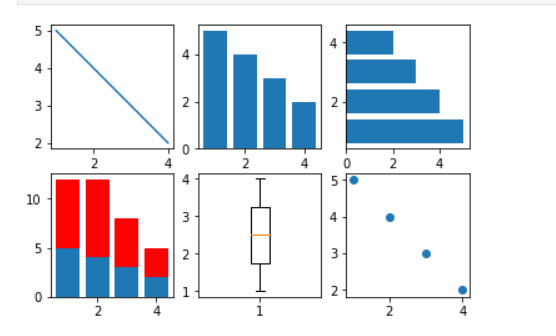
各种图
from matplotlib.pyplot import *

x = [1,2,3,4]
y = [5,4,3,2]

figure()  ##创建新的图表 ,所有接下来的绘图操作都在该图表


subplot(231)  ##231表示共有2行* 3列图表,指定在第一个上描述
plot(x, y)

subplot(232)
bar(x, y)

subplot(233)
barh(x, y)

subplot(234)
bar(x, y)
y1 = [7,8,5,3]
bar(x, y1, bottom=y, color = 'r')

subplot(235)
boxplot(x)

subplot(236)
scatter(x,y)

show()
箱线图
from pylab import *

dataset = [113, 115, 119, 121, 124,
           124, 125, 126, 126, 126,
           127, 127, 128, 129, 130,
           130, 131, 132, 133, 136]


subplot(121)
boxplot(dataset, vert=False)

subplot(122)
hist(dataset)

show()

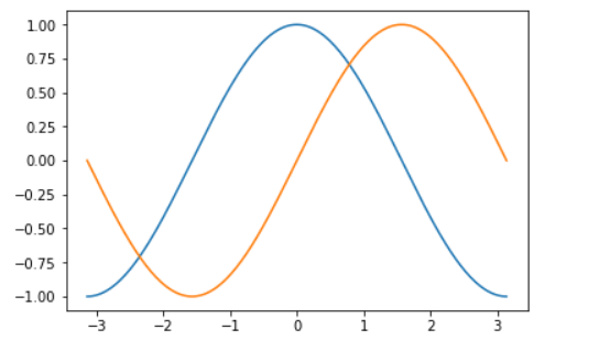
正余弦图
import matplotlib.pyplot as pl
import numpy as np

# generate uniformly distributed
# 256 points from -pi to pi, inclusive
x = np.linspace(-np.pi, np.pi, 256, endpoint=True)

# these are vectorised versions
# of math.cos, and math.sin in built-in Python maths
# compute cos for every x
y = np.cos(x)

# compute sin for every x
y1 = np.sin(x)

# plot both cos and sin
pl.plot(x, y)
pl.plot(x, y1)

pl.show()
美化后:
from pylab import *
import numpy as np

# generate uniformly distributed
# 256 points from -pi to pi, inclusive
x = np.linspace(-np.pi, np.pi, 256, endpoint=True)

# these are vectorised versions
# of math.cos, and math.sin in built-in Python maths
# compute cos for every x
y = np.cos(x)

# compute sin for every x
y1 = np.sin(x)

# plot cos
plot(x, y)

# plot sin
plot(x, y1)

# define plot title
title("Functions $\sin$ and $\cos$")

# set x limit
xlim(-3.0, 3.0)
# set y limit
ylim(-1.0, 1.0)

# format ticks at specific values
xticks([-np.pi, -np.pi/2, 0, np.pi/2, np.pi],
          [r'$-\pi$', r'$-\pi/2$', r'$0$', r'$+\pi/2$', r'$+\pi$'])
yticks([-1, 0, +1],
          [r'$-1$', r'$0$', r'$+1$'])

show()

设置坐标轴的长度和范围
l = [-1, 1 , -10 , 10]  ##分别代表xmin xmax ymin ymax   xy 坐标轴的刻度
axis(l)
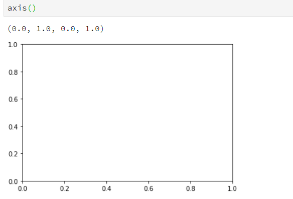
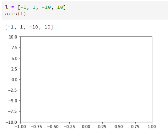
使用axis 设置坐标轴的刻度,不设置默认使用最小值
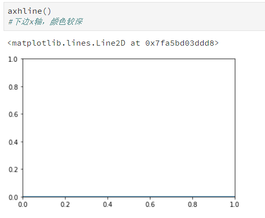
做标轴添加一条线
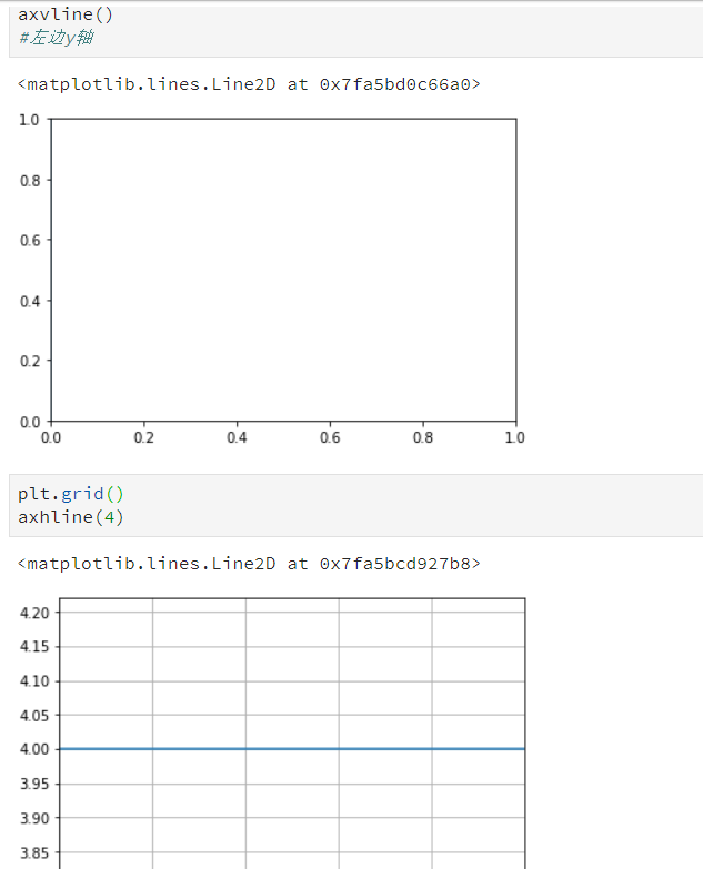
添加网格属性,默认是关闭的
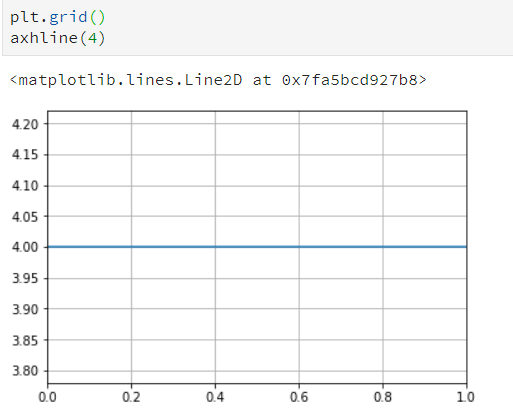
设置图表的线型,属性,格式化字符串
##线条粗细
plt.grid()
axhline(4, linewidth=8)
plot(x, y , linewidth=10)
设置线条属性


颜色:
color = "#eeefff"
title("title is ", color="#123456")
plt.grid()
plot(x, y , linewidth=10)
设置刻度,刻度标签和网格
figure 图形
subplots 子区
figure()会显式的创建一个图形,表示图型用户界面窗口
plot() 隐士的创建图形
一个图形包含一个或多个子区,子区以网格方式排列plot subplot() 调用时指定所有plot的行数和列数及要操作的plot 序号
##图1
from pylab import *

# get current axis
ax = gca()

# set view to tight, and maximum number of tick intervals to 10
ax.locator_params(tight=True, nbins = 10)

# generate 100 normal distribution values
ax.plot(np.random.normal(10, .1, 100))

show()

##图2
from pylab import *
import matplotlib as mpl
import datetime

fig = figure()

# get current axis
ax = gca()

# set some daterange
start = datetime.datetime(2013, 1, 1)
stop = datetime.datetime(2013, 12, 31)
delta = datetime.timedelta(days = 1)

# convert dates for matplotlib
dates = mpl.dates.drange(start, stop, delta)

# generate some random values
values = np.random.rand(len(dates))

ax = gca()

# create plot with dates
ax.plot_date(dates, values, linestyle='-', marker='')

# specify formater
date_format = mpl.dates.DateFormatter('%Y-%m-%d')

# apply formater
ax.xaxis.set_major_formatter(date_format)

# autoformat date labels
# rotates labels by 30 degrees by default
# use rotate param to specify different rotation degree
# use bottom param to give more room to date labels
fig.autofmt_xdate()

show()
添加图例和注解
from matplotlib.pyplot import *

# generate different normal distributions
x1 = np.random.normal(30, 3, 100)
x2 = np.random.normal(20, 2, 100)
x3 = np.random.normal(10, 3, 100)

# plot them
plot(x1, label='plot')
plot(x2, label='2nd plot')
plot(x3, label='last plot')

# generate a legend box
legend(bbox_to_anchor=(0., 1.02, 1., .102), loc=3,
       ncol=3, mode="expand", borderaxespad=0.)

# annotate an important value
annotate("Important value", (55,20), xycoords='data',
         xytext=(5, 38),
         arrowprops=dict(arrowstyle='->'))
show()

移动轴线到图中央
import matplotlib.pyplot as plt
import numpy as np

x = np.linspace(-np.pi, np.pi, 500, endpoint=True)
y = np.sin(x)

plt.plot(x, y)

ax = plt.gca()

# hide two spines
ax.spines['right'].set_color('none')
ax.spines['top'].set_color('none')

# move bottom and left spine to 0,0
ax.spines['bottom'].set_position(('data',0))
ax.spines['left'].set_position(('data',0))

# move ticks positions
ax.xaxis.set_ticks_position('bottom')
ax.yaxis.set_ticks_position('left')

plt.show()
直方图
import numpy as np
import matplotlib.pyplot as plt

mu = 100
sigma = 15
x = np.random.normal(mu, sigma, 10000)

ax = plt.gca()

# the histogram of the data
ax.hist(x, bins=35, color='r')

ax.set_xlabel('Values')
ax.set_ylabel('Frequency')

ax.set_title(r'$\mathrm{Histogram:}\ \mu=%d,\ \sigma=%d$' % (mu, sigma))

plt.show()

 浙公网安备 33010602011771号