SVG之图形的引用use、剪切clipPath和蒙板mask
一、使用<use>标签实现图形的引用
当我们在使用SVG绘制图形时,有时候会出现大量重复图形,这个时候我们就可以使用<use>标签进行图形引用,相当于图形的克隆。<use>标签在SVG文档内取得目标节点,并在别的地方复制它们。它的效果等同于这些节点被深克隆到一个不可见的DOM中,然后将其粘贴到use元素的位置,很像HTML5中的克隆模板元素。因为克隆的节点是不可见的,所以当使用CSS样式化一个use元素以及它的隐藏的后代元素的时候,必须小心注意。隐藏的、克隆的DOM不能保证继承CSS属性,除非你明文设置使用CSS继承。
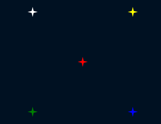
假如我们现在想绘制满天繁星图,首先我们可以先绘制出一颗星星然后再多次引用这颗星星即可。
-
 1 <!DOCTYPE html>
 2 <html>
 3
 4 <head>
 5     <meta charset="utf-8">
 6     <meta http-equiv="X-UA-Compatible" content="IE=edge,chrome=1">
 7     <title>星空</title>
 8     <meta name="description" content="">
 9     <meta name="keywords" content="">
10     <link href="" rel="stylesheet">
11     <style type="text/css">
12         html,
13         body {
14             margin: 0;
15             padding: 0;
16             width: 100%;
17             height: 100%;
18             background: #001122;
19             line-height: 0;
20             font-size: 0;
21             /*svg标签是内联元素,防止撑满后会有滚动条出现*/
22         }
23     </style>
24 </head>
25 <body>
26     <svg width="100%" height="100%"
27         viewBox="-400 -300 800 600"
28         preserveAspectRatio="xMidYMid slice"
29         xmlns="http://www.w3.org/2000/svg">
30         <!--一颗星星-->
31         <s>
32             <polygon id="star" points="0 -10 2 -2 10 0 2 2 0 10 -2 2 -10 0 -2 -2" fill="inhert" />
33         </>
34         <!--引用出很多星星-->
35         <use x="0" y="0" xlink:href="#star" fill="red" />
36         <use x="-100" y="-100" xlink:href="#star" fill="white" />
37         <use x="100" y="100" xlink:href="#star" fill="blue" />
38         <use x="-100" y="100" xlink:href="#star" fill="green" />
39         <use x="100" y="-100" xlink:href="#star" fill="yellow" />
40     </svg>
41 </body>
42 </html>
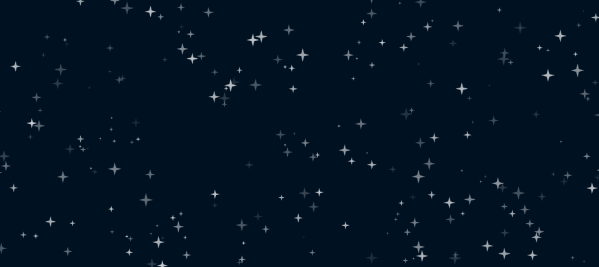
现在有一个问题就是我们希望漫天繁星的效果,那么我们就不能通过手动添加<user>标签,下面我们使用js脚本来帮助我们完成这种效果:
-
 1 <!DOCTYPE html>
 2 <html>
 3
 4 <head>
 5     <meta charset="utf-8">
 6     <meta http-equiv="X-UA-Compatible" content="IE=edge,chrome=1">
 7     <title>浪漫星空</title>
 8     <meta name="description" content="">
 9     <meta name="keywords" content="">
10     <link href="" rel="stylesheet">
11     <style type="text/css">
12         html,
13         body {
14             margin: 0;
15             padding: 0;
16             width: 100%;
17             height: 100%;
18             background: #001122;
19             line-height: 0;
20             font-size: 0;
21             /*svg标签是内联元素,防止撑满后会有滚动条出现*/
22         }
23     </style>
24 </head>
25 <body>
26     <svg width="100%" height="100%"
27         viewBox="-400 -300 800 600"
28         preserveAspectRatio="xMidYMid slice"
29         xmlns="http://www.w3.org/2000/svg">
30         <!--一颗星星-->
31         <defs>
32             <polygon id="star" points="0 -10 2 -2 10 0 2 2 0 10 -2 2 -10 0 -2 -2" fill="white" />
33         </defs>
34         <!--引用出很多星星-->
35         <g id="star-group"></g>
36     </svg>
37 </body>
38     <script type="text/javascript">
39         var SVG_NS = 'http://www.w3.org/2000/svg';
40         var XLINK_NS = 'http://www.w3.org/1999/xlink';
41
42         renderStart();
43         //创建user标签
44         function use(origin){
45             var _use = document.createElementNS(SVG_NS,'use');
46             _use.setAttributeNS(XLINK_NS,'xlink:href','#'+origin.id);
47             return _use;
48         }
49         //创建若干颗星星
50         function renderStart(){
51             var starRef = document.getElementById('star');
52             var starGroup = document.getElementById('star-group');
53             var starCount = 500;//星星数量
54             console.log(starGroup);//方便调试js
55             var star;
56             while (starCount--) {
57                 star = use(starRef);
58                 star.setAttribute('opacity', random(0.1, 0.8));//随机透明度
59                 star.setAttribute('transform', 'translate(' + random(-400, 400) + ',' + random(-300, 50) + ') scale(' + random(0.1, 0.6) + ')');//随机位移/缩放
60                 starGroup.appendChild(star);
61             }
62         }
63         //产生随机数字
64         function random(min, max) {
65             return min + (max - min) * Math.random();
66         }
67     </script>
68 </html>
二、使用<clipPath>标签实现图形的剪切
clip即剪切的意思,我们使用clipPath标签来描述剪切路径,然后在图形中使用clip-path属性来使用。很容易理解,我们一定都见过这样的头像:

这就是剪切的效果,我们使用<clipPath>标签来定义剪切路劲,比如上图的剪切路径就是一个圆,然后我们在需要被剪切的图像中使用clip-path属性进行使用就可以了,来看具体的例子:
-
<!DOCTYPE html>
<html>
<head>
    <meta charset="utf-8">
    <title>clipPath</title>
</head>
<body>
    <svg xmlns="http://www.w3.org/2000/svg" version="1.1" width="800px" height="600px">
        <image xlink:href="https://cdn.duitang.com/uploads/item/201508/30/20150830105732_nZCLV.jpeg" x="0" y="0" height="300px" width="400px" clip-path="url(#header)"></image>
        <circle cx="100" cy="100" r="71" stroke="red" stroke-width="2px" fill="none" transform="translate(94,62)"></circle>

    </svg>
</body>
</html>

这是一个图形和一个矩形构成的图片,如果我们需要使用圆圈作为剪切路劲,我们需要使用<clipPath>来创建,并在图形中引用:
-
<!DOCTYPE html>
<html>
<head>
    <meta charset="utf-8">
    <title>clipPath</title>
</head>
<body>
    <svg xmlns="http://www.w3.org/2000/svg" version="1.1" width="800px" height="600px">
        <image xlink:href="https://cdn.duitang.com/uploads/item/201508/30/20150830105732_nZCLV.jpeg" x="0" y="0" height="300px" width="400px" clip-path="url(#header)"></image>
        <defs>
            <clipPath id="header">
                <circle cx="100" cy="100" r="71" transform="translate(94,62)"></circle>
            </clipPath>
        </defs>
    </svg>
</body>
</html>

三、使用<mask>标签实现图形的蒙板
mask的意思是“面具”,而蒙板的意思是“蒙在上面的板子”,都是遮挡的意思。之前看过很多mask的使用说明和案例,都觉得不好理解,所以在这里我尽量简单明了。首先看一个图形:
-
<!DOCTYPE html>
<html>
<head>
    <meta charset="utf-8">
    <title>mask</title>
</head>
<body>
    <svg xmlns="http://www.w3.org/2000/svg" version="1.1" width="800px" height="600px">
        <circle cx="240" cy="90" r="80" fill="red" opacity="0.7"></circle>
        <circle cx="200" cy="130" r="80" fill="yellow" opacity="0.7"></circle>
    </svg>
    <div></div>
</body>
</html>

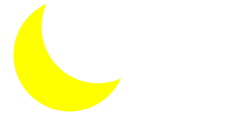
很简单的两个透明矩形重叠的效果,假设现在我有一个需求,就是画一个月牙,也就是图中黄色未遮挡的那部分(当然你可以使用<path>或其他标签来画),如果我们能让黄色未遮挡部分显示而其余部分完全透明,那么我们就可以实现这个效果。
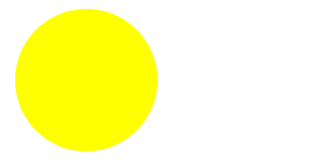
很明显,现在要说的mask就有这个功能,mask是遮罩、蒙板的意思,而且可以让蒙板中的一部分透明而其余部分完全显示。如果你觉得抽象我们直接看实例,我们先画一个圆月:<!DOCTYPE html> <html> <head> <meta charset="utf-8"> <title>mask</title> </head> <body> <svg xmlns="http://www.w3.org/2000/svg" version="1.1" width="800px" height="600px"> <circle cx="200" cy="130" r="80" fill="yellow"></circle> </svg> <div></div> </body> </html>
然后我们定义一个蒙板,就是刚才画的那两个圆:
<s>
    <mask id="myMask">
        <!--mask中使用颜色来控制透明度:white表示透明度为0,即完全显示;black表示透明度为1,即完全透明-->
        <circle cx="200" cy="130" r="80" fill="white"></circle>
        <circle cx="240" cy="90" r="80" fill="balck"></circle>
    </mask>
</s>
即我们让刚才红色圆的位置不显示,黄色位置的圆显示,然后我们在上面这个圆月中使用这个蒙板:
<!DOCTYPE html>
<html>
<head>
    <meta charset="utf-8">
    <title>clip</title>
</head>
<body>
    <svg xmlns="http://www.w3.org/2000/svg" version="1.1" width="800px" height="600px">
        <!--预定义蒙板-->
        <defs>
            <mask id="myMask">
                <!--mask中使用颜色来控制透明度:white表示透明度为0,即完全显示;black表示透明度为1,即完全透明-->
                <circle cx="200" cy="130" r="80" fill="white"></circle>
                <circle cx="240" cy="90" r="80" fill="balck"></circle>
            </mask>
        </defs>
        <!--使用蒙板-->
        <circle cx="200" cy="130" r="80" fill="yellow" mask="url(#myMask)"></circle>
    </svg>
    <div></div>
</body>
</html>
可能还是有些抽象,所以我们应该多尝试,以此来验证自己想法的正确性。
ps:当然mask不只是一部分透明一部分不透明,我们还可以使用半透明等蒙板,根据实际需要来调整蒙板中的fill即可。
四、综合运用
结合我们之前画的星星月亮,我们可以画出一幅星空图,图中除了灯塔的动画效果,其余都是前面用过的知识点,这里就不在赘述,之后的笔记中我会总结一些SVG动画效果,欢迎移步:
-
 start sky
<!DOCTYPE html>
<html lang="en">
<head>
    <meta charset="utf-8">
    <title>Star Sky</title>
    <style>
        html, body {
            margin: 0;
            padding: 0;
            width: 100%;
            height: 100%;
            background: #001122;
            line-height: 0;
            font-size: 0;
        }
    </style>
</head>
<body>
    <svg width="100%" height="100%"
        viewBox="-400 -300 800 600"
        preserveAspectRatio="xMidYMid slice">
        <!--预定义一颗星星-->
        <defs>
            <polygon id="star" points="0 -10 2 -2 10 0 2 2 0 10 -2 2 -10 0 -2 -2" fill="white"></polygon>
        </defs>
        <!--实景-->
        <g id="real">
            <!--满天繁星(动态生成)-->
            <g id="star-group"></g>
            <g id="moon-group" transform="translate(0 50)">
                <mask id="moon-mask">
                    <circle cx="-250" cy="-150" r="100" fill="white"></circle>
                    <circle cx="-200" cy="-200" r="100" fill="black"></circle>
                </mask>
                <circle mask="url(#moon-mask)" cx="-250" cy="-150" r="100" fill="yellow"></circle>
            </g>
            <!--灯塔-->
            <g id="light-tower" transform="translate(250, 0)">
                <defs>
                    <linearGradient id="tower" x1="0" y1="0" x2="1" y2="0">
                        <stop offset="0" stop-color="#999"></stop>
                        <stop offset="1" stop-color="#333"></stop>
                    </linearGradient>
                    <radialGradient id="light" cx="0.5" cy="0.5" r="0.5">
                        <stop offset="0" stop-color="rgba(255, 255, 255, .8)"></stop>
                        <stop offset="1" stop-color="rgba(255, 255, 255, 0)"></stop>
                    </radialGradient>
                    <clipPath id="light-mask">
                        <polygon transform="rotate(10)" points="0 0 -300 -15 -300 15">
                            <!--SVG动画效果-->
                            <animateTransform
                                attributeName="transform"
                                attributeType="XML"
                                type="rotate"
                                from="0"
                                to="360"
                                dur="10s"
                                repeatCount="indefinite">
                            </animateTransform>
                        </polygon>
                        <circle cx="0" cy="0" r="2"></circle>
                    </clipPath>
                </defs>
                <polygon points="0 0 5 50 -5 50" fill="url(#tower)"></polygon>
                <ellipse cx="0" cy="0" rx="300" ry="100" clip-path="url(#light-mask)" fill="url(#light)"></ellipse>
            </g>
        </g>

        <!--虚景:使用use标签复制实景,使用mask等设置相关效果-->
        <g id="reflact" mask="url(#fading)" transform="translate(0 50)">
            <defs>
                <linearGradient id="fade" x1="0" y1="0" x2="0" y2="1">
                    <stop offset="0" stop-color="rgba(255,255,255,.3)"></stop>
                    <stop offset="0.5" stop-color="rgba(255,255,255,0)"></stop>
                </linearGradient>
                <mask id="fading">
                    <rect x="-800" y="0" width="1600" height="400" fill="url(#fade)"></rect>
                </mask>
            </defs>
            <use xlink:href="#real" transform="scale(1, -1) translate(0 -40)"></use>
        </g>
        <rect x="-800" y="50" width="1600" height="400" opacity="0.2" fill="url(#fade)"></rect>
    </svg>
</body>
    <script>
        /* jshint browser: true */
        var SVG_NS = 'http://www.w3.org/2000/svg';
        var XLINK_NS = 'http://www.w3.org/1999/xlink';
        var paper = document.querySelector('svg');
        var defs = document.querySelector('svg defs');
        renderStar();
        function use(origin) {
            var _use = document.createElementNS(SVG_NS, 'use');
            _use.setAttributeNS(XLINK_NS, 'xlink:href', '#' + origin.id);
            return _use;
        }
        function random(min, max) {
            return min + (max - min) * Math.random();
        }
        function renderStar() {
            var starRef = document.getElementById('star');
            var starGroup = document.getElementById('star-group');
            var starCount = 500;
            var star;
            while (starCount--) {
                star = use(starRef);
                star.setAttribute('opacity', random(0.1, 0.4));
                star.setAttribute('transform',
                    'translate(' + random(-400, 400) + ',' + random(-300, 50) + ') ' +
                    'scale(' + random(0.1, 0.6) + ')');
                starGroup.appendChild(star);
            }
        }
    </script>
</html>


 浙公网安备 33010602011771号