Avalonia:使用附加属性将命令绑定到事件
最近在学习Avalonia,体验神奇的Reactiveui响应式编程,在体验中有一个需求,需要将命令绑定到控件事件,一般是安装包:install-package xaml.behaviors 或者安装 install-package xaml.behaviors.interactions,二个包任选一个可以满足要求。
<Interaction.Behaviors>
	<EventTriggerBehavior EventName="Loaded">
		<InvokeCommandAction Command="{Binding InitCommand}"/>
	</EventTriggerBehavior>
</Interaction.Behaviors>
如果去问deepseek,豆包,腾讯元宝,都会使用过时弃用的包,我这样用才是当下最新的用法。
我们也可以使用附加属性实现这个功能。
在项目中新建Behaviors文件夹,在文件夹下创建LoadedBehavior.cs,该类必须继承AvaloniaObject,代码如下。
using Avalonia;
using Avalonia.Controls;
using Avalonia.Data;
using Avalonia.Interactivity;
using System.Windows.Input;

namespace AttachedPropertyDemo.Behaviors
{
    public class LoadedBehavior : AvaloniaObject
    {
        static LoadedBehavior()
        {
            ExecuteCommandOnLoadedProperty.Changed.AddClassHandler<Interactive>(OnExecuteCommandOnLoadedChanged);
        }

        public static readonly AttachedProperty<ICommand> ExecuteCommandOnLoadedProperty =
            AvaloniaProperty.RegisterAttached<LoadedBehavior, Interactive, ICommand>("ExecuteCommandOnLoaded", default, false, BindingMode.OneTime);

        public static ICommand? GetExecuteCommandOnLoaded(AvaloniaObject element) => element.GetValue(ExecuteCommandOnLoadedProperty);

        public static void SetExecuteCommandOnLoaded(AvaloniaObject element, ICommand value)
        {
            element.SetValue(ExecuteCommandOnLoadedProperty!, value);
        }

        private static void OnExecuteCommandOnLoadedChanged(Interactive element, AvaloniaPropertyChangedEventArgs e)
        {
            if (e.NewValue is ICommand command)
            {
                element.AddHandler(Control.LoadedEvent, Handler);
            }
            else
            {
                element.RemoveHandler(Control.LoadedEvent, Handler);
            }
        }

        private static void Handler(object? sender, RoutedEventArgs e)
        {
            if (sender is Interactive element)
            {
                ICommand command = element.GetValue(ExecuteCommandOnLoadedProperty);
                if (command?.CanExecute(null) == true)
                {
                    command.Execute(null);
                }
            }
        }
    }
}
创建附加属性,我这样才是最正确的方法,和官网一样。Deepseek,豆包,元宝都有问题。
在我的viewmodel中反射Avalonia.Media空间下的颜色,为了使代码简洁,有必要安装ReactiveUi.SourceGenerators这个包,源代码生成器。代码如下:
using Avalonia.Media;
using ReactiveUI;
using ReactiveUI.SourceGenerators;
using System.Collections.ObjectModel;
using System.Linq;

namespace AttachedPropertyDemo.ViewModels
{
    public partial class ColorsViewModel : ViewModelBase
    {
        [Reactive]
        private string? _colorName;
        [Reactive]
        private Color? _color;

        public ObservableCollection<ColorsViewModel> Colors { get; } = [];

        public ColorsViewModel()
        {

        }

        [ReactiveCommand]
        private void Init()
        {
            var properties = typeof(Colors).GetProperties(System.Reflection.BindingFlags.Public | System.Reflection.BindingFlags.Static)
                .Where(p => p.PropertyType == typeof(Color));

            foreach( var property in properties)
            {
                if(property.GetValue(null) is Color color)
                {
                    Colors.Add(new ColorsViewModel
                    {
                        Color = color,
                        ColorName = property.Name
                    });
                }
            }
        }
    }
}
用vs2022使用Avalonia时,创建控件,一定要注意名称空间的正确引用。
<UserControl xmlns="https://github.com/avaloniaui"
             xmlns:x="http://schemas.microsoft.com/winfx/2006/xaml"
             xmlns:d="http://schemas.microsoft.com/expression/blend/2008"
             xmlns:mc="http://schemas.openxmlformats.org/markup-compatibility/2006"
			 xmlns:vm="using:AttachedPropertyDemo.ViewModels"
			 xmlns:b="using:AttachedPropertyDemo.Behaviors"
             mc:Ignorable="d" d:DesignWidth="800" d:DesignHeight="450"
             x:Class="AttachedPropertyDemo.Views.ColorsView"
			 x:DataType="vm:ColorsViewModel">
	<Grid RowDefinitions="Auto,*" b:LoadedBehavior.ExecuteCommandOnLoaded="{Binding InitCommand}">
		<TextBlock Text="{Binding Colors.Count,StringFormat='Avalonia.Media Colors:{0}'}"/>
		<ScrollViewer Grid.Row="1">
			<ItemsControl ItemsSource="{Binding Colors}">
				<ItemsControl.ItemTemplate>
					<DataTemplate>
						<StackPanel Orientation="Horizontal" Spacing="10" Margin="5">
							<Rectangle Width="600" Height="30">
								<Rectangle.Fill>
									<SolidColorBrush Color="{Binding Color}"/>
								</Rectangle.Fill>
							</Rectangle>
							<TextBlock Text="{Binding ColorName}"/>
						</StackPanel>
					</DataTemplate>
				</ItemsControl.ItemTemplate>
			</ItemsControl>
		</ScrollViewer>
	</Grid>
</UserControl>
默认生成是这样的x:Class="AttachedPropertyDemo.ColorsView",我们一定要手动更改过来。x:Class="AttachedPropertyDemo.Views.ColorsView",这样ViewLocator.cs才能正常工作。
MainWindowsViewModel代码
using ReactiveUI.SourceGenerators;

namespace AttachedPropertyDemo.ViewModels
{
    public partial class MainWindowViewModel : ViewModelBase
    {
        [Reactive]
        private ViewModelBase? _currentPage;

        public MainWindowViewModel()
        {
            CurrentPage = new ColorsViewModel();
        }
    }
}
MainWindow.axaml
<Window xmlns="https://github.com/avaloniaui"
        xmlns:x="http://schemas.microsoft.com/winfx/2006/xaml"
        xmlns:vm="using:AttachedPropertyDemo.ViewModels"
        xmlns:d="http://schemas.microsoft.com/expression/blend/2008"
        xmlns:mc="http://schemas.openxmlformats.org/markup-compatibility/2006"
        mc:Ignorable="d" d:DesignWidth="1024" d:DesignHeight="560"
		Width="1024" Height="560"
        x:Class="AttachedPropertyDemo.Views.MainWindow"
        x:DataType="vm:MainWindowViewModel"
        Icon="/Assets/avalonia-logo.ico"
        Title="AttachedPropertyDemo">

    <Design.DataContext>
        <!-- This only sets the DataContext for the previewer in an IDE,
             to set the actual DataContext for runtime, set the DataContext property in code (look at App.axaml.cs) -->
        <vm:MainWindowViewModel/>
    </Design.DataContext>

    <Grid RowDefinitions="Auto,*">
		<Border Grid.Row="0" Height="100" Background="{DynamicResource PrimaryGradient}">
			<TextBlock Text="通过附加属性执行命令" Classes="head"/>
		</Border>
	<TransitioningContentControl Grid.Row="1" Content="{Binding CurrentPage}"/>
	</Grid>

</Window>
在App中定义样式。
<Application xmlns="https://github.com/avaloniaui"
             xmlns:x="http://schemas.microsoft.com/winfx/2006/xaml"
             x:Class="AttachedPropertyDemo.App"
             xmlns:local="using:AttachedPropertyDemo"
             RequestedThemeVariant="Default">
             <!-- "Default" ThemeVariant follows system theme variant. "Dark" or "Light" are other available options. -->

    <Application.DataTemplates>
        <local:ViewLocator/>
    </Application.DataTemplates>
	<Application.Resources>
		<SolidColorBrush x:Key="PrimaryBackground">#14172D</SolidColorBrush>
		<SolidColorBrush x:Key="PrimaryForeground">#cfcfcf</SolidColorBrush>
		<LinearGradientBrush x:Key="PrimaryGradient" StartPoint="0%,0%" EndPoint="0%,100%">
			<GradientStop Offset="0" Color="#111214"/>
			<GradientStop Offset="1" Color="#151E3E"/>
		</LinearGradientBrush>
	</Application.Resources>

    <Application.Styles>
        <FluentTheme/>

		<Style Selector="Grid">
			<Setter Property="Background" Value="{DynamicResource PrimaryBackground}"/>
		</Style>

		<Style Selector="TextBlock">
			<Setter Property="Foreground" Value="{DynamicResource PrimaryForeground}"/>
		</Style>

		<Style Selector="TextBlock.head">
			<Setter Property="HorizontalAlignment" Value="Center"/>
			<Setter Property="FontSize" Value="30"/>
			<Setter Property="FontWeight" Value="Bold"/>
			<Setter Property="VerticalAlignment" Value="Center"/>
		</Style>

		<Style Selector=":is(TextBlock)">
			<Setter Property="VerticalAlignment" Value="Center"/>
			<Setter Property="Margin" Value="5"/>
		</Style>
    </Application.Styles>
</Application>
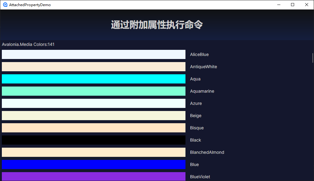
运行图

 浙公网安备 33010602011771号