

CSS
CSS,层叠样式表 cascading style sheets ,可以美化HTML语言,并显示HTML不可描述的效果,定义HTML元素
一、CSS与HTML结合方式
- 内联方式 在开始标签里设置style,只能对一个开始标签设置
- 内部样式表: 在head和body中间添加style属性,设置 选择器 {属性:值;属性:值} ,只能在本页面内设置,注释用/*注释文本*/
- 外部样式表
- link方式: <link href="xxx" rel="stylesheet">
- @import方式+URL
- 外部导入css使用<link>与@import的区别
- 加载顺序不同:@import方式导入会先加载html,再导入css样式,如果网络条件不好,就会先看到没有修饰的页面,再看到修饰后的页面; 如果使用link方式,它会先加载样式表,也就是说,我们看到的直接就是修饰的页面
- @import方式导入css样式,不支持javascript的动态修改的。而link支持。
- 加载顺序不同:@import方式导入会先加载html,再导入css样式,如果网络条件不好,就会先看到没有修饰的页面,再看到修饰后的页面; 如果使用link方式,它会先加载样式表,也就是说,我们看到的直接就是修饰的页面
- 优先级: 内联>内部>外部 ,就近原则
<!DOCTYPE html>
<html lang="en">
<head>
    <meta charset="UTF-8">
    <meta name="viewport" content="width=device-width, initial-scale=1.0">
    <meta http-equiv="X-UA-Compatible" content="ie=edge">
    <title>Document</title>
    <!-- 3.1外部link方式加载样式表--> <!--3.2  @import 'css/01test2.css'-->
    <link rel="stylesheet" href="css/01test.css">
</head>
    <!-- 2. 内部样式表-->
    <style>
        h3{
            color:aqua
        }
    </style>
<body>
    <!-- 1. 内联方式-->
    <h1 style="color:#c30">我爱你中国</h1>
    <h2>我爱你中国</h2>
    <h3>i love you </h3>
</body>
</html>
二、CSS使用
1. 选择器
- 元素(标签选择器): 直接选择标签,元素
- 类选择器: 将标签设置类名, .类名 选定类名下的标签
- id选择器: 给标签设置唯一属性ID, #id 选定ID下的标签, ID不能以数字开头
<!DOCTYPE html>
<html lang="en">
<head>
    <meta charset="UTF-8">
    <meta name="viewport" content="width=device-width, initial-scale=1.0">
    <meta http-equiv="X-UA-Compatible" content="ie=edge">
    <title>Document</title>
</head>
<style>
  h1{
      color: darkseagreen
  }
  .a{
      color:darkturquoise
  }
  #a12{
      color:rebeccapurple
  }
</style>
<body>
    <h1 >hello</h1>
    <h1 class="a">hello</h1>
    <h1 id="a12">hello</h1>
</body>
</html>
2. 选择器组
一组相同的标签用同种修饰方式,选用逗号拼接,共用一种修饰方式
<!DOCTYPE html>
<html lang="en">
<head>
    <meta charset="UTF-8">
    <meta name="viewport" content="width=device-width, initial-scale=1.0">
    <meta http-equiv="X-UA-Compatible" content="ie=edge">
    <title>Document</title>
</head>
<style>
    .a, .c, #b{
        color: brown
    }
</style>
<body>
    <h1 class="a">hello</h1>
    <h1 id="b">hello</h1>
    <h1 class="c">hello</h1>
</body>
</html>
3. 派生选择器
- 子代派生器: 大于符号
- 后代派生器: 空格
<!DOCTYPE html>
<html lang="en">
<head>
    <meta charset="UTF-8">
    <meta name="viewport" content="width=device-width, initial-scale=1.0">
    <meta http-equiv="X-UA-Compatible" content="ie=edge">
    <title>Document</title>
</head>
<style>
    div p{color: brown} /*后代派生器,所有的p都变为brown颜色*/
    div >p{color: yellow;}  /*子代派生器,子级p都变为yellow颜色,只有一级*/

</style>
<body>
    <!--相当于div有p1,p2,span-->
    <!-- span有p3,p4-->
    <div>
        <p>1hello</p>
        <p>2hello</p>
        <span>
            <p>3hello</p>
            <p>4hello</p>
        </span>
    </div>
</body>
</html>
4. 伪类
伪类用于对选择器加一些特殊的效果,伪类的属性列表摆放遵循爱恨原则
- link: 向未被访问的链接添加样式
- visited: 向已访问的链接添加样式
- hover:悬停改变样式
- active:单击激活,不松手,向激活的元素添加样式
- first-child: 向元素种类的第一个元素添加样式
<style>
    /*未访问的链接*/
    a:link{
        font-size: 30px;
        color:orange
    }
     /*已访问的链接*/
    a:visited{
        color:red
    }
     /*悬停样式*/
    a:hover{
        color: green
    }
     /*激活样式*/
    a:active{
        color: blueviolet;
        font-size: 60px
    }
     /*第一个元素*/
    li:first-child{
        color: brown
    }
</style>
5. 文字属性
- font-family 字体
- font-size 字体大小,可以用像素px,也可以用倍数 em
- font-weight:bold/normal 加粗/正常
- color:value 字体颜色
- text-align 文本对齐格式
- text-decoration: underline/none 下划线
- line-height: 行高
- text-indent:value(em) 首行缩进
<!DOCTYPE html>
<html lang="en">
<head>
    <meta charset="UTF-8">
    <meta name="viewport" content="width=device-width, initial-scale=1.0">
    <meta http-equiv="X-UA-Compatible" content="ie=edge">
    <title>Document</title>
</head>
<style>
    .title{
        font-family: "隶书";  /*字体*/
        font-size: 3em;/*字体大小*/
        font-weight:bold;/*字体加粗*/
        color:red;/*字体颜色*/
        text-align: center;/*居中*/
        line-height: 30px;/*行高*/
        text-decoration: underline;/*下划线*/
    }
   .author{
       text-align: right;/*向右对齐*/

   }
   #para{
       text-indent: 2em/*首行缩进2个字符*/
   }
</style>
<body>
    <p class="title">我爱你中国</p>
    <p class="author">作者:rf</p>
    <p id="para">五十六个民族,五十六只花</p>
    <p id="spara">五十六个兄弟姐妹是一家</p>
</body>
</html>
6. 背景属性
- 背景大小 width,height
- 背景颜色 background-color
- 背景图片 background-image:url()
- 背景平铺 background-repeat: no-repeat不平铺, repeat-x横向平铺 , repeat-y纵向平铺, 默认全平铺
- 背景位置 background-position:xx px xxpx; 第一个是x轴,第二个是y轴,数值可以为负
- 背景固定 background-attachment: 默认值是 scroll:默认情况下,背景会随文档滚动 ;可取值为 fixed:背景图像固定,并不会随着页面的其余部分滚动,常用于实现称为水印的图像
<!DOCTYPE html>
<html lang="en">
<head>
    <meta charset="UTF-8">
    <meta name="viewport" content="width=device-width, initial-scale=1.0">
    <meta http-equiv="X-UA-Compatible" content="ie=edge">
    <title>Document</title>
</head>
<style>
    div{
        width: 1000px; height: 800px;
        background-color:orangered;
        background-image: url("img/t0159c04f0aa743088a.jpg");
        background-repeat: no-repeat;
        background-position:100px,100px;
        background-attachment: fixed;
    }
</style>
<body>
    <div>
        <h1>hello </h1>
        <h1>hello </h1>
        <h1>hello </h1>
        <h1>hello </h1>
        <h1>hello </h1>
        <h1>hello </h1>
        <h1>hello </h1>
        <h1>hello </h1>
        <h1>hello </h1>
        <h1>hello </h1>
        <h1>hello </h1>
        <h1>hello </h1>
    </div>
</body>
</html>
7. 列表属性
css可以用图片作为列表项
- 有序列表
- decimal:标记是数字。
- decimal-leading-zero:0开头的数字标记。(01, 02, 03, 等。)
- lower-roman:小写罗马数字(i, ii, iii, iv, v, 等。)
- upper-roman:大写罗马数字(I, II, III, IV, V, 等。)
- lower-alpha:小写英文字母The marker is lower-alpha (a, b, c, d, e,等。)
- upper-alpha:大写英文字母The marker is upper-alpha (A, B, C, D, E,等。)
- 无序列表
- none:无标记。(去除标记)disc:默认。标记是实心圆。
- circle:标记是空心圆。
- square:标记是实心方块。
- list-style-image:自定义图片标记
<!DOCTYPE html>
<html lang="en">
<head>
    <meta charset="UTF-8">
    <meta name="viewport" content="width=device-width, initial-scale=1.0">
    <meta http-equiv="X-UA-Compatible" content="ie=edge">
    <title>Document</title>
</head>
<style>
 .a{
     list-style: square;
 }
 .b{
     list-style-image: url(img/t0159c04f0aa743088a.jpg)
 }
 .c{list-style: circle;}
.d{
    list-style: upper-alpha;
}
.e{
    list-style: lower-roman;
}
.f{
    list-style: decimal;
}
.g{
    list-style: decimal-leading-zero;
}
</style>
<body>
    <ul class="a">
        <li>amy</li>
        <li>大明</li>
        <li>sam</li>
    </ul>
    <ul class="b">
        <li>amy</li>
        <li>大明</li>
        <li>sam</li>
    </ul>
    <ul class="c">
        <li>amy</li>
        <li>大明</li>
        <li>sam</li>
    </ul>
    <ol class="d">
        <li>amy</li>
        <li>大明</li>
        <li>sam</li>
    </ol>
    <ol class="e">
        <li>amy</li>
        <li>大明</li>
        <li>sam</li>
    </ol>
    <ol class="f">
        <li>amy</li>
        <li>大明</li>
        <li>sam</li>
    </ol>
    <ol class="g">
            <li>amy</li>
            <li>大明</li>
            <li>sam</li>
        </ol>
</body>
</html>
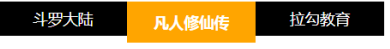
<!DOCTYPE html>
<html lang="en">
<head>
    <meta charset="UTF-8">
    <meta name="viewport" content="width=device-width, initial-scale=1.0">
    <meta http-equiv="X-UA-Compatible" content="ie=edge">
    <title>导航条</title>
</head>
<style>
    li{
        list-style: none;
        color: white;
        background-color: black;
        width: 150px;
        font-size: 1.3em;
        float: left; /*纵向变水平*/
        text-align: center;
        line-height: 40px;
    }
    li:hover{
        font-size: 1.5em;
        background-color: orange;
        line-height: 50px;
        cursor: pointer; /*鼠标形状*/
    }
</style>
<body>
    <ul>
        <li>斗罗大陆</li>
        <li>凡人修仙传</li>
        <li>拉勾教育</li>
    </ul>
</body>
</html>
8. 边框与轮廓属性
css可以给指定元素添加边框和轮廓,边框包裹内容,轮廓包裹边框
- 边框 border :围绕元素内容和内边距的一条或多条线
- 设置边框格式 border-style : 默认无边框,dotted实心点 ;dashed虚线; solid 实线; double双线; groove 3d沟槽; ridge 3d脊边框; inset 3d嵌入边框 ;outset 3d突出边框
- 设置边框颜色 border-color
- 设置边框单边宽度,样式 border-top/bottom/left/right-width/style/color
- 设置所有边宽度 border-width
- 简写 border: 宽度 样式 颜色
- 轮廓 outline:绘制于元素周围的一条线,位于边框边缘的外围,可起到突出元素的作用
- 简写 outline: 宽度 样式 颜色
<!DOCTYPE html>
<html lang="en">
<head>
    <meta charset="UTF-8">
    <meta name="viewport" content="width=device-width, initial-scale=1.0">
    <meta http-equiv="X-UA-Compatible" content="ie=edge">
    <title>Document</title>
</head>
<style>
    div{
        width: 100px;
        height: 30px;
    }
    .b1{
        border:20px none red;
    }
    .b2{
        border:20px dotted red;
    }

    .b3{
        border:10px dashed red;
    }
    .b4{
        border:20px solid red;
    }
    .b5{
        border:20px double red;
    }
    .b6{
        border:20px groove red;
    }
    .b7{
        border:20px ridge red;
    }
    .b8{
        border:20px inset red;
    }
    .b9{
        border:20px outset red;
        outline: 5px blue solid;
    }
    .b10{
        border-top-width:10px;
        border-style: solid;
        border-left-color: aqua;
        border-right-style: dotted;
        border-bottom:5px red dashed;
    }
</style>
<body>
    <div class="b1">默认无边框</div> <br>
    <div class="b2">点</div> <br>
    <div class="b3">虚线</div> <br>
    <div class="b4">实线</div> <br>
    <div class="b5">double</div> <br>
    <div class="b6">3d沟槽</div> <br>
    <div class="b7">3d脊边框</div> <br>
    <div class="b8">嵌入</div> <br>
    <div class="b9">突出</div> <br>
    <div class="b10"></div> <br>
    <div class="b11"></div> <br>
    <div class="b12"></div> <br>
    <div class="b13"></div> <br>

</body>
</html>
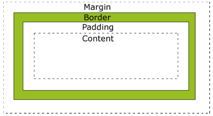
- 盒子模型:在CSS中,"box model"这一术语是用来设计和布局时使用,边距,边框,填充,和实际内容。盒子模型允许我们在其它元素和周围元素边框之间的空间放置元素。
![]()
<!DOCTYPE html>
<html lang="en">
<head>
    <meta charset="UTF-8">
    <meta name="viewport" content="width=device-width, initial-scale=1.0">
    <meta http-equiv="X-UA-Compatible" content="ie=edge">
    <title>Document</title>
</head>
<style>
div{
    width: 500px;
    height:400px;
    border: 10px red solid;  /*边框*/
    margin-top: 100px; /*外边距*/
    margin-left: 50px;
    padding-top: 20px;  /*边框内边距*/
    padding-left: 30px;

}</style>
<body>
    <div> <img src="img/t0159c04f0aa743088a.jpg" > </div>

</body>
</html>
10. 定位
- 默认定位
- 块级元素,h1/ul/li/p/div等,自上而下,垂直分布,可以改变宽高值
- 行内元素, span/a/b 不换行,不可以改变宽高,需要用display: inline-block;转成行内块元素
- 行内块元素,input/img,从左到右水平排列自动换行,可以改变宽高值
- 浮动定位
- float: left /right/none 向左或向右浮动或不浮动,消除块级的换行
- 相对定位 position:relative; 再自定义四个方向上与原位置的偏移量
- 绝对定位 position:absolute; 再自定义四个方向上与父级的偏移量;确定父级位置找父级,无父级位置往上级找,找不到默认父级为body
- 固定定位 position:fixed;再自定义四个方向上的偏移量
<!DOCTYPE html>
<html lang="en">
<head>
    <meta charset="UTF-8">
    <meta name="viewport" content="width=device-width, initial-scale=1.0">
    <meta http-equiv="X-UA-Compatible" content="ie=edge">
    <title>Document</title>
</head>
<style>
    /*默认定位*/
.a{
    width: 100px;
    height: 100px;
    background-color: aqua;
    border: 2px solid black;
    margin:10px;
}
span{
    width: 100px;
    height: 100px;
    background-color: pink;
    border:2px solid black;
}
.la{
    width: 100px;
    height: 100px;
    border:2px solid black;
    background-color: pink;
    display: inline-block;
}
input{
    width: 100px;
    height: 100px;
    background-color: yellow;
    border:2px solid black;
}

/*浮动定位*/
.b{
    width:200px;
    height:200px;
    border: 2px solid black;
    margin: 20px;
}
.b1,.b2{
  width: 50px;
  height: 50px;
  border:2px black solid;
  margin: 20px;
}
.b1{
    background: red;
    float: left;
}
.b2{
    background: blue;
    float: right;
}
/*相对定位*/
.c{
    width:200px;
    height:200px;
    border: 2px solid black;
    margin: 20px;
}
.c1,.c2,.c3{
  width: 20px;
  height: 20px;
  border:2px black solid;
}
.c1{
    background: palevioletred;
}
.c2{
    background: darkcyan;
    position: relative;
    top:10px;
    left:10px;
}
.c3{
    background: chocolate;
}

/*绝对定位*/
.grandfa{
    width:150px;
    height:150px;
    background: olive;
    margin: 20px;
    padding: 20px;
    /* position: relative;   爸爸没定位就上升到爷爷*/
    /*爷爷没定位就上升到body*/
}
.father{
    width:100px;
    height:100px;
    background: black;
    padding: 20px;
    position: relative;
}
.d1,.d2,.d3{
  width: 20px;
  height: 20px;
  border:2px black solid;
}
.d1{
    background: palevioletred;
    position: absolute;
    top:50px;
    left:50px;
}
.d2{
    background: darkcyan;
}
.d3{
    background: chocolate;
}
/*固定定位*/
.e{
    width:50px;
    height: 50px;
    background: green;
    position: fixed;
    top: 50px;
    right: 50px;
}
</style>
<body>
    <!--默认定位-->
    <div class="a">hello </div>
    <span>lagou </span>
    <span>lagou </span>
    <span class="la">lagou </span>
    <input type="text"> <br>
    <!--浮动定位-->
    <div class="b">
        <div class="b1"></div>
        <div class="b2"></div>
    </div>
    <!--相对定位-->
    <div class="c">
        <div class="c1"></div>
        <div class="c2"></div>
        <div class="c3"></div>
    </div>
    <!--绝对定位-->
    <div class="grandfa">
        <div class="father">
            <div class="d1"></div>
            <div class="d2"></div>
            <div class="d3"></div>
        </div>
    </div>
     <!--固定定位-->
     <div class="e">你好</div>

</body>
</html>
11. z轴属性
- z轴属性用于重叠元素的摆放位置,z值大摆放的越上面,z-index必须与相对位置或绝对定位结合使用,数值没有要求
<!DOCTYPE html>
<html lang="en">
<head>
    <meta charset="UTF-8">
    <meta name="viewport" content="width=device-width, initial-scale=1.0">
    <meta http-equiv="X-UA-Compatible" content="ie=edge">
    <title>Document</title>
</head>
<style>
.head{
    width: 200px;
    height:200px;
    border: 2px black solid;
}
.a,.b{
    width: 100px;
    height:50px;
}
.a{
    background: red;
    position: relative;
    z-index: 2;
}
.b{
    background: blue;
    position: relative;
    top: -20px;
    left: 20px;
    z-index: 1;
}
</style>
<body>
    <div class="head">
        <div class="a"></div>
        <div class="b"></div>
    </div>
</body>
</html>
12.CSS3样式
- 圆角
- border-radius:左上 右上 右下 左下;
- border-radius:四个角;
- border-radius:50%; 圆形
- 阴影
- box-shadow:1 2 3 4 5; 1:水平偏移 2:垂直偏移 3:模糊半径 4:扩张半径 5:颜色 ,可以写多个颜色
- box-shadow:1 2 3 4 5; 1:水平偏移 2:垂直偏移 3:模糊半径 4:扩张半径 5:颜色 ,可以写多个颜色
- 渐变
- 线性渐变 background:linear-gradient([方向/角度],颜色列表) 方向加to,角度加deg,从左下角算起,以逗号隔开
- 径向渐变background: radial-gradient(颜色列表) ,以圆形式渐变
<!DOCTYPE html>
<html lang="en">
<head>
    <meta charset="UTF-8">
    <meta name="viewport" content="width=device-width, initial-scale=1.0">
    <meta http-equiv="X-UA-Compatible" content="ie=edge">
    <title>Document</title>
</head>
<style>
/*圆角*/
.a{
    width: 50px;
    height: 50px;
    background: red;
    border-radius: 0px 10px 20px 50px;
    margin: 10px;
}
.b{
    width: 50px;
    height: 50px;
    background: red;
    border-radius: 20px;
    margin:10px;
}
.c{
    width: 50px;
    height: 50px;
    background: red;
    border-radius: 30%;
    margin: 10px;
}
.d{
    width: 50px;
    height: 50px;
    background: red;
    border-radius: 50%;
    margin:10px;
}
/*盒子阴影*/
.e{
    width: 50px;
    height: 50px;
    background: red;
    margin:10px;
    box-shadow:10px 10px 50px 10px black
    /*1.水平距离  2.垂直距离  3.模糊半径 4.阴影范围  5. 阴影颜色 */
}
.f{
    width: 50px;
    height: 50px;
    background: red;
    margin:10px;
    box-shadow:0px 0px 5px 10px blue
}
/*线性渐变*/
.g{
    width: 50px;
    height: 50px;
    background: red;
    margin:10px;
    background: linear-gradient(red, black,green,pink)
}
.h{
    width: 50px;
    height: 50px;
    background: red;
    margin:10px;
    background: linear-gradient(to left top ,red, black,green,pink)
}
.i{
    width: 50px;
    height: 50px;
    background: red;
    margin:10px;
    background: linear-gradient(50deg ,red, black,green,pink)
}
/*径向渐变*/
.j{
    width: 50px;
    height: 50px;
    background: red;
    margin:10px;
    background: radial-gradient(red, black,green,pink)
}
.k{
    width: 50px;
    height: 50px;
    background: red;
    margin:10px;
    border-radius: 50%;
    background: radial-gradient(red, black,green,pink)
}

</style>
<body>
    <div class="a"></div>
    <div class="b"></div>
    <div class="c"></div>
    <div class="d"></div>
    <div class="e"></div>
    <div class="f"></div>
    <div class="g"></div>
    <div class="h"></div>
    <div class="i"></div>
    <div class="j"></div>
    <div class="k"></div>
</body>
</html>
- 背景
- 位置 background-origin:指定了背景图像的位置区域
- border-box : 背景贴边框的边
- padding-box : 背景贴内边框的边
- content-box : 背景贴内容的边
- 裁切 background-clip:
- border-box 边框开切,背景在边框下,
- padding-box 内边距开切,背景贴合边框,
- content-box 内容开切,背景贴着内边距
- 大小 background-size:
- contain(完全适应)
- cover(完全覆盖)
- 位置 background-origin:指定了背景图像的位置区域
<!DOCTYPE html>
<html lang="en">
<head>
    <meta charset="UTF-8">
    <meta name="viewport" content="width=device-width, initial-scale=1.0">
    <meta http-equiv="X-UA-Compatible" content="ie=edge">
    <title>Document</title>
</head>
<style>
/*背景位置*/
div{
    width:100px;
    height:100px;
    background-image: url(img/t01f59fe896bc74d125.jpg);
    margin:10px;
    padding: 10px;
    border:5px orange dashed;
    background-repeat: no-repeat;
}
.a{
    background-origin: border-box;
}
.b{
    background-origin: padding-box;
}
.c{
    background-origin: content-box;
}
/*背景剪切*/
.e,.f,.g{
    width:100px;
    height:100px;
    background:pink;
    margin:10px;
    padding: 10px;
    border:5px orange dashed;
}
.e{
    background-clip: border-box;
}
.f{
    background-clip: padding-box;
}
.g{
    background-clip: content-box;
}
/*背景覆盖大小*/
.h,.i{
    width:100px;
    height:100px;
    background-image: url(img/t017e6730377e3c2003.jpg);
    margin:10px;
    padding: 10px;
    border:5px orange dashed;
}
.h{
    background-size: cover;
}
.i{background-size: contain;}
</style>
<body>
    <div class="a"></div>外边框
    <div class="b"></div>内边框
    <div class="c"></div>内容
    <div class="e"></div>外边框剪切
    <div class="f"></div>内边框剪切
    <div class="g"></div>内容剪切
    <div class="h"></div>完全覆盖
    <div class="i"></div>完全适应
</body>
</html>
- 过渡:不能控制时间点,一种过渡的变化过程 transition{1 2 3 4}
- 1:过渡或动画模拟的css属性,必须是CSS3里有的属性
- 2:完成过渡所使用的时间
- 3:过渡函数 : 匀速linear 逐渐慢下来ease 加速ease-in 减速 ease-out 先加速后减速 ease-in-out
- 4:过渡开始出现的延迟时间
<!DOCTYPE html>
<html lang="en">
<head>
    <meta charset="UTF-8">
    <meta name="viewport" content="width=device-width, initial-scale=1.0">
    <meta http-equiv="X-UA-Compatible" content="ie=edge">
    <title>Document</title>
</head>
<style>
div{
    width:100px;
    height: 50px;
    border: 5px red solid;
    margin: 10px;
}
.a{
    transition:width 2s linear 1s;
}
.a:hover{
    width:200px;
}
.b{transition: background-color 3s ease-in-out 1s;}
.b:hover{
    background:blue;
}
.c{transition: font-weight 3s ease 1s;}
.c:hover{
    font-weight: bold;
}
.d{transition:font-size 2s ease 1s;}
.d:hover{
    font-size: 1.25em;
}
</style>
<body>
    <div class="a">hello</div>
    <div class="b">hello</div>
    <div class="c">hello</div>
    <div class="d">hello</div>
</body>
</html>
- 动画:可以控制变化的时间点和动作
- 关键帧:@keyframes 动画帧 { from{} to{} } 或者{ 0%{} 20%{}... }
- 动画属性:animation:1 2 3 4 5
- 1:动画帧 @keyframes 动画帧的名字
- 2:执行时间
- 3:过渡函数: 匀速linear 逐渐慢下来ease 加速ease-in 减速 ease-out 先加速后减速 ease-in-out
- 4:动画执行的延迟(可省略)
- 5:动画执行的次数 infinite 无限次,alternate 来回循环
<!DOCTYPE html>
<html lang="en">
<head>
    <meta charset="UTF-8">
    <meta name="viewport" content="width=device-width, initial-scale=1.0">
    <meta http-equiv="X-UA-Compatible" content="ie=edge">
    <title>Document</title>
</head>
<style>
.all,.out{
    width:600px;
    height: 300px;
    border: 5px red solid;
}
@keyframes x{
   from{ margin-left: 0px;}
   to{ margin-left: 500px;}
}
img{
    animation:x 3s linear 1s 2;
}

@keyframes y{
    0%{margin-left: 0px; }
    25%{background: red;}
    50%{background: yellow;}
    75%{background: blue;}
    100%{background: green; margin-left: 500px;}
}
.in{
    width: 50px;
    height: 50px;
    background: palegoldenrod;
}
.in{
    animation: y 2s linear infinite alternate;
}

</style>
<body>
    <!--一个 元素从左向右移动,3秒内执行2次-->
    <div class="all">
        <img src="img/t0159c04f0aa743088a.jpg" >
    </div>
    <!--一个 元素从左向右移动,3秒内执行完成。无限次交替执行-->
    <div class="out">
       <div class="in">hello</div>
    </div>
</body>
</html>

 浙公网安备 33010602011771号