
Pandas高级教程之:plot画图详解
简介
python中matplotlib是非常重要并且方便的图形化工具,使用matplotlib可以可视化的进行数据分析,今天本文将会详细讲解Pandas中的matplotlib应用。
基础画图
要想使用matplotlib,我们需要引用它:
In [1]: import matplotlib.pyplot as plt
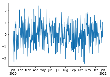
假如我们要从2020年1月1日开始,随机生成365天的数据,然后作图表示应该这样写:
ts = pd.Series(np.random.randn(365), index=pd.date_range("1/1/2020", periods=365))

ts.plot()
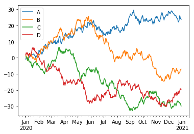
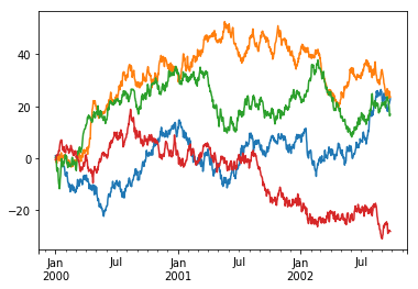
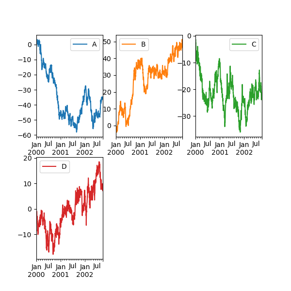
使用DF可以同时画多个Series的图像:
df3 =  pd.DataFrame(np.random.randn(365, 4), index=ts.index, columns=list("ABCD"))

 df3= df3.cumsum()

df3.plot()
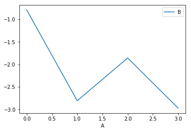
可以指定行和列使用的数据:
df3 = pd.DataFrame(np.random.randn(365, 2), columns=["B", "C"]).cumsum()

df3["A"] = pd.Series(list(range(len(df))))

df3.plot(x="A", y="B");
其他图像
plot() 支持很多图像类型,包括bar, hist, box, density, area, scatter, hexbin, pie等,下面我们分别举例子来看下怎么使用。
bar
df.iloc[5].plot(kind="bar");

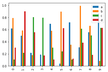
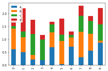
多个列的bar:
df2 = pd.DataFrame(np.random.rand(10, 4), columns=["a", "b", "c", "d"])

df2.plot.bar();
stacked bar
df2.plot.bar(stacked=True);
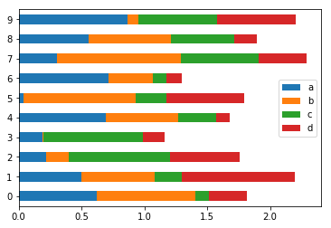
barh
barh 表示横向的bar图:
df2.plot.barh(stacked=True);
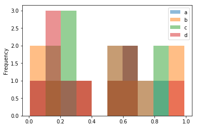
Histograms
df2.plot.hist(alpha=0.5);
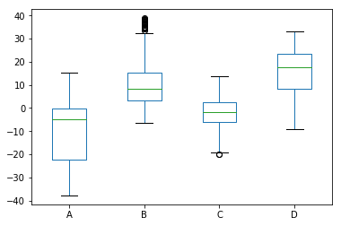
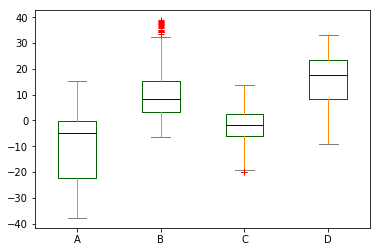
box
df.plot.box();
box可以自定义颜色:
color = {
   ....:     "boxes": "DarkGreen",
   ....:     "whiskers": "DarkOrange",
   ....:     "medians": "DarkBlue",
   ....:     "caps": "Gray",
   ....: }

df.plot.box(color=color, sym="r+");
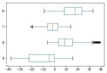
可以转成横向的:
df.plot.box(vert=False);
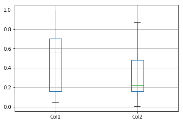
除了box,还可以使用DataFrame.boxplot来画box图:
In [42]: df = pd.DataFrame(np.random.rand(10, 5))

In [44]: bp = df.boxplot()

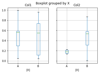
boxplot可以使用by来进行分组:
df = pd.DataFrame(np.random.rand(10, 2), columns=["Col1", "Col2"])

df
Out[90]:
       Col1      Col2
0  0.047633  0.150047
1  0.296385  0.212826
2  0.562141  0.136243
3  0.997786  0.224560
4  0.585457  0.178914
5  0.551201  0.867102
6  0.740142  0.003872
7  0.959130  0.581506
8  0.114489  0.534242
9  0.042882  0.314845

df.boxplot()
现在给df加一列:
 df["X"] = pd.Series(["A", "A", "A", "A", "A", "B", "B", "B", "B", "B"])

df
Out[92]:
       Col1      Col2  X
0  0.047633  0.150047  A
1  0.296385  0.212826  A
2  0.562141  0.136243  A
3  0.997786  0.224560  A
4  0.585457  0.178914  A
5  0.551201  0.867102  B
6  0.740142  0.003872  B
7  0.959130  0.581506  B
8  0.114489  0.534242  B
9  0.042882  0.314845  B

bp = df.boxplot(by="X")
Area
使用 Series.plot.area() 或者 DataFrame.plot.area() 可以画出area图。
In [60]: df = pd.DataFrame(np.random.rand(10, 4), columns=["a", "b", "c", "d"])

In [61]: df.plot.area();
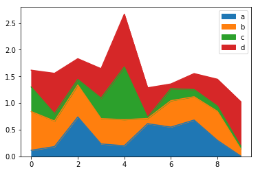
如果不想叠加,可以指定stacked=False
In [62]: df.plot.area(stacked=False);

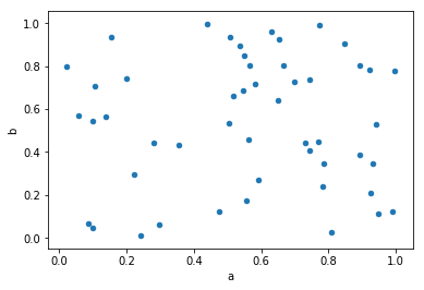
Scatter
DataFrame.plot.scatter() 可以创建点图。
In [63]: df = pd.DataFrame(np.random.rand(50, 4), columns=["a", "b", "c", "d"])

In [64]: df.plot.scatter(x="a", y="b");
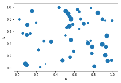
scatter图还可以带第三个轴:
df.plot.scatter(x="a", y="b", c="c", s=50);

可以将第三个参数变为散点的大小:
df.plot.scatter(x="a", y="b", s=df["c"] * 200);
Hexagonal bin
使用 DataFrame.plot.hexbin() 可以创建蜂窝图:
In [69]: df = pd.DataFrame(np.random.randn(1000, 2), columns=["a", "b"])

In [70]: df["b"] = df["b"] + np.arange(1000)

In [71]: df.plot.hexbin(x="a", y="b", gridsize=25);
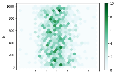
默认情况下颜色深度表示的是(x,y)中元素的个数,可以通过reduce_C_function来指定不同的聚合方法:比如 mean, max, sum, std.
In [72]: df = pd.DataFrame(np.random.randn(1000, 2), columns=["a", "b"])

In [73]: df["b"] = df["b"] = df["b"] + np.arange(1000)

In [74]: df["z"] = np.random.uniform(0, 3, 1000)

In [75]: df.plot.hexbin(x="a", y="b", C="z", reduce_C_function=np.max, gridsize=25);

Pie
使用 DataFrame.plot.pie() 或者 Series.plot.pie()来构建饼图:
In [76]: series = pd.Series(3 * np.random.rand(4), index=["a", "b", "c", "d"], name="series")

In [77]: series.plot.pie(figsize=(6, 6));

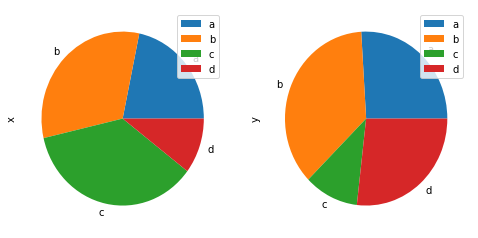
可以按照列的个数分别作图:
In [78]: df = pd.DataFrame(
   ....:     3 * np.random.rand(4, 2), index=["a", "b", "c", "d"], columns=["x", "y"]
   ....: )
   ....:

In [79]: df.plot.pie(subplots=True, figsize=(8, 4));
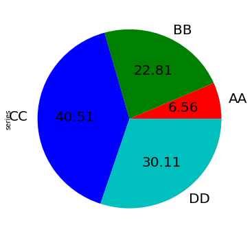
更多定制化的内容:
In [80]: series.plot.pie(
   ....:     labels=["AA", "BB", "CC", "DD"],
   ....:     colors=["r", "g", "b", "c"],
   ....:     autopct="%.2f",
   ....:     fontsize=20,
   ....:     figsize=(6, 6),
   ....: );
如果传入的value值加起来不是1,那么会画出一个伞形:
In [81]: series = pd.Series([0.1] * 4, index=["a", "b", "c", "d"], name="series2")

In [82]: series.plot.pie(figsize=(6, 6));

在画图中处理NaN数据
下面是默认画图方式中处理NaN数据的方式:
| 画图方式 | 处理NaN的方式 |
|---|---|
| Line | Leave gaps at NaNs |
| Line (stacked) | Fill 0’s |
| Bar | Fill 0’s |
| Scatter | Drop NaNs |
| Histogram | Drop NaNs (column-wise) |
| Box | Drop NaNs (column-wise) |
| Area | Fill 0’s |
| KDE | Drop NaNs (column-wise) |
| Hexbin | Drop NaNs |
| Pie | Fill 0’s |
其他作图工具
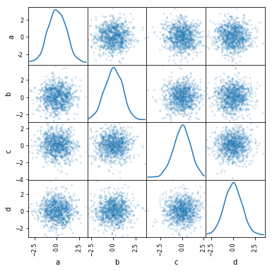
散点矩阵图Scatter matrix
可以使用pandas.plotting中的scatter_matrix来画散点矩阵图:
In [83]: from pandas.plotting import scatter_matrix

In [84]: df = pd.DataFrame(np.random.randn(1000, 4), columns=["a", "b", "c", "d"])

In [85]: scatter_matrix(df, alpha=0.2, figsize=(6, 6), diagonal="kde");
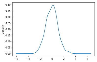
密度图Density plot
使用 Series.plot.kde() 和 DataFrame.plot.kde() 可以画出密度图:
In [86]: ser = pd.Series(np.random.randn(1000))

In [87]: ser.plot.kde();
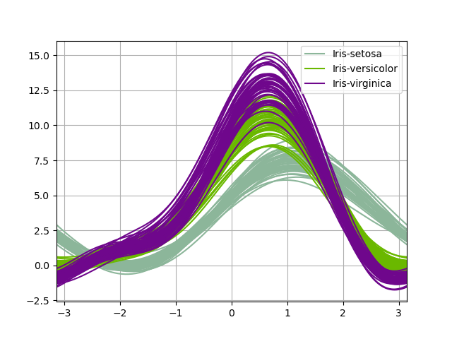
安德鲁斯曲线Andrews curves
安德鲁斯曲线允许将多元数据绘制为大量曲线,这些曲线是使用样本的属性作为傅里叶级数的系数创建的. 通过为每个类对这些曲线进行不同的着色,可以可视化数据聚类。 属于同一类别的样本的曲线通常会更靠近在一起并形成较大的结构。
In [88]: from pandas.plotting import andrews_curves

In [89]: data = pd.read_csv("data/iris.data")

In [90]: plt.figure();

In [91]: andrews_curves(data, "Name");
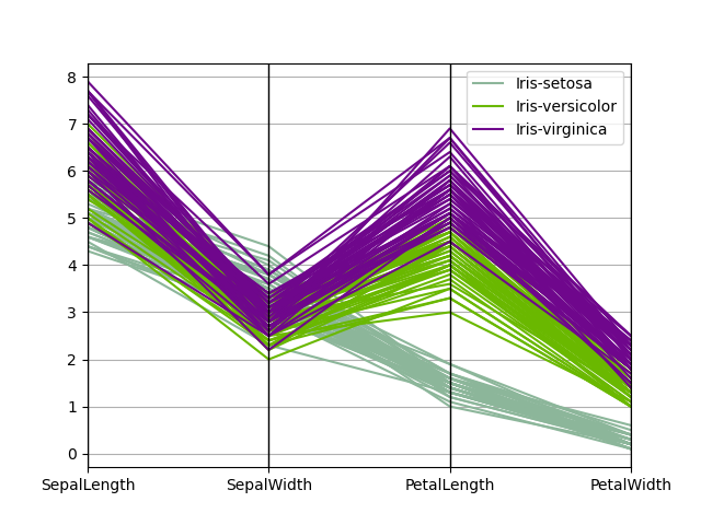
平行坐标Parallel coordinates
平行坐标是一种用于绘制多元数据的绘制技术。 平行坐标允许人们查看数据中的聚类,并直观地估计其他统计信息。 使用平行坐标点表示为连接的线段。 每条垂直线代表一个属性。 一组连接的线段代表一个数据点。 趋于聚集的点将显得更靠近。
In [92]: from pandas.plotting import parallel_coordinates

In [93]: data = pd.read_csv("data/iris.data")

In [94]: plt.figure();

In [95]: parallel_coordinates(data, "Name");
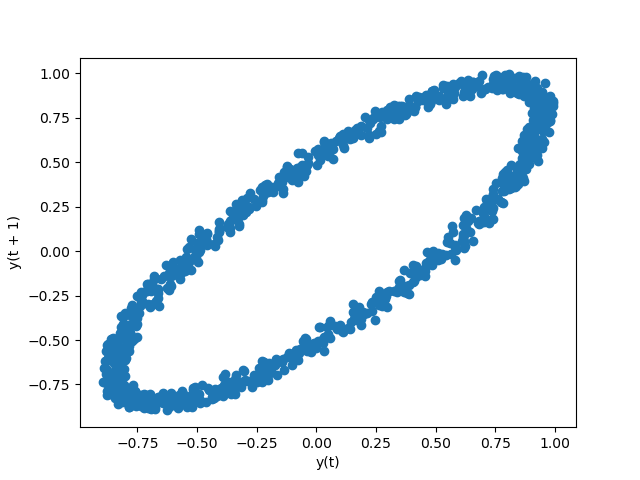
滞后图lag plot
滞后图是用时间序列和相应的滞后阶数序列做出的散点图。可以用于观测自相关性。
In [96]: from pandas.plotting import lag_plot

In [97]: plt.figure();

In [98]: spacing = np.linspace(-99 * np.pi, 99 * np.pi, num=1000)

In [99]: data = pd.Series(0.1 * np.random.rand(1000) + 0.9 * np.sin(spacing))

In [100]: lag_plot(data);
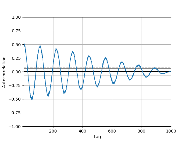
自相关图Autocorrelation plot
自相关图通常用于检查时间序列中的随机性。 自相关图是一个平面二维坐标悬垂线图。横坐标表示延迟阶数,纵坐标表示自相关系数。
In [101]: from pandas.plotting import autocorrelation_plot

In [102]: plt.figure();

In [103]: spacing = np.linspace(-9 * np.pi, 9 * np.pi, num=1000)

In [104]: data = pd.Series(0.7 * np.random.rand(1000) + 0.3 * np.sin(spacing))

In [105]: autocorrelation_plot(data);
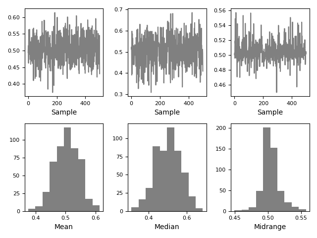
Bootstrap plot
bootstrap plot用于直观地评估统计数据的不确定性,例如均值,中位数,中间范围等。从数据集中选择指定大小的随机子集,为该子集计算出相关统计信息, 重复指定的次数。 生成的图和直方图构成了引导图。
In [106]: from pandas.plotting import bootstrap_plot

In [107]: data = pd.Series(np.random.rand(1000))

In [108]: bootstrap_plot(data, size=50, samples=500, color="grey");
RadViz
他是基于弹簧张力最小化算法。它把数据集的特征映射成二维目标空间单位圆中的一个点,点的位置由系在点上的特征决定。把实例投入圆的中心,特征会朝圆中此实例位置(实例对应的归一化数值)“拉”实例。
In [109]: from pandas.plotting import radviz

In [110]: data = pd.read_csv("data/iris.data")

In [111]: plt.figure();

In [112]: radviz(data, "Name");

图像的格式
matplotlib 1.5版本之后,提供了很多默认的画图设置,可以通过matplotlib.style.use(my_plot_style)来进行设置。
可以通过使用matplotlib.style.available来列出所有可用的style类型:
import matplotlib as plt;

plt.style.available
Out[128]:
['seaborn-dark',
 'seaborn-darkgrid',
 'seaborn-ticks',
 'fivethirtyeight',
 'seaborn-whitegrid',
 'classic',
 '_classic_test',
 'fast',
 'seaborn-talk',
 'seaborn-dark-palette',
 'seaborn-bright',
 'seaborn-pastel',
 'grayscale',
 'seaborn-notebook',
 'ggplot',
 'seaborn-colorblind',
 'seaborn-muted',
 'seaborn',
 'Solarize_Light2',
 'seaborn-paper',
 'bmh',
 'seaborn-white',
 'dark_background',
 'seaborn-poster',
 'seaborn-deep']
去掉小图标
默认情况下画出来的图会有一个表示列类型的图标,可以使用legend=False禁用:
In [115]: df = pd.DataFrame(np.random.randn(1000, 4), index=ts.index, columns=list("ABCD"))

In [116]: df = df.cumsum()

In [117]: df.plot(legend=False);
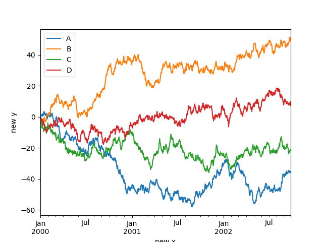
设置label的名字
In [118]: df.plot();

In [119]: df.plot(xlabel="new x", ylabel="new y");
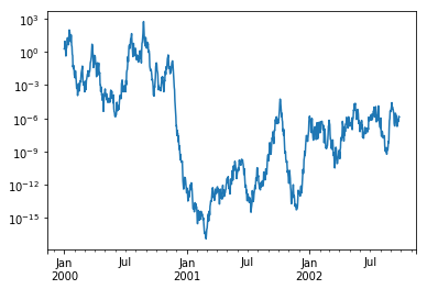
缩放
画图中如果X轴或者Y轴的数据差异过大,可能会导致图像展示不友好,数值小的部分基本上无法展示,可以传入logy=True进行Y轴的缩放:
In [120]: ts = pd.Series(np.random.randn(1000), index=pd.date_range("1/1/2000", periods=1000))

In [121]: ts = np.exp(ts.cumsum())

In [122]: ts.plot(logy=True);
多个Y轴
使用secondary_y=True 可以绘制多个Y轴数据:
In [125]: plt.figure();

In [126]: ax = df.plot(secondary_y=["A", "B"])

In [127]: ax.set_ylabel("CD scale");

In [128]: ax.right_ax.set_ylabel("AB scale");
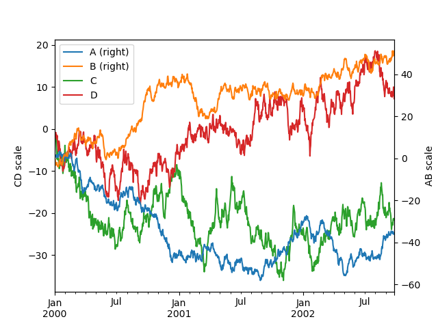
小图标上面默认会添加right字样,想要去掉的话可以设置mark_right=False:
In [129]: plt.figure();

In [130]: df.plot(secondary_y=["A", "B"], mark_right=False);
坐标文字调整
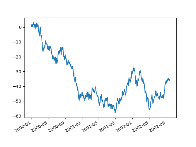
使用时间做坐标的时候,因为时间太长,导致x轴的坐标值显示不完整,可以使用x_compat=True 来进行调整:
In [133]: plt.figure();

In [134]: df["A"].plot(x_compat=True);
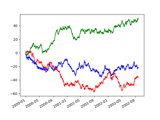
如果有多个图像需要调整,可以使用with:
In [135]: plt.figure();

In [136]: with pd.plotting.plot_params.use("x_compat", True):
   .....:     df["A"].plot(color="r")
   .....:     df["B"].plot(color="g")
   .....:     df["C"].plot(color="b")
   .....:
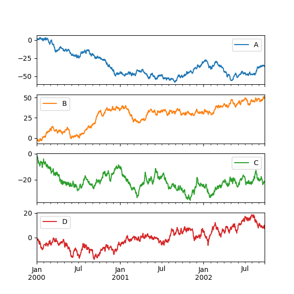
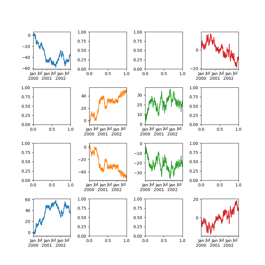
子图
绘制DF的时候,可以将多个Series分开作为子图显示:
In [137]: df.plot(subplots=True, figsize=(6, 6));
可以修改子图的layout:
df.plot(subplots=True, layout=(2, 3), figsize=(6, 6), sharex=False);
上面等价于:
In [139]: df.plot(subplots=True, layout=(2, -1), figsize=(6, 6), sharex=False);
一个更复杂的例子:
In [140]: fig, axes = plt.subplots(4, 4, figsize=(9, 9))

In [141]: plt.subplots_adjust(wspace=0.5, hspace=0.5)

In [142]: target1 = [axes[0][0], axes[1][1], axes[2][2], axes[3][3]]

In [143]: target2 = [axes[3][0], axes[2][1], axes[1][2], axes[0][3]]

In [144]: df.plot(subplots=True, ax=target1, legend=False, sharex=False, sharey=False);

In [145]: (-df).plot(subplots=True, ax=target2, legend=False, sharex=False, sharey=False);
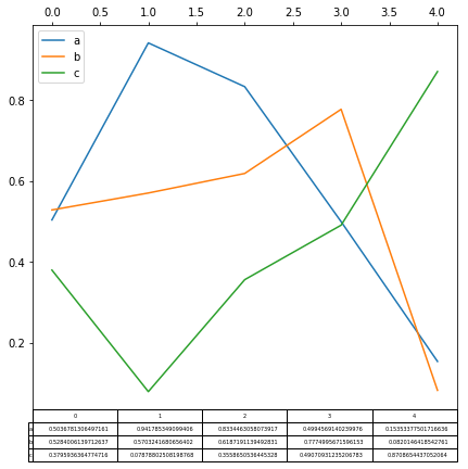
画表格
如果设置table=True , 可以直接将表格数据一并显示在图中:
In [165]: fig, ax = plt.subplots(1, 1, figsize=(7, 6.5))

In [166]: df = pd.DataFrame(np.random.rand(5, 3), columns=["a", "b", "c"])

In [167]: ax.xaxis.tick_top()  # Display x-axis ticks on top.

In [168]: df.plot(table=True, ax=ax)

fig
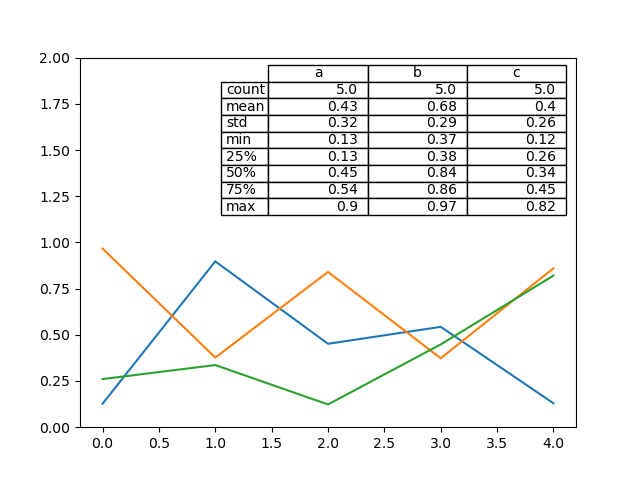
table还可以显示在图片上面:
In [172]: from pandas.plotting import table

In [173]: fig, ax = plt.subplots(1, 1)

In [174]: table(ax, np.round(df.describe(), 2), loc="upper right", colWidths=[0.2, 0.2, 0.2]);

In [175]: df.plot(ax=ax, ylim=(0, 2), legend=None);
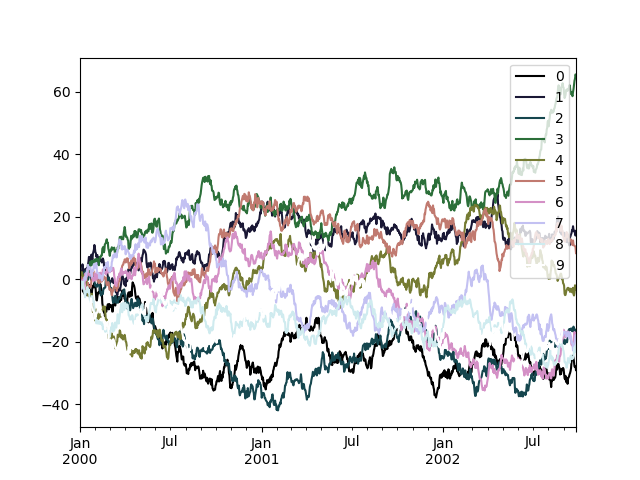
使用Colormaps
如果Y轴的数据太多的话,使用默认的线的颜色可能不好分辨。这种情况下可以传入colormap 。
In [176]: df = pd.DataFrame(np.random.randn(1000, 10), index=ts.index)

In [177]: df = df.cumsum()

In [178]: plt.figure();

In [179]: df.plot(colormap="cubehelix");
本文已收录于 http://www.flydean.com/09-python-pandas-plot/
最通俗的解读,最深刻的干货,最简洁的教程,众多你不知道的小技巧等你来发现!

 浙公网安备 33010602011771号