大二下学期第一次结对作业(第一阶段)
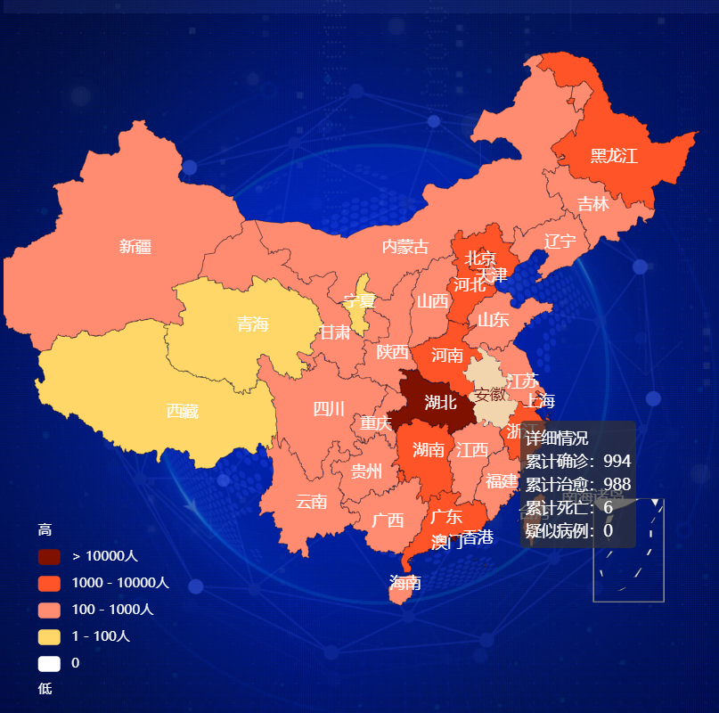
昨日完成了对于各个表的前端与后端数据的连接,今日主要完成了地图话展示个各省的疫情信息。
实现以颜色深浅代表感染人数的多少,鼠标移动到对应的省份,省份会高亮并显示对应的详细信息。
地图的实现较为复杂可以再echarts官网的资源中寻找与自已想要效果相似的,然后进行以下修改。
var map_myChart = echarts.init(document.querySelector(".map .chart"));
        var map_data = [
            { name: "河北", value: 900, value2: 200, value3: 400 }
        ];
        var map_option = {
            tooltip: {
                formatter: function(params, ticket, callback) {
                    return params.seriesName + "<br />" + "累计确诊" + ":" + params.data.value +
                        "<br />" + "累计治愈" + ":" + params.data.value2 + "<br />" + "累计死亡" + ":" + params.data.value3 + "<br />" + "疑似病例:" + 0
                }
            },
            toolbox: { //右边那三个图标
                show: true,
                orient: 'vertical',
                left: 'right',
                top: 'center',
                feature: {
                    dataView: { readOnly: false, title: 'hello', textColor: "#777" },
                    restore: {},
                    saveAsImage: {}
                }
            }, // 提供下载工具
            visualMap: { //左边的图标
                min: 0,
                max: 100000,
                left: 26,
                bottom: 30,
                showLabel: !0,
                text: ["高", "低"],
                textStyle: {
                    fontSize: 12,
                    color: "#fff"
                },
            pieces: [{
                gt: 10000,
                label: "> 10000人",
                color: "#7f1100"
            }, {
                gte: 1000,
                lte: 10000,
                label: "1000 - 10000人",
                color: "#ff5428"
            }, {
                gte: 100,
                lt: 1000,
                label: "100 - 1000人",
                color: "#ff8c71"
            }, {
                gt: 0,
                lt: 100,
                label: "1 - 100人",
                color: "#ffd768"
            }, {
                value: 0,
                color: "#ffffff"
            }],
                show: !0
            },
            grid: [{
                right: '5%',
                top: '20%',
                bottom: '10%',
                width: '20%'
            }, ],
            geo: {
                map: "china",
                // right:'25%',
                // left:'18%',
                center: [105.97, 30.71],
                roam: true,
                scaleLimit: { //通过鼠标控制的缩放
                    min: 1,
                    max: 2
                },
                zoom: 1.1, //当前缩放比例
                top: 120, //组件离容器上方的距离
                label: {
                    normal: {
                        show: !0,
                        fontSize: "14",
                        color: "#fff"
                    }
                },
        //         regions: [{
        //     name: '青海',
        //     label: {
        //         normal: {

        //         }
        //     }
        // }],
                itemStyle: {
                    normal: {
                        //shadowBlur: 50,
                        // shadowColor: 'rgba(0, 0, 0, 0.2)',
                        borderColor: "rgba(0, 0, 0, 0.5)"
                    },
                    emphasis: {
                        areaColor: "#f2d5ad", //鼠标放上去的颜色
                        shadowOffsetX: 0,
                        shadowOffsetY: 0,
                        borderWidth: 0
                    }
                }
            },

            series: [{
                name: "详细情况",
                type: "map",
                geoIndex: 0,
                data: map_data
            }]
            // },
            // {
            //         name: '哈喽喽',
            //         type: 'scatter',
            //         itemStyle: itemStyle,
            //         data: window.dataList
            //     }
            // ]
            };
        map_myChart.setOption(map_option);
        window.addEventListener("resize", function() {
            map_myChart.resize();
        });
 function get_c2_data() {
            $.ajax({
                url: "/c2",
                success: function (data) {
                    map_option.series[0].data=data.data;
                    map_myChart.setOption(map_option);
                },
                error: function (xhr, type, errorThrown) {
                }
            })
        }
@app.route('/c2')
def get_c2_data():
    res=[]
    for tup in utils.get_c2_data():
        print(tup)
        res.append({"name":tup[0],"value":int(tup[1]),"value2":int(tup[2]),"value3":int(tup[3])})
    return jsonify({"data":res})
def get_c2_data():
    """
    :return:  返回各省数据
    """
    # 因为会更新多次数据,取时间戳最新的那组数据
    sql = "select province,sum(confirm),sum(heal),sum(dead) from details " \
          "where update_time=(select update_time from details " \
          "order by update_time desc limit 1) " \
          "group by province"
    res = query(sql)
    print(res)
    return res
效果图:

 浙公网安备 33010602011771号