
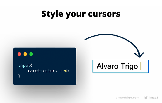
有趣的css属性[一]
caret-color:red;
格式化代码小图标

background-repeat
img的属性alt的小知识

给没有alt属性的添加border
复制一个dom的多个class属性

基于物理的动画
http://dynamicsjs.com/
CSS Gap是CSS Grid规范和Flexbox的功能
 .row{
        display: flex;
        gap: 32px;
      }
我们发现竟然可以给flex 添加间隙
resize
控制一个元素的可调整大小性
none
元素不能被用户缩放。
both
允许用户在水平和垂直方向上调整元素的大小。
horizontal
允许用户在水平方向上调整元素的大小。
vertical
允许用户在垂直方向上调整元素的大小。
resize: none; 不能
resize: both; 水平垂直
resize: horizontal; 垂直
resize: vertical; 水平
结合滚动条使用
      overflow: auto;
        resize: both;
改成 grid
.row{
        display: grid;
        gap: 32px;
        grid-template-columns: 220fr 400fr 250fr;
        overflow: auto;
        resize:horizontal;
        width: 50%;
      }
      img{
        width: 100%;
      }
<div class="row">
  <div class="col" >
    <img alt="A cute kitten" src="https://placekitten.com/220/450" />
  </div>
  <div class="col">
    <img alt="A cute kitten" src="https://placekitten.com/400/450" />
  </div>
  <div class="col">
    <img alt="A cute kitten" src="https://placekitten.com/250/450" />
  </div>
</div>
transition
  <style>
    .aaa{
      width: 50%;
      height: 50vh;
      background-color: #5b1e1e;
      transition: width .3s ease-in-out;
    }
    .aaa:hover{
      width: 100%;
    }
  </style>
<div class="aaa">
  AAABBBCCC
</div>
宽度过渡
如果添加背景颜色过渡
transition: width .3s ease-in-out,background-color .4s ease-in-out;
  .aaa:hover{
      width: 100%;
      background-color: #7e41e2;
    }
transition-delay
transition:all 3s easy-in-out transition-delay;
最后的可选参数为延迟过渡
旋转
div {
  transition: transform 1s;
}

div:hover {
  transform: rotate(1080deg);
}
当鼠标松开,回到原样
max-content min-content
 <style>
    .aaa{
      width:min-content;
      margin: 0 auto;
      padding:1em;
    }
  </style>
<div class="aaa">
  <img src="http://placekitten.com/200/200" alt="">
  <span>What a lovely pattern we got there in this image which is encapsulted in a figure element. Oh dear, look
    how long this caption is!
  </span>
</div>

 <style>
    .aaa{
      width:max-content;
      margin: 0 auto;
      padding:1em;
    }
    img{
      display: block;
    }
  </style>
<div class="aaa">
  <img src="http://placekitten.com/200/200" alt="">
  <span>What a lovely pattern we got there in this image which is encapsulted in a figure element. Oh dear, look
    how long this caption is!
  </span>
</div>
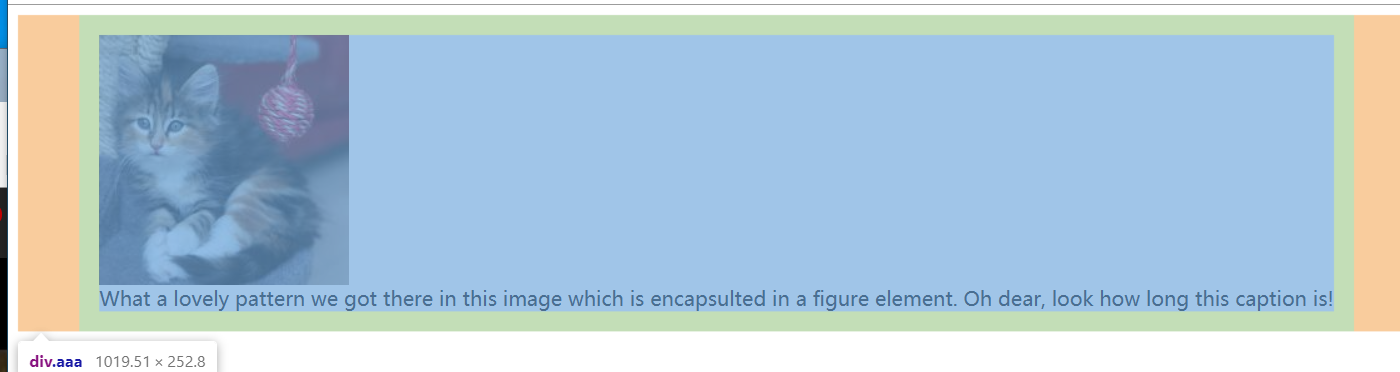
展开最大的内容宽度
fit-content
该fit-content值大约相当于margin-left: auto和margin-right: auto行为
居中
 ul {
      background: deepskyblue;
      padding: 1em;
      text-align: center;
    }

    li {
      display: inline-block;
      background: tomato;
      padding: .5em;
    }
另一种方法居中
ul {
    background: deepskyblue;
    padding: 1em;
    width: fit-content;
    margin: 1em auto;
}
悬浮过渡
难点:
不hover :圆点在右下角
hover: 圆点在左下角
   h1::before {
      transform: scaleX(0);
      transform-origin: bottom right;
    }

    h1:hover::before {
      transform: scaleX(1);
      transform-origin: bottom left;
    }
css 缓冲函数
css 支持的缓冲函数:cubic-bezier 和steps() 两种
三次贝塞尔曲线
cubic-bezier(0.1, 0.7, 1.0, 0.1)
像 ease,linear都属于三次贝塞尔曲线里面的
自由设置的的工具,可以直接谷歌cubic-bezier 就可以找到
阴影圆环
圆变椭圆
.ccc{
      width: 200px;
      height: 200px;
      border-radius: 50%;
      border:3px solid #c0eeaa;
    }
我们发现当我们增加width或者height的时候,圆会变成椭圆
或者我们增加padding的方向属性的高度的时候也会变成椭圆
如果有box-sizing: border-box; ,那么padding要大于自身的长度才有效果
box-shadow
box-shadow: 10px 5px 5px red;
x偏移量,y偏移量,模糊,散布半径,颜色
一般都是这四个
.ccc {
      width: 200px;
      height: 200px;
      border: 3px solid #c0eeaa;
      box-shadow: 0 -10px 0 #feac5e,
      10px 0 0 #c779d0,
      0 10px 0 #4bc0c8,
      -10px 0 0 #42db75;
    }
  .ccc {
      width: 200px;
      height: 200px;
      border: 3px solid #c0eeaa;
      border-radius: 50%;
      box-shadow: 0 -10px 0 #feac5e,
      10px 0 0 #c779d0,
      0 10px 0 #4bc0c8,
      -10px 0 0 #42db75;
      padding-top: 58px;
    }

添加过渡,自定义速度
 .ccc {
      width: 200px;
      height: 200px;
      border: 3px solid #c0eeaa;
      border-radius: 50%;
      box-shadow: 0 -10px 0 #feac5e,
      10px 0 0 #c779d0,
      0 10px 0 #4bc0c8,
      -10px 0 0 #42db75;
      padding-top: 58px;
      /*添加过渡,cubic-bezier自定义速度*/
      transition: transform 0.4s cubic-bezier(0.23,1.83,0.42,1.19);
    }
    .ccc:hover{
      transform: scale(1.2);
    }
添加动画
过渡主要是给父盒子添加这样,子盒子才会放大
  .box {
      display: grid;
      height: 100vh;
      place-content: center;
      box-sizing: border-box;
    }

    .ccc {
      width: 200px;
      height: 200px;
      border: 3px solid #c0eeaa;
      border-radius: 50%;
      padding-top: 30px;

      animation: 1s linear infinite alternate boxMagic,
      4s linear infinite spinning;
    }
    /*过渡主要是给父盒子添加这样,子盒子才会放大*/
    .ddd{
      /*添加过渡,cubic-bezier自定义速度*/
      transition: transform 0.4s cubic-bezier(0.23,1.83,0.42,1.19);
    }
    .ddd:hover{
      transform: scale(1.2);
    }
    @keyframes boxMagic {
      from {
        box-shadow:
          0 0 0 #feac5e,
          0 0 0 #c779d0,
          0 0 0 #4bc0c8,
          0 0 0 #42db75;
      }
      to {
        box-shadow:
          0 -10px 0 #feac5e,
          10px 0 0 #c779d0,
          0 10px 0 #4bc0c8,
          -10px 0 0 #42db75;
      }
    }
    @keyframes spinning {

      from {
        transform: rotate(0deg);
      }
      to {
        transform: rotate(360deg);
      }
    }
决定自己的高度的是你的态度,而不是你的才能
记得我们是终身初学者和学习者
总有一天我也能成为大佬


 浙公网安备 33010602011771号