
javascript原生技巧篇

有趣的css问题
<div style="margin:0 auto;max-width:450px;">
  <div style="height:20vh;background-color: firebrick;">   </div>
</div>

父元素
margin:0 auto;max-width:450px;居中子孩子不写宽度直接继承父级的
max-width好像直接跟父元素直接写
width类型
object-fit
object-fit: cover;
被替换的内容在保持其宽高比的同时填充元素的整个内容框。如果对象的宽高比与内容框不相匹配,该对象将被剪裁以适应内容框。
用于img
will-change
定义将来将要更改的属性(通过css或者js)
will-change: transform,left,top;
告诉浏览器针对这几个css属性进行优化,
通过js进行修改的时候回进行优化
错误使用方法
.my-element:hover {
  will-change: opacity;
  transition: opacity .25s ease-in-out;
}
will-change是将来时,所以在动画发生时不应应用
可以把will-change放在父元素上
.parent-element:hover {
  will-change: opacity;
}

.my-element:hover {
  transition: opacity .25s ease-in-out;
}
Mozilla建议will-change在元素更改完成后删除。这就是为什么还建议will-change通过JavaScript进行设置以便将其删除的原因。如果will-change在CSS样式表中设置了,则无法将其删除。
const el = document.querySelector('.parent-element')
el.addEventListener('mouseenter', addWillChange)
el.addEventListener('animationend', removeChange)

const addWillChange = () => {
  this.style.willChange = 'opacity'
}

const removeChange = () => {
  this.style.willChange = 'auto'
}
requestAnimationFrame 动画
默认1s中60次
  <h1 id="ccc"></h1>

 	let number = 0;
    let h1 = document.querySelector('#ccc')
    let ref;
    const countUp = () => {
      number++;
      // UI 更新
      h1.textContent=number;
      if (number < 100000) {
      ref=  requestAnimationFrame(countUp)
      }
    }
    // 开启动画
    requestAnimationFrame(countUp)
    // 假设 5s清除动画
    setTimeout(()=>{
      cancelAnimationFrame(ref)
    },5000)
https://codepen.io/kikiki_kiki/pen/jOWraNL
晚上研究,控制帧率
window.requestAnimationFrame(callback);
参数
该参数与performance.now()的返回值相同,它表示requestAnimationFrame() 开始去执行回调函数的时刻。
const countUp = (now) => {
    console.log(now); // performance.now()  5s 也就是now最终的数值应该超过 5000ms
    number++;
    // UI 更新
    h1.textContent=number;
    if (number < 60*5) {
      ref=  requestAnimationFrame(countUp)
    }
  }
唉....最后想出了这种方法,减少递归次数进行优化
  let number = 0;
  let h1 = document.querySelector('#ccc')
  let ref;
  const countUp = () => {
    number++;
    // UI 更新
    h1.textContent=number;
    if (number < 5) {
      setTimeout(()=>{
        ref=  requestAnimationFrame(countUp)
      },1000)
    }
  }
  // 开启动画
  requestAnimationFrame(countUp)
特殊的基本数据类型
number,boolean,string
let a=1
a.sex='xxx'
a //1

let b='xxx'
b.sex='bbb'
b // 'xxx'

let c=true
b.sex='ccc'
b // true
都不会报错,第二行会创建一个number,string,boolean 的对象,但是第三行执行的时候会被销毁
Object 构造函数作为一个工厂方法,能够根据传入值得类型返回相应原始值包装类型的实例
let obj=new Object('xxx')
obj instanceof String // true
Number ,Boolean 同理
解构
let arr = [1, 2, 3, 4, 5]
let {length, 0: first, [length - 1]: last} = arr;
console.log(first, last);
// 1, 5
let {1:squired}=arr;
console.log(squired);// 2
扁平化数组
let a=['a','b','c',['d','e','f',['b','d']]]
String(a).split(',');

[
  'a', 'b', 'c',
  'd', 'e', 'f',
  'b', 'd'
]
let a=['a','b','c']
for (let [key, value] of a.entries()) {
  console.log(key, value);
}
delele
let arr = [1, 2, 3];
delete arr[0];
delete arr[2];
console.log(arr.length);// 3
删除但是没有改变长度
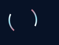
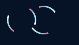
动画
 .spinner{
      width: 100px;
      height: 100px;
      display: flex;
      max-width: 100px;
      position: relative;
      box-sizing: border-box;
      border-radius: 50%;
      margin-left:-25px;
      background:conic-gradient(transparent 0%, transparent 27%, #CD798F 27%, #92DFF0 38%, white 48%, transparent 48%, transparent 77%, #CD798F 77%, #92DFF0 88%, white 98%, transparent 98%);
      /*mix-blend-mode: color-dodge;*/
      animation: spin 4s linear infinite;
    }
    .spinner:before{
      content: '';
      position: absolute;
      top:0;
      right:0;
      bottom:0;
      left:0;
      z-index:-1;
      margin:5px;
      border-radius: 50%;
      background-color: #fff;
    }
    @keyframes spin {
      0%{
        transform: rotateZ(0deg);
      }
      100%{
        transform: rotateZ(360deg);
      }
    }

html

    <div class="spinner"></div>
重要代码
background:conic-gradient(transparent 0%, transparent 27%);
 颜色,度数
conic-gradient()函数是CSS中的内置函数,用于将圆锥曲线渐变设置为背景图像。圆锥倾斜角从0度到360度开始。圆锥形是圆形的,并使用元素的中心作为色标的源点。
mix-blend-mode: color-dodge;
元素的内容应该与元素的直系父元素的内容和元素的背景如何混合
animation-direction: reverse;
反向运行动画
https://css-tricks.com/examples/nth-child-tester/
focus-within
:focus-within 是一个CSS 伪类 ,表示一个元素获得焦点,或,该元素的后代元素获得焦点。换句话说,元素自身或者它的某个后代匹配 :focus 伪类。(shadow DOM 树中的后代也包括在内)
鼠标hover标记一个特殊字段
决定自己的高度的是你的态度,而不是你的才能
记得我们是终身初学者和学习者
总有一天我也能成为大佬


 浙公网安备 33010602011771号