
SVG研究之路(三) 过滤器
SVG 过滤器
基本原型
<svg width="1000" height="577">
  <filter id="demoFilter">
   <!-- 添加过滤器的效果-->
  </filter>
  <image xlink:href="..." width="100%" height="100%" x="0" y="0" filter="url(#demoFilter)"/>
</svg>
工具
https://yoksel.github.io/svg-filters/#/
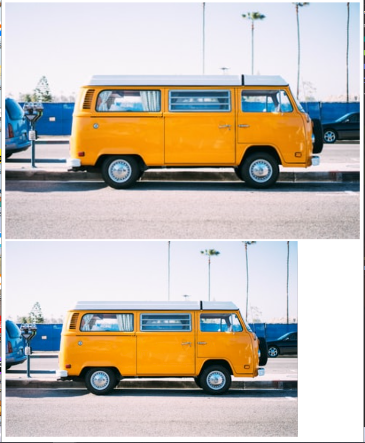
高斯模糊 feGaussianBlur
每一个<filter> 对一个或者多个输入执行单个基本图形操作
高斯模糊的应用标签feGaussianBlur
<svg width="900" height="400">
  <filter id="myFilter">
    <feGaussianBlur stdDeviation="5"></feGaussianBlur>
  </filter>

  <image xlink:href="https://images.unsplash.com/photo-1464219789935-c2d9d9aba644?ixlib=rb-0.3.5&q=80&fm=jpg&crop=entropy&cs=tinysrgb&w=400&fit=max&s=ddb6851784d97d7c81931a46b0a76a97" width="100%" height="100%" x="10" y="10" filter="url(#myFilter)"/>
</svg>

<svg width="900" height="400">
  <filter id="filter" >
    <feGaussianBlur stdDeviation="5"></feGaussianBlur>
  </filter>
  <text x="100" y="140" font-size="90" font-weight="700" filter="url(#filter)">fdaklfakjwakjfwalkwal</text>
</svg>

元素的默认过滤区域是元素的边界框,如果许多滤镜会影响到边框之外的像素,默认情况下会被最终裁断
所以我们要修改,通过扩展延展过滤器应用到该区域
x,y ,width,height解决思路:
x,y 提供负百分比值,为width,height提供大于100%记住
x,y,width,height都依赖于filterUnits使用
filterUnits的值:
- objectBoundingBox : 默认值, 使用百分比
- userSpaceOnUse : 使用像素(px)为单位
<!-- 使用 objectBoundingBox 单位 -->
<filter id="filter"
        x="5%" y="5%" width="100%" height="100%">

<!-- 使用 userSpaceOnUse 单位 -->
<filter id="filter"
        filterUnits="userSpaceOnUse"
        x="5px" y="5px" width="500px" height="350px">
解决案例
<svg width="900" height="400">
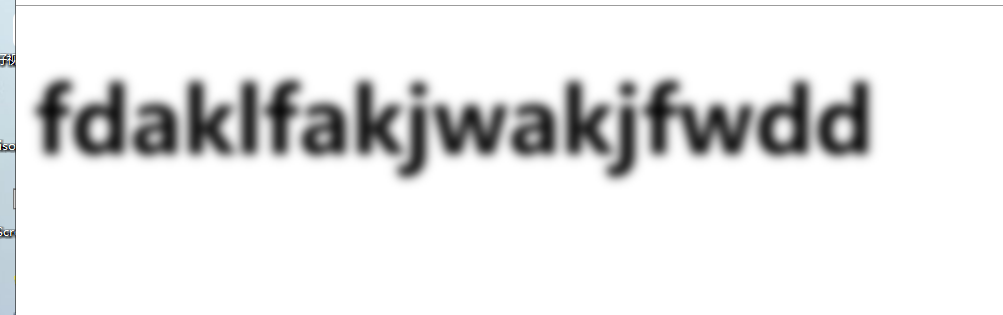
<filter id="filter" x="-10%" y="-10%" width="120%" height="120%" filterUnits="objectBoundingBox">
<feGaussianBlur stdDeviation="5"></feGaussianBlur>
</filter>
<text x="10" y="140" font-size="90" font-weight="700" filter="url(#filter)">fdaklfakjwakjfwdd</text>
</svg>
给蒙版添加Alpha通道创建黑色副本
feGaussianBlur=SourceAlpha 高斯模糊, stdDeviation='10' 设置值(标准差) ,result='名字1' 这个其实就是一个标识
<svg width="600px" height="400px" viewBox="0 0 600 400">
  <filter id="drop-shadow">
    <feGaussianBlur in="SourceAlpha" stdDeviation="10" result="DROP1"></feGaussianBlur>
  </filter>
  <image xlink:href="https://images.unsplash.com/photo-1464219789935-c2d9d9aba644?ixlib=rb-0.3.5&q=80&fm=jpg&crop=entropy&cs=tinysrgb&w=400&fit=max&s=ddb6851784d97d7c81931a46b0a76a97" width="100%" height="100%" x="0" y="0" filter="url(#drop-shadow)"/>
</svg>
feOffset
偏移SVG中的图层
除了 in和result 属性之外还有
dx,dy 沿着 x轴和y轴分别偏移图层距离
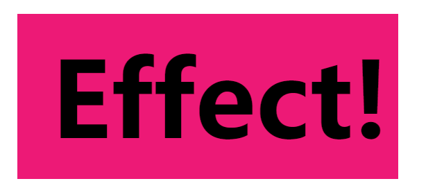
feFlood
- 使用
flood-color属性中指定的颜色填充当前过滤器区域 - 使用
flood-opacity透明度
 <filter id="flooder" x="0" y="0" width="100%" height="100%">
    <feFlood flood-color="#EB0066" flood-opacity=".1"></feFlood>
  </filter>
  <text  dx="100"  dy="200" font-size="150" font-weight="bold" filter="url(#flooder)">Effect!</text>
feMerge
就是将元素或效果的图层合并一起
在内部<feMergeNode> 使用两个或多个
多个<feMergeNode> 从上到下是 最顶层
<svg width="600px" height="400px" viewBox="0 0 600 400">
  <filter id="flooder">
    <feFlood flood-color="#EB0066" flood-opacity=".9" result="FLOOD"></feFlood>

    <feMerge>
      <feMergeNode in="FLOOD" /> <!--背景-->
      <feMergeNode in="SourceGraphic" /><!-- 这个才是上层的-->
    </feMerge>
  </filter>

  <text dx="100" dy="200" font-size="150" font-weight="bold" filter="url(#flooder)">Effect!</text>
</svg>
in="SourceGraphic"引入此文本
in="FLOOD"背景我们发现
feMergeNode两个的顺序换一下,背景就是相当于被盖到了
feComposite
operator 属性用于指定复合操作
in和in2 属性, 第一个in 是我们的颜色蹭,第二个输入是我们的模糊阴影背景
result 类似于id的一个标识
<svg width="600px" height="400px" viewBox="0 0 600 400">
  <filter id="drop-shadow">
    <feGaussianBlur in="SourceAlpha" stdDeviation="10" result="DROP"></feGaussianBlur>

    <feFlood flood-color="#bbb" result="COLOR"></feFlood>

    <feComposite in="COLOR" in2="DROP" operator="in" result="SHADOW"></feComposite>
  </filter>
  <image xlink:href="https://images.unsplash.com/photo-1464219789935-c2d9d9aba644?ixlib=rb-0.3.5&q=80&fm=jpg&crop=entropy&cs=tinysrgb&w=400&fit=max&s=ddb6851784d97d7c81931a46b0a76a97" width="100%" height="100%" x="0" y="0" filter="url(#drop-shadow)"/>
</svg>
比较重要的知识点就是图层的合成功能
综合上述的技巧
<svg width="600px" height="400px" viewBox="0 0 600 400">
  <filter id="drop-shadow">
    <!-- 获取源alpha并将其模糊;我们将结果命名为 DROP -->
    <feGaussianBlur in="SourceAlpha" stdDeviation="10" result="DROP"></feGaussianBlur>
    <!-- 用浅灰色
            填充区域;我们将这一层命名为“ COLOR” -->
    <feFlood flood-color="#bbb" result="COLOR"></feFlood>

    <!--将DROP和COLOR图层组合在一起以使阴影着色。结果命名为“ SHADOW”-->
    <feComposite in="COLOR" in2="DROP" operator="in" result="SHADOW"></feComposite>

    <!--将SHADOW层向下移动20像素正确的。现在,新层称为“ DROPSHADOW”-->
    <feOffset in="SHADOW" dx="20" dy="20" result="DROPSHADOW"></feOffset>

    <!-- 将DROPSHADOW和源图像分层,确保图像位于顶部(请记住:MergeNode顺序很重要)  -->
    <feMerge>
      <!--背景-->
      <feMergeNode in="DROPSHADOW"></feMergeNode>
      <!--上层-->
      <feMergeNode in="SourceGraphic"></feMergeNode>
    </feMerge>
  </filter>

  <image xlink:href="https://images.unsplash.com/photo-1464219789935-c2d9d9aba644?ixlib=rb-0.3.5&q=80&fm=jpg&crop=entropy&cs=tinysrgb&w=400&fit=max&s=ddb6851784d97d7c81931a46b0a76a97" width="100%" height="100%" x="0" y="0" filter="url(#drop-shadow)"/>
</svg>
变形 feMorphology
feMorphology 收缩或扩展元素
operator="erode" radius="3"
像素 erode(缩小) 3个像素
<svg width="450" height="300">

  <image xlink:href="https://images.unsplash.com/photo-1464219789935-c2d9d9aba644?ixlib=rb-0.3.5&q=80&fm=jpg&crop=entropy&cs=tinysrgb&w=400&fit=max&s=ddb6851784d97d7c81931a46b0a76a97" width="100%" height="100%" x="10" y="10" />
  <text x="10" y="40" sytle="color:#ccc">原始</text>
</svg>

<svg width="450" height="300">
  <filter id="demoFilter">
   <!-- 添加过滤器的效果-->
    <feMorphology operator="erode" radius="3"></feMorphology>
  </filter>
  <image xlink:href="https://images.unsplash.com/photo-1464219789935-c2d9d9aba644?ixlib=rb-0.3.5&q=80&fm=jpg&crop=entropy&cs=tinysrgb&w=400&fit=max&s=ddb6851784d97d7c81931a46b0a76a97" width="100%" height="100%" x="0" y="0" filter="url(#demoFilter)"/>
  <text x="10" y="40" sytle="color:#ccc">erode</text>
</svg>
<svg width="450" height="300">
  <filter id="demoFilter1">
    <!-- 添加过滤器的效果-->
    <feMorphology operator="dilate" radius="3"></feMorphology>
  </filter>
  <image xlink:href="https://images.unsplash.com/photo-1464219789935-c2d9d9aba644?ixlib=rb-0.3.5&q=80&fm=jpg&crop=entropy&cs=tinysrgb&w=400&fit=max&s=ddb6851784d97d7c81931a46b0a76a97" width="100%" height="100%" x="0" y="0" filter="url(#demoFilter1)"/>
  <text x="10" y="40" sytle="color:#ccc">dilate</text>
</svg>
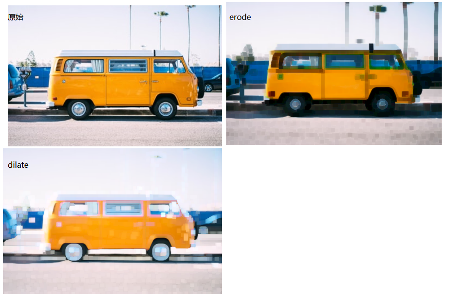
图像看起来像自身的抽象绘画,整体大小随着像素的扩大或者缩小而变化的
颜色差异:
``erode
产生的图像具有更多的暗像素,而dilate`产生的光输出
erode(默认值)将每个像素分别设置为每个R,G,B和A通道的最暗或最透明度,并且dilate将每个像素的每个通道分别设置为与来自其相邻像素的最亮或最不透明的值匹配。
alpha通道,文本的黑色,加粗像素
<svg width="900" height="400">
  <filter id="outline">
    <feMorphology in="SourceAlpha" result="DILATED" operator="dilate" radius="2"></feMorphology>
  </filter>
  <filter id="outline1">
    <feMorphology in="SourceAlpha" result="DILATED" operator="erode" radius="2"></feMorphology>
  </filter>
  <text font-size="80px" dx="100" dy="100" font-weight="700" stroke="deepPink" stroke-width="3px">Stroked Text</text>
  <!--获取文本的alpha通道,仅为文本的黑色,加粗4像素-->
  <text font-size="80px" dx="200" dy="200" font-weight="700" stroke="deepPink" stroke-width="3px" filter="url(#outline)">Stroked Text</text>
  <!-- 变细-->
  <text font-size="80px" dx="300" dy="300" font-weight="700" stroke="deepPink" stroke-width="3px" filter="url(#outline1)">Stroked Text</text>
</svg>
in=SourceGraphic
图形自身坐标原始输入
<svg width="600px" height="400px" viewBox="0 0 600 400">
  <filter id="drop-shadow">
    <feMorphology in="SourceAlpha" result="DILATED" operator="dilate" radius="4"></feMorphology>

    <feFlood flood-color="#32DFEC" flood-opacity="1" result="PINK"></feFlood>
    <feComposite in="PINK" in2="DILATED" operator="in" result="OUTLINE"></feComposite>
    <feMerge>
<!--     填充的底层  -->
      <feMergeNode in="OUTLINE"/>
<!--      原样输入-->
      <feMergeNode in="SourceGraphic"/>
    </feMerge>
  </filter>

  <text dx="10" dy="100" filter="url(#drop-shadow)" letter-spacing="10px" font-size="50">SVG Rocks</text>
</svg>

扣出字体内部的内容
用operator='out
<svg width="900" height="450" viewBox="0 0 900 450">
	<filter id="myFilter">
		<feMorphology operator="dilate" radius="8"
		in="SourceGraphic" result="THICKNESS" />
		<feComposite operator="out" in="THICKNESS" in2="SourceGraphic" ></feComposite>
	</filter>

	<text dx="100" dy="300" filter="url(#myFilter)" letter-spacing="10px">SVG Rocks</text>
</svg>

<h2>SVG Rocks in HTML too!</h2>
决定自己的高度的是你的态度,而不是你的才能
记得我们是终身初学者和学习者
总有一天我也能成为大佬


 浙公网安备 33010602011771号