文本溢出省略
单行文本溢出
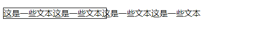
<!DOCTYPE html>
<html lang="en">
<head>
    <meta charset="UTF-8">
    <title>Title</title>
    <style>
        p{
            border: 1px solid black;
            line-height: 20px;
            width: 200px;
            height: 20px;
            white-space: nowrap; /*设置该属性使文本在一行内显示,不自动换行*/
        }
    </style>
</head>
<body>
<p>这是一些文本这是一些文本这是一些文本这是一些文本</p>
</body>
</html>
效果如下:
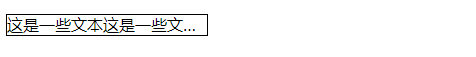
解决方法
p{
            border: 1px solid black;
            line-height: 20px;
            width: 200px;
            height: 20px;
            white-space: nowrap;
            overflow: hidden; /*文本溢出时隐藏超出的内容*/
            text-overflow: ellipsis;  /*文本溢出时显示省略号来替代被修剪的文本*/
}
效果如下:
多行文本溢出
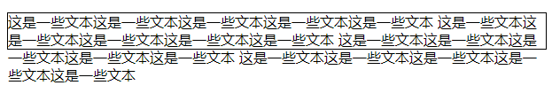
<!DOCTYPE html>
<html lang="en">
<head>
    <meta charset="UTF-8">
    <title>Title</title>
    <style>
        p {
            border: 1px solid black ;
            line-height: 20px;  /*行高可以控制容器内可容纳的文本行数*/
            height: 40px;
        }
    </style>
</head>
<body>

<p class="demo">
    这是一些文本这是一些文本这是一些文本这是一些文本这是一些文本
    这是一些文本这是一些文本这是一些文本这是一些文本这是一些文本
    这是一些文本这是一些文本这是一些文本这是一些文本这是一些文本
    这是一些文本这是一些文本这是一些文本这是一些文本这是一些文本
</p>
</body>
</html>
效果如下:
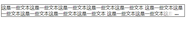
方法1:使用定位元素
使用伪元素::after为<p>元素末尾添加一个省略号,并将该省略号声明为绝对定位元素,始终位于容器的右下角。
p {
            border: 1px solid black ;
            position: relative; /*不要忘了将容器声明为定位元素,使其成为省略号的容纳块*/
            line-height: 20px;
            height: 40px;
            overflow: hidden;
}
p::after {
            content:"...";
            font-weight:bold;
            position:absolute;
            bottom:0;
            right:0;
            padding:0 20px 1px 45px;

            /* 为了展示效果更好 */
            background: -webkit-gradient(linear, left top, right top, from(rgba(255, 255, 255, 0)), to(white), color-stop(50%, white));
            background: -moz-linear-gradient(to right, rgba(255, 255, 255, 0), white 50%, white);
            background: -o-linear-gradient(to right, rgba(255, 255, 255, 0), white 50%, white);
            background: -ms-linear-gradient(to right, rgba(255, 255, 255, 0), white 50%, white);
            background: linear-gradient(to right, rgba(255, 255, 255, 0), white 50%, white);
}
效果如下:
缺点:
- 即使文本没有溢出了,省略号也始终存在;
方法2:使用-webkit-line-clamp属性
p {
            border: 1px solid black ;
            height: 40px;
            display: -webkit-box;
            overflow: hidden;
            -webkit-line-clamp: 2;
            -webkit-box-orient: vertical;
}
优点:
- 文本溢出是显示省略号,没溢出时不显示;
缺点:
- 兼容性差,只能在webkit内核的浏览器中使用,多用于移动端页面;

 浙公网安备 33010602011771号