
对人力资源分析案例研究数据集进行数据分析
一.选题背景
近年就业面临着诸多挑战。一方面,经济的不景气和就业市场的不稳定性使得就业难度加大,就业形势越来越严峻。另一方面,高校毕业生的数量不断增加,而就业岗位的数量却没有相应增加,导致竞争激烈,难以找到合适的工作。此外,还有一些特殊的问题,如女性就业歧视、农村学生就业难等,使得就业问题更加复杂化。分析人力资源数据集,可以分析在在职人员中,学历,所处地,性别,年龄等,为自己找工作做参考。
二.大数据分析设计方案
1.数据集的内容与数据特征分析
一共有23490条样本,下面是该样本包含的内容。该数据集有人员的地区,学历,性别,年龄,工作时长等数据,分析数据可以看出该数据来源公司招聘条件,学历的所占比,男女数据的比例,工作时长等,可以为求职者做一些参考。
| 字段名称 | 字段类型 | 字段说明 |
|---|---|---|
| employee_id | 整型 | 职员id。 |
| department | 字符型 | 部门。 |
| region | 字符型 | 地区。 |
| education | 字符型 | 学历。 |
| gender | 字符型 | 性别。 |
| recruitment_channel | 字符型 | 招募渠道。 |
| no_of_trainings | 整型 | 训练次数。 |
| age | 整型 | 年龄。 |
| previous_year_rating | 浮点型 | 以往年份评级。 |
| length_of_service | 整型 | 工作时长。 |
| KPIs_met >80% | 整型 | KPI完成80%。 |
| awards_won? | 整型 | 获奖。 |
| avg_training_score | 整型 | 平均训练得分。 |
2.数据分析课题设计分析方案
数据集导入和处理-->数据清洗-->数据分析-->数据可视化
三.数据分析步骤
数据源:
http://www.idatascience.cn/dataset-detail?table_id=517
1.导入数据

#####导入数据集
import pandas as pd

import numpy as np

from datetime import datetime

from sklearn.linear_model import LinearRegression

df = pd.read_csv(r"C:\Users\dxh\人力资源分析案例研究数据集.csv",encoding='gb18030')

df.head()

#显示形状
df.shape

#显示列名
df.columns
#观察各个属性的类型
#dataframe中的 object 类型来自于 Numpy,
# 描述了每一个元素 在 ndarray 中的类型 (也就是Object类型)
df.dtypes

#统计男女性别人数
df["gender"].value_counts()

#统计不同学历人数
df["education"].value_counts()

#统计不同年龄人数
df["age"].value_counts()

男性是女性人数的2.4倍左右,男女人数差距较大。学历中,学士学位最多,其次是硕士及其以上学历多,中学以下的人数最多。在职人数中27—36这个年龄段的人数最多。
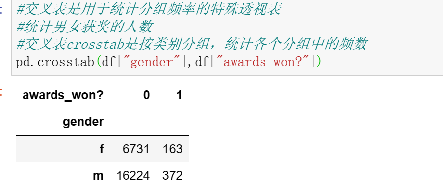
#交叉表是用于统计分组频率的特殊透视表
#统计男女获奖的人数
#交叉表crosstab是按类别分组,统计各个分组中的频数
pd.crosstab(df["gender"],df["awards_won?"])
#使用corr()函数,判断两个属性是否具有相关性,获奖与KPI>80%
df['awards_won?'].corr(df['KPIs_met >80%'])

#使用corr()函数,判断两个属性是否具有相关性,是否训练平均分与训练
df['avg_training_score'].corr(df['no_of_trainings'])

#使用corr()函数,判断两个属性是否具有相关性,平均得分和是否获奖
df['avg_training_score'].corr(df['awards_won?'])

2.数据清洗
#####数据清洗
#数据维度
print('===数据维度:{:}行{:}列===\n'.format(df.shape[0],df.shape[1]))
#查询空值
df.isnull()
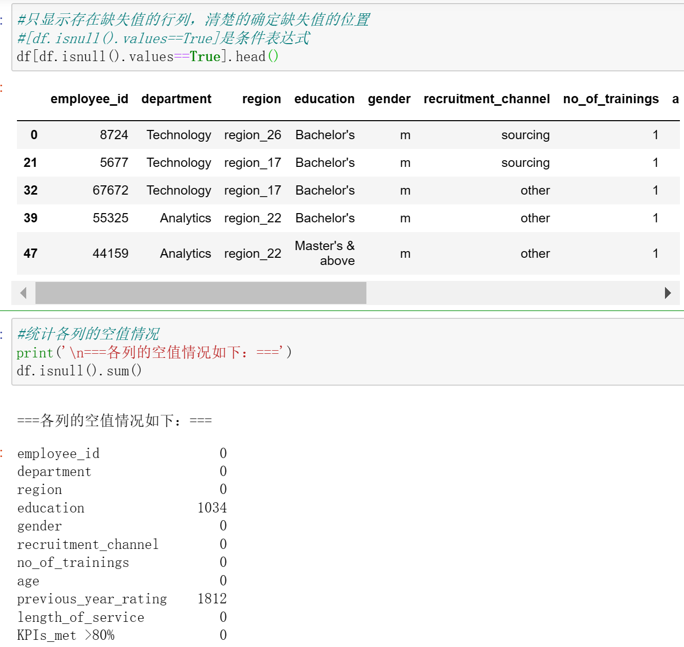
#只显示存在缺失值的行列,清楚的确定缺失值的位置
#[df.isnull().values==True]是条件表达式
df[df.isnull().values==True].head()

#统计各列的空值情况
print('\n===各列的空值情况如下:===')
df.isnull().sum()
# 查找重复值
df.duplicated()

#使用describe查看统计信息
df.describe()

#删除无效列与行,重复值处理,空值与缺失值处理,空格处理,异常值处理,数据清洗完成后,保存为新文件,人力资源分析案例研究数据集clean.csv
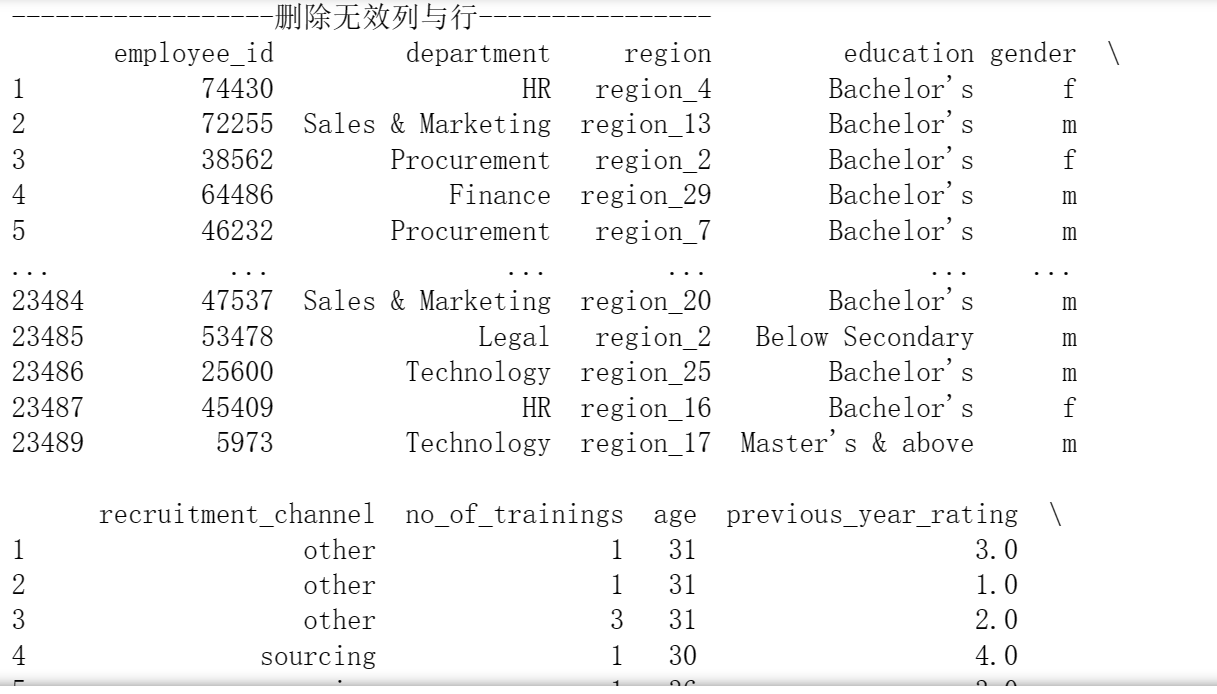
print("------------------删除无效列与行----------------")
print(df.dropna())#删除所有无效
#print(df.dropna(axis=1))#列
print("------------------重复数据----------------")
print(df.drop_duplicates())#删除重复数据
print("------------------空格缺失值----------------")
print(df.notnull())
print(df.fillna(0))#空值,缺失值填充
print("------------------空格----------------")
print(df.isnull().any())
print("------------------去除异常值----------------")
print(df.reset_index())
print("------------------保存----------------")
df.to_csv('C:/Users/dxh/人力资源分析案例研究数据集clean.csv',sep='\t',encoding='utf-32')
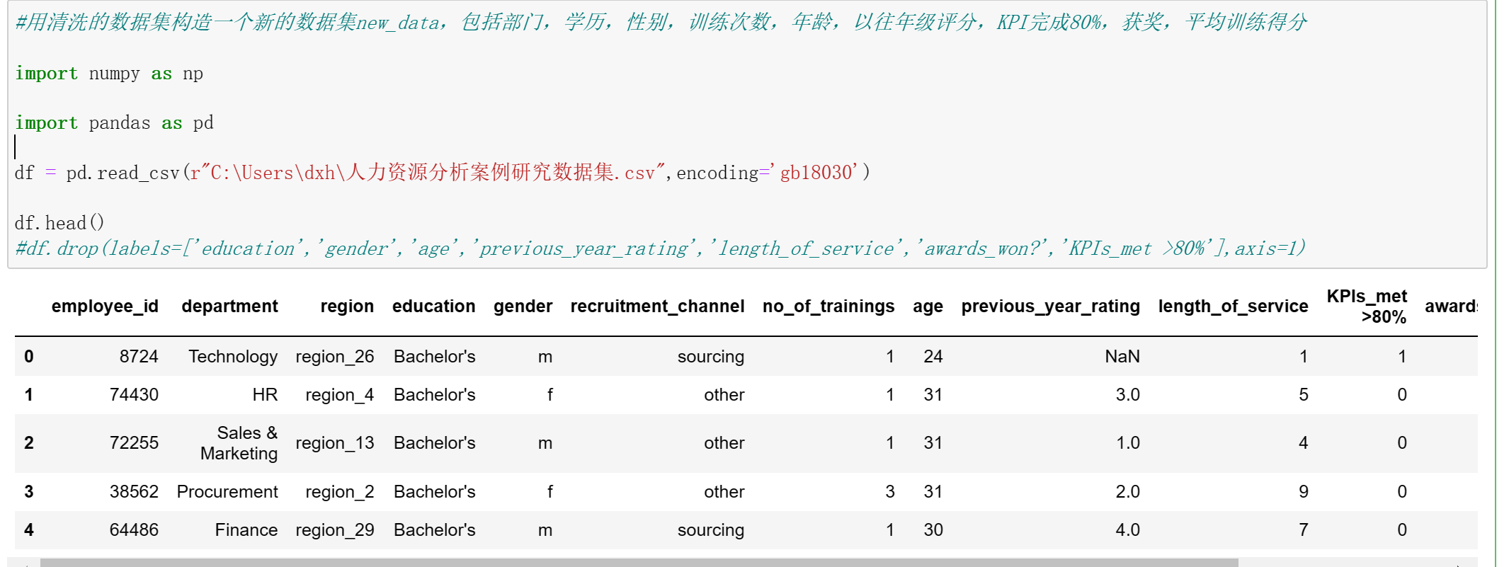
#用清洗的数据集构造一个新的数据集new_data,包括部门,学历,性别,训练次数,年龄,以往年级评分,KPI完成80%,获奖,平均训练得分

import numpy as np

import pandas as pd

df = pd.read_csv(r"C:\Users\dxh\人力资源分析案例研究数据集.csv",encoding='gb18030')

df.head()
#df.drop(labels=['education','gender','age','previous_year_rating','length_of_service','awards_won?','KPIs_met >80%'],axis=1)
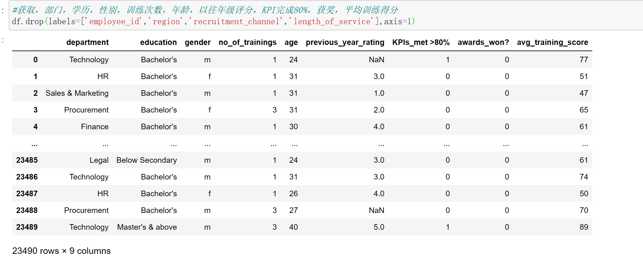
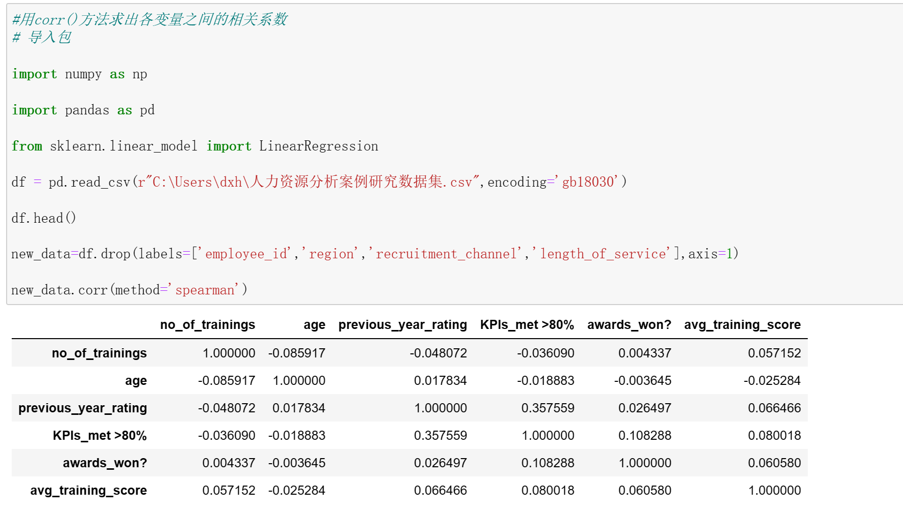
#用corr()方法求出各变量之间的相关系数
# 导入包

import numpy as np

import pandas as pd

from sklearn.linear_model import LinearRegression

df = pd.read_csv(r"C:\Users\dxh\人力资源分析案例研究数据集.csv",encoding='gb18030')

df.head()

new_data=df.drop(labels=['employee_id','region','recruitment_channel','length_of_service'],axis=1)

new_data.corr(method='spearman')
3.数据分析
import pandas as pd
import matplotlib.pyplot as plt
import numpy as np
import scipy.stats as stats
import sklearn
pd.options.display.max_columns =50 # 限定最多输出50列
df = pd.read_csv(r"C:\Users\dxh\人力资源分析案例研究数据集.csv",encoding='gb18030')
print(df.head())
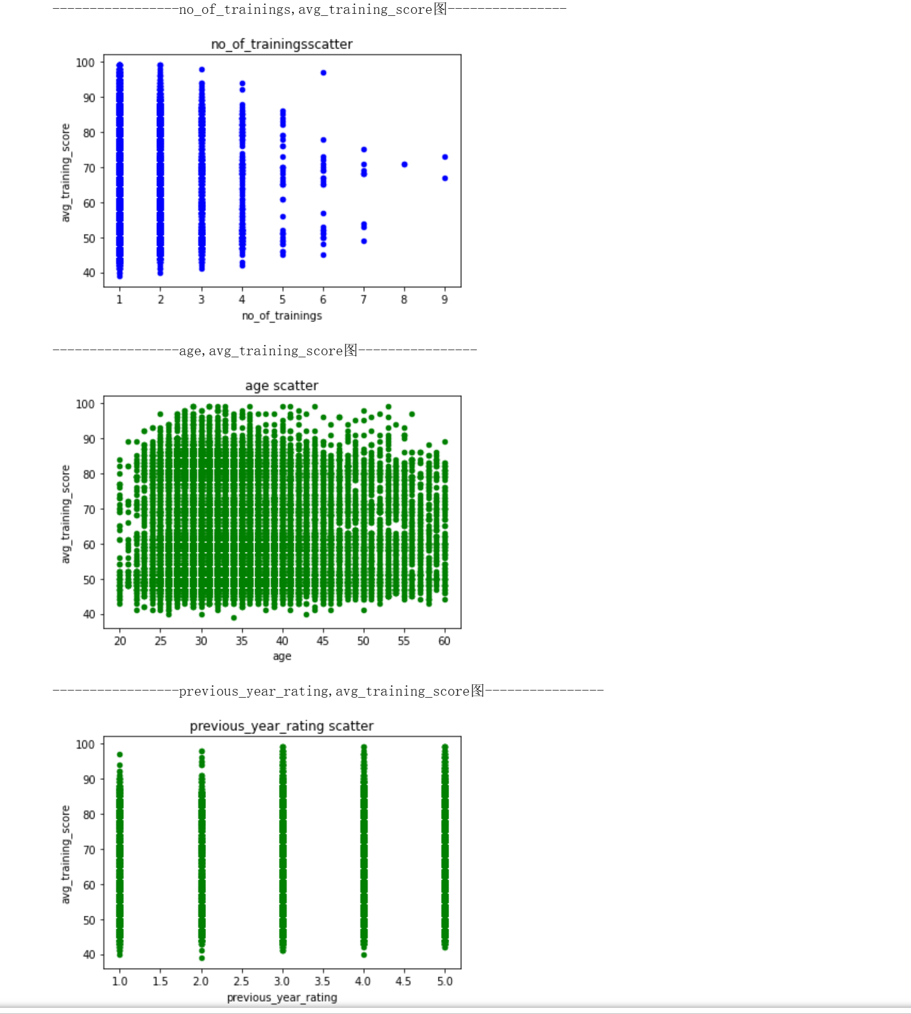
#是否训练与训练平均得分
print("-----------------no_of_trainings,avg_training_score图----------------")
df.plot.scatter(x='no_of_trainings', y='avg_training_score',color='b',title='no_of_trainingsscatter')
plt.show()
print("-----------------age,avg_training_score图----------------")
df.plot.scatter(x='age', y='avg_training_score',color='g',title='age scatter')
plt.show()
print("-----------------previous_year_rating,avg_training_score图----------------")
df.plot.scatter(x='previous_year_rating', y='avg_training_score',color='g',title='previous_year_rating scatter')
plt.show()
#训练次数和平均训练得分
#用sklearn库的LinearRegression构建线性回归预测模型,两个特征变量的线性关系,求出线性回归方程的斜率与截距。
#绘制散点图与回归方程
import pandas as pd

import matplotlib.pyplot as plt

from sklearn.linear_model import LinearRegression

X = df[['no_of_trainings']]

y = df['avg_training_score']

reg = LinearRegression().fit(X, y)

print('模型的斜率:', reg.coef_[0])

print('模型的截距:', reg.intercept_)

plt.scatter(X, y)

plt.plot(X, reg.predict(X), color='red', linewidth=2)

plt.xlabel('no_of_trainings')

plt.ylabel('avg_training_score')

plt.show()
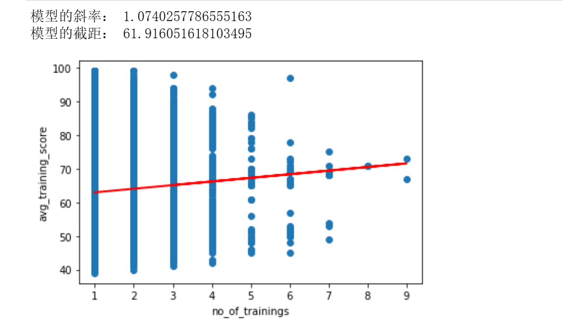
训练次数越多,平均训练得分相应更高
4.数据可视化
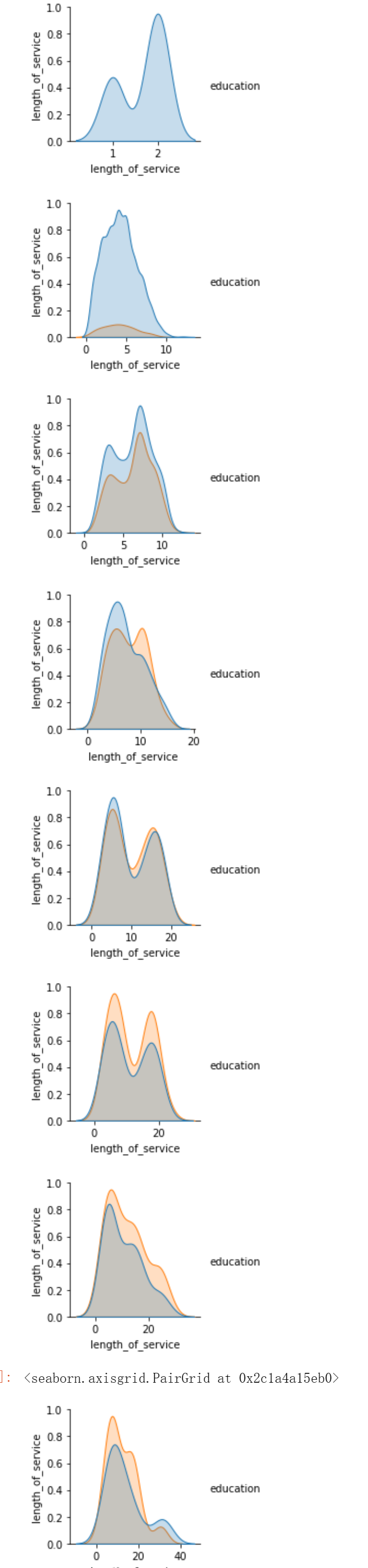
#平均训练得分和工作时长
import seaborn
import matplotlib.pyplot as plt
seaborn.pairplot(df[df.age == 21], vars = ['length_of_service'], hue = 'avg_training_score')
plt.show()
seaborn.pairplot(df[df.age == 30], vars = ['length_of_service'], hue = 'avg_training_score')
plt.show()
seaborn.pairplot(df[df.age== 35], vars = ['length_of_service'], hue = 'avg_training_score')
plt.show()
seaborn.pairplot(df[df.age== 40], vars = ['length_of_service'], hue = 'avg_training_score')
plt.show()
seaborn.pairplot(df[df.age== 45], vars = ['length_of_service'], hue = 'avg_training_score')
plt.show()
seaborn.pairplot(df[df.age==50], vars = ['length_of_service'], hue = 'avg_training_score')
plt.show()
seaborn.pairplot(df[df.age==55], vars = ['length_of_service'], hue = 'avg_training_score')
plt.show()
seaborn.pairplot(df[df.age==60], vars = ['length_of_service'], hue = 'avg_training_score')
plt.show()

import seaborn
import matplotlib.pyplot as plt
seaborn.pairplot(df[df.age == 21], vars = ['length_of_service'], hue = 'education')
plt.show()
seaborn.pairplot(df[df.age == 30], vars = ['length_of_service'], hue = 'education')
plt.show()
seaborn.pairplot(df[df.age== 35], vars = ['length_of_service'], hue = 'education')
plt.show()
seaborn.pairplot(df[df.age== 40], vars = ['length_of_service'], hue = 'education')
plt.show()
seaborn.pairplot(df[df.age== 45], vars = ['length_of_service'], hue = 'education')
plt.show()
seaborn.pairplot(df[df.age==50], vars = ['length_of_service'], hue = 'education')
plt.show()
seaborn.pairplot(df[df.age==55], vars = ['length_of_service'], hue = 'education')
plt.show()
seaborn.pairplot(df[df.age==60], vars = ['length_of_service'], hue = 'education')
#平均训练得分和工作时长
import seaborn as sns
import matplotlib.pyplot as plt
plt.figure( figsize=(20,15), dpi=50)
plt.subplot(3,2,1)
plt.grid(True)
sns.distplot(df['length_of_service'],color='b',label='length_of_service')
plt.legend(loc='upper right')
plt.subplot(3,2,2)
sns.kdeplot(df['avg_training_score'],color='r',label='avg_training_score')
plt.legend(loc='upper right')
plt.grid(True)
plt.figure( figsize=(20,15), dpi=50)
plt.subplot(3,2,3)
sns.regplot(x='length_of_service',y='avg_training_score',data=df)
plt.subplot(3,2,4)
sns.regplot(x='length_of_service',y='avg_training_score',data=df,color='r',marker='*')
plt.figure( figsize=(20,15), dpi=50)
plt.subplot(3,2,5)
sns.boxplot(x='avg_training_score',y='length_of_service',data=df)
plt.subplot(3,2,6)
sns.boxplot(y='length_of_service',data=df)
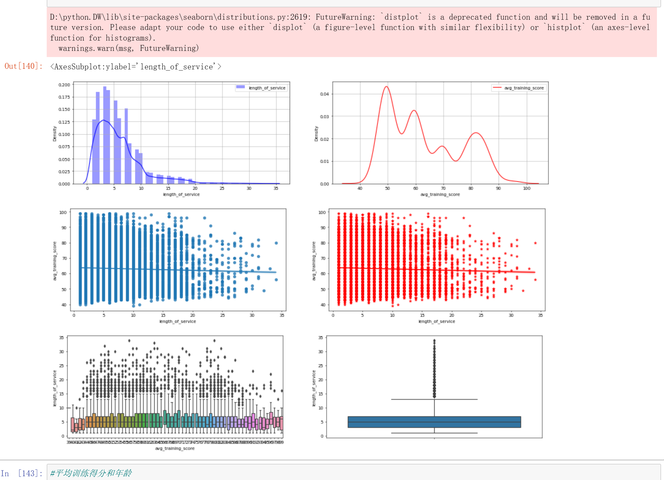
#平均训练得分和年龄
import seaborn as sns
import matplotlib.pyplot as plt
plt.figure( figsize=(20,15), dpi=50)
plt.subplot(3,2,1)
plt.grid(True)
sns.distplot(df['age'],label='age')
plt.legend(loc='upper right')
plt.subplot(3,2,2)
plt.grid(True)
sns.kdeplot(df['age'],color='r',label='age')
plt.legend(loc='upper right')
plt.figure( figsize=(20,15), dpi=50)
plt.subplot(3,2,3)
sns.regplot(x='age',y='avg_training_score',data=df)
plt.subplot(3,2,4)
sns.regplot(x='age',y='avg_training_score',data=df,color='r',marker='*')
plt.figure( figsize=(20,15), dpi=50)
plt.subplot(3,2,5)
sns.boxplot(x='avg_training_score',y='age',data=df)
plt.subplot(3,2,6)
sns.boxplot(y='avg_training_score',x='age',data=df)

#用lmplot()命令探索多个变量带来的交互作用
import pandas as pd
import seaborn as sns
#引入hue参数(hue=education)进行分类,并分析不同学历水平和训练平均得分的有什么不同
sns.lmplot(x='age',y='avg_training_score',hue='education',data=df)
#引入hue参数(hue=ength_of_service)进行分类,并分析不同工作时长和训练平均得分的有什么不同。
sns.lmplot(x='age',y='avg_training_score',hue='length_of_service',data=df)
#分析不同部门和训练平均得分的有什么不同
sns.lmplot(x='age',y='avg_training_score',hue='department',data=df)
#分析不同往年评分和训练平均得分的有什么不同
sns.lmplot(x='age',y='avg_training_score',hue='previous_year_rating',data=df)
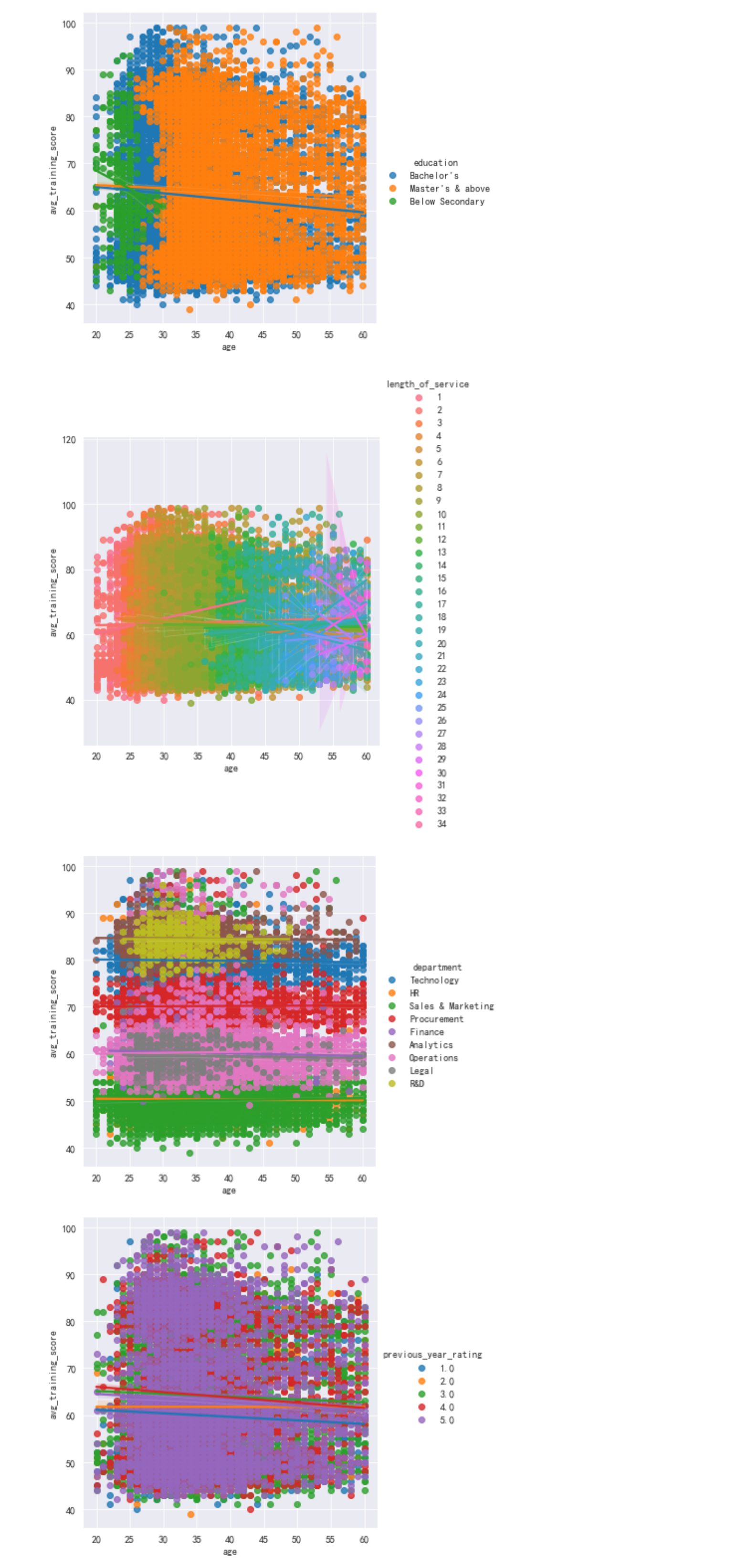
技术部门,销售和市场营销部门,操作部门,采购部门的人数近似,并且构成了大部分人员,如果想进入该公司考虑这几个较大部门可能性会更加大。
#分析不同训练次数和训练平均得分的有什么不同
sns.lmplot(x='age',y='avg_training_score',hue='no_of_trainings',data=df)
#分析不同招募渠道和训练平均得分的有什么不同
sns.lmplot(x='age',y='avg_training_score',hue='recruitment_channel',data=df)
#分析不同地区和训练平均得分的有什么不同
sns.lmplot(x='age',y='avg_training_score',hue='region',data=df)
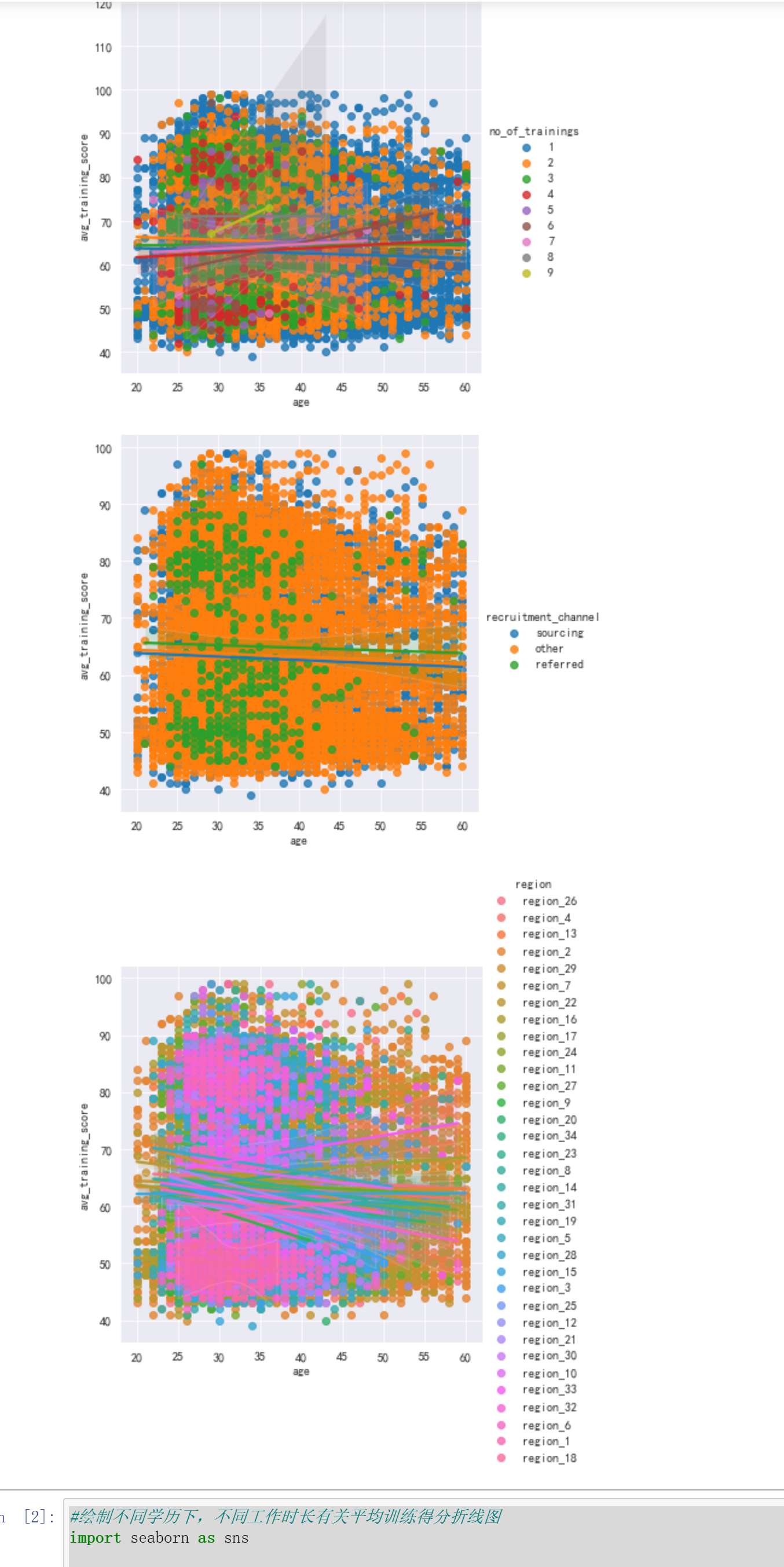
训练次数越多,平均训练得分越高
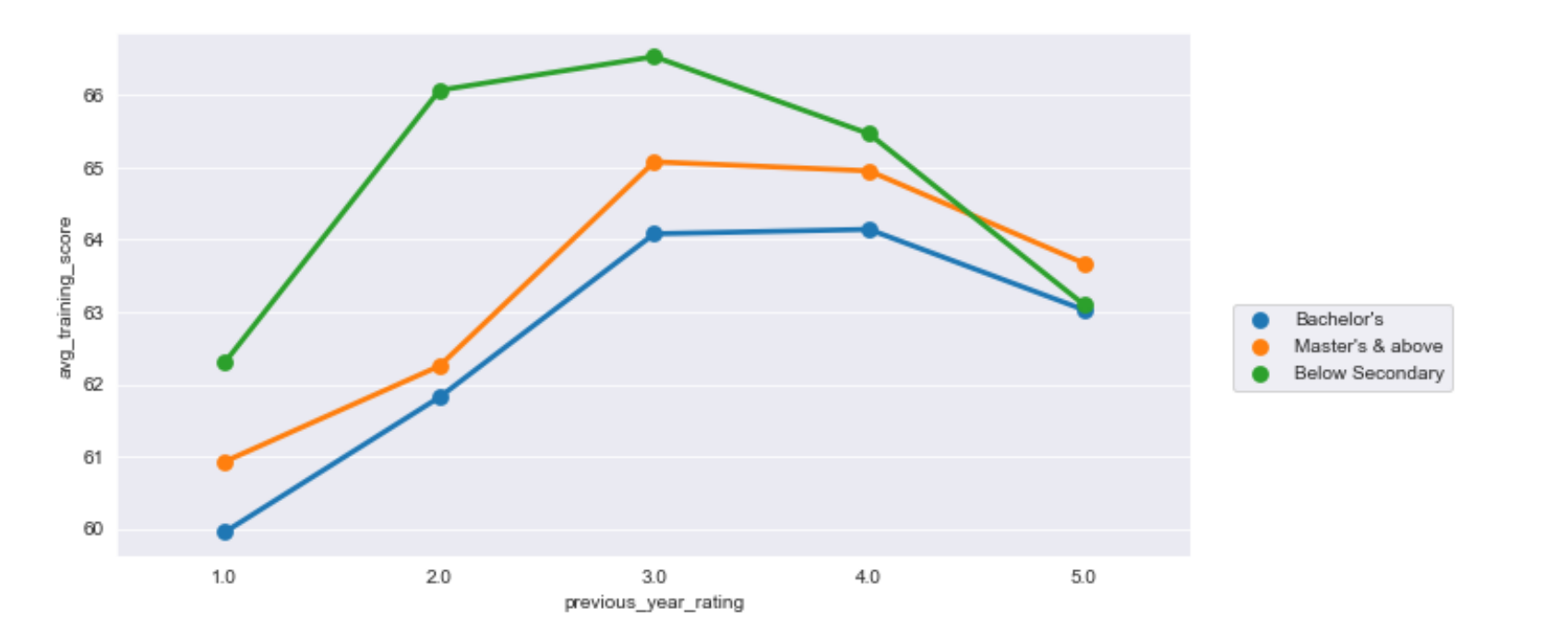
#绘制不同学历下,不同工作时长有关平均训练得分折线图
import seaborn as sns

import matplotlib.pyplot as plt

sns.set_style("darkgrid")

plt.figure(figsize=(10,5))

sns.pointplot(x="length_of_service",y="avg_training_score",hue='education', data=df,ci=None)

plt.legend(bbox_to_anchor=(1.03,0.5))
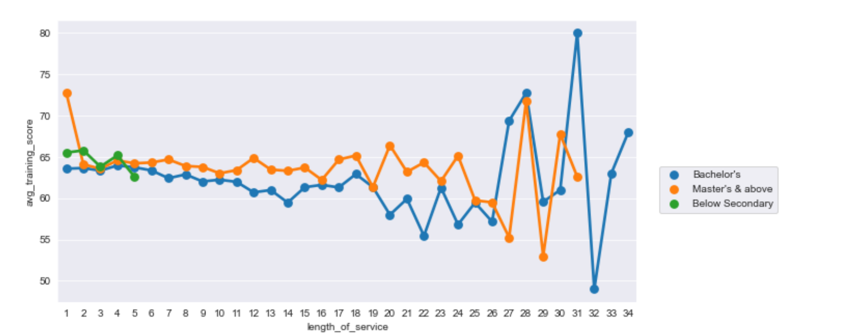
工作时间更加长并且学历更高者,训练平均得分更加不稳定
#不同学历下,不同往年评级的平均训练得分折现统计图
import seaborn as sns

import matplotlib.pyplot as plt

sns.set_style("darkgrid")

plt.figure(figsize=(10,5))

sns.pointplot(x="previous_year_rating",y="avg_training_score",hue='education', data=df,ci=None)

plt.legend(bbox_to_anchor=(1.03,0.5))
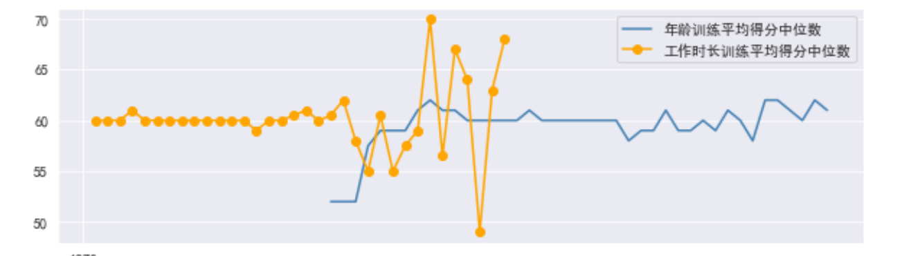
#绘制不同年龄训练平均得分中位数和不同工作时长训练平均得分中位数图形
import matplotlib

import matplotlib.pyplot as plt

font={'family':'SimHei'}

matplotlib.rc('font',**font)

group_d=df.groupby('age')['avg_training_score'].median()

group_m=df.groupby('length_of_service')['avg_training_score'].median()

group_m.index=pd.to_datetime(group_m.index)

group_d.index=pd.to_datetime(group_d.index)

plt.figure(figsize=(10,3))

plt.plot(group_d.index,group_d.values,'-',color='steelblue',label="不同年龄训练平均得分中位数")

plt.plot(group_m.index,group_m.values,'-o',color='orange',label="不同工作时长训练平均得分中位数")

plt.legend()

plt.show()
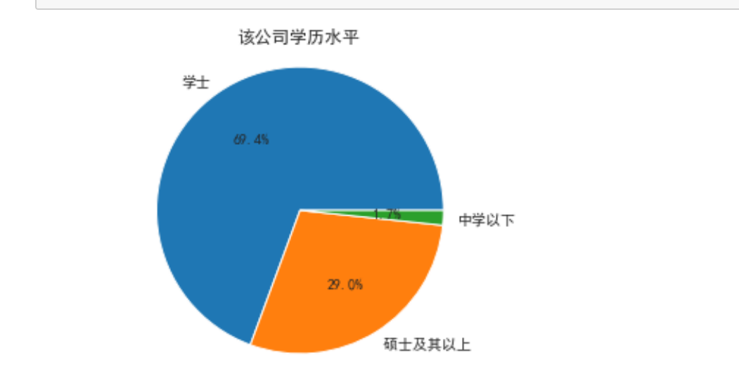
import matplotlib.pyplot as plt
Type = ['学士', '硕士及其以上 ', '中学以下']
Data = [15578,6504,374]
cols = ['r','g','y','coral']
#绘制饼图
plt.pie(Data ,labels=Type, autopct='%1.1f%%')
#设置显示图像为圆形
plt.axis('equal')
plt.title('该公司学历水平')
plt.show()
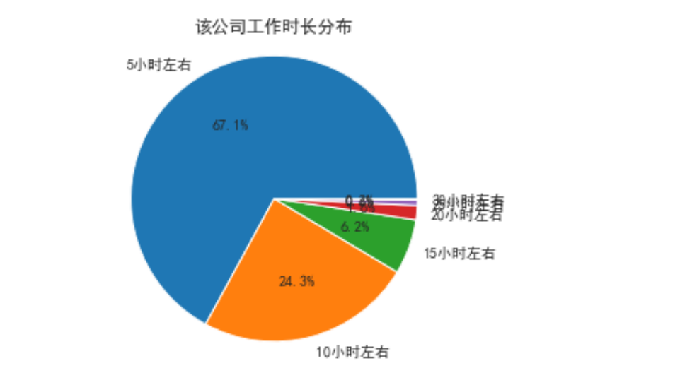
import matplotlib.pyplot as plt
Type = ['5小时左右', '10小时左右 ', '15小时左右', '20小时左右', '25小时左右', '30小时左右']
Data = [2592,941,240,62,24,6]
cols = ['r','g','y','coral']
#绘制饼图
plt.pie(Data ,labels=Type, autopct='%1.1f%%')
#设置显示图像为圆形
plt.axis('equal')
plt.title('该公司工作时长分布')
plt.show()
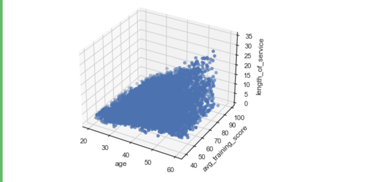
import numpy as np
import matplotlib.pyplot as plt
from mpl_toolkits. mplot3d import Axes3D
fig = plt.figure()
ax = Axes3D(fig)
x = df['age']
y = df['avg_training_score']
z = df['length_of_service']
ax. scatter(x, y, z)
ax.set_xlabel('age')
ax.set_ylabel( 'avg_training_score' )
ax.set_zlabel('length_of_service' )
plt.show()
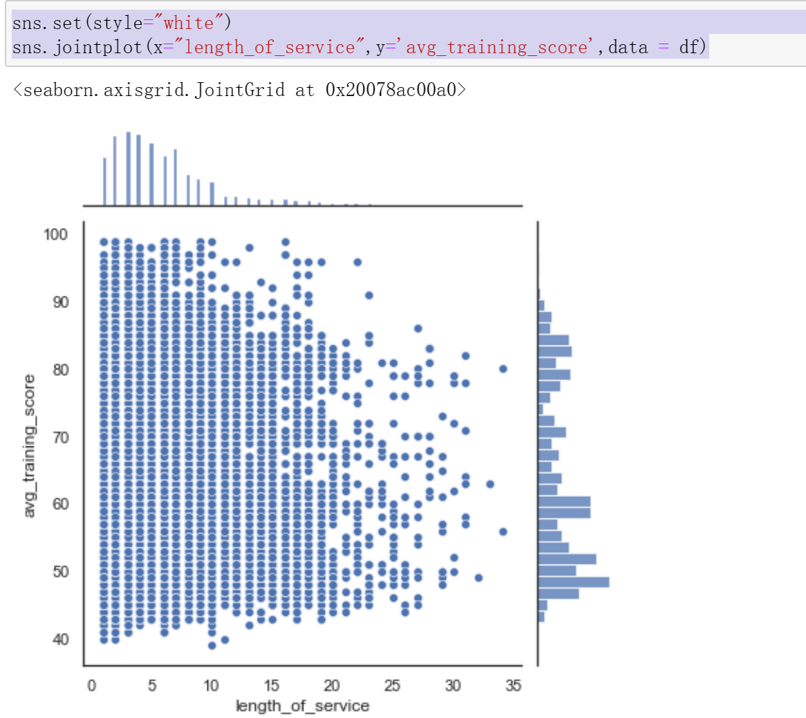
sns.set(style="white")
sns.jointplot(x="length_of_service",y='avg_training_score',data = df)
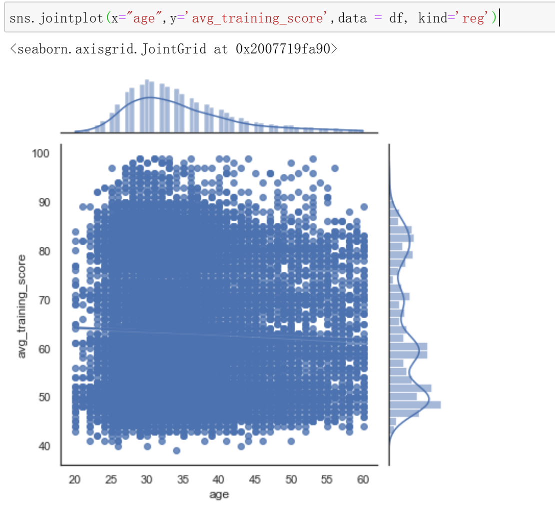
sns.jointplot(x="age",y='avg_training_score',data = df, kind='reg')
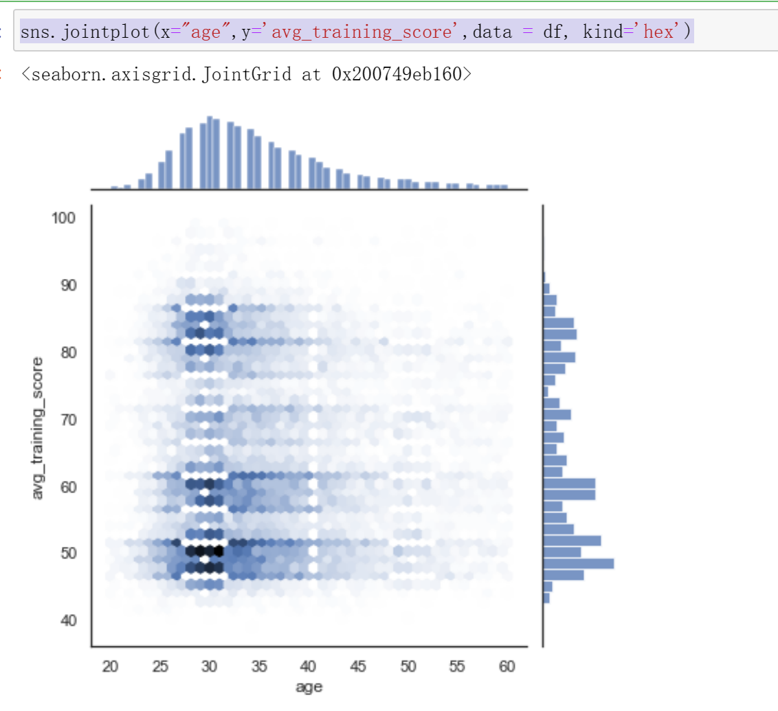
sns.jointplot(x="age",y='avg_training_score',data = df, kind='hex')
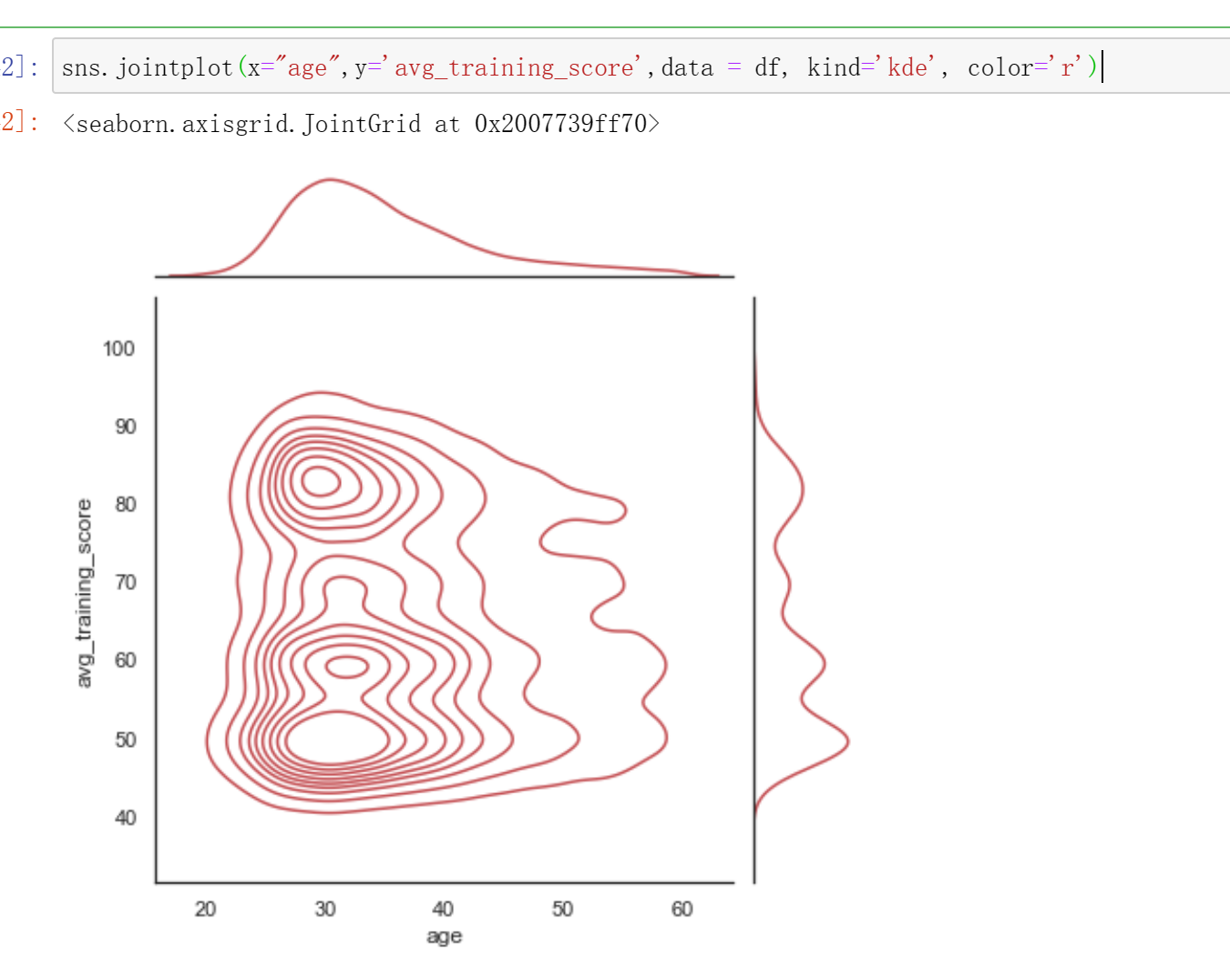
sns.jointplot(x="age",y='avg_training_score',data = df, kind='kde', color='r')
# 根据两个离散变量嵌套分组的盒图,hue用于指定要嵌套的离散变量
sns.boxplot(x='gender',y='age', hue='education', data=df)

fig,axes=plt.subplots(1,2)
#1.使用两个变量作图(下图左子图)
sns.countplot(x=df['gender'], hue=df['education'], ax=axes[0])
#2.绘制水平图(下图右子图)
sns.countplot(y=df['gender'], hue=df['education'], ax=axes[1])

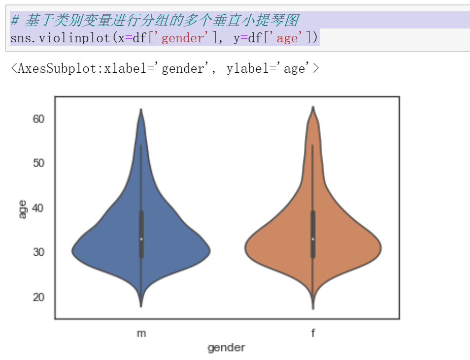
# 基于类别变量进行分组的多个垂直小提琴图
sns.violinplot(x=df['gender'], y=df['age'])
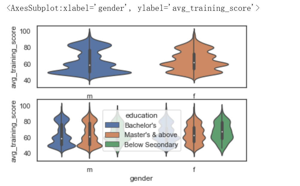
fig,axes=plt.subplots(2,1)
# 1.默认绘图效果
sns.violinplot(x=df['gender'], y=df['avg_training_score'], ax=axes[0])
#2. hue参数可以对字段进行细分
sns.violinplot(x=df['gender'], y=df['avg_training_score'], hue=df['education'], ax=axes[1])
完整代码
1 #####导入数据集
2 import pandas as pd
3 import numpy as np
4 from datetime import datetime
5 from sklearn.linear_model import LinearRegression
6 df = pd.read_csv(r"C:\Users\dxh\人力资源分析案例研究数据集.csv",encoding='gb18030')
7 df.head()
8 #显示形状
9 df.shape
10 #显示列名
11 df.columns
12 #观察各个属性的类型
13 #dataframe中的 object 类型来自于 Numpy,
14 # 描述了每一个元素 在 ndarray 中的类型 (也就是Object类型)
15 df.dtypes
16 #统计男女性别人数
17 df["gender"].value_counts()
18 #统计不同学历人数
19 df["education"].value_counts()
20 #统计不同年龄人数
21 df["age"].value_counts()
22 #统计kpi>80%人数
23 df["KPIs_met >80%"].value_counts()
24 #统计不同工作时长
25 df["length_of_service"].value_counts()
26 #交叉表是用于统计分组频率的特殊透视表
27 #统计男女获奖的人数
28 #交叉表crosstab是按类别分组,统计各个分组中的频数
29 pd.crosstab(df["gender"],df["awards_won?"])
30 #使用corr()函数,判断两个属性是否具有相关性,获奖与KPI>80%
31 df['awards_won?'].corr(df['KPIs_met >80%'])
32 #使用corr()函数,判断两个属性是否具有相关性,是否训练平均分与训练
33 df['avg_training_score'].corr(df['no_of_trainings'])
34 #使用corr()函数,判断两个属性是否具有相关性,平均得分和是否获奖
35 df['avg_training_score'].corr(df['awards_won?'])
36 #####数据清洗
37 #数据维度
38 print('===数据维度:{:}行{:}列===\n'.format(df.shape[0],df.shape[1]))
39 #查询空值
40 df.isnull()
41 #只显示存在缺失值的行列,清楚的确定缺失值的位置
42 #[df.isnull().values==True]是条件表达式
43 df[df.isnull().values==True].head()
44 #统计各列的空值情况
45 print('\n===各列的空值情况如下:===')
46 df.isnull().sum()
47 # 查找重复值
48 df.duplicated()
49 #使用describe查看统计信息
50 df.describe()
51 #删除无效列与行,重复值处理,空值与缺失值处理,空格处理,异常值处理,数据清洗完成后,保存为新文件,人力资源分析案例研究数据集clean.csv
52 print("------------------删除无效列与行----------------")
53 print(df.dropna())#删除所有无效
54 #print(df.dropna(axis=1))#列
55 print("------------------重复数据----------------")
56 print(df.drop_duplicates())#删除重复数据
57 print("------------------空格缺失值----------------")
58 print(df.notnull())
59 nt(df.fillna(0))#空值,缺失值填充
60 print("------------------空格----------------")
61 print(df.isnull().any())
62 print("------------------去除异常值----------------")
63 print(df.reset_index())
64 print("------------------保存----------------")
65 df.to_csv('C:/Users/dxh/人力资源分析案例研究数据集clean.csv',sep='\t',encoding='utf-32')
66 #用清洗的数据集构造一个新的数据集new_data,包括部门,学历,性别,训练次数,年龄,以往年级评分,KPI完成80%,获奖,平均训练得分
67 import numpy as np
68 import pandas as pd
69 df = pd.read_csv(r"C:\Users\dxh\人力资源分析案例研究数据集.csv",encoding='gb18030')
70 df.head()
71 #df.drop(labels=['education','gender','age','previous_year_rating','length_of_service','awards_won?','KPIs_met >80%'],axis=1)
72 #获取,部门,学历,性别,训练次数,年龄,以往年级评分,KPI完成80%,获奖,平均训练得分
73 df.drop(labels=['employee_id','region','recruitment_channel','length_of_service'],axis=1)
74 #用corr()方法求出各变量之间的相关系数
75 # 导入包
76 import numpy as np
77 import pandas as pd
78 from sklearn.linear_model import LinearRegression
79 df = pd.read_csv(r"C:\Users\dxh\人力资源分析案例研究数据集.csv",encoding='gb18030')
80 df.head()
81 new_data=df.drop(labels=['employee_id','region','recruitment_channel','length_of_service'],axis=1)
82 new_data.corr(method='spearman')
83 import pandas as pd
84 import matplotlib.pyplot as plt
85 import numpy as np
86 import scipy.stats as stats
87 import sklearn
88 pd.options.display.max_columns =50 # 限定最多输出50列
89 df = pd.read_csv(r"C:\Users\dxh\人力资源分析案例研究数据集.csv",encoding='gb18030')
90 print(df.head())
91 #是否训练与训练平均得分
92 print("-----------------no_of_trainings,avg_training_score图----------------")
93 df.plot.scatter(x='no_of_trainings', y='avg_training_score',color='b',title='no_of_trainingsscatter')
94 plt.show()
95 print("-----------------age,avg_training_score图----------------")
96 df.plot.scatter(x='age', y='avg_training_score',color='g',title='age scatter')
97 plt.show()
98 print("-----------------previous_year_rating,avg_training_score图----------------")
99 df.plot.scatter(x='previous_year_rating', y='avg_training_score',color='g',title='previous_year_rating scatter')
100 plt.show()
101 #训练次数和平均训练得分
102 #用sklearn库的LinearRegression构建线性回归预测模型,两个特征变量的线性关系,求出线性回归方程的斜率与截距。
103 #绘制散点图与回归方程
104 import pandas as pd
106 import matplotlib.pyplot as plt
108 from sklearn.linear_model import LinearRegression
110 X = df[['no_of_trainings']]
112 y = df['avg_training_score']
114 reg = LinearRegression().fit(X, y)
116 print('模型的斜率:', reg.coef_[0])
118 print('模型的截距:', reg.intercept_)
120 plt.scatter(X, y)
122 plt.plot(X, reg.predict(X), color='red', linewidth=2)
124 plt.xlabel('no_of_trainings')
126 plt.ylabel('avg_training_score')
128 plt.show()
129 #平均训练得分和工作时长
130 import seaborn
131 import matplotlib.pyplot as plt
132 seaborn.pairplot(df[df.age == 21], vars = ['length_of_service'], hue = 'avg_training_score')
133 plt.show()
134 seaborn.pairplot(df[df.age == 30], vars = ['length_of_service'], hue = 'avg_training_score')
135 plt.show()
136 seaborn.pairplot(df[df.age== 35], vars = ['length_of_service'], hue = 'avg_training_score')
137 plt.show()
138 seaborn.pairplot(df[df.age== 40], vars = ['length_of_service'], hue = 'avg_training_score')
139 plt.show()
140 seaborn.pairplot(df[df.age== 45], vars = ['length_of_service'], hue = 'avg_training_score')
141 plt.show()
142 seaborn.pairplot(df[df.age==50], vars = ['length_of_service'], hue = 'avg_training_score')
143 plt.show()
144 seaborn.pairplot(df[df.age==55], vars = ['length_of_service'], hue = 'avg_training_score')
145 plt.show()
146 seaborn.pairplot(df[df.age==60], vars = ['length_of_service'], hue = 'avg_training_score')
147 plt.show()
148 import seaborn
149 import matplotlib.pyplot as plt
150 seaborn.pairplot(df[df.age == 21], vars = ['length_of_service'], hue = 'education')
151 plt.show()
152 seaborn.pairplot(df[df.age == 30], vars = ['length_of_service'], hue = 'education')
153 plt.show()
154 seaborn.pairplot(df[df.age== 35], vars = ['length_of_service'], hue = 'education')
155 plt.show()
156 seaborn.pairplot(df[df.age== 40], vars = ['length_of_service'], hue = 'education')
157 plt.show()
158 seaborn.pairplot(df[df.age== 45], vars = ['length_of_service'], hue = 'education')
159 plt.show()
160 seaborn.pairplot(df[df.age==50], vars = ['length_of_service'], hue = 'education')
161 plt.show()
162 seaborn.pairplot(df[df.age==55], vars = ['length_of_service'], hue = 'education')
163 plt.show()
164 seaborn.pairplot(df[df.age==60], vars = ['length_of_service'], hue = 'education')
165 #平均训练得分和工作时长
166 import seaborn as sns
167 import matplotlib.pyplot as plt
168 plt.figure( figsize=(20,15), dpi=50)
169 plt.subplot(3,2,1)
170 plt.grid(True)
171 sns.distplot(df['length_of_service'],color='b',label='length_of_service')
172 plt.legend(loc='upper right')
173 plt.subplot(3,2,2)
174 sns.kdeplot(df['avg_training_score'],color='r',label='avg_training_score')
175 plt.legend(loc='upper right')
176 plt.grid(True)
177 plt.figure( figsize=(20,15), dpi=50)
178 plt.subplot(3,2,3)
179 sns.regplot(x='length_of_service',y='avg_training_score',data=df)
180 plt.subplot(3,2,4)
181 sns.regplot(x='length_of_service',y='avg_training_score',data=df,color='r',marker='*')
182 plt.figure( figsize=(20,15), dpi=50)
183 plt.subplot(3,2,5)
184 sns.boxplot(x='avg_training_score',y='length_of_service',data=df)
185 plt.subplot(3,2,6)
186 sns.boxplot(y='length_of_service',data=df)
187 #平均训练得分和年龄
188 import seaborn as sns
189 import matplotlib.pyplot as plt
190 plt.figure( figsize=(20,15), dpi=50)
191 plt.subplot(3,2,1)
192 plt.grid(True)
193 sns.distplot(df['age'],label='age')
194 plt.legend(loc='upper right')
195 plt.subplot(3,2,2)
196 plt.grid(True)
197 sns.kdeplot(df['age'],color='r',label='age')
198 plt.legend(loc='upper right')
199 plt.figure( figsize=(20,15), dpi=50)
200 plt.subplot(3,2,3)
201 sns.regplot(x='age',y='avg_training_score',data=df)
202 plt.subplot(3,2,4)
203 sns.regplot(x='age',y='avg_training_score',data=df,color='r',marker='*')
204 plt.figure( figsize=(20,15), dpi=50)
205 plt.subplot(3,2,5)
206 sns.boxplot(x='avg_training_score',y='age',data=df)
207 plt.subplot(3,2,6)
208 sns.boxplot(y='avg_training_score',x='age',data=df)
209 #用lmplot()命令探索多个变量带来的交互作用
210 import pandas as pd
211 import seaborn as sns
212 #引入hue参数(hue=education)进行分类,并分析不同学历水平和训练平均得分的有什么不同
213 sns.lmplot(x='age',y='avg_training_score',hue='education',data=df)
214 #引入hue参数(hue=ength_of_service)进行分类,并分析不同工作时长和训练平均得分的有什么不同。
215 sns.lmplot(x='age',y='avg_training_score',hue='length_of_service',data=df)
216 #分析不同部门和训练平均得分的有什么不同
217 sns.lmplot(x='age',y='avg_training_score',hue='department',data=df)
218 #分析不同往年评分和训练平均得分的有什么不同
219 sns.lmplot(x='age',y='avg_training_score',hue='previous_year_rating',data=df)
220 #分析不同训练次数和训练平均得分的有什么不同
221 sns.lmplot(x='age',y='avg_training_score',hue='no_of_trainings',data=df)
222 #分析不同招募渠道和训练平均得分的有什么不同
223 sns.lmplot(x='age',y='avg_training_score',hue='recruitment_channel',data=df)
224 #分析不同地区和训练平均得分的有什么不同
225 sns.lmplot(x='age',y='avg_training_score',hue='region',data=df)
226 #绘制不同学历下,不同工作时长有关平均训练得分折线图
227 import seaborn as sns
228 import matplotlib.pyplot as plt
229 sns.set_style("darkgrid")
230 plt.figure(figsize=(10,5))
231 sns.pointplot(x="length_of_service",y="avg_training_score",hue='education', data=df,ci=None)
232 plt.legend(bbox_to_anchor=(1.03,0.5))
233 #不同学历下,不同往年评级的平均训练得分折现统计图
234 import seaborn as sns
235 import matplotlib.pyplot as plt
236 sns.set_style("darkgrid")
237 plt.figure(figsize=(10,5))
238 sns.pointplot(x="previous_year_rating",y="avg_training_score",hue='education', data=df,ci=None)
239 plt.legend(bbox_to_anchor=(1.03,0.5))
240 #绘制不同年龄训练平均得分中位数和不同工作时长训练平均得分中位数图形
241 import matplotlib
242 import matplotlib.pyplot as plt
243 font={'family':'SimHei'}
244 matplotlib.rc('font',**font)
245 group_d=df.groupby('age')['avg_training_score'].median()
246 group_m=df.groupby('length_of_service')['avg_training_score'].median()
247 group_m.index=pd.to_datetime(group_m.index)
248 group_d.index=pd.to_datetime(group_d.index)
249 plt.figure(figsize=(10,3))
250 plt.plot(group_d.index,group_d.values,'-',color='steelblue',label="不同年龄训练平均得分中位数")
251 plt.plot(group_m.index,group_m.values,'-o',color='orange',label="不同工作时长训练平均得分中位数")
252 plt.legend()
253 plt.show()
254 import matplotlib.pyplot as plt
255 Type = ['学士', '硕士及其以上 ', '中学以下']
256 Data = [15578,6504,374]
257 cols = ['r','g','y','coral']
258 #绘制饼图
259 plt.pie(Data ,labels=Type, autopct='%1.1f%%')
260 #设置显示图像为圆形
261 plt.axis('equal')
262 plt.title('该公司学历水平')
263 plt.show()
264 import matplotlib.pyplot as plt
265 Type = ['25岁', '30岁 ', '35岁', '40岁', '45岁', '50岁', '55岁', '60岁']
266 Data = [586,1596,1169,675,303,205,135,89]
267 cols = ['r','g','y','coral']
268 #绘制饼图
269 plt.pie(Data ,labels=Type, autopct='%1.1f%%')
270 #设置显示图像为圆形
271 plt.axis('equal')
272 plt.title('该公司年龄分布')
273 plt.show()
274 import matplotlib.pyplot as plt
275 Type = ['5小时左右', '10小时左右 ', '15小时左右', '20小时左右', '25小时左右', '30小时左右']
276 Data = [2592,941,240,62,24,6]
277 cols = ['r','g','y','coral']
278 #绘制饼图
279 plt.pie(Data ,labels=Type, autopct='%1.1f%%')
280 #设置显示图像为圆形
281 plt.axis('equal')
282 plt.title('该公司工作时长分布')
283 plt.show()
284 import numpy as np
285 import matplotlib.pyplot as plt
286 from mpl_toolkits. mplot3d import Axes3D
287 fig = plt.figure()
288 ax = Axes3D(fig)
289 x = df['age']
290 y = df['avg_training_score']
291 z = df['length_of_service']
292 ax. scatter(x, y, z)
293 ax.set_xlabel('age')
294 ax.set_ylabel( 'avg_training_score' )
295 ax.set_zlabel('length_of_service' )
296 plt.show()
297 sns.set(style="white")
298 sns.jointplot(x="length_of_service",y='avg_training_score',data = df)
299 sns.jointplot(x="age",y='avg_training_score',data = df, kind='reg')
300 sns.jointplot(x="age",y='avg_training_score',data = df, kind='hex')
301 sns.jointplot(x="age",y='avg_training_score',data = df, kind='kde', color='r')
302 sns.boxplot(x='gender',y='age', data=df)
303 # 根据两个离散变量嵌套分组的盒图,hue用于指定要嵌套的离散变量
304 sns.boxplot(x='gender',y='age', hue='education', data=df)
305 fig,axes=plt.subplots(1,2)
306 #1.使用两个变量作图(下图左子图)
307 sns.countplot(x=df['gender'], hue=df['education'], ax=axes[0])
308 #2.绘制水平图(下图右子图)
309 sns.countplot(y=df['gender'], hue=df['education'], ax=axes[1])
310 # 基于类别变量进行分组的多个垂直小提琴图
311 sns.violinplot(x=df['gender'], y=df['age'])
312 fig,axes=plt.subplots(2,1)
313 # 1.默认绘图效果
314 sns.violinplot(x=df['gender'], y=df['avg_training_score'], ax=axes[0])
315 #2. hue参数可以对字段进行细分
316 sns.violinplot(x=df['gender'], y=df['avg_training_score'], hue=df['education'], ax=axes[1])
四.总结
1.数据分析过程中得出该数据集,只有很少的一部分人是中级以下学历,学士学位以及以上占大部分,说明了学历的重要性,求职过程中有一个较好的学历更加有优势。年龄,主要集中的年龄就是25到35这一年龄段,说明该公司需求大的也是年轻人。其中男性女性人数相差较大,女生相应的岗位可能需求更加小。
2.分析该数据不仅让我学习到了python数据分析方面的知识,也让我意识到了学历在人生职业生涯中的重要性,以及工作之后也有训练,考核等等,人生总是在路上,没有终点,翻过一座高山后面还有新的挑战在等着我。不足之处是分析做的还是不够全面,每两个关系之间的关系,多个变量的交叉影响还可以更加全面,技术上也有未突破的。

 浙公网安备 33010602011771号