
matplotlib----初探------4条形图
概念
>>>>>>>>>>>>>>>>>>>>>>>>>>>>>>>>>>>>>>>>>>>>>>>>>>>>>>>>>>>>>>>>>>>>>>>>>>>>>>>>>>>>>>>>>>>
以长方形的长度为变量的统计图表
用来比较多个项目分类的数据大小
通常利用于较小的数据集分析
例如不同季度的销量,不同国家的人口等
>>>>>>>>>>>>>>>>>>>>>>>>>>>>>>>>>>>>>>>>>>>>>>>>>>>>>>>>>>>>>>>>>>>>>>>>>>>>>>>>>>>>>>>>>>>
简单的例子
参数调整 - height, width, bottom, color, orientation
并列条形图 VS 层叠条形图
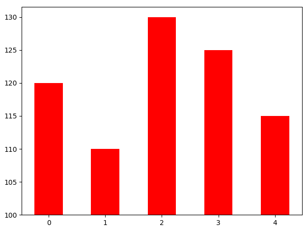
import numpy as np
import matplotlib.pyplot as plt
N=5
y=[20,10,30,25,15]
index = np.arange(N)
p1 = plt.bar(index, height=y,width=0.5,bottom=100,color='red')
plt.show()
》》》》》》》》》》》》》》》》》》》》》》》》》》》》》》》》》》》》》》》》》》》》》》》》》》》
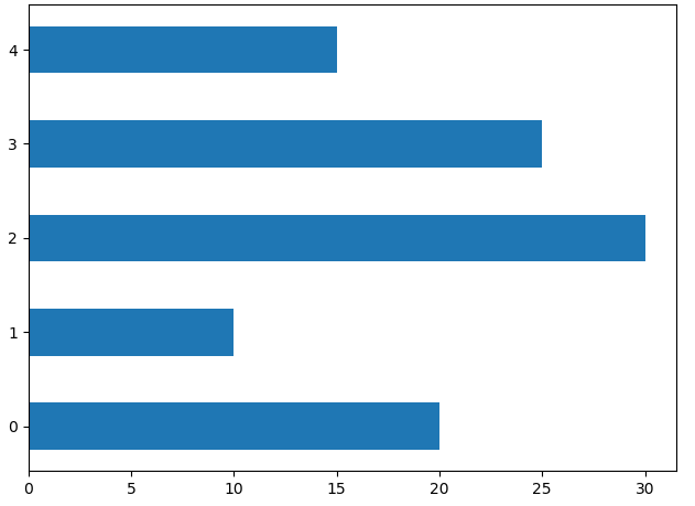
import numpy as np
import matplotlib.pyplot as plt
N=5
y=[20,10,30,25,15]
index = np.arange(N)
p2 = plt.bar(0, bottom=index, width=y,height=0.5,orientation='horizontal')
plt.show()
》》》》》》》》》》》》》》》》》》》》》》》》》》》》》》》》》》》》》》》》》》》》》》》》》》》》》》》》》》
两栏:
import numpy as np
import matplotlib.pyplot as plt
N=5
y=[20,10,30,25,15]
index = np.arange(N)
index=np.arange(4)
sales_BJ=[52,55,63,53]
sales_SH=[44,66,55,41]
bar_width=0.3
plt.bar(index,sales_BJ,bar_width,color='b')
plt.bar(index+bar_width,sales_SH,bar_width,color='r')
plt.show()

>>>>>>>>>>>>>>>>>>>>>>>>>>>>>>>>>>>>>>>>>>>>>>>>>>>>>>>>>>>>>>>>>>>>>>
import numpy as np
import matplotlib.pyplot as plt
N=5
y=[20,10,30,25,15]
index = np.arange(N)
index=np.arange(4)
sales_BJ=[52,55,63,53]
sales_SH=[44,66,55,41]
bar_width=0.3
plt.bar(index,sales_BJ,bar_width,color='b')
plt.bar(index,sales_SH,bar_width,color='r',bottom=sales_BJ)
plt.show()


 浙公网安备 33010602011771号