
Numerical and Text Labelling in Matplotlib Python
This is an old article from my notebook. I find it very useful and often look back into it for work. I revise it again and post it here.
Introduction
Labelling is a eternal topic in data analysis. After a data visulization with matplotlib or other libraries, people still want to see how excatly the number is. For example, not only how long one bar is compare to another, but also how long each bar is.
Another good thing of labelling is after we put numbers on the plot, we no longer need y-axis. We can unvisible y-axis and make our plot more refreshing.
Bad news is in matplotlib there is no such bulid-in function or argument to help us do so. There is not much useful infomation on internet when I studied this topic, some of them even highly wrong. Today I give myself a chance to summary what I have used/ learned in a period about labelling, including numerical and string text.
In this article we will talk about:
1. How to label a vertical bar chart
2. How to label a horizontal bar char.
3. How to label a stacked bar chart.
4. How to label a line plot.
We will import these libraries in the article:
import pandas as pd
import matplotlib.pyplot as plt
How to label a vertical bar chart
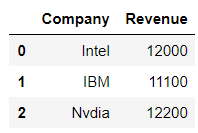
First we will make up some data for example.
# fake some data
companies = {
    'Company': ['Intel', 'IBM', 'Nvdia'],
    'Revenue': [12000, 11100, 12200]
}

companies = pd.DataFrame.from_dict(companies)

companies
I often use object-oriented style, that is create figure & axises. Someone may like function style which use "plt." a lot, but the idea behind the process is all the same.
# install
fig = plt.figure(figsize=(10, 5))
ax1 = fig.add_subplot(1, 1, 1)

# draw
ax1.bar(companies['Company'], companies['Revenue'], width=0.5, color=['lightblue', 'grey', 'salmon'])
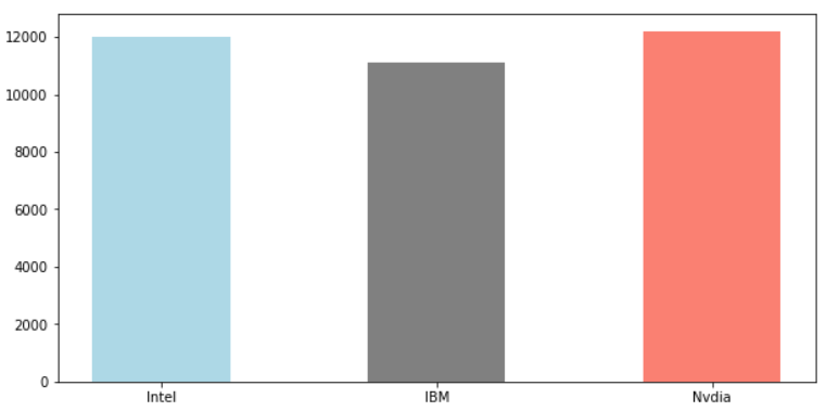
Without any label or customize, this is what we get. Let's have a look at the labelling.
# install
fig = plt.figure(figsize=(10, 5))
ax1 = fig.add_subplot(1, 1, 1)

# draw
rects = ax1.bar(companies['Company'], companies['Revenue'], width=0.5, color=['lightblue', 'grey', 'salmon'])

# labeling
for rect in rects:
    height = rect.get_height()
    ax1.annotate('{}'.format(height),
                xy=(rect.get_x() + rect.get_width() / 2, height),
                xytext=(0, 3),  # 3 points vertical offset
                textcoords="offset points",
                ha='center', va='bottom')

# customize
ax1.set_ylim([0, 14000])
This method use a fact that ax.bar() will return a rects object. These kind of objects have attached many good methods behind the screen: .height()/ .get_x() / .get_width(), we can use them for labeling.
One quick note, some example on internet will tell you to use ax1.text(). But that function has much less arguments than ax.annotate(), so basically we don't use it.

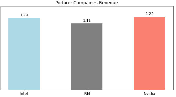
Adding a label to plot may makes y-axis not long enough. We often use ax.set_ylim([]) to make y-axis longer.
Also we can use ax1.get_yaxis().set_visible(False) to dismiss y-axis, after we have exact number on plot, which will make the plot more refreshing.
# install
fig = plt.figure(figsize=(10, 5))
ax1 = fig.add_subplot(1, 1, 1)

# draw
rects = ax1.bar(companies['Company'], companies['Revenue'], width=0.5, color=['lightblue', 'grey', 'salmon'])

# labeling
for rect in rects:
    height = rect.get_height()
    ax1.annotate('{:.2f}'.format(height / 10000),
                xy=(rect.get_x() + rect.get_width() / 2, height),
                xytext=(0, 3),  # 3 points vertical offset
                textcoords="offset points",
                ha='center', va='bottom', fontsize=12)

# customize
ax1.set_ylim([0, 14000])
ax1.set_title('Picture: Compaines Revenue', fontsize=14)
ax1.get_yaxis().set_visible(False)
ax1.set_xticklabels(labels=['Intel', 'IBM', 'Nvidia'], fontsize=12)
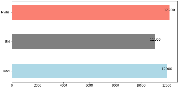
How to label a horizontal bar
We may think label a horizontal bar is the same with vertical bar. Yes and no.
There are certain difference we need to know. Without these knowledge, we may spend a lot of time or get lost.
First we have look at horizontal bar without label.
fig = plt.figure(figsize=(10, 5))
ax1 = fig.add_subplot(1, 1, 1)

ax1.barh(companies['Company'], companies['Revenue'], height=0.5, color=['lightblue', 'grey', 'salmon'])

There are a few things we need to clear:
1. In horizontal bar, the first argument is still x(catagories) and the second argument is values. But x-axis is now from below to above.
As a provement of this point, if we use ax.set_xlabel(), it will show on vertical side.
2. The width argument changes into height.
3. The catogories series start from below to above. In the example, first one is Interl.
4. The most important value in labeling a bar chart is how long one bar is. In vertical bar, it's height, in horizontal bar, it's width.
We will see how labelling works in horizontal bar.
fig = plt.figure(figsize=(10, 5))
ax1 = fig.add_subplot(1, 1, 1)
rects = ax1.barh(airlines['Company'], airlines['Revenue'], height=0.5, color=['lightblue', 'grey', 'salmon'])

for rect in rects:
    width = rect.get_width() # how long the bar is
    ax1.annotate('{}'.format(width),
                 xy=(width, rect.get_y() + rect.get_height() / 2),
                 textcoords="offset points",
                 xytext=(0, 0), # location adjust
                 ha='center', va='bottom',
                 fontsize=12, color='k') # weight='bold' availabel
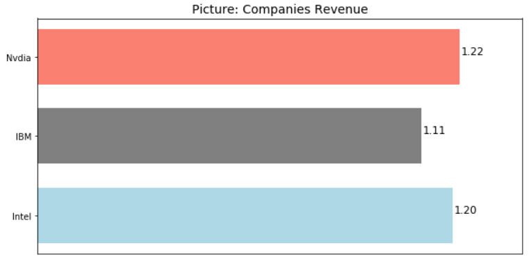
We can do a little more customize
fig = plt.figure(figsize=(10, 5))
ax1 = fig.add_subplot(1, 1, 1)
rects = ax1.barh(companies['Company'], companies['Revenue'], height=0.7, color=['lightblue', 'grey', 'salmon'])

for rect in rects:
    width = rect.get_width() # how long the bar is
    ax1.annotate('{:.2f}'.format(width / 10000),
                 xy=(width, rect.get_y() + rect.get_height() / 2), # first is how long, second is how height
                 textcoords="offset points",
                 xytext=(15, 0), # location adjust
                 ha='center', va='bottom',
                 fontsize=12, color='k') # weight='bold' availabel

ax1.set_xlim([0, 14000])
ax1.get_xaxis().set_visible(False)
ax1.set_title('Picture: Companies Revenue', fontsize=14)
How to label a stack bar
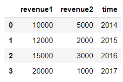
First we make up some new data for demonstration. We often want to show this kind of data in stack bar.
# fake some data
time_series = {
    'time': ['2014', '2015', '2016', '2017'],
    'revenue1': [10000, 12000, 15000, 20000],
    'revenue2': [5000, 2000, 3000, 1000]
}

time_series = pd.DataFrame.from_dict(time_series)

time_series
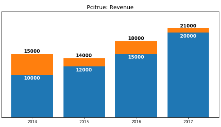
Drawing a stack bar in matplotlib will use an argument called bottom.
fig = plt.figure(figsize=(10, 5))
ax1 = fig.add_subplot(1, 1, 1)

ax1.bar(time_series['time'], time_series['revenue1'])
ax1.bar(time_series['time'], time_series['revenue2'], bottom=time_series['revenue1'])

In stack bar, our main challenge is how to label the above bars. One solution is using for rect1, rect2 in zip(rects1, rects2), our second bar height is it's height plus bottom bar's height.
We can use xytext=(0, 0) argument to adjust location of labeling, and use weight / color to make our label more clear.
fig = plt.figure(figsize=(10, 5))
ax1 = fig.add_subplot(1, 1, 1)

rects1 = ax1.bar(time_series['time'], time_series['revenue1'])
rects2 = ax1.bar(time_series['time'], time_series['revenue2'], bottom=time_series['revenue1'])

for rect1, rect2 in zip(rects1, rects2):

    height1 = rect1.get_height()
    ax1.annotate('{}'.format(height1),
                xy=(rect1.get_x() + rect1.get_width() / 2, height1),
                xytext=(0, -15),
                textcoords="offset points",
                ha='center', va='bottom', fontsize=12,
                color='w', weight='bold')

    height2 = height1 + rect2.get_height()
    ax1.annotate('{}'.format(height2),
                xy=(rect2.get_x() + rect2.get_width() / 2, height2),
                xytext=(0, 0),
                textcoords="offset points",
                ha='center', va='bottom', fontsize=12,
                color='k', weight='bold')

ax1.get_yaxis().set_visible(False)
ax1.set_title('Pcitrue: Revenue', fontsize=14)
ax1.set_ylim([0, 25000])
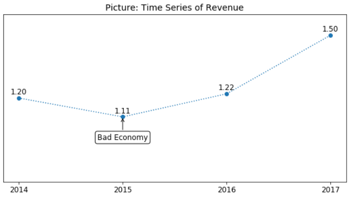
How to label a line plot
First we will make up some data for demonstration.
# fake some data
time_series = {
    'Year': ['2014', '2015', '2016', '2017'],
    'Revenue': [12000, 11100, 12200, 15000]
}

time_series = pd.DataFrame.from_dict(time_series)

time_series

Compare to bar chart, line plot has no a return object to use for label. We will use zip(x, y) and still ax.annotate(). Even there are many lines in a plot, the above method stays unchanged. We can just write different for-loops.
As a bonus, we will add a new feature called box into the plot. This feature can be added to all above cases as well.
The best thing here is we are still using function annotate(). If I may, the consistence of Python and it's libraries is far more good beyond R's.
# install
fig = plt.figure(figsize=(10, 5))
ax1 = fig.add_subplot(1, 1, 1)

# draw
ax1.plot(time_series['Year'], time_series['Revenue'], marker='o', ls=':')

# label
for x, y in zip(time_series['Year'], time_series['Revenue']):
    height = y
    ax1.annotate('{:.2f}'.format(height / 10000),
                xy=(x, y),
                xytext=(0, 3),  # 3 points vertical offset
                textcoords="offset points",
                ha='center', va='bottom', fontsize=12)

ax1.annotate('Bad Economy', xy=(time_series.index[1], time_series.loc[1, 'Revenue']),
             xytext=(0, -40),  # 3 points vertical offset
             textcoords="offset points",
             ha='center', va='bottom', fontsize=12,
             arrowprops=dict(arrowstyle='->'), bbox = dict(boxstyle="round", fc='w'))


# customize
ax1.set_ylim([8000, 16000])
ax1.get_yaxis().set_visible(False)
ax1.set_xticklabels(labels=[2014, 2015, 2016, 2017], fontsize=12)
ax1.set_title('Picture: Time Series of Revenue', fontsize=14)
Summary
If only one thing can be taken from this article, it must be function annotate(). Detail of this function can be found at matplotlib.org.
Second thing, we should use bar() function's return object, it has some attached method, which can help us add label bar charts.
Last but not least, a box can be added to our plot by annotate() as well.

 浙公网安备 33010602011771号