使用xlsxwriter实现带table数据表的折线图
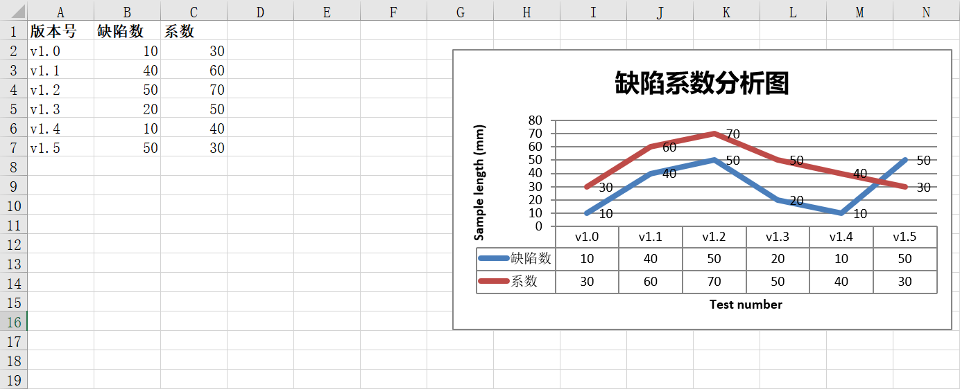
效果展示:
代码展示:
import xlsxwriter

workbook = xlsxwriter.Workbook('chart_line.xlsx')
worksheet = workbook.add_worksheet()
bold = workbook.add_format({'bold': 1})

# Add the worksheet data that the charts will refer to.
headings = ['版本号', '缺陷数', '系数']
data = [
    ['v1.0', 'v1.1', 'v1.2', 'v1.3', 'v1.4', 'v1.5'],
    [10, 40, 50, 20, 10, 50],
    [30, 60, 70, 50, 40, 30],
]

worksheet.write_row('A1', headings, bold)
worksheet.write_column('A2', data[0])
worksheet.write_column('B2', data[1])
worksheet.write_column('C2', data[2])

# Create a new chart object. In this case an embedded chart.
chart1 = workbook.add_chart({'type': 'line'})

# Configure the first series.
chart1.add_series({
    'name':       '=Sheet1!$B$1',
    'categories': '=Sheet1!$A$2:$A$7',
    'values':     '=Sheet1!$B$2:$B$7',
    'data_labels': {'value': True}
})

# Configure a second series. Note use of alternative syntax to define ranges.
chart1.add_series({
    'name':       '=Sheet1!$C$1',
    'categories': '=Sheet1!$A$2:$A$7',
    'values':     '=Sheet1!$C$2:$C$7',
    'data_labels': {'value': True}
})

# Add a chart title and some axis labels.
chart1.set_title ({'name': '缺陷系数分析图'})
chart1.set_x_axis({'name': 'Test number'})
chart1.set_y_axis({'name': 'Sample length (mm)'})

# Set an Excel chart style. Colors with white outline and shadow.
chart1.set_style(10)

#不显示图例
chart1.set_legend({'none': True})
# Insert the chart into the worksheet (with an offset).
worksheet.insert_chart('G2', chart1, {'x_offset': 25, 'y_offset': 10})

#设置数据表
chart1.set_table({'show_keys': True})

workbook.close()
感兴趣的同学可直接查阅官方文档:https://xlsxwriter.readthedocs.io/

 浙公网安备 33010602011771号