
bootstrap初探
- bootstrap资源
- http://getbootstrap.com
- http://github.com/twbs
- http://www.bootcss.com
- bootstrap栅格系统
- 容器:流体(container-fluid)、固定(container)
- 分12列,阈值 分辨率>=1200,container固定尺寸为1170px,若阈值在992到1200之间container固定尺寸为970px,若分辨率在992以下778以上为750px,778px以下为自适应,没有固定的宽度值
-
<!DOCTYPE HTML>
<html>
    <head>
        <meta http-equiv="Content-Type" content="text/html; charset=utf-8">
        <title>无标题文档</title>
        <meta http-equiv="X-UA-Compatible" content="IE=edge">
        <meta name="viewport" content="width=device-width, initial-scale=1">
        <link rel="stylesheet" href="css/bootstrap.css">
        <style>
            .container{ border:1px #000 solid;}
        </style>
    </head>
<body>
<!--<div class="container-fluid">
    aaaaaaaaa
</div>
-->
<div class="container">
    aaaaaaaaa
</div>

</body>
    <script src="js/jquery-2.1.3.js"></script>
    <script src="js/bootstrap.js"></script>
</html>
- 分为12列,可根据列数确定,demo如下
-
![]() View Code
View Code1 <!DOCTYPE HTML> 2 <html> 3 <head> 4 <meta http-equiv="Content-Type" content="text/html; charset=utf-8"> 5 <title>无标题文档</title> 6 <meta http-equiv="X-UA-Compatible" content="IE=edge"> 7 <meta name="viewport" content="width=device-width, initial-scale=1"> 8 <link rel="stylesheet" href="css/bootstrap.css"> 9 <style> 10 .container{ border:1px #000 solid; background: #CCC;} 11 div[class*=col-] { color: white; border: 1px solid red;} 12 </style> 13 </head> 14 <body> 15 16 <div class="container"> 17 <div class="col-lg-1">col-lg-1</div> 18 <div class="col-lg-11">col-lg-1</div> 19 </div> 20 21 </body> 22 <script src="js/jquery-2.1.3.js"></script> 23 <script src="js/bootstrap.js"></script> 24 </html>
![]()
-
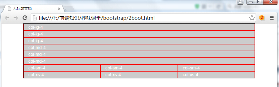
- 不同分辨率下,设置col-lg表示超大分辨率,col-md是中等分辨率,col-sm是pad类似大小,col-xs是移动设备,如果设置了col-*那么会按照相应的分辨率显示,如果小于相应的分辨率则会变为几行,demo如下,可自行运行,以及对应demo图片
-
![]() View Code
View Code<!DOCTYPE HTML> <html> <head> <meta http-equiv="Content-Type" content="text/html; charset=utf-8"> <title>无标题文档</title> <meta http-equiv="X-UA-Compatible" content="IE=edge"> <meta name="viewport" content="width=device-width, initial-scale=1"> <link rel="stylesheet" href="css/bootstrap.css"> <style> .container{ border:1px #000 solid; background: #CCC;} div[class*=col-] { color: white; border: 1px solid red;} </style> </head> <body> <!--div class="container"> <div class="col-lg-1">col-lg-1</div> <div class="col-lg-11">col-lg-1</div> </div--> <div class="container"> <div class="row"> <div class="col-lg-4">col-lg-4</div> <div class="col-lg-4">col-lg-4</div> <div class="col-lg-4">col-lg-4</div> </div> <div class="row"> <div class="col-md-4">col-md-4</div> <div class="col-md-4">col-md-4</div> <div class="col-md-4">col-md-4</div> </div> <div class="row"> <div class="col-sm-4">col-sm-4</div> <div class="col-sm-4">col-sm-4</div> <div class="col-sm-4">col-sm-4</div> </div> <div class="row"> <div class="col-xs-4">col-xs-4</div> <div class="col-xs-4">col-xs-4</div> <div class="col-xs-4">col-xs-4</div> </div> </div> </body> <script src="js/jquery-2.1.3.js"></script> <script src="js/bootstrap.js"></script> </html>
![]()
-
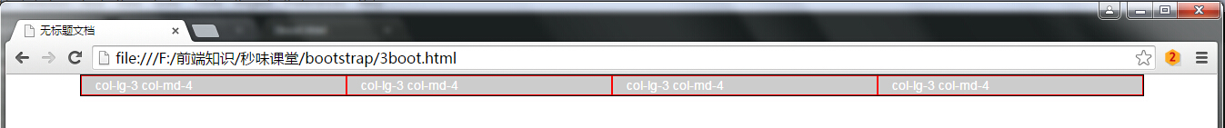
- 组合布局,可设置多个class,在分辨率为一个值得时候按照某个class显示,如果分辨率换成另外一个按照另外一个class显示,如下面demo所示,当分辨率大于1200时,按照col-lg显示四列,如果分辨率小于1200大于992,按照col-md显示三列
-
![]() View Code
View Code<!DOCTYPE HTML> <html> <head> <meta http-equiv="Content-Type" content="text/html; charset=utf-8"> <title>无标题文档</title> <meta http-equiv="X-UA-Compatible" content="IE=edge"> <meta name="viewport" content="width=device-width, initial-scale=1"> <link rel="stylesheet" href="css/bootstrap.css"> <style> .container{ border:1px #000 solid; background: #CCC;} div[class*=col-] { color: white; border: 1px solid red;} </style> </head> <body> <div class="container"> <div class="row"> <div class="col-lg-3 col-md-4">col-lg-3 col-md-4</div> <div class="col-lg-3 col-md-4">col-lg-3 col-md-4</div> <div class="col-lg-3 col-md-4">col-lg-3 col-md-4</div> <div class="col-lg-3 col-md-4">col-lg-3 col-md-4</div> </div> </div> </body> <script src="js/jquery-2.1.3.js"></script> <script src="js/bootstrap.js"></script> </html>
![]()
![]()
-
- 列偏移col-lg-offset-4,向右偏移4个网格距离,demo如下,代码运行效果如下
-
![]() View Code
View Code<!DOCTYPE HTML> <html> <head> <meta http-equiv="Content-Type" content="text/html; charset=utf-8"> <title>无标题文档</title> <meta http-equiv="X-UA-Compatible" content="IE=edge"> <meta name="viewport" content="width=device-width, initial-scale=1"> <link rel="stylesheet" href="css/bootstrap.css"> <style> .container{ border:1px #000 solid; background: #CCC;} div[class^=col-] { color: white; border: 1px solid red;} </style> </head> <body> <div class="container"> <div class="row"> <div class="col-lg-3">col-lg-3</div> <div class="col-lg-3">col-lg-3</div> <div class="col-lg-3">col-lg-3</div> <div class="col-lg-3">col-lg-3</div> </div> <div class="row"> <div class="col-lg-4 col-lg-offset-3">col-lg-4</div> </div> </div> </body> <script src="js/jquery-2.1.3.js"></script> <script src="js/bootstrap.js"></script> </html>
![]()
- 最多偏移为12,若大于12则不起任何作用,demo以及代码运行效果如下
![]() View Code
View Code<!DOCTYPE HTML> <html> <head> <meta http-equiv="Content-Type" content="text/html; charset=utf-8"> <title>无标题文档</title> <meta http-equiv="X-UA-Compatible" content="IE=edge"> <meta name="viewport" content="width=device-width, initial-scale=1"> <link rel="stylesheet" href="css/bootstrap.css"> <style> .container{ border:1px #000 solid; background: #CCC;} div[class^=col-] { color: white; border: 1px solid red;} </style> </head> <body> <div class="container"> <div class="row"> <div class="col-lg-3">col-lg-3</div> <div class="col-lg-3">col-lg-3</div> <div class="col-lg-3">col-lg-3</div> <div class="col-lg-3">col-lg-3</div> </div> <div class="row"> <div class="col-lg-4 col-lg-offset-13">col-lg-4 col-lg-offset-13</div> </div> </div> </body> <script src="js/jquery-2.1.3.js"></script> <script src="js/bootstrap.js"></script> </html>
![]()
-
- 列排序col-lg-push往后(往右)移动若干个,col-lg-pull往前(往左)移动若干个
-
![]() View Code
View Code<!DOCTYPE HTML> <html> <head> <meta http-equiv="Content-Type" content="text/html; charset=utf-8"> <title>无标题文档</title> <meta http-equiv="X-UA-Compatible" content="IE=edge"> <meta name="viewport" content="width=device-width, initial-scale=1"> <link rel="stylesheet" href="css/bootstrap.css"> <style> .container{ border:1px #000 solid; background: #CCC;} div[class^=col-] { color: white; border: 1px solid red;} </style> </head> <body> <div class="container"> <div class="row"> <div class="col-lg-2">col-lg-2</div> <div class="col-lg-10">col-lg-10</div> </div> <div class="row"> <div class="col-lg-2 col-lg-push-10">col-lg-2</div> <div class="col-lg-10 col-lg-pull-2">col-lg-10</div> </div> </div> </body> <script src="js/jquery-2.1.3.js"></script> <script src="js/bootstrap.js"></script> </html>
![]()
-


 浙公网安备 33010602011771号