pandas抓取国家外汇管理局网站汇率数据;openpyxl绘制excel折线图;
公司的一个小工作,需要抓取美元、欧元汇率并绘制成折线图。很小的功能,背后却涉及很多Python知识,甚至一些冷门的知识点。知识点总结如下:
1.python抓取网页数据,利用pandas.read_html()进行解析
2.python日期操作,包括获取今天日期,获取上周一日期,上周五日期,今年的第一天等。还有个必须要提的就是将DataFrame里面的字符串写进excel文件时,如何让excel显示为日期格式,分为两步:
①利用pandas.to_datetime()将DataFrame先转化成日期格式,然后用to_excel()写入EXCEL文件
②利用cell.number_format = 'yyyy/m/d'将单元格格式调整成日期格式
这是核心的两步,具体的还要看下面的源代码。
3.openpyxl绘制折线图,其中还包括两个比较冷门的知识点:
①调整数据标签(dLbls)的字体、颜色
②调整趋势线(trendline)的线型、颜色
网上关于这两知识点的案例极少,以至于我费了好长时间才整明白。
话不多说,上代码。
import pandas
import requests
import datetime

from openpyxl import load_workbook
from openpyxl.chart import LineChart, Reference
from openpyxl.chart.label import DataLabelList
from openpyxl.chart.shapes import GraphicalProperties
from openpyxl.chart.text import RichText
from openpyxl.chart.trendline import Trendline
from openpyxl.drawing.line import LineProperties
from openpyxl.drawing.text import Paragraph, ParagraphProperties, CharacterProperties
from openpyxl.styles import Font, Border, Side, Alignment


# 获取上周一
def getLastMonday():
    monday = datetime.date.today()  # 获取今天的日期
    one_day = datetime.timedelta(days=1)  # 获取日期单位增量:一天
    monday -= (7 * one_day)  # 将今天的日期减去7天,得到上周的今天
    # 以下代码,将上周的今天每次减1天,直到monday.weekday()为0为止。monday.weekday()是获取星期几,周一到周日依次是0到6
    while monday.weekday() != 0:
        monday -= one_day
    # 按格式输出字符串,可以理解为将日期格式转化为字符串格式
    return datetime.datetime.strftime(monday, "%Y-%m-%d")


# 获取上周五
def getLastFriday():
    friday = datetime.date.today()
    one_day = datetime.timedelta(days=1)
    friday -= (7 * one_day)
    if friday.weekday() > 4:
        while friday.weekday() != 4:
            friday -= one_day
    else:
        while friday.weekday() != 4:
            friday += one_day
    return datetime.datetime.strftime(friday, "%Y-%m-%d")


# 获取并格式化输出今年第一天
def get_first_day_of_this_year():
    this_year_start = datetime.datetime(datetime.datetime.today().year, 1, 1)
    return datetime.datetime.strftime(this_year_start, "%Y-%m-%d")


# 获取并格式化输出今天
def get_today():
    return datetime.datetime.strftime(datetime.datetime.today(), "%Y-%m-%d")


# post方法访问网页链接,以下是国家外汇局网站获取汇率的链接
url = "http://www.safe.gov.cn/AppStructured/hlw/RMBQuery.do"
headers = {"Content-Type": "text/html;charset=utf-8"}
r = requests.post(url, params={'startDate': getLastMonday(), 'endDate': getLastFriday()}, headers=headers)

#pandas.read_html方法从网页返回结果中拉取表格数据,保存在DataFrame对象中
df = pandas.read_html(r.text)[4].sort_index(ascending=False)
df1 = pandas.to_datetime(df["日期"], format="%Y-%m-%d") #由于df["日期"]是文本格式的,要先转化成日期格式,再写入excel文件时才能正常显示为日期格式
df2 = df["美元"].div(100).round(4) #除以100,并保留4位小数
df_eur = df["欧元"].div(100).round(4)
df3 = pandas.concat([df1, df2], axis=1).T #拼接多个DataFrame对象,并.T将结果转置
df3_1 = pandas.concat([df1, df_eur], axis=1).T
df3.to_excel("数据、图表.xlsx", header=False) #将DataFrame对象写入excel文件

#向excel文件中追加写入数据
filepath = "数据、图表.xlsx"
wb = load_workbook(filepath, data_only=True)
writer = pandas.ExcelWriter(filepath)
writer.book = wb
writer.sheets = {sheets.title: sheets for sheets in writer.book.worksheets}
df3_1.to_excel(writer, sheet_name="Sheet1", startrow=0, startcol=11, header=False) #指定写入的sheet名称,以及从第几行、第几列开始写
writer.save()
writer.close()

ws = wb.active
ws.cell(1, 7).value = "本周平均"
ws.cell(2, 7).value = df2.mean().round(4) #mean()方法用于DataFrame求平均数
ws.cell(1, 18).value = "本周平均"
ws.cell(2, 18).value = df_eur.mean().round(4)
for row in ws['A1:G2']:
    for cell in row:
        if cell.row == 1:
            cell.number_format = 'yyyy/m/d;@' #将单元格调整为日期格式,前提是写入的dataframe也是日期格式,最终excel里面才会正常显示为日期格式
        cell.font = Font(size=9) #调整单元格字体
        cell.border = Border(left=Side(style='thin'), right=Side(style='thin'), top=Side(style='thin'),
                             bottom=Side(style='thin')) #调整单元格边框
        cell.alignment = Alignment(horizontal='center', vertical='center', wrap_text=True) #调整单元格居中,自动换行
#以下代码与上一段趋同,就不详细注释了
for row in ws['L1:R2']:
    for cell in row:
        if cell.row == 1:
            cell.number_format = 'yyyy/m/d;@'
        cell.font = Font(size=9)
        cell.border = Border(left=Side(style='thin'), right=Side(style='thin'), top=Side(style='thin'),
                             bottom=Side(style='thin'))
        cell.alignment = Alignment(horizontal='center', vertical='center', wrap_text=True)

#以下代码添加折线图
lc = LineChart()
# lc.title = ""
lc.style = 13 #设置表格样式
data = Reference(ws, min_col=1, min_row=2, max_col=6, max_row=2) #设置数据区域
line_data = Reference(ws, min_col=2, min_row=1, max_col=6, max_row=1) #设置标题区域
lc.add_data(data, from_rows=True, titles_from_data=True)
lc.set_categories(line_data)
line1 = lc.series[0]
# line1.graphicalProperties.line.solidFill = 'FF0000' #设置线条颜色
line1.graphicalProperties.line.width = 30000 #设置线条粗细
line1.dLbls = DataLabelList()
line1.dLbls.showVal = True  # 显示数据标签
axis = CharacterProperties(b=True, solidFill="FF0000")  # 与下一句一起设置数据标签字体加粗、红色
line1.dLbls.txPr = RichText(p=[Paragraph(pPr=ParagraphProperties(defRPr=axis), endParaRPr=axis)])
line1.trendline = Trendline(
    spPr=GraphicalProperties(ln=LineProperties(w=20000, prstDash='sysDot', solidFill='5082BE')))  # 显示蓝色点状趋势线
# line1.trendline = Trendline(spPr=GraphicalProperties(ln=LineProperties(solidFill='FF0000')))  # 显示红色趋势线
lc.legend = None  # 隐藏图例

lc1 = LineChart()
# lc1.title = ""
lc1.style = 13
data1 = Reference(ws, min_col=12, min_row=2, max_col=17, max_row=2)
line_data1 = Reference(ws, min_col=13, min_row=1, max_col=17, max_row=1)
lc1.add_data(data1, from_rows=True, titles_from_data=True)
lc1.set_categories(line_data1)
line1_1 = lc1.series[0]
# line1.graphicalProperties.line.solidFill = 'FF0000'
line1_1.graphicalProperties.line.width = 30000
line1_1.dLbls = DataLabelList()
line1_1.dLbls.showVal = True  # 显示数据标签
axis = CharacterProperties(b=True, solidFill="FF0000")  # 与下一句一起设置数据标签字体加粗、红色
line1_1.dLbls.txPr = RichText(p=[Paragraph(pPr=ParagraphProperties(defRPr=axis), endParaRPr=axis)])
# print(line1.dLbls.graphicalProperties)
line1_1.trendline = Trendline(
    spPr=GraphicalProperties(ln=LineProperties(w=20000, prstDash='sysDot', solidFill='5082BE')))  # 显示蓝色点状趋势线
# line1_1.trendline = Trendline(spPr=GraphicalProperties(ln=LineProperties(solidFill='FF0000')))  # 显示红色趋势线
lc1.legend = None  # 隐藏图例

ws.add_chart(lc, "A6")
ws.add_chart(lc1, "L6")

wb.create_sheet("Sheet2", 1)  # 创建一个新的工作表
wb.save("数据、图表.xlsx")

# 用DataFrame.to_excel()和ExcelWriter一起将数据追加到现有的工作簿中
filepath = "数据、图表.xlsx"
writer = pandas.ExcelWriter(filepath)
writer.book = wb
writer.sheets = {sheets.title: sheets for sheets in writer.book.worksheets}
r2 = requests.post(url, params={'startDate': get_first_day_of_this_year(), 'endDate': get_today()}, headers=headers)
df4 = pandas.read_html(r2.text)[4].sort_index(ascending=False)
df5 = pandas.concat(
    [pandas.to_datetime(df4['日期'], format="%Y-%m-%d"), df4['美元'].div(100).round(4), df4['欧元'].div(100).round(4)],
    axis=1)
df5.to_excel(writer, sheet_name="Sheet2", index=False)
writer.save()
writer.close()

# 调整sheet2的格式,调整前要重新load一遍工作簿,以获取最新的工作簿
wb = load_workbook("数据、图表.xlsx", data_only=True)
ws2 = wb["Sheet2"]
for row in ws2[ws2.dimensions]:
    for cell in row:
        if cell.column == 1:
            cell.number_format = 'yyyy/m/d;@'
        cell.font = Font(size=9)
        cell.border = Border(left=Side(style='thin'), right=Side(style='thin'), top=Side(style='thin'),
                             bottom=Side(style='thin'))
        cell.alignment = Alignment(horizontal='center', vertical='center', wrap_text=True)

lc2 = LineChart()
# lc2.title = "今年外汇走势图"
lc2.style = 1
data = Reference(ws2, min_col=2, min_row=1, max_col=2, max_row=ws2.max_row)
line_data = Reference(ws2, min_col=1, min_row=2, max_col=1, max_row=ws2.max_row)
lc2.add_data(data, titles_from_data=True)
lc2.set_categories(line_data)
line3 = lc2.series[0]
line3.graphicalProperties.line.solidFill = '5082BE'
line3.graphicalProperties.line.width = 20000
line3.trendline = Trendline(
    spPr=GraphicalProperties(ln=LineProperties(w=20000, prstDash='sysDot', solidFill='5082BE')))  # 显示蓝色点状趋势线
lc2.legend = None  # 隐藏图例

lc3 = LineChart()
# lc2.title = "今年外汇走势图"
lc3.style = 1
data2 = Reference(ws2, min_col=3, min_row=1, max_col=3, max_row=ws2.max_row)
line_data2 = Reference(ws2, min_col=1, min_row=2, max_col=1, max_row=ws2.max_row)
lc3.add_data(data2, titles_from_data=True)
lc3.set_categories(line_data2)
line4 = lc3.series[0]
line4.graphicalProperties.line.solidFill = '5082BE'
line4.graphicalProperties.line.width = 20000
line4.trendline = Trendline(
    spPr=GraphicalProperties(ln=LineProperties(w=20000, prstDash='sysDot', solidFill='5082BE')))  # 显示蓝色点状趋势线
lc3.legend = None  # 隐藏图例

ws2.add_chart(lc2, "E2")
ws2.add_chart(lc3, "E20")

wb.save("数据、图表.xlsx")
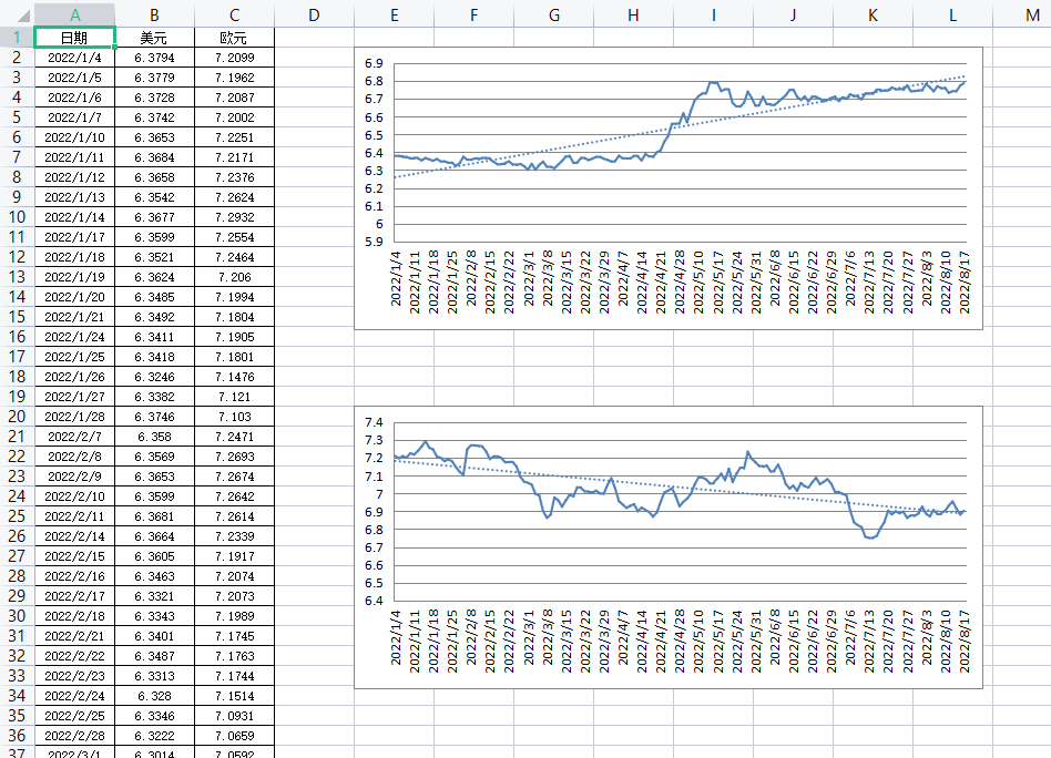
下面是效果图
sheet1:

sheet2:

 浙公网安备 33010602011771号