
jqplot使用小心得
这两天做一个项目,需要画饼图,所以在网上搜到jqplot这个插件。下面就说说我对他的简单的使用心得。
先说说我想要的效果:1.我需要修改饼图每个部分的背景色
2.我需要修改饼图里面文本的颜色和字体大小
3.还需要右侧说明文本都是带链接的
4.标题放在图表下面
上效果图: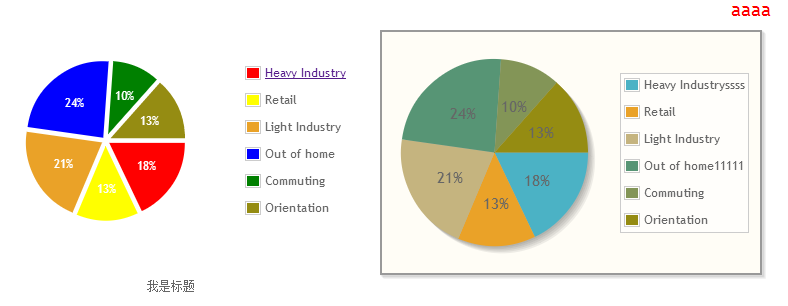 左侧是我的,右侧是对比默认饼图
然后代码伺候:
  1 <!DOCTYPE html PUBLIC "-//W3C//DTD XHTML 1.0 Strict//EN" "http://www.w3.org/TR/xhtml1/DTD/xhtml1-strict.dtd">
  2 <html xmlns="http://www.w3.org/1999/xhtml" xml:lang="en">
  3 <head>
  4   <meta http-equiv="Content-Type" content="text/html;charset=UTF-8">
  5   <title>Document</title>
  6
  7   <script type="text/javascript" src="jquery.min.js"></script>
  8   <script type="text/javascript" src="jquery.jqplot.min.js"></script>
  9   <script src="plugins/jqplot.pieRenderer.min.js"></script>
 10   <script src="plugins/jqplot.donutRenderer.min.js"></script>
 11   <!--[if lt IE 9]><script  type="text/javascript" src="excanvas.min.js"></script><![endif]-->
 12   <link rel="stylesheet" href="jquery.jqplot.min.css" />
 13   <style>
 14     div{float:left;}
 15     /*原来这样就可以设置饼图内的文本字体和颜色,这个可是让我苦苦在API里面找了好久google了好久,~~~~(>_<)~~~~ */
 16    .table{color:#fff;font-size:10px;}
 17     /*这里加z-index是因为要让分类名称的链接可以点击*/
 18     #div1 table.jqplot-table-legend, #div1 table.jqplot-cursor-legend{z-index:50;border:none;font-size:12px;color:#666;}
 19     /*默认是把图标标题设置在图表上方,但是我们设计非要放在下面,让我在API里google了好久,~~~~(>_<)~~~~ 后来没办法,自己重新弄了一个标题*/
 20     .table .table_tit{position:absolute;bottom:-10px;left:0;text-align:center;width:100%;color:#666;}
 21   </style>
 22   <script>
 23     $(document).ready(function(){
 24       var data = [
 25         //没想到这个数组里面还可以放html的链接标签,他居然认识
 26         ['<a href="http://www.baidu.com" target="_blank">Heavy Industry</a>', 12],['Retail', 9], ['Light Industry', 14],   //设置数据名称和值
 27         ['Out of home', 16],['Commuting', 7], ['Orientation', 9]
 28       ];
 29       var data2 = [
 30         ['Heavy Industryssss', 12],['Retail', 9], ['Light Industry', 14],
 31         ['Out of home11111', 16],['Commuting', 7], ['Orientation', 9]
 32       ];
 33       var plot1 = jQuery.jqplot ('div1', [data],
 34         {
 35           // title:'Exponential Line',
 36           // title: {
 37           //     text: 'aaaa',  //设置当前图的标题
 38           //     show: true,//设置当前图的标题是否显示
 39           //     textAlign:'right',
 40           //     textColor:'red',
 41           // },
 42           grid: {
 43             background:'#fff',    //设置整个饼图后的背景色
 44             shadow:false,          //取消整个图的阴影
 45             shadowAngle: 45,            // 设置阴影区域的角度,从x轴顺时针方向旋转
 46             shadowOffset: 0.5,          // 设置阴影区域偏移出图片边框的距离
 47             shadowWidth: 1,             // 设置阴影区域的宽度
 48             shadowDepth: 1,             // 设置影音区域重叠阴影的数量
 49             shadowAlpha: 0.07,
 50             borderWidth: 0              //取消图最外层边框
 51           },
 52           seriesColors:["red", "yellow", "#EAA228", "blue", "green", "#958c12"  //设置饼图每个区域颜色
 53           ],
 54           seriesDefaults: {
 55             // Make this a pie chart.
 56             renderer: jQuery.jqplot.PieRenderer,
 57
 58             rendererOptions: {
 59               // Put data labels on the pie slices.
 60               // By default, labels show the percentage of the slice.
 61               showDataLabels: true,
 62
 63                 diameter: 160, // 设置饼的直径
 64              padding: 20,        // 饼距离其分类名称框或者图表边框的距离,变相该表饼的直径
 65              sliceMargin: 5,     // 饼的每个部分之间的距离
 66
 67             fill:true,         // 设置饼的每部分被填充的状态
 68             // background:["red","yellow","green"],
 69             shadow:false,       //为饼的每个部分的边框设置阴影,以突出其立体效果    让饼图变成平面
 70             // shadowOffset: 2,    //设置阴影区域偏移出饼的每部分边框的距离
 71             // shadowDepth: 5,     // 设置阴影区域的深度
 72             // shadowAlpha: 0.07,   // 设置阴影区域的透明度
 73             highlightColors: ["rgb(129,0,0)", "rgb(240,189,104)", "rgb(214,202,165)", "rgb(137,180,158)", "rgb(168,180,137)", "rgb(0,0,0)"]    //修改高亮的部分背景颜色
 74             }
 75           },
 76           // markerOptions:{color: '#000'},
 77           legend: { show:true, location: 'e',
 78                //marginTop : "300px"    //设置右侧数据列表的margin
 79            }
 80         }
 81       );
 82       var plot2 = jQuery.jqplot ('div2', [data2],  //这个是默认的饼图
 83         {
 84           title:'Exponential Line',
 85             title: {
 86                 text: 'aaaa',  //设置当前图的标题
 87                 show: true,//设置当前图的标题是否显示
 88                 textAlign:'right',
 89                 textColor:'red',
 90             },
 91           seriesDefaults: {
 92             // Make this a pie chart.
 93             renderer: jQuery.jqplot.PieRenderer,
 94             rendererOptions: {
 95               // Put data labels on the pie slices.
 96               // By default, labels show the percentage of the slice.
 97               showDataLabels: true
 98             }
 99           },
100           legend: { show:true, location: 'e' }
101         }
102       );
103     });
104   </script>
105 </head>
106 <body>
107   <div style="width:800px;">
108       <div id="div1" class="table">
109         <p class="table_tit">我是标题</p>
110       </div>
111       <div id="div2"></div>
112   </div>
113 </body>
114 </html>
最后附上我认为最全的jqplot文档:http://www.cnblogs.com/CraryPrimitiveMan/p/3471682.html 比官网详细啊。。。。感谢楼主!
补充:前两天又用jqplot做了柱状图,里面数据需要显示百分比,大体跟画饼图一样,只有这里有点区别:
 1 ....
 2 seriesDefaults:{
 3             renderer:$.jqplot.BarRenderer,
 4              pointLabels: { show: true, formatString: '%s %%', ypadding:-0.8},//'%s %%'这样打出来%
 5             shadow: false,   //去掉柱状图每个柱子的阴影
 6             rendererOptions: {fillToZero: true},
 7             rendererOptions: {
 8               barWidth: 35,    //每个柱子的宽度
 9               barMargin: 30    //柱子间的间距
10             }
11         }
12
13 ...
但是在做的过程中,发现有个bug,就是无法显示50%的柱状图,尝试无果,就换了另一个框架highcharts。但是highcharts也有bug,就是柱状图的第一个数据显示不出来,所以用假数据代替。还有当多个柱状图的时候,最后一个图的最后一个柱状图默认不显示,需要鼠标划过柱状图上方的数值才显示,最后也用假数据了,这个是只有ie6,7的bug。

 浙公网安备 33010602011771号