
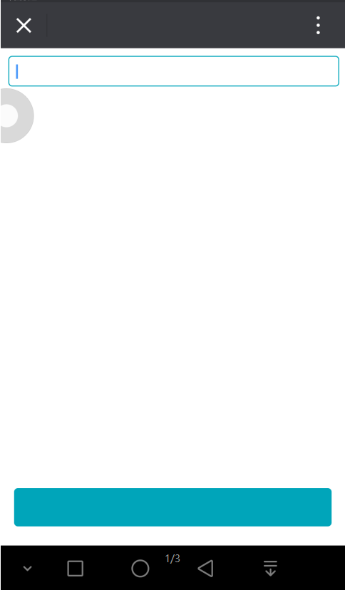
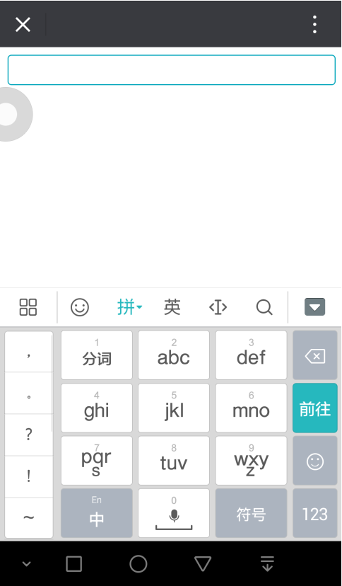
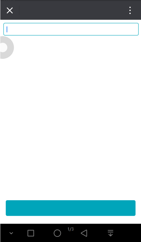
移动端 fixed 固定按钮在屏幕下方,然后按钮被键盘顶上来...顶上来了有没有~
在移动端 H5 页面开发中,我使用了 fixed 固定某个元素在屏幕的最下方,
这时点击输入框,接着非常非常自然地出现了元素被系统键盘顶起来的情况,如下图。

解决方案:
首先,给页面最外层包裹一层 div(相对定位) ,然后页面渲染完成时给 div 的高度等于 body(document.body.clientHeight) 的高度,
接下来再给需要定位在屏幕下方的元素设置绝对定位即可解决问题。
css
body,html {
    height       : 100%;
    margin       : 0;
    padding      : 0;
}
#view {
    width        : 100%;
    height       : 100%;
    position     : relative;
    text-align   : center;
}
.watch {
    width        : 98% ;
    height       : 30px;
    border       : 1px solid #00a5ba;
    outline      : none;
    border-radius: 4px ;
}
.fixed-btn {
    width        : 100%;
    height       : 40px;
    background   : #00a5ba;
    border-radius: 4px ;
    position     : absolute;
    bottom       : 0   ;
    left         : 0   ;
}
html
<div id="view">
    <input type="text" class="watch">
    <div class="fixed-btn"></div>
</div>
js
window.onload = function () {
  var load = document.body.clientHeight
  var view = document.getElementById('view')
  view.style.height = load + 'px'

}
我们想要的效果如下图:

 浙公网安备 33010602011771号