关于适配手机浏览器 safe-area 几点体会 (Blazor/MauiBlazor/H5)
话不多说, 先上代码
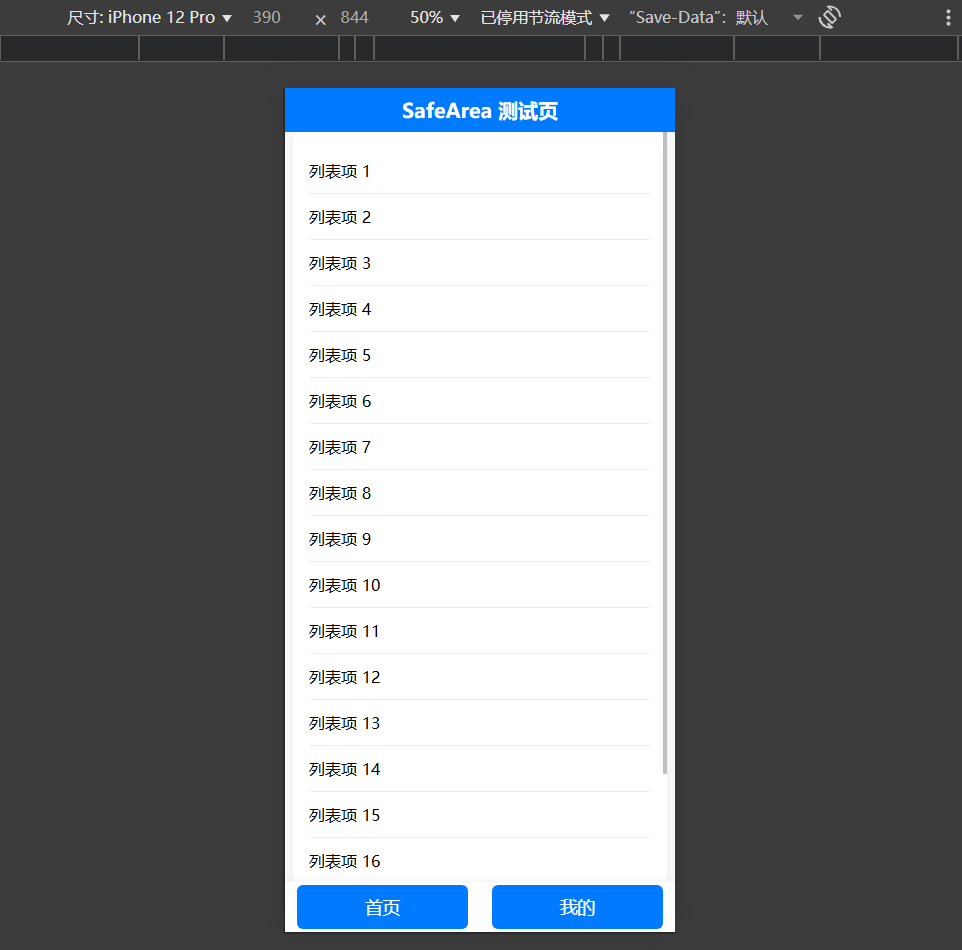
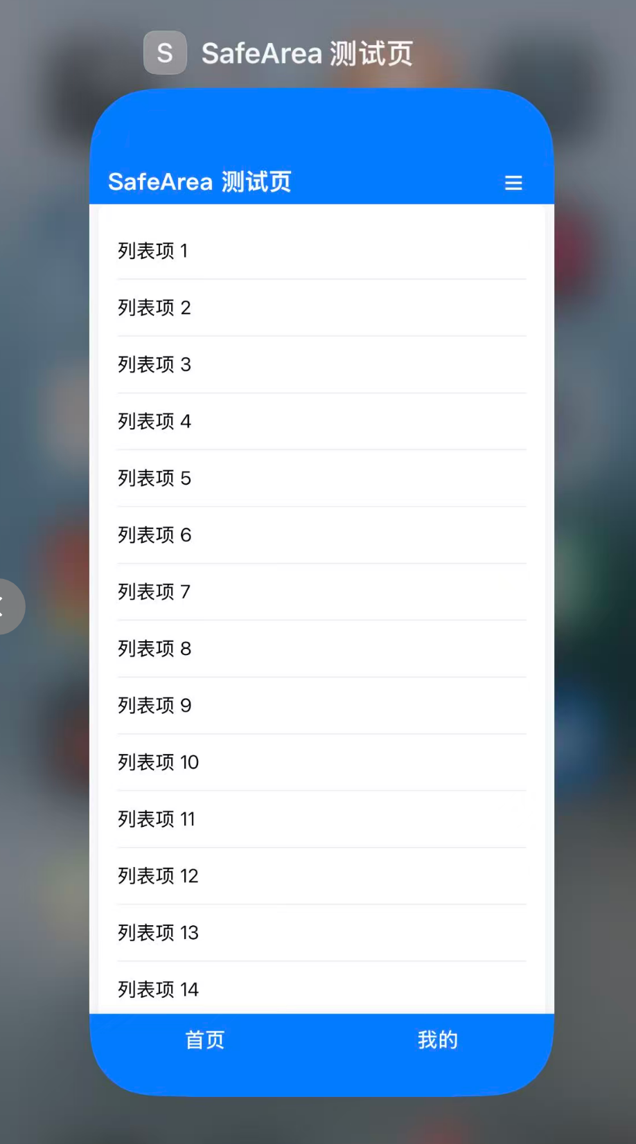
下面是一个适配手机浏览器 safe-area 的测试 HTML 页面,包含如下特性:
- 顶部标题栏,支持 safe-area-inset-top,上滑时自动隐藏,下滑时显示。
- 中间部分为最大宽度 800px 的滚动列表,超出自动显示滚动条。
- 底部有两个导航按钮,固定在底部,支持 safe-area-inset-bottom。
- 响应式布局,适配手机和桌面。
<!DOCTYPE html>
<html lang="zh-CN">
<head>
    <meta charset="UTF-8" />
    <title>SafeArea 测试页</title>
    <meta name="viewport" content="width=device-width, initial-scale=1.0, viewport-fit=cover" />
    <style>
        html, body {
            height: 100%;
            margin: 0;
            padding: 0;
            box-sizing: border-box;
            background: #f8f9fa;
            overflow: hidden;
        }

        body {
            min-height: 100vh;
            display: flex;
            flex-direction: column;
            padding-top: env(safe-area-inset-top);
            padding-bottom: env(safe-area-inset-bottom);
        }

        .header {
            height: 56px;
            padding-top: env(safe-area-inset-top);
            background: #007bff;
            color: #fff;
            display: flex;
            align-items: center;
            justify-content: center;
            font-size: 1.25rem;
            font-weight: bold;
            z-index: 100;
            transition: transform 0.3s;
            position: sticky;
            top: 0;
        }

            .header.hide {
                transform: translateY(-100%);
            }

        .content {
            flex: 1 1 auto;
            display: flex;
            justify-content: center;
            align-items: stretch;
            overflow: hidden;
        }

        .list-container {
            width: 100%;
            max-width: 800px;
            background: #fff;
            border-radius: 8px;
            box-shadow: 0 2px 8px rgba(0,0,0,0.05);
            overflow-y: auto;
            padding: 16px;
            margin: 0 8px;
            height: 100%;
        }

        .list-item {
            padding: 12px 0;
            border-bottom: 1px solid #eee;
        }

            .list-item:last-child {
                border-bottom: none;
            }

        .footer {
            height: 64px;
            padding-bottom: env(safe-area-inset-bottom);
            background: #fff;
            display: flex;
            justify-content: space-around;
            align-items: center;
            box-shadow: 0 -2px 8px rgba(0,0,0,0.05);
            z-index: 101;
            position: sticky;
            bottom: 0;
        }

            .footer button {
                flex: 1 1 0;
                margin: 0 12px;
                height: 44px;
                font-size: 1.1rem;
                border: none;
                border-radius: 6px;
                background: #007bff;
                color: #fff;
                font-weight: 500;
                transition: background 0.2s;
            }

                .footer button:active {
                    background: #0056b3;
                }

        @media (max-width: 820px) {
            .list-container {
                max-width: 100vw;
            }
        }
    </style>
</head>
<body>
    <div class="header" id="header">SafeArea 测试页</div>
    <div class="content">
        <div class="list-container" id="list">
            <!-- 列表内容示例 -->
            <div class="list-item">列表项 1</div>
            <div class="list-item">列表项 2</div>
            <div class="list-item">列表项 3</div>
            <div class="list-item">列表项 4</div>
            <div class="list-item">列表项 5</div>
            <div class="list-item">列表项 6</div>
            <div class="list-item">列表项 7</div>
            <div class="list-item">列表项 8</div>
            <div class="list-item">列表项 9</div>
            <div class="list-item">列表项 10</div>
            <div class="list-item">列表项 11</div>
            <div class="list-item">列表项 12</div>
            <div class="list-item">列表项 13</div>
            <div class="list-item">列表项 14</div>
            <div class="list-item">列表项 15</div>
            <div class="list-item">列表项 16</div>
            <div class="list-item">列表项 17</div>
            <div class="list-item">列表项 18</div>
            <div class="list-item">列表项 19</div>
            <div class="list-item">列表项 20</div>
        </div>
    </div>
    <div class="footer">
        <button type="button" onclick="alert('首页')">首页</button>
        <button type="button" onclick="alert('我的')">我的</button>
    </div>
    <script>
        // 标题栏自动隐藏/显示
        let lastScroll = 0;
        const header = document.getElementById('header');
        const list = document.getElementById('list');
        list.addEventListener('scroll', function () {
            const currentScroll = list.scrollTop;
            if (currentScroll > lastScroll && currentScroll > 10) {
                header.classList.add('hide');
            } else if (currentScroll < lastScroll) {
                header.classList.remove('hide');
            }
            lastScroll = currentScroll;
        });
    </script>
</body>
</html>
说明:
- 使用了 env(safe-area-inset-*) 适配 iPhone 刘海屏等安全区域。
- 标题栏通过监听列表滚动自动隐藏/显示。
- 列表最大宽度 800px,超出自动滚动。
- 底部按钮始终固定,适配安全区。
- 可直接在手机浏览器或桌面浏览器中测试。
safe-area-inset-top:
env(safe-area-inset-top) 是一种 CSS 环境变量,用于适配 iPhone 等带有刘海或圆角屏幕的设备的“安全区域”(Safe Area)。
作用说明:
- 在 iOS Safari 浏览器中,env(safe-area-inset-top) 表示页面顶部的安全距离(像素值),用于避免内容被刘海、状态栏遮挡。
- 例如 iPhone X 及以上机型,顶部有刘海,env(safe-area-inset-top) 通常为 44px,普通设备则为 0px。
- 你可以用它为顶部、底部、左侧、右侧设置合适的 padding 或 margin,让内容始终显示在安全区域内。
body {
    padding-top: env(safe-area-inset-top);
    padding-bottom: env(safe-area-inset-bottom);
}
相关环境变量:
- env(safe-area-inset-top):顶部安全区
- env(safe-area-inset-bottom):底部安全区
- env(safe-area-inset-left):左侧安全区
- env(safe-area-inset-right):右侧安全区
适用场景:
- 移动端 Web 页面,尤其是全屏、沉浸式布局时,确保内容不会被设备的物理结构遮挡。
注意:
- 只有在支持安全区的设备和浏览器(如 iOS Safari)中才有效,其他环境下为 0px。
- 需在 下使用,才能生效。
手机端双滚动条
出现手机端双滚动条,通常是因为 Body 和内部某个容器(如 .list-container)都设置了 overflow 或高度,导致两层都可以滚动。例如:
- Body 使用了 flex 布局和 min-height: 100vh,但没有显式限制 overflow,默认会根据内容溢出滚动。
- .list-container 设置了固定高度(height: calc(100vh - ... ))和 overflow-y: auto,自身也会出现滚动条。
- 如果 .list-container 内容高度超过其自身高度,同时整个页面内容超过视口高度,浏览器会同时显示页面和容器的滚动条。
解决方法:只让 .list-container 滚动,禁止 Body 滚动:
- 设置 body, html 的 overflow: hidden;,防止页面整体滚动。
- 保持 .list-container 的 overflow-y: auto;,只让列表滚动。
html, body {
    height: 100%;
    margin: 0;
    padding: 0;
    box-sizing: border-box;
    background: #f8f9fa;
    overflow: hidden; /* 禁止页面滚动条 */
}
这样,只有 .list-container 会出现滚动条,页面不会再有双滚动条现象。
补充说明:
- 如果页面有弹窗、下拉菜单等需要页面滚动,可以在弹窗打开时临时移除 overflow: hidden。
- 这种方式适合“单区域滚动”场景,常用于移动端全屏页面。
流布局
将 Content 设置为绝对定位,并让其顶部和底部分别与 Header 和 .footer 对齐,这样 .list-container 的高度会自动适配,不会被遮挡
<style>
    html, body {
        height: 100%;
        margin: 0;
        padding: 0;
        box-sizing: border-box;
        background: #f8f9fa;
        overflow: hidden;
    }
    body {
        min-height: 100vh;
        position: relative;
        padding-top: env(safe-area-inset-top);
        padding-bottom: env(safe-area-inset-bottom);
    }
    .header {
        position: fixed;
        top: 0;
        left: 0;
        right: 0;
        height: 56px;
        padding-top: env(safe-area-inset-top);
        background: #007bff;
        color: #fff;
        display: flex;
        align-items: center;
        justify-content: center;
        font-size: 1.25rem;
        font-weight: bold;
        z-index: 100;
        transition: transform 0.3s;
    }
    .header.hide {
        transform: translateY(-100%);
    }
    .content {
        position: absolute;
        top: calc(56px + env(safe-area-inset-top));
        bottom: calc(64px + env(safe-area-inset-bottom));
        left: 0;
        right: 0;
        display: flex;
        justify-content: center;
        align-items: stretch;
        overflow: hidden;
    }
    .list-container {
        width: 100%;
        max-width: 800px;
        background: #fff;
        border-radius: 8px;
        box-shadow: 0 2px 8px rgba(0,0,0,0.05);
        overflow-y: auto;
        padding: 16px;
        margin: 0 8px;
        height: 100%;
    }
    .list-item {
        padding: 12px 0;
        border-bottom: 1px solid #eee;
    }
    .list-item:last-child {
        border-bottom: none;
    }
    .footer {
        position: fixed;
        left: 0;
        right: 0;
        bottom: 0;
        height: 64px;
        padding-bottom: env(safe-area-inset-bottom);
        background: #fff;
        display: flex;
        justify-content: space-around;
        align-items: center;
        box-shadow: 0 -2px 8px rgba(0,0,0,0.05);
        z-index: 101;
    }
    .footer button {
        flex: 1 1 0;
        margin: 0 12px;
        height: 44px;
        font-size: 1.1rem;
        border: none;
        border-radius: 6px;
        background: #007bff;
        color: #fff;
        font-weight: 500;
        transition: background 0.2s;
    }
    .footer button:active {
        background: #0056b3;
    }
    @media (max-width: 820px) {
        .list-container {
            max-width: 100vw;
        }
    }
</style>
iOS 下滚动不到底部元素
主要原因如下:
- env(safe-area-inset-top/bottom) 取值问题
在 iOS Safari 下,env(safe-area-inset-top) 和 env(safe-area-inset-bottom) 只有在“全屏模式”或“PWA模式”下才会有非零值,普通网页通常为 0px。
如果你用 calc(56px + env(safe-area-inset-top)),但 env(safe-area-inset-top) 实际为 0px,布局没问题;但如果为 44px(如 iPhone X 刘海屏),顶部和底部的可用空间会变小,导致 Content 区域高度变小,列表内容被遮挡,无法滚动到底部。 - fixed 定位遮挡内容
Header 和 .footer 都是 position: fixed,会覆盖页面内容。如果 Content 区域高度计算不准确,最后一项会被 .footer 遮住,无法滚动到可视区。 - iOS Safari 滚动兼容性
iOS Safari 对 overflow: hidden、position: absolute、height: 100% 等组合有兼容性问题,可能导致滚动区域高度计算异常。
推荐修正方案:
- 建议用 JS 动态计算高度
用 JavaScript 获取 Header 和 .footer 的实际高度,再动态设置 Content 的 Top 和 Bottom,确保滚动区域高度准确。 - 或直接用 flex 布局
用 flex 布局让 Content 自动填满中间区域,避免绝对定位和高度计算问题。
<style>
    html, body {
        height: 100%;
        margin: 0;
        padding: 0;
        box-sizing: border-box;
        background: #f8f9fa;
        overflow: hidden;
    }
    body {
        min-height: 100vh;
        display: flex;
        flex-direction: column;
        padding-top: env(safe-area-inset-top);
        padding-bottom: env(safe-area-inset-bottom);
    }
    .header {
        height: 56px;
        padding-top: env(safe-area-inset-top);
        background: #007bff;
        color: #fff;
        display: flex;
        align-items: center;
        justify-content: center;
        font-size: 1.25rem;
        font-weight: bold;
        z-index: 100;
        transition: transform 0.3s;
        position: sticky;
        top: 0;
    }
    .header.hide {
        transform: translateY(-100%);
    }
    .content {
        flex: 1 1 auto;
        display: flex;
        justify-content: center;
        align-items: stretch;
        overflow: hidden;
    }
    .list-container {
        width: 100%;
        max-width: 800px;
        background: #fff;
        border-radius: 8px;
        box-shadow: 0 2px 8px rgba(0,0,0,0.05);
        overflow-y: auto;
        padding: 16px;
        margin: 0 8px;
        height: 100%;
    }
    .list-item {
        padding: 12px 0;
        border-bottom: 1px solid #eee;
    }
    .list-item:last-child {
        border-bottom: none;
    }
    .footer {
        height: 64px;
        padding-bottom: env(safe-area-inset-bottom);
        background: #fff;
        display: flex;
        justify-content: space-around;
        align-items: center;
        box-shadow: 0 -2px 8px rgba(0,0,0,0.05);
        z-index: 101;
        position: sticky;
        bottom: 0;
    }
    .footer button {
        flex: 1 1 0;
        margin: 0 12px;
        height: 44px;
        font-size: 1.1rem;
        border: none;
        border-radius: 6px;
        background: #007bff;
        color: #fff;
        font-weight: 500;
        transition: background 0.2s;
    }
    .footer button:active {
        background: #0056b3;
    }
    @media (max-width: 820px) {
        .list-container {
            max-width: 100vw;
        }
    }
</style>
- Header 和 .footer 用 position: sticky,不遮挡内容,flex布局自动撑开中间区域。
- Content 用 flex 自动填满剩余空间,.list-container 高度为 100%,滚动条正常。
- 这样 iOS 下最后一项能正常滚动到可视区。
最终可用版本
<!DOCTYPE html>
<html lang="zh-CN">
<head>
<meta charset="UTF-8" />
<title>SafeArea 测试页</title>
<meta name="viewport" content="width=device-width, initial-scale=1.0, viewport-fit=cover, user-scalable=no" />
<style>
:root {
--header-height: 56px;
--footer-height: 64px;
--primary-color: #007bff;
--primary-text-color: #fff;
--background-color: #f8f9fa;
--safearea-top: env(safe-area-inset-top);
--safearea-bottom: env(safe-area-inset-bottom);
}
html, body {
height: 100%;
margin: 0;
padding: 0;
box-sizing: border-box;
background: var(--background-color);
overflow: hidden;
}
body {
min-height: 100vh;
display: flex;
flex-direction: column;
padding-top: var(--safearea-top);
padding-bottom: var(--safearea-bottom);
}
.header {
height: var(--header-height);
padding: var(--safearea-top) 16px 0 16px;
background: var(--primary-color);
color: var(--primary-text-color);
display: flex;
align-items: center;
justify-content: space-between;
font-size: 1.25rem;
font-weight: bold;
z-index: 100;
transition: transform 0.3s;
position: fixed;
top: 0;
left: 0;
right: 0;
}
.header.hide {
transform: translateY(-100%);
}
.menu-btn {
background: none;
border: none;
color: var(--primary-text-color);
font-size: 1.5rem;
cursor: pointer;
padding: 4px 8px;
border-radius: 4px;
transition: background 0.2s;
}
.menu-btn:active {
background: rgba(255,255,255,0.15);
}
.dropdown-menu {
position: absolute;
top: calc(var(--header-height) + var(--safearea-bottom));
right: 16px;
min-width: 160px;
background: var(--primary-text-color);
box-shadow: 0 4px 16px rgba(0,0,0,0.12);
border-radius: 8px;
overflow: hidden;
z-index: 200;
opacity: 0;
pointer-events: none;
transform: translateY(-10px);
transition: opacity 0.2s, transform 0.2s;
}
.dropdown-menu.show {
opacity: 1;
pointer-events: auto;
transform: translateY(0);
}
.dropdown-menu .menu-item {
padding: 12px 20px;
color: #333;
cursor: pointer;
border-bottom: 1px solid #f0f0f0;
background: var(--primary-text-color);
transition: background 0.2s;
}
.dropdown-menu .menu-item:last-child {
border-bottom: none;
}
.dropdown-menu .menu-item:hover {
background: #f5f5f5;
}
.content {
flex: 1 1 auto;
display: flex;
justify-content: center;
align-items: stretch;
overflow: hidden;
padding-top: var(--header-height);
padding-bottom: calc(var(--footer-height) + var(--safearea-bottom));
transition: padding-top 0.3s;
}
.list-container {
width: 100%;
max-width: 800px;
background: var(--primary-text-color);
border-radius: 8px;
box-shadow: 0 2px 8px rgba(0,0,0,0.05);
overflow-y: auto;
padding: 0 16px;
margin: 8px;
}
.list-item {
padding: 12px 0;
border-bottom: 1px solid #eee;
}
.list-item:last-child {
border-bottom: none;
}
.footer {
height: var(--footer-height);
padding-bottom: var(--safearea-bottom);
background: var(--primary-color);
display: flex;
justify-content: space-around;
align-items: center;
box-shadow: 0 -2px 8px rgba(0,0,0,0.05);
z-index: 101;
position: fixed;
left: 0;
right: 0;
bottom: 0;
overflow: visible;
}
.footer::after {
content: "";
position: absolute;
left: 0;
right: 0;
bottom: 0;
height: var(--safearea-bottom);
background: var(--primary-color);
z-index: -1;
pointer-events: none;
}
.footer button {
flex: 1 1 0;
margin: 0 12px;
height: 44px;
font-size: 1.1rem;
border: none;
border-radius: 6px;
background: transparent;
color: var(--primary-text-color);
font-weight: 500;
transition: background 0.2s;
}
.footer button:active {
background: rgba(255,255,255,0.15);
}
@media (max-width: 820px) {
.list-container {
max-width: 100vw;
}
}
</style>
</head>
<body>
<div class="header" id="header">
<span>SafeArea 测试页</span>
<button class="menu-btn" id="menuBtn" aria-label="菜单">☰</button>
</div>
<div class="dropdown-menu" id="dropdownMenu">
<div class="menu-item" onclick="alert('菜单项1')">菜单项1</div>
<div class="menu-item" onclick="alert('菜单项2')">菜单项2</div>
<div class="menu-item" onclick="alert('菜单项3')">菜单项3</div>
</div>
<div class="content" id="content">
<div class="list-container" id="list">
<!-- 列表内容示例 -->
<div class="list-item">列表项 1</div>
<div class="list-item">列表项 2</div>
<div class="list-item">列表项 3</div>
<div class="list-item">列表项 4</div>
<div class="list-item">列表项 5</div>
<div class="list-item">列表项 6</div>
<div class="list-item">列表项 7</div>
<div class="list-item">列表项 8</div>
<div class="list-item">列表项 9</div>
<div class="list-item">列表项 10</div>
<div class="list-item">列表项 11</div>
<div class="list-item">列表项 12</div>
<div class="list-item">列表项 13</div>
<div class="list-item">列表项 14</div>
<div class="list-item">列表项 15</div>
<div class="list-item">列表项 16</div>
<div class="list-item">列表项 17</div>
<div class="list-item">列表项 18</div>
<div class="list-item">列表项 19</div>
<div class="list-item">列表项 20</div>
</div>
</div>
<div class="footer">
<button type="button" onclick="location.reload()">首页</button>
<button type="button" onclick="alert('我的')">我的</button>
</div>
<script>
// 标题栏自动隐藏/显示(iOS回弹防抖动优化)
let lastScroll = 0;
let ticking = false;
const header = document.getElementById('header');
const list = document.getElementById('list');
const content = document.getElementById('content');
const HIDE_THRESHOLD = 20; // 阈值,避免回弹区间触发
function isListAtBottom() {
return list.scrollTop + list.clientHeight >= list.scrollHeight - 1;
}
function updateHeaderOnScroll() {
const currentScroll = list.scrollTop;
// 回弹区间或触底,强制显示标题栏
if (currentScroll <= HIDE_THRESHOLD) {
console.log('回弹区间');
} else if (isListAtBottom()) {
console.log('触底');
} else if (currentScroll > lastScroll) {
// 向下滚动且未隐藏时才隐藏
if (!header.classList.contains('hide')) {
header.classList.add('hide');
}
content.style.paddingTop = '0';
console.log('向下滚动');
} else if (currentScroll < lastScroll) {
// 向上滚动且已隐藏时才显示
if (header.classList.contains('hide')) {
header.classList.remove('hide');
}
content.style.paddingTop = 'var(--header-height)';
console.log('向上滚动');
}
lastScroll = currentScroll;
ticking = false;
}
list.addEventListener('scroll', function () {
if (!ticking) {
window.requestAnimationFrame(updateHeaderOnScroll);
ticking = true;
}
});
// 折叠菜单逻辑
const menuBtn = document.getElementById('menuBtn');
const dropdownMenu = document.getElementById('dropdownMenu');
menuBtn.addEventListener('click', function (e) {
dropdownMenu.classList.toggle('show');
e.stopPropagation();
});
// 点击空白处收起菜单
document.addEventListener('click', function (e) {
if (dropdownMenu.classList.contains('show')) {
dropdownMenu.classList.remove('show');
}
});
// 阻止菜单内部点击冒泡
dropdownMenu.addEventListener('click', function (e) {
e.stopPropagation();
});
</script>
</body>
</html>
关联项目
FreeSql QQ群:4336577
BA & Blazor QQ群:795206915
Maui Blazor 中文社区 QQ群:645660665
知识共享许可协议
本作品采用 知识共享署名-非商业性使用-相同方式共享 4.0 国际许可协议 进行许可。欢迎转载、使用、重新发布,但务必保留文章署名AlexChow(包含链接: https://github.com/densen2014 ),不得用于商业目的,基于本文修改后的作品务必以相同的许可发布。如有任何疑问,请与我联系 。
转载声明
本文来自博客园,作者:周创琳 AlexChow,转载请注明原文链接:https://www.cnblogs.com/densen2014/p/19479656
AlexChow
今日头条 | 博客园 | 知乎 | Gitee | GitHub


 浙公网安备 33010602011771号