基于MaterialDesign设计风格的妹纸app的简单实现
*今天看了郭神的第二行代码,深深的被MaterialDesign的设计风格所吸引,然后就照例做了一个小Demo,希望多多支持,图片资源来源于网络。
照例,一波动态图来袭:

效果还不错吧,就是有点失真...其实在这之前Android的UI风格都不是很美观,所谷歌的设计工程师们就开始研究出了一种新的设计语言---MaterialDesign。在2015年得谷歌大会上推出了DesignSupport库,使得开发者在即使不了解MaterialDesign的情况下也能非常轻松地将自己得应用Material化。
接下来我会按照下面流程介绍如何实现这一效果
ToolbarDrawerLayoutSnackBarCardViewRecyclerViewSwipeRefreshLayoutAppBarLayoutCollapsingToolbarLayout沉浸式状态栏
首先添加依赖:
compile 'com.android.support:appcompat-v7:24.2.1'
compile 'com.android.support:design:24.0.0'
compile'com.android.support:recyclerview-v7:24.0.0'
compile 'com.github.bumptech.glide:glide:3.7.0'
compile 'com.android.support:cardview-v7:24.1.1'
compile 'de.hdodenhof:circleimageview:2.1.0'
1. Toolbar
效果如下:

它有点类似于之前得ActionBar,就是活动最顶部得哪个标题栏。但是,它只能位于活动得顶部,从而影响效果,所有官方现在已经不再建议使用ActionBar了。
1. 设置AppTheme("NoActionBar")
2. 添加控件
<android.support.v7.widget.Toolbar
android:id="@+id/toolbar"
android:layout_width="match_parent"
android:layout_height="?attr/actionBarSize"
android:background="?attr/colorPrimary"
android:theme="@style/ThemeOverlay.AppCompat.Dark.ActionBar"
app:popupTheme="@style/Theme.AppCompat.Light" />
其他属性我就不说了,
app:popupTheme这个是单独将弹出得菜单项指定成淡色主题。
这个时候需要指定一个新的命名空间
xmlns:app这是由于MaterialDesign是在Android5.0系统中才出现得,而很多Material属性在5.0之前得系统中是不存在得,那么为了能够兼容之前得老系统,我们就得使用app:。
3. 在代码中使用
mToolbar = (Toolbar) findViewById(R.id.toolbar);
setSupportActionBar(mToolbar);
首先通过
findViewById得到Toobar实例,然后调用setSupportActionBar()方法将实例传入。
4. 设置菜单选项
在menu文件夹中创建xml文件
app:showAsAction来指定按钮得显示位置
ifRoom: 表示屏幕空间足够得情况下显示再Toolbar,不够就显示再菜单中
always: 表示永远显示在Toolbar中,如果屏幕空间不够则不显示
never: 表示永远显示在菜单当中
5. 在代码中实用菜单选项
/***************************
* 创建菜单
***************************/
@Override
public boolean onCreateOptionsMenu(Menu menu) {
getMenuInflater().inflate(R.menu.menu, menu);
return true;
}
/***************************
* 给菜单设置点击事件
***************************/
@Override
public boolean onOptionsItemSelected(MenuItem item) {
switch (item.getItemId()) {
case R.id.backup:
Toast.makeText(MainActivity.this, "backup", Toast.LENGTH_SHORT).show();
break;
case R.id.delete:
Toast.makeText(this, "delete", Toast.LENGTH_SHORT).show();
break;
case R.id.settings:
Toast.makeText(this, "setting", Toast.LENGTH_SHORT).show();
break;
default:
}
return true;
}
2. DrawerLayout
这个在我之前得文章讲过,可以直接点击查看 高大上的侧滑菜单DrawerLayout,解决了不能全屏滑动的问题
不过左侧可以再优化下,实用新的控件 NavigationView
NavigationView
在使用前,提前准备好两个东西:
menu和headerLayout
1. 创建menu
将group得
checkableBehavior属性指定为single,表示所有得菜单项只能单选
2. 创建headerLayout
<de.hdodenhof.circleimageview.CircleImageView
android:id="@+id/icon_image"
android:layout_width="70dp"
android:layout_height="70dp"
android:layout_centerInParent="true"
android:src="@drawable/nav_icon" />
3. 在布局中使用
<android.support.design.widget.NavigationView
android:id="@+id/nv_left"
android:layout_width="match_parent"
android:layout_height="match_parent"
android:layout_gravity="left"
app:headerLayout="@layout/nav_header"
app:menu="@menu/nav_menu">
</android.support.design.widget.NavigationView>
app:headerLayout: headerLayout文件
app:menu: menu文件
android:layout_gravity="left"设置为左侧菜单
4. 在代码中使用
//给NavigationView设置item选择事件
mNavigationView.setCheckedItem(R.id.nav_call);
mNavigationView.setNavigationItemSelectedListener(new NavigationView.OnNavigationItemSelectedListener() {
@Override
public boolean onNavigationItemSelected(MenuItem item) {
...
return true;
}
});
3. SnackBar
跟Toast有点相似,不过不同点在于加入一个可交互按钮,当用户点击按钮得时候可以执行一些额外得逻辑操作
效果如下:

使用起来比较简单,跟Toast很像。
Snackbar snackbar = Snackbar.make(getCurrentFocus(), item.getTitle(), Snackbar.LENGTH_SHORT);
snackbar.setAction("Undo", new View.OnClickListener() {
@Override
public void onClick(View v) {
}
});
snackbar.setActionTextColor(Color.BLUE);
snackbar.show();
4. CardView
效果如下:

CardView 其实是一个FrameLayout,只是额外提供了圆角和阴影效果,
直接在布局中使用。
<android.support.v7.widget.CardView
xmlns:android="http://schemas.android.com/apk/res/android"
xmlns:app="http://schemas.android.com/apk/res-auto"
android:layout_width="match_parent"
android:layout_height="wrap_content"
android:background="?android:attr/selectableItemBackground"
app:cardElevation="10dp"
android:layout_margin="5dp"
app:cardCornerRadius="18dp">
...//子布局
</android.support.v7.widget.CardView>
app:cardCornerRadius指定卡片圆角得弧度,数值越大,圆角得弧度越大
app:cardElevation制定卡片得高度,高度值越大,投影得范围越大
5. RecyclerView
这个在之前得文章也说过,如果需要查看,请移驾到: 简单粗暴----RecyclerView
本次得Demo里数据我就不详细说了,太多了,很简单。
6. SwipeRefreshLayout
效果如下:

使用 SwipeRefreshLayout 直接可以实现下拉刷新的功能
1. 在布局中添加
<android.support.v4.widget.SwipeRefreshLayout
android:id="@+id/srl_main"
android:layout_width="match_parent"
android:layout_height="match_parent">
<android.support.v7.widget.RecyclerView
android:id="@+id/rv_main"
android:layout_width="match_parent"
android:layout_height="match_parent">
</android.support.v7.widget.RecyclerView>
</android.support.v4.widget.SwipeRefreshLayout>
2. 在代码中添加
mRefreshLayout.setColorSchemeColors(Color.RED, Color.BLUE, Color.YELLOW, Color.GREEN);
mRefreshLayout.setOnRefreshListener(new SwipeRefreshLayout.OnRefreshListener() {
@Override
public void onRefresh() {
refreshFruits();
}
});
可以给刷新得时候设置颜色的变换,在
onRefresh()中实现刷新得功能
7. AppBarLayout
先看一下效果:

AppBarLayout实际是一个垂直方向得LinearLayout,它在内部做了很多滚动事件得封装,并应用了MaterialDesign设计理念。
在布局中实用:
<android.support.design.widget.CoordinatorLayout
android:layout_width="match_parent"
android:layout_height="match_parent">
<android.support.design.widget.AppBarLayout
android:fitsSystemWindows="true"
android:layout_width="match_parent"
android:layout_height="wrap_content">
<android.support.v7.widget.Toolbar
android:id="@+id/toolbar"
android:fitsSystemWindows="true"
android:layout_width="match_parent"
android:layout_height="?attr/actionBarSize"
android:background="?attr/colorPrimary"
android:theme="@style/ThemeOverlay.AppCompat.Dark.ActionBar"
app:layout_scrollFlags="scroll|enterAlways|snap"
app:popupTheme="@style/Theme.AppCompat.Light" />
</android.support.design.widget.AppBarLayout>
<android.support.v4.widget.SwipeRefreshLayout
...
app:layout_behavior="@string/appbar_scrolling_view_behavior">
...
</android.support.v4.widget.SwipeRefreshLayout>
</android.support.design.widget.CoordinatorLayout>
app:layout_scrollFlags: 当AppBarLayout接收到滚动事件得时候,它内部得子空间就是通过这个属性影响这些事件的
scroll:表示当RecyclerView向上滚动得时候,Toolbar会跟着一起向上滚动并实现隐藏。
enterAlways:表示当RecyclerView向下滚动得时候,Toolbar会跟着一起向下滚动并重新显示。
snap:表示当Toolbar还没有完全隐藏或显示得时候,会根据当前滚动得距离,自动选择是隐藏还是显示。
8. CollapsingToolbarLayout
效果如下:

可折叠式标题栏这个就比之前就负责点了,我先贴代码,然后一一解释。
<android.support.design.widget.CoordinatorLayout
xmlns:android="http://schemas.android.com/apk/res/android"
xmlns:app="http://schemas.android.com/apk/res-auto"
android:layout_width="match_parent"
android:layout_height="match_parent"
android:fitsSystemWindows="true">
<android.support.design.widget.AppBarLayout
android:id="@+id/appBar"
android:layout_width="match_parent"
android:layout_height="250dp"
android:fitsSystemWindows="true">
<android.support.design.widget.CollapsingToolbarLayout
android:id="@+id/collapsing_toolbar"
android:layout_width="match_parent"
android:layout_height="match_parent"
android:theme="@style/ThemeOverlay.AppCompat.Dark.ActionBar"
android:fitsSystemWindows="true"
app:contentScrim="?attr/colorPrimary"
app:layout_scrollFlags="scroll|exitUntilCollapsed">
<android.support.v7.widget.Toolbar
android:id="@+id/toolbar"
android:layout_width="match_parent"
android:layout_height="?attr/actionBarSize"
app:layout_collapseMode="pin" />
</android.support.design.widget.CollapsingToolbarLayout>
</android.support.design.widget.AppBarLayout>
<android.support.v4.widget.NestedScrollView
android:layout_width="match_parent"
android:layout_height="match_parent"
app:layout_behavior="@string/appbar_scrolling_view_behavior">
<android.support.v7.widget.CardView
android:layout_width="match_parent"
android:layout_height="wrap_content"
android:layout_marginBottom="15dp"
android:layout_marginLeft="15dp"
android:layout_marginRight="15dp"
android:layout_marginTop="35dp"
app:cardCornerRadius="4dp">
</android.support.v7.widget.CardView>
</android.support.v4.widget.NestedScrollView>
</android.support.design.widget.CoordinatorLayout>
app:contentScrim:在趋于折叠状态以及折叠之后得背景色
app:layout_scrollFlags这个之前讲过
scroll:表示CollapsingToolbarLayout会随着妹纸内容详情得滚动一起滚动
exitUntilCollapsed:表示当CollapsingToolbarLayout随着滚动完成折叠之后就保留在界面上,不再移出屏幕
app:layout_collapseMode="pin"把Toolbar指定成pin,表示在折叠的过程中位置始终保持不变
app:layout_collapseMode="parallax"ImageView 指定成 parallax,表示会在折叠得过程中产生一定得错位偏移,这种模式得视觉效果会非常好
NestedScrollView:在ScrollView基础上增加了嵌套响应滚动事件得功能
9. 沉浸式状态栏
这个只是在Android5.0后才有的,设置状态栏为透明
在setContentView();之前添加代码:
if (Build.VERSION.SDK_INT >= Build.VERSION_CODES.KITKAT) {
//透明状态栏
getWindow().addFlags(WindowManager.LayoutParams.FLAG_TRANSLUCENT_STATUS);
//透明导航栏
getWindow().addFlags(WindowManager.LayoutParams.FLAG_TRANSLUCENT_NAVIGATION);
}
需要在直接子布局添加:android:fitsSystemWindows="true 表示该控件会出现在系统状态栏里
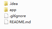
项目文件截图:
 基于MaterialDesign设计风格的妹纸app的简单实现
注:本文著作权归作者,由demo大师代发,拒绝转载,转载需要作者授权


 浙公网安备 33010602011771号