


接上篇ccs之经典布局(一)(水平垂直居中)
四、两列布局
单列宽度固定,另一列宽度是自适应。两列中左则是确定的宽度,右列是自动填充剩余所有空间的一种布局效果
1、float+overflow:auto;
固定端用float进行浮动,自适应端overflow:auto;触发BFC.
2、absolute+margin-left
父容器相对定位,固定端于父容器绝对定位,自适应margin-left设置为固定端width
3、table布局
父容器display:table,内容撑开宽度,所以需要设置width:100%;两端都以display:table-cell
4、css计算属性
固定端float,自适应端的宽度为calc(100%-固定端的宽度);或者是固定端float,自适应端元素的margin属性值需要与定宽元素的width属性一致(如元素中定义了clear:both则子元素会出问题)
5、flex布局
父容器flex布局,固定端固定with,自适应端flex:1实现自适应
<!DOCTYPE html>
<html lang="en">

<head>
    <meta charset="UTF-8">
    <title>两列布局</title>
    <style>
        * {
            margin: 0;
            margin: 0;
        }

        .left,
        .right {
            height: 500px;
        }
        .parent{
            /* position: relative;                  第2种方法*/

            /* display: table;                      第3种方法
            width: 100%;
            table-layout: fixed; */
            /* display: flex;;                      第5种方法 */

        }

        .left {
            width: 300px;
            background: greenyellow;
            /* float: left;                              第1种方法 */
            /* position: absolute;                       第2种方法  */
            /* display: table-cell;                      第3种方法 */
            /* float: left;                              第4种方法 */
        }

        .right {
            background: orange;
            /* overflow: auto;                             第1种方法*/
            /* margin-left: 300px;                         第2种方法 */
            /* display:table-cell;                         第3种方法 */
            /* width: calc(100%-300px);                    第4种方法 */
            /* flex: 1;                                    第5种方法 */

        }

        .inner {
            background: pink;
            height: 100px;
        }
    </style>
</head>
<body>
    <div class="parent">
        <div class="left"></div>
        <div class="right">
            <div class="inner">inner</div>
        </div>
    </div>
</body>
</html>
五、三列布局
三列布局一般情况下指的是左右两边固定,中间自适应的布局方式。
1、float+margin
左右两边是固定端,进行浮动,中间端使用margin来自适应。需要注意一点:使用浮动时,中间列对应的DOM元素在html应该放在最后。
2、中间相对定位,左右绝对定位
左右设置position:absolute,中间position:relative,还需注意的一点是要设置左右两边的top和left。
3、使用table布局
这种布局的时候要注意的是DOM元素的顺序问题,用的少。
4、flex布局,这种就是兼容性的问题。
5、grid布局,这种就是兼容性的问题。
<!DOCTYPE html>
<html lang="en">
<head>
    <meta charset="UTF-8">
    <title>三列布局</title>
    <style>
    *{
        margin:0;
        padding:0;
    }
    .container{
        /* display: table;                         第3种方法
        width: 100%; */

        /* display: flex;                          第4种方法  */
        /* display: grid;
        grid-template-columns: 200px auto 300px;      第5种方法 */

    }


    .right,.left{
        width: 200px;
        height: 500px;

        /* position: absolute;                    第2种方法 */
        /* display: table-cell;                     第3种方法 */

    }
    .left{
        background: chocolate;
        /* float: left;                           第1种方法 */

        /* top:0;                                     第2种方法
        left: 0; */
    }
    .center{
        height: 500px;
        background: yellow;
        min-width: 100px;
        /* margin:0 300px 0 200px;                   第1种方法   */

        /* position:relative;                        第2种方法
        margin: 0 300px 0 200px; */

        /* display: table-cell;                      第3种方法 */

        /* flex:1;                                   第4种方法 */

    }
    .right{
        width: 300px;
        background: yellowgreen;
        /* float: right;                             第1种方法 */

        /* top: 0;                                   第2种方法
        right: 0; */
    }


    </style>
</head>
<body>
    <div class="container">
            <div class="left">左端</div>
            <div class="center">中间</div>    <!--记得第3种方法的时候dom元素的顺序要注意 -->
            <div class="right">右边</div>
    </div>

</body>
</html>
从三列布局中我们可以看到圣杯布局和双飞翼布局,下面对这两种布局做出解释和代码实现。
1、双飞翼布局
要求:header,footer各自占领屏幕所有的宽度,高度自定。
中间的container是一个三栏布局。三栏布局两侧宽度固定不变,中间部分的自动填充整个区域。
代码实现:
a.left,cneter,right 三者都设置左浮动; 设置center的宽度为100%; left设置margin-left:-100%,right设置margin-left:自身的宽度;设置center的main值为左右两个侧栏的距离,margin:0 right宽度 0 left宽度;
2、圣杯布局
要求:header,footer各自占领屏幕所有的宽度,高度自定。
中间的container是一个三栏布局。三栏布局两侧宽度固定不变,中间部分的自动填充整个区域。
代码实现:
3、二者的相同点和不同点
相同:要实现的效果是一样的。两边宽度固定,中间自适应,且中间栏要放在文档前面提前渲染。在问题的解决中三栏都是要浮动的,左右两栏加上负margin让其跟中间栏并排,以形成三栏布局。
不同点:解决中间栏div内容不被挡的思路不一样。
双飞翼布局:为了中间的div不被挡,直接在中间div内部创建了一个子div用于放置内容,在该子div里用margin-left和margin-right为左右两栏留出位置,改变了DOM结构。
圣杯布局:为了中间的div不被挡,将中间div设置了左右padding后,将左右两个div用相对布局position:relative配合right和left属性来使用。不改变DOM结构,但代码量多。
4、圣杯布局和双飞翼布局的另外实现方法
使用 flex/grid布局也可以达到上面效果
<!DOCTYPE html>
<html lang="en">

<head>
    <meta charset="UTF-8">
    <title>双飞翼布局</title>
    <style>
        * {
            margin: 0;
            padding: 0;
        }

        body {
            font-size: 20px;
            font-weight: bold;
            min-width: 550px;
        }
        .column{
            text-align: center;
            height: 500px;
            line-height: 500px;
        }
        .header,
        .footer {
            height: 50px;
            line-height: 50px;
            text-align: center;
            background: rgb(168, 167, 164);
        }
        .container{
           overflow: hidden;
        }
        .left{
            width: 200px;
            background: palevioletred;
            float: left;
            margin-left: -100%;
        }
        .right{
            width: 190px;
            background: palevioletred;
            float: left;
            margin-left: -190px;
        }
        .center{
            width: 100%;
            float: left;
            background: rgb(140, 240, 93);
        }
        .main{
            margin: 0 190px 0 200px;
        }
    </style>
</head>

<body>
    <div class="header">header</div>

    <div class="container">
        <div class="center column">
            <div class="main">center</div>
        </div>

        <div class="left column">left</div>

        <div class="right column">right</div>
    </div>

    <div class="footer">footer</div>
</body>

</html>
<!DOCTYPE html>
<html lang="en">

<head>
    <meta charset="UTF-8">
    <title>圣杯布局</title>
    <style>
        * {
            margin: 0;
            padding: 0;
        }

        body {
            font-size: 20px;
            font-weight: bold;
        }

        .header,
        .footer {
            height: 50px;
            line-height: 50px;
            text-align: center;
            background: grey;
        }

        .column {
            text-align: center;
            height: 500px;
            line-height: 500px;
        }
        .container{
            /* 这是为了放好中间center的位置 */
            padding:  0 190px 0 200px;
        }
        .center{
            width: 100%;
            background: greenyellow;
            float: left;
        }
        .left{
            width: 200px;
            background: palevioletred;
            float: left;
            margin-left: -100%;

            position: relative;/* 中间栏位置放好后,左栏的位置也相应的右移,通过相对定位的left恢复到正确的位置 */
            left: -200px;
        }
        .right{
            width: 190px;
            background: palevioletred;
            float: right;
            margin-left:-190px;
            position: relative;/* 中间栏位置放好后,右栏的位置也相应的左移,通过相对定位的right恢复到正确的位置 */
          right: -190px;
        }

       .footer{
           clear: both;
       }

    </style>
</head>

<body>
        <div class="header">header</div>

        <div class="container">
            <div class="center column">
                <div class="main">center</div>
            </div>

            <div class="left column">left</div>

            <div class="right column">right</div>
        </div>

        <div class="footer">footer</div>
</body>

</html>
<!DOCTYPE html>
<html lang="en">

<head>
    <meta charset="UTF-8">
    <title>双飞翼布局之flex</title>
    <style>
        * {
            margin: 0;
            padding: 0;
        }

        body {
            font-size: 20px;
            font-weight: bold;
            min-width: 550px;
        }

        .column {
            text-align: center;
            height: 500px;
            line-height: 500px;
        }

        .header,
        .footer {
            height: 50px;
            line-height: 50px;
            text-align: center;
            background: rgb(168, 167, 164);
        }
        .container{
            display: flex;
        }
        .center{
            background: rgb(140, 240, 93);
            flex:1;
            order:2
        }
        .left{
            background: palevioletred;
            width: 200px;
           order:1
        }
        .right{
            background:palevioletred;
            width: 190px;
            order:3;
        }
    </style>
</head>

<body>
    <div class="header">header</div>

    <div class="container">
        <div class="center column">
            <div class="main">center</div>
        </div>

        <div class="left column">left</div>

        <div class="right column">right</div>
    </div>

    <div class="footer">footer</div>
</body>

</html>
<!DOCTYPE html>
<html lang="en">

<head>
    <meta charset="UTF-8">
    <title>双飞翼布局之grid</title>
    <style>
        * {
            margin: 0;
            padding: 0;
        }

        body {
            font-size: 20px;
            font-weight: bold;
            min-width: 550px;
        }

        .column {
            text-align: center;
            height: 500px;
            line-height: 500px;
        }

        .header,
        .footer {
            height: 50px;
            line-height: 50px;
            text-align: center;
            background: rgb(168, 167, 164);
        }
        .container{
            display: grid;
            grid-template-columns:200px auto 190px;
            grid-template-rows: auto;
        }
        .left{
            grid-column: 1/2;
            /* grid-row: 1/2; */
            background: palevioletred;
        }
        .center{
            grid-column: 2/3;
            grid-row: 1/2;
            background: greenyellow;
        }
        .right{
           grid-column: 3/4;
           grid-row: 1/2;
            background: palevioletred;
        }
    </style>
</head>

<body>
    <div class="header">header</div>

    <div class="container">
        <div class="center column">
            <div class="main">center</div>
        </div>

        <div class="left column">left</div>

        <div class="right column">right</div>
    </div>

    <div class="footer">footer</div>
</body>

</html>

六、css3之多列布局
css多列可以更加容易定义多列文本,像报纸那样。
属性如下:
1、column-count 规定元素应该被分隔的列数
适用于:除了table外的非替换块级元素,table cells,inline-block元素
auto:根据浏览器来计算,integer:取值大于0
2、column-gap 规定列与列之间的间隔大小
3、column-rule 设置或者检索对象列与列之间的边框,复合属性
color-rule-color/color-rule-style/color-rule-width
4、column-fill 设置或检索对象所有列的高度是否统一
auto 列高度自适应内容
balance 所有列的高度以其中最高的一列统一
5、column-span 设置或检索对象元素是否跨所有的列
none不跨列,all 跨所有列
6、column-width 设置或检索对象每列的宽度
7、columns 设置或检索对象的列数和每列的宽度,是一个复合属性
<'column-width'>||<'column-count'>
<!DOCTYPE html>
<html lang="en">
<head>
    <meta charset="UTF-8">
    <meta name="viewport" content="width=device-width, initial-scale=1.0">
    <meta http-equiv="X-UA-Compatible" content="ie=edge">
    <title>Document</title>
    <style>
    div{
        column-count:4;
        column-gap:30px;
        column-rule:2px solid green;
        column-span: all;
        columns: 50px 3;
    }
    </style>
</head>
<body>
    <h2>测试标题测试标题测试标题测试标题</h2>
    <div>测试文字测试文字测试文字测试文字测试文字测试文字测试文字测试文字测试文字测试文字测试文字测试文字测试文字测试文字测试文字测试文字测试文字测试文字测试文字测试文字测试文字测试文字测试文字测试文字测试文字测试文字测试文字测试文字测试文字测试文字测试文字测试文字测试文字测试文字测试文字测试文字测试文字测试文字测试文字测试文字测试文字测试文字测试文字测试文字测试文字测试文字测试文字测试文字测试文字测试文字测试文字测试文字测试文字测试文字测试文字测试文字测试文字测试文字测试文字测试文字测试文字测试文字测试文字测试文字测试文字测试文字测试文字测试文字测试文字测试文字测试文字测试文字测试文字测试文字测试文字测试文字测试文字</div>
</body>
</html>
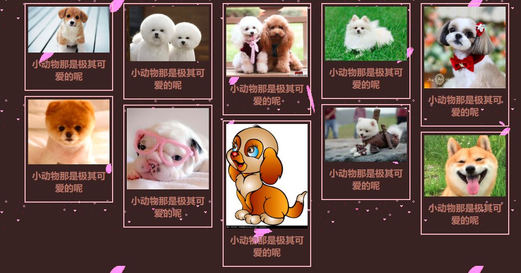
多列用于瀑布流上可以做出很漂亮的效果
<!DOCTYPE html>
<html lang="en">

<head>
    <meta charset="UTF-8">
    <meta name="viewport" content="width=device-width, initial-scale=1.0">
    <meta http-equiv="X-UA-Compatible" content="ie=edge">
    <title>Document</title>
    <style>
        *{
            margin:0;
            padding:0;
            box-sizing:border-box;
        }
        body{
            background-size:500px 500px;
            background:url(../MYPROJECT/imges/a.png),url(../MYPROJECT/imges/bg.gif);
            background-color: hsl(0, 20%, 17%);
        }
        #items{
           width: 90%;
           margin: 10px 5%;
           column-count: 5;
           column-gap: 20px;
           column-fill:auto;
        }
        img{
            display: block;
            width:100%;
        }
        #items div{
            border:2px solid pink;
            margin-bottom: 10px;
            padding:5px;
            break-inside: avoid;

        }
        p{
            font-size: 18px;
            color:#a77869;
            text-align: center;
            font-weight: bold;
            padding:10px 0;
        }
    </style>
</head>

<body>
    <div id="items">
        <div>
            <img src="../MyProject/imges/1.jpg">
            <p>
                小动物那是极其可爱的呢
            </p>
        </div>
        <div>
            <img src="../MyProject/imges/2.jpg">
            <p>
                小动物那是极其可爱的呢
            </p>
        </div>
        <div>
            <img src="../MyProject/imges/3.jpg">
            <p>
                小动物那是极其可爱的呢
            </p>
        </div>
        <div>
            <img src="../MyProject/imges/4.jpg">
            <p>
                小动物那是极其可爱的呢
            </p>
        </div>
        <div>
            <img src="../MyProject/imges/5.jpg">
            <p>
                小动物那是极其可爱的呢
            </p>
        </div>
        <div>
            <img src="../MyProject/imges/6.jpg">
            <p>
                小动物那是极其可爱的呢
            </p>
        </div>
        <div>
            <img src="../MyProject/imges/7.jpg">
            <p>
                小动物那是极其可爱的呢
            </p>
        </div>
        <div>
            <img src="../MyProject/imges/8.jpg">
            <p>
                小动物那是极其可爱的呢
            </p>
        </div>
        <div>
            <img src="../MyProject/imges/9.jpg">
            <p>
                小动物那是极其可爱的呢
            </p>
        </div>
        <div>
            <img src="../MyProject/imges/10.jpg">
            <p>
                小动物那是极其可爱的呢
            </p>
        </div>
    </div>
</body>

</html>


 浙公网安备 33010602011771号