
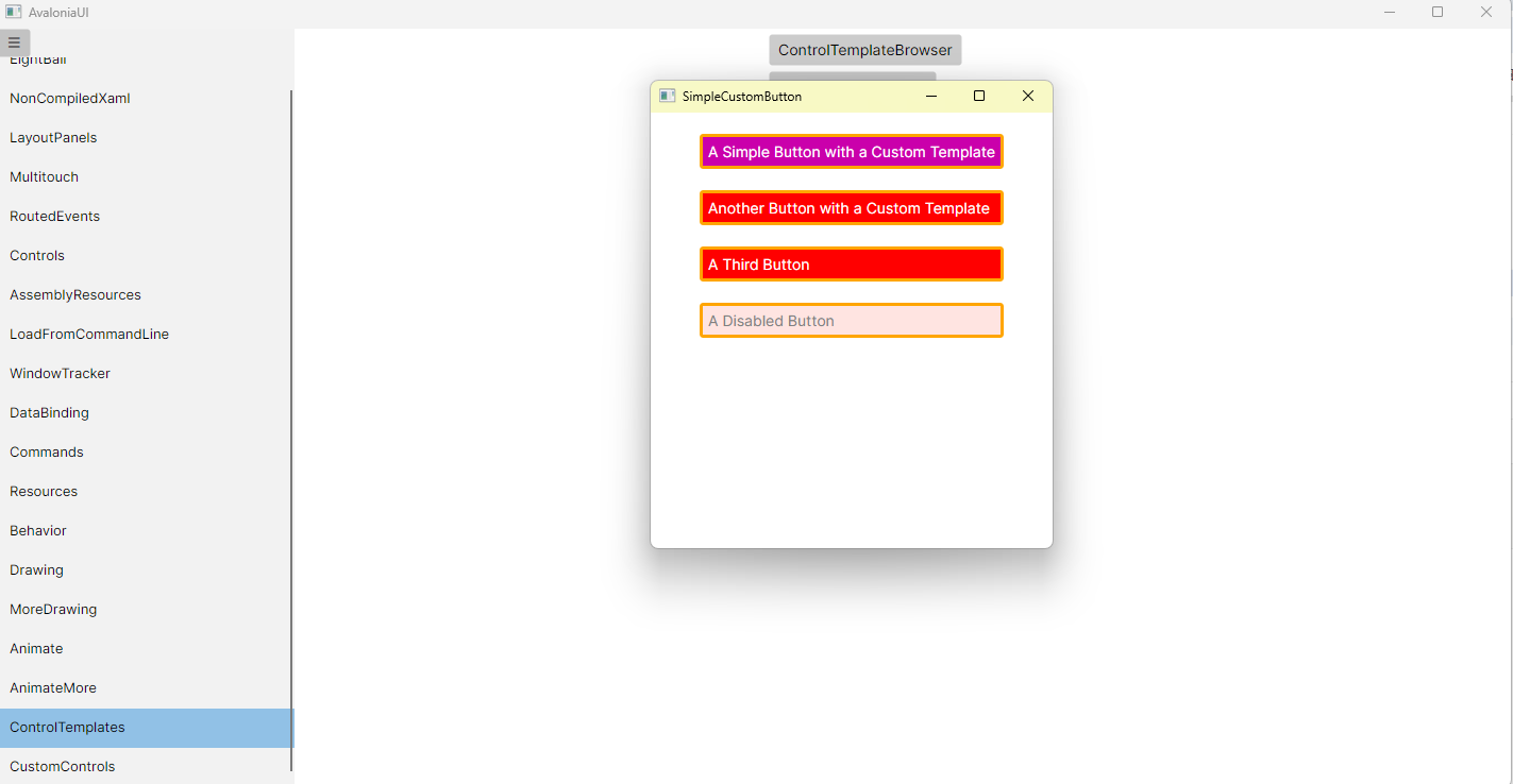
SimpleCustomButton.axaml代码
<Window xmlns="https://github.com/avaloniaui"
        xmlns:x="http://schemas.microsoft.com/winfx/2006/xaml"
        xmlns:d="http://schemas.microsoft.com/expression/blend/2008"
        xmlns:mc="http://schemas.openxmlformats.org/markup-compatibility/2006"
        Height="410" Width="378"
        x:Class="AvaloniaUI.SimpleCustomButton"
        Title="SimpleCustomButton">
    <Window.Styles>
        <Style Selector="Button">
            <Setter Property="HorizontalAlignment" Value="Stretch"/>
            <Setter Property="VerticalAlignment" Value="Stretch"/>
            <Setter Property="Template">
                <ControlTemplate>
                    <Border x:Name="border"
                            BorderBrush="Orange"
                            BorderThickness="3"
                            CornerRadius="2"
                            Background="Red">
                        <Grid>
                            <Rectangle x:Name="focusCue"
                                       IsHitTestVisible="False"
                                       Stroke="Black"
                                       StrokeThickness="1"
                                       IsVisible="False"
                                       StrokeDashArray="1,2">
                            </Rectangle>
                            <ContentPresenter Margin="{TemplateBinding Padding}"
                                              HorizontalAlignment="{TemplateBinding HorizontalContentAlignment}"
                                              VerticalAlignment="{TemplateBinding VerticalContentAlignment}"
                                              Content="{TemplateBinding Content}"
                                              ContentTemplate="{TemplateBinding ContentTemplate}"
                                              RecognizesAccessKey="True"
                                              Foreground="White"/>
                        </Grid>
                    </Border>
                </ControlTemplate>
            </Setter>

            <!-- 子选择器(用 ^ 访问模板内部元素) -->
            <Style Selector="^:pointerover /template/ Border#border">
                <Setter Property="Background" Value="DarkRed"/>
                <Style.Animations>
                    <Animation Duration="0:0:1"
                               IterationCount="Infinite"
                               PlaybackDirection="Alternate">
                        <KeyFrame Cue="0%">
                            <Setter Property="Background" Value="Red"/>
                        </KeyFrame>
                        <KeyFrame Cue="100%">
                            <Setter Property="Background" Value="Blue"/>
                        </KeyFrame>
                    </Animation>
                </Style.Animations>
            </Style>

            <Style Selector="^:pressed /template/ Border#border">
                <Setter Property="Background" Value="IndianRed"/>
                <Setter Property="BorderBrush" Value="DarkKhaki"/>
            </Style>

            <Style Selector="^:focus /template/ Rectangle#focusCue">
                <Setter Property="IsVisible" Value="True"/>
            </Style>

            <Style Selector="^:disabled /template/ Border#border">
                <Setter Property="Background" Value="MistyRose"/>
            </Style>

            <Style Selector="^:disabled /template/ ContentPresenter">
                <Setter Property="Foreground" Value="Gray"/>
            </Style>
        </Style>
    </Window.Styles>

    <StackPanel Margin="10" HorizontalAlignment="Center">
        <Button Margin="10"
                Padding="5"
                Name="cmdOne">
            A Simple Button with a Custom Template
        </Button>

        <Button Margin="10"
                Padding="5"
                Name="cmdTwo">
            Another Button with a Custom Template
        </Button>

        <Button Margin="10"
                Padding="5"
                Name="cmdThree">
            A Third Button
        </Button>

        <Button Margin="10"
                Padding="5"
                IsEnabled="False"
                Name="cmdFour">
            A Disabled Button
        </Button>
    </StackPanel>
</Window>
SimpleCustomButton.axaml.cs代码
using Avalonia;
using Avalonia.Controls;
using Avalonia.Markup.Xaml;

namespace AvaloniaUI;

public partial class SimpleCustomButton : Window
{
    public SimpleCustomButton()
    {
        InitializeComponent();
    }
}
运行效果

 浙公网安备 33010602011771号