对CSDN热门文章进行爬取与分析
对 CSDN 热门文章进行爬取与分析
(一)选题背景
万维网上有着无数的网页,包含着海量的信息,无孔不入、森罗万象。但很多时候,无论出于数据分析或产品需求,我们需要从某些网站,提取出我们感兴趣、有价值的内容,但是纵然是进化到21世纪的人类,依然只有两只手,一双眼,不可能去每一个网页去点去看,然后再复制粘贴。所以我们需要一种能自动获取网页内容并可以按照指定规则提取相应内容的程序;很幸运在大学期间我学会了这门技术--爬虫。通过本学期的学习,我对爬虫有了一定的了解,为了检验成果,我决定,对国内首屈一指的编程社区 CSDN 进行爬虫测试。
(二)主题式网络爬虫设计方案
1.主题式网络爬虫名称:
《对csdn热门文章进行爬取与分析》
2.主题式网络爬虫爬取的内容与数据待征分析
爬取 CSDN 热门版块数据 网站位于 (8条消息) 博客排行榜 (csdn.net)

3.主题式网络爬虫设计方案概述(包括实现思路与技术难点)
实现思路:
通过抓取该页面数据得到综合热榜的文章相关所有信息,将其存入文件然后进行数据可视化。
技术难点:
页面为动态页面,无法直接爬取,需要想办法到后台,接受json数据文件,并提取出来。
(三)主题页面的结构特征分析(10分)
1、网页分析
在此处我们可以看见我们要爬取的数据,但是后面我在爬取之后发现我爬取的是错误的,无法获得任何信息;
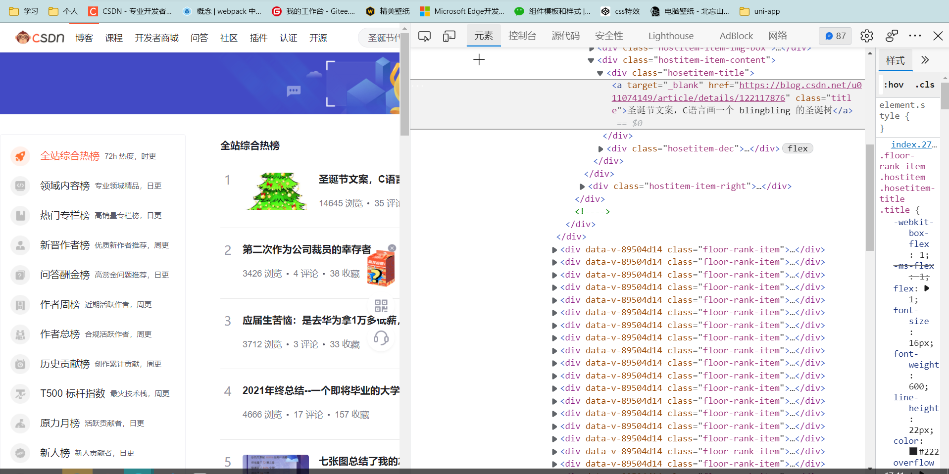
我经过查阅资料发现,本网站是动态网站,数据全是通过json文件传入的,我根据网上资料打开了网络后台,找到了该文件
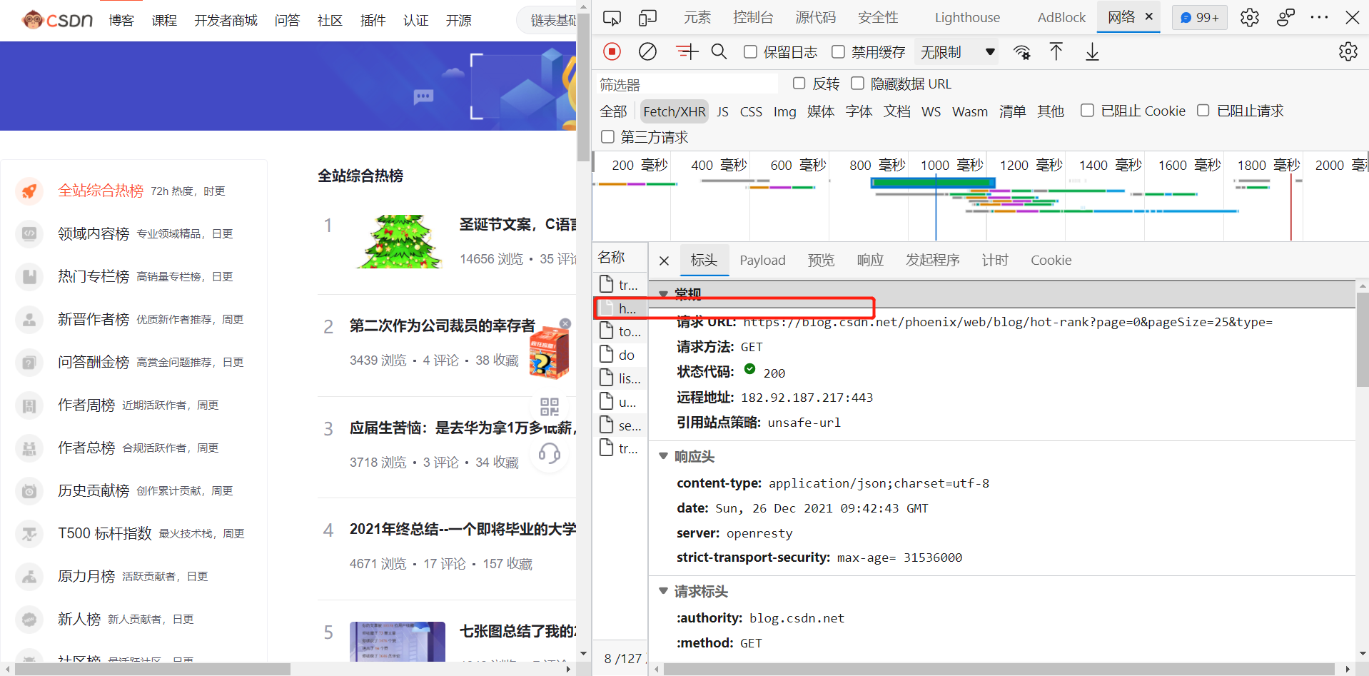
右键打开后,发现是我们需要的数据

格式化数据后
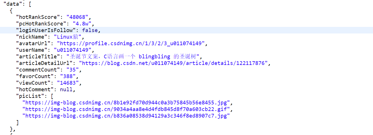
发现数据与其对应字段,自此可以开始写代码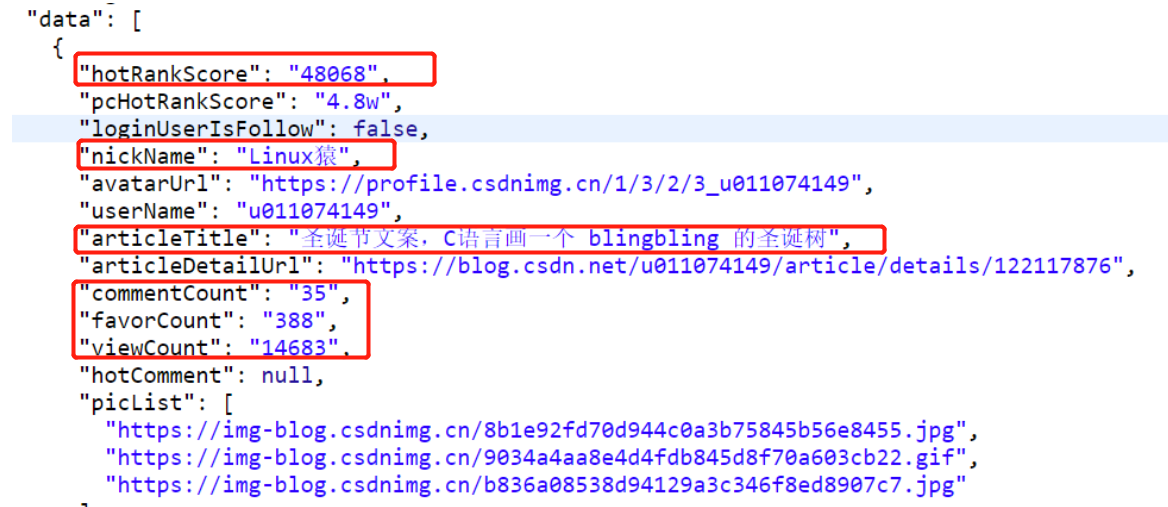
(四)网络爬虫程序设计
-
导入数据包
 1 # 导入相关库
 2 import requests
 3 import json
 4 import pandas as pd
 5 import numpy as np
 6 import matplotlib.pyplot as plt
 7 import matplotlib
 8 import seaborn as sns
 9 from scipy.optimize import leastsq
10 from PIL import Image
11 from mpl_toolkits.mplot3d import Axes3D
12 from bs4 import BeautifulSoup
-
伪装爬虫,爬取数据
 1 #需要爬取的网站的url
 2 url = 'https://blog.csdn.net/phoenix/web/blog/hot-rank?page=0&pageSize=25&type='
 3 #爬虫伪装
 4 headers = {'user-agent': 'Mozilla/5.0 (Windows NT 10.0; Win64; x64)AppleWebKit/537.36 (KHTML, like Gecko) Chrome/75.0.3770.100 Safari/537.36'}
 5 #设置超时时间
 6 r = requests.get(url,timeout = 30,headers = headers)
 7 r.encoding = 'utf-8'
 8 html = r.text
 9 print(html)
10 # 获取源代码
11 soup = BeautifulSoup(html, 'lxml')
12 # 构造Soup的对象
13 #print(soup.prettify())
![]()
- 将爬到的数据进行清洗并保存
 1 # 数据爬取与清洗
 2 def getAPPData(html):
 3     # 将json字符串转换为字典
 4     dict0 = json.loads(html).get('data')[0]
 5
 6     # 再将字典的键值对拆开到不同列表里
 7     lst0 = list(dict0.values())
 8     dict1 = json.loads(html).get('data')[1]
 9     lst1 = list(dict1.values())
10     dict2 = json.loads(html).get('data')[2]
11     lst2 = list(dict2.values())
12     dict3 = json.loads(html).get('data')[3]
13     lst3 = list(dict3.values())
14     dict4 = json.loads(html).get('data')[4]
15     lst4 = list(dict4.values())
16     dict5 = json.loads(html).get('data')[5]
17     lst5 = list(dict5.values())
18     dict6 = json.loads(html).get('data')[6]
19     lst6 = list(dict6.values())
20     dict7 = json.loads(html).get('data')[7]
21     lst7 = list(dict7.values())
22     dict8 = json.loads(html).get('data')[8]
23     lst8 = list(dict8.values())
24     dict9 = json.loads(html).get('data')[9]
25     lst9 = list(dict9.values())
26
27     '''
28         先要创建DataFrame便于处理和清洗数据
29         将df改成全局变量方便后面的函数使用
30     '''
31
32     global df
33     col = list(dict0.keys())
34     df = pd.DataFrame([lst0, lst1, lst2, lst3, lst4, lst5, lst6, lst7, lst8, lst9], columns=col)
35
36      #进行数据清洗,删除无效列,像loginUserIsFollow,avatarUrl,userName,articleDetailUrl等等都是在分析中并不需要的列,需要删除
37     df.drop('loginUserIsFollow', axis=1, inplace=True)
38     df.drop('avatarUrl', axis=1, inplace=True)
39     df.drop('userName', axis=1, inplace=True)
40     df.drop('articleDetailUrl', axis=1, inplace=True)
41     df.drop('hotComment', axis=1, inplace=True)
42     df.drop('picList', axis=1, inplace=True)
43
44     df['hotRankScore'].apply(str)
45     #查找重复值
46     print(df.duplicated())
47
48     #查找缺少值
49     print(df.isnull())
50
51     # 清洗完数据后,将dataframe保存到excel表格
52     # 自定义路径方便后期查看
53     df.to_excel('csdn.xlsx')
54
55 getAPPData(html)
![]()
- 绘制图形
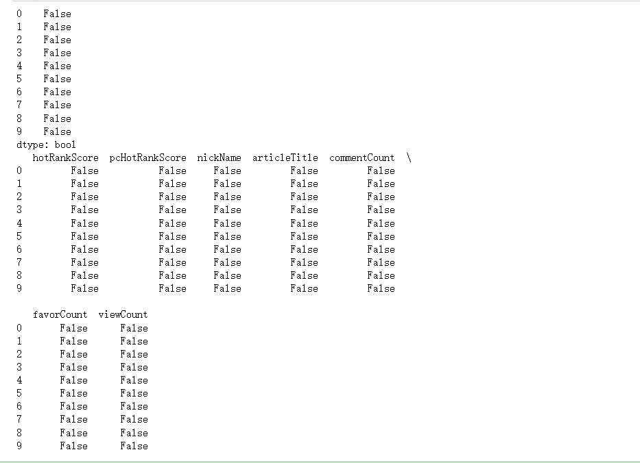
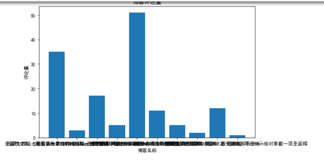
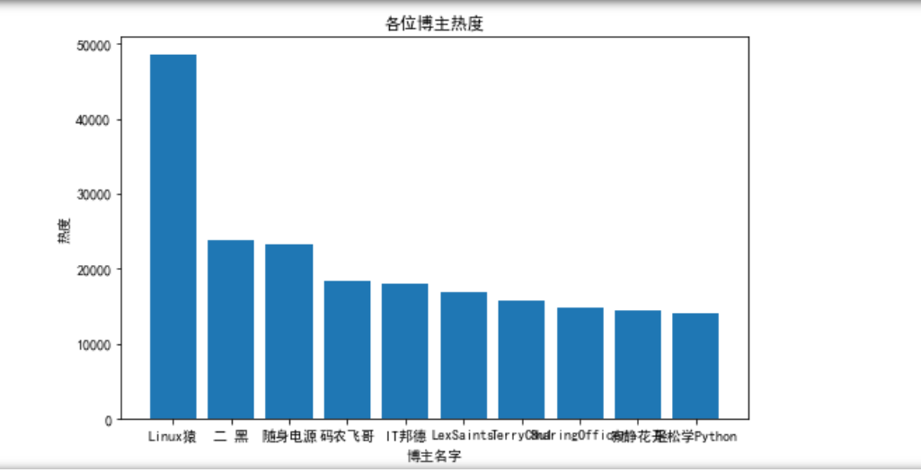
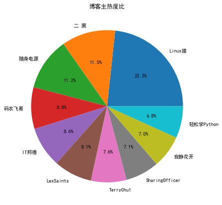
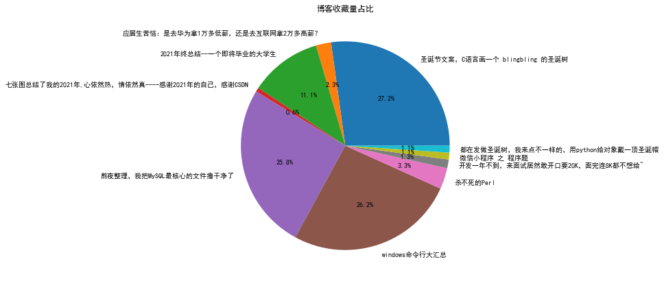
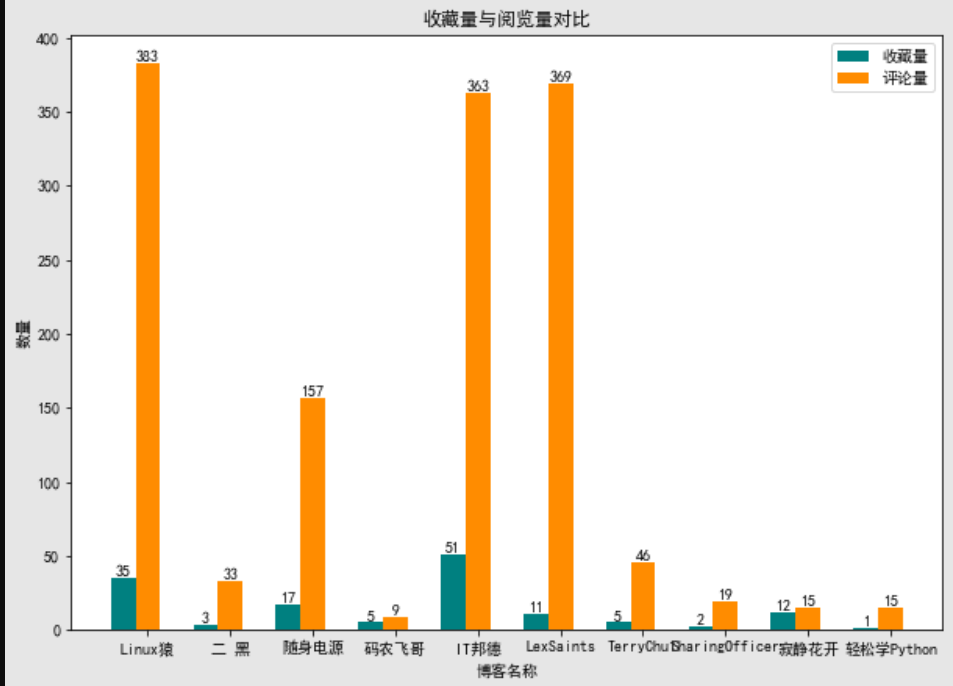
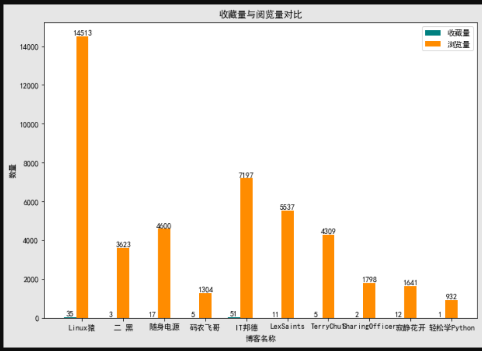
  1 def PlotData():
  2     # 将默认字体改为中文字体
  3     plt.rcParams['font.sans-serif'] = ['SimHei']
  4     # 解决负号不正常显示的问题
  5     matplotlib.rcParams['axes.unicode_minus'] = False
  6
  7     # 绘制第一张直方图
  8     # 图画比例
  9     plt.figure(figsize=(10, 7))
 10     # 构造数据
 11     # x轴
 12     x = df['nickName']
 13     # y轴
 14     y1 = df['hotRankScore']
 15
 16     plt.bar(x, y1)
 17     # 设置标题
 18     plt.title('各位博主热度')
 19     # 横坐标
 20     plt.xlabel('博主名字')
 21     # 纵坐标
 22     plt.ylabel('热度')
 23     # 将图片保存到file文件夹下
 24     plt.savefig('各位博主热度.jpg')
 25     plt.show()
 26
 27     # 绘制第二张直方图
 28     plt.figure(figsize=(50, 40))
 29     x2=df['articleTitle']
 30     y2 = df['viewCount']
 31
 32     plt.bar(x2, y2)
 33     plt.title('该博客浏览量')
 34     plt.xlabel('文章名')
 35     plt.ylabel('浏览量')
 36     plt.savefig('该博客浏览量.jpg')
 37     plt.show()
 38
 39     # 绘制第三张直方图
 40     plt.figure(figsize=(50, 40))
 41     y3 = df['commentCount']
 42
 43     plt.bar(x2, y3)
 44     plt.title('博客评论量')
 45     plt.xlabel('博客名称')
 46     plt.ylabel('评论量')
 47     plt.savefig('博客评论量.jpg')
 48     plt.show()
 49
 50     # 绘制第一张饼图
 51     plt.figure(figsize=(7, 7))
 52     # 标签名
 53     labels = df['nickName']
 54     # 构造数据
 55     data = df['hotRankScore']
 56
 57     # 绘制图形
 58     plt.pie(data, labels=labels, autopct='%1.1f%%')
 59     plt.title('博客主热度比')
 60     plt.savefig('博客主热度比.jpg')
 61     plt.show()
 62
 63     # 绘制第二张饼图
 64     plt.figure(figsize=(7, 7))
 65     labels = df['articleTitle']
 66     data = df['viewCount']
 67
 68     plt.pie(data, labels=labels, autopct='%1.1f%%')
 69     plt.title('博客浏览量占比')
 70     plt.savefig('博客浏览量占比.jpg')
 71     plt.show()
 72
 73     # 绘制第三张饼图
 74     plt.figure(figsize=(7, 7))
 75     labels = df['articleTitle']
 76     data = df['favorCount']
 77
 78     plt.pie(data, labels=labels, autopct='%1.1f%%')
 79     plt.title('博客收藏量占比')
 80     plt.savefig('博客收藏量占比.jpg')
 81     plt.show()
 82
 83     # 绘制组合柱状图
 84     plt.figure(figsize=(10, 7))
 85     # 构建数据
 86     x0 = df['nickName']
 87     UseNum = df['commentCount']
 88     UseTime = df['favorCount']
 89     x = list(range(len(UseNum)))
 90     # 设置间距
 91     bar_width = 0.3
 92
 93     # 在偏移间距位置绘制柱状图
 94     for i in range(len(x)):
 95         x[i] -= bar_width
 96     plt.bar(x, height=UseNum, width=bar_width, label='收藏量', fc='teal')
 97     for a, b in zip(x, UseNum):
 98         plt.text(a, b, b, ha='center', va='bottom', fontsize=10)
 99
100     for i in range(len(x)):
101         x[i] += bar_width
102     plt.bar(x, height=UseTime, width=bar_width, label='评论量', tick_label=x0, fc='darkorange')
103     for a, b in zip(x, UseTime):
104         plt.text(a, b, b, ha='center', va='bottom', fontsize=10)
105
106     # 设置标题
107     plt.title('收藏量与阅览量对比')
108     # 设置横纵坐标
109     plt.xlabel('博客名称')
110     plt.ylabel('数量')
111     # 显示图例
112     plt.legend()
113     # 将图片保存到file文件夹下
114     plt.savefig('收藏量与评论量对比.jpg')
115     plt.show()
116
117
118
119       # 绘制组合柱状图
120     plt.figure(figsize=(10, 7))
121     # 构建数据
122     x0 = df['nickName']
123     UseNum = df['commentCount']
124     UseTime = df['viewCount']
125     x = list(range(len(UseNum)))
126     # 设置间距
127     bar_width = 0.3
128
129     # 在偏移间距位置绘制柱状图
130     for i in range(len(x)):
131         x[i] -= bar_width
132     plt.bar(x, height=UseNum, width=bar_width, label='收藏量', fc='teal')
133     for a, b in zip(x, UseNum):
134         plt.text(a, b, b, ha='center', va='bottom', fontsize=10)
135
136     for i in range(len(x)):
137         x[i] += bar_width
138     plt.bar(x, height=UseTime, width=bar_width, label='浏览量', tick_label=x0, fc='darkorange')
139     for a, b in zip(x, UseTime):
140         plt.text(a, b, b, ha='center', va='bottom', fontsize=10)
141
142     # 设置标题
143     plt.title('收藏量与阅览量对比')
144     # 设置横纵坐标
145     plt.xlabel('博客名称')
146     plt.ylabel('数量')
147     # 显示图例
148     plt.legend()
149     # 将图片保存到file文件夹下
150     plt.savefig('收藏量与阅览量对比.jpg')
151     plt.show()
152
153 PlotData()
![]()
![]()
![]()
![]()
![]()
![]()
![]()
![]()
-
分析两组数据并画散点图和建立回归方程
-
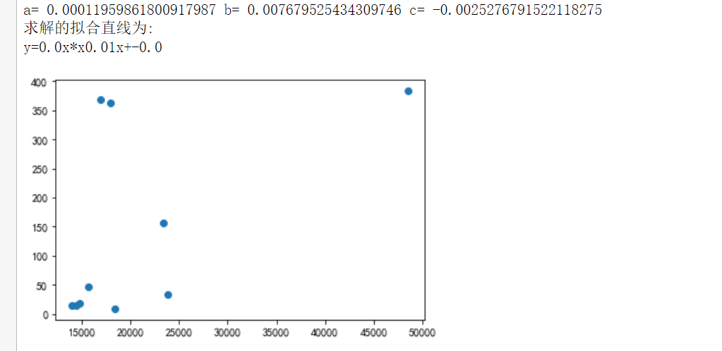
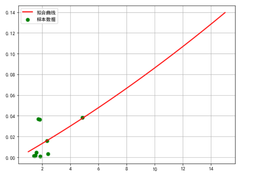
 1 def rc():
 2 # 分析两组数据并画散点图和建立回归方程
 3     # 设置中文字体
 4     plt.rcParams['font.sans-serif'] = ['SimHei']
 5
 6     # 嵌套函数
 7     # 需要拟合的函数func,指定函数的形状
 8     def func1(p, x):
 9         a, b, c = p
10         return a * x * x + b * x + c
11
12     # 偏差函数
13     def error1(p, x, y):
14         return func1(p, x) - y
15     df = pd.DataFrame(pd.read_excel('csdn.xlsx'))
16     # 画样本图像
17     plt.scatter(df.hotRankScore, df.favorCount)
18
19     # 设置样本数据
20     X =df.hotRankScore / 10000
21     Y = df.favorCount / 10000
22     plt.figure(figsize=(8, 6))
23
24     # 设置函数拟合参数
25     p0 = [1, 15, 20]
26
27     # 进行最小二乘拟合
28     para = leastsq(error1, p0, args=(X, Y))
29     a, b, c = para[0]
30
31     # 读取结果
32     print('a=', a, 'b=', b, 'c=', c)
33     print("求解的拟合直线为:")
34     print("y=" + str(round(a, 2)) + "x*x" + str(round(b, 2)) + "x+" + str(round(c, 2)))
35
36     # 画拟合曲线
37     plt.scatter(X, Y, color='green', label='样本数据', linewidth=2)
38     x = np.linspace(1, 15, 20)
39     y = a * x * x + b * x + c
40     plt.plot(x, y, color='red', label='拟合曲线', linewidth=2)
41     plt.legend()
42     plt.title('')
43     plt.grid()
44     plt.show()
45
46 rc()
![]()
![]()
7.完整代码展示
  1 # 导入相关库
  2 import requests
  3 import json
  4 import pandas as pd
  5 import numpy as np
  6 import matplotlib.pyplot as plt
  7 import matplotlib
  8 import seaborn as sns
  9 from scipy.optimize import leastsq
 10 from PIL import Image
 11 from mpl_toolkits.mplot3d import Axes3D
 12 from bs4 import BeautifulSoup
 13
 14 #需要爬取的网站的url
 15 url = 'https://blog.csdn.net/phoenix/web/blog/hot-rank?page=0&pageSize=25&type='
 16 #爬虫伪装
 17 headers = {'user-agent': 'Mozilla/5.0 (Windows NT 10.0; Win64; x64)AppleWebKit/537.36 (KHTML, like Gecko) Chrome/75.0.3770.100 Safari/537.36'}
 18 #设置超时时间
 19 r = requests.get(url,timeout = 30,headers = headers)
 20 r.encoding = 'utf-8'
 21 html = r.text
 22 print(html)
 23 # 获取源代码
 24 soup = BeautifulSoup(html, 'lxml')
 25 # 构造Soup的对象
 26 #print(soup.prettify())
 27
 28 # 数据爬取与清洗
 29 def getAPPData(html):
 30     # 将json字符串转换为字典
 31     dict0 = json.loads(html).get('data')[0]
 32
 33     # 再将字典的键值对拆开到不同列表里
 34     lst0 = list(dict0.values())
 35     dict1 = json.loads(html).get('data')[1]
 36     lst1 = list(dict1.values())
 37     dict2 = json.loads(html).get('data')[2]
 38     lst2 = list(dict2.values())
 39     dict3 = json.loads(html).get('data')[3]
 40     lst3 = list(dict3.values())
 41     dict4 = json.loads(html).get('data')[4]
 42     lst4 = list(dict4.values())
 43     dict5 = json.loads(html).get('data')[5]
 44     lst5 = list(dict5.values())
 45     dict6 = json.loads(html).get('data')[6]
 46     lst6 = list(dict6.values())
 47     dict7 = json.loads(html).get('data')[7]
 48     lst7 = list(dict7.values())
 49     dict8 = json.loads(html).get('data')[8]
 50     lst8 = list(dict8.values())
 51     dict9 = json.loads(html).get('data')[9]
 52     lst9 = list(dict9.values())
 53
 54     '''
 55         先要创建DataFrame便于处理和清洗数据
 56         将df改成全局变量方便后面的函数使用
 57     '''
 58
 59     global df
 60     col = list(dict0.keys())
 61     df = pd.DataFrame([lst0, lst1, lst2, lst3, lst4, lst5, lst6, lst7, lst8, lst9], columns=col)
 62
 63      #进行数据清洗,删除无效列,像loginUserIsFollow,avatarUrl,userName,articleDetailUrl等等都是在分析中并不需要的列,需要删除
 64     df.drop('loginUserIsFollow', axis=1, inplace=True)
 65     df.drop('avatarUrl', axis=1, inplace=True)
 66     df.drop('userName', axis=1, inplace=True)
 67     df.drop('articleDetailUrl', axis=1, inplace=True)
 68     df.drop('hotComment', axis=1, inplace=True)
 69     df.drop('picList', axis=1, inplace=True)
 70
 71     df['hotRankScore'].apply(str)
 72     #查找重复值
 73     print(df.duplicated())
 74
 75     #查找缺少值
 76     print(df.isnull())
 77
 78     # 清洗完数据后,将dataframe保存到excel表格
 79     # 自定义路径方便后期查看
 80     df.to_excel('csdn.xlsx')
 81
 82 getAPPData(html)
 83
 84 def PlotData():
 85     # 将默认字体改为中文字体
 86     plt.rcParams['font.sans-serif'] = ['SimHei']
 87     # 解决负号不正常显示的问题
 88     matplotlib.rcParams['axes.unicode_minus'] = False
 89
 90     # 绘制第一张直方图
 91     # 图画比例
 92     plt.figure(figsize=(8,5))
 93     # 构造数据
 94     # x轴
 95     x = df['nickName']
 96     # y轴
 97     y1 = df['hotRankScore']
 98
 99     plt.bar(x, y1)
100     # 设置标题
101     plt.title('各位博主热度')
102     # 横坐标
103     plt.xlabel('博主名字')
104     # 纵坐标
105     plt.ylabel('热度')
106     # 将图片保存到file文件夹下
107     plt.savefig('各位博主热度.jpg')
108     plt.show()
109
110     # 绘制第二张直方图
111     plt.figure(figsize=(8,5))
112     x2=df['articleTitle']
113     y2 = df['viewCount']
114
115     plt.bar(x2, y2)
116     plt.title('该博客浏览量')
117     plt.xlabel('文章名')
118     plt.ylabel('浏览量')
119     plt.savefig('该博客浏览量.jpg')
120     plt.show()
121
122     # 绘制第三张直方图
123     plt.figure(figsize=(8,5))
124     y3 = df['commentCount']
125
126     plt.bar(x2, y3)
127     plt.title('博客评论量')
128     plt.xlabel('博客名称')
129     plt.ylabel('评论量')
130     plt.savefig('博客评论量.jpg')
131     plt.show()
132
133     # 绘制第一张饼图
134     plt.figure(figsize=(7, 7))
135     # 标签名
136     labels = df['nickName']
137     # 构造数据
138     data = df['hotRankScore']
139
140     # 绘制图形
141     plt.pie(data, labels=labels, autopct='%1.1f%%')
142     plt.title('博客主热度比')
143     plt.savefig('博客主热度比.jpg')
144     plt.show()
145
146     # 绘制第二张饼图
147     plt.figure(figsize=(7, 7))
148     labels = df['articleTitle']
149     data = df['viewCount']
150
151     plt.pie(data, labels=labels, autopct='%1.1f%%')
152     plt.title('博客浏览量占比')
153     plt.savefig('博客浏览量占比.jpg')
154     plt.show()
155
156     # 绘制第三张饼图
157     plt.figure(figsize=(7, 7))
158     labels = df['articleTitle']
159     data = df['favorCount']
160
161     plt.pie(data, labels=labels, autopct='%1.1f%%')
162     plt.title('博客收藏量占比')
163     plt.savefig('博客收藏量占比.jpg')
164     plt.show()
165
166     # 绘制组合柱状图
167     plt.figure(figsize=(10, 7))
168     # 构建数据
169     x0 = df['nickName']
170     UseNum = df['commentCount']
171     UseTime = df['favorCount']
172     x = list(range(len(UseNum)))
173     # 设置间距
174     bar_width = 0.3
175
176     # 在偏移间距位置绘制柱状图
177     for i in range(len(x)):
178         x[i] -= bar_width
179     plt.bar(x, height=UseNum, width=bar_width, label='收藏量', fc='teal')
180     for a, b in zip(x, UseNum):
181         plt.text(a, b, b, ha='center', va='bottom', fontsize=10)
182
183     for i in range(len(x)):
184         x[i] += bar_width
185     plt.bar(x, height=UseTime, width=bar_width, label='评论量', tick_label=x0, fc='darkorange')
186     for a, b in zip(x, UseTime):
187         plt.text(a, b, b, ha='center', va='bottom', fontsize=10)
188
189     # 设置标题
190     plt.title('收藏量与阅览量对比')
191     # 设置横纵坐标
192     plt.xlabel('博客名称')
193     plt.ylabel('数量')
194     # 显示图例
195     plt.legend()
196     # 将图片保存到file文件夹下
197     plt.savefig('收藏量与评论量对比.jpg')
198     plt.show()
199
200
201
202       # 绘制组合柱状图
203     plt.figure(figsize=(10, 7))
204     # 构建数据
205     x0 = df['nickName']
206     UseNum = df['commentCount']
207     UseTime = df['viewCount']
208     x = list(range(len(UseNum)))
209     # 设置间距
210     bar_width = 0.3
211
212     # 在偏移间距位置绘制柱状图
213     for i in range(len(x)):
214         x[i] -= bar_width
215     plt.bar(x, height=UseNum, width=bar_width, label='收藏量', fc='teal')
216     for a, b in zip(x, UseNum):
217         plt.text(a, b, b, ha='center', va='bottom', fontsize=10)
218
219     for i in range(len(x)):
220         x[i] += bar_width
221     plt.bar(x, height=UseTime, width=bar_width, label='浏览量', tick_label=x0, fc='darkorange')
222     for a, b in zip(x, UseTime):
223         plt.text(a, b, b, ha='center', va='bottom', fontsize=10)
224
225     # 设置标题
226     plt.title('收藏量与阅览量对比')
227     # 设置横纵坐标
228     plt.xlabel('博客名称')
229     plt.ylabel('数量')
230     # 显示图例
231     plt.legend()
232     # 将图片保存到file文件夹下
233     plt.savefig('收藏量与阅览量对比.jpg')
234     plt.show()
235
236 PlotData()
237
238 def rc():
239 # 分析两组数据并画散点图和建立回归方程
240     # 设置中文字体
241     plt.rcParams['font.sans-serif'] = ['SimHei']
242
243     # 嵌套函数
244     # 需要拟合的函数func,指定函数的形状
245     def func1(p, x):
246         a, b, c = p
247         return a * x * x + b * x + c
248
249     # 偏差函数
250     def error1(p, x, y):
251         return func1(p, x) - y
252     df = pd.DataFrame(pd.read_excel('csdn.xlsx'))
253     # 画样本图像
254     plt.scatter(df.hotRankScore, df.favorCount)
255
256     # 设置样本数据
257     X =df.hotRankScore / 10000
258     Y = df.favorCount / 10000
259     plt.figure(figsize=(8, 6))
260
261     # 设置函数拟合参数
262     p0 = [1, 15, 20]
263
264     # 进行最小二乘拟合
265     para = leastsq(error1, p0, args=(X, Y))
266     a, b, c = para[0]
267
268     # 读取结果
269     print('a=', a, 'b=', b, 'c=', c)
270     print("求解的拟合直线为:")
271     print("y=" + str(round(a, 2)) + "x*x" + str(round(b, 2)) + "x+" + str(round(c, 2)))
272
273     # 画拟合曲线
274     plt.scatter(X, Y, color='green', label='样本数据', linewidth=2)
275     x = np.linspace(1, 15, 20)
276     y = a * x * x + b * x + c
277     plt.plot(x, y, color='red', label='拟合曲线', linewidth=2)
278     plt.legend()
279     plt.title('')
280     plt.grid()
281     plt.show()
282
283 rc()
8.持久化体现


已通过代码保存下来成图片

(五)总结
1.经过对主题数据的分析与可视化,可以得到哪些结论?是否达到顶期的目标
第一次仔细研究CSDN这种技术分享型网站,发现似乎跟娱乐网站不一样,在娱乐网站中,流量为王,热度高的一定点赞量,评论量都很高,收藏量很少,但是技术分享型网站不一样,热度高的,收藏量比评论量多非常多,相差的近乎好几倍;且发现虽然昨天是圣诞节,但是在CSDN上前十只有几个是跟圣诞主题有关的,似乎节日对此类知识分享型网站影响较小,或者说,趁热度的人较少;
2.在完成此比设计过程中,得到哪些收获?以及要改进的建议?
经过python对网络爬虫的学习,让自己深刻了解到了python这门语言强大的功能,以及对数据处理的简便与快捷,让数据以更生动形象具体
的方式呈现在我们眼前,同时了解到自身对这门语言的理解还不够透彻,在处理很多方面细节不够到位,让自己认识到更多的不足,同时加深了对这门语言的热爱。期间看过大量的教学视频,查找了大量的第三方库的使用。

 浙公网安备 33010602011771号