
微信小程序-瀑布流实现的几种方式
第一种:推荐固定条数的数据(刷新需要整体数据刷新的那种)
 编辑
编辑 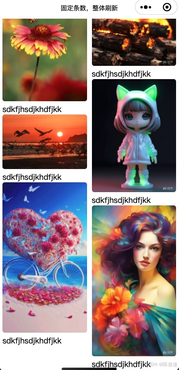
wxss
.gallery {
  padding: 20rpx;
  /*定义列数*/
  column-count: 2;
  /*列间距*/
  column-gap: 20rpx;
}
.item {
  break-inside: avoid;
}
/*图片本身*/
.item image {
  border-radius: 10rpx;
  width: 100%;
}
js
Page({
  data: {
    images: [
      'https://img0.baidu.com/it/u=1799694557,1475747482&fm=253&fmt=auto&app=138&f=JPEG?w=500&h=750',
      'http://gips1.baidu.com/it/u=436886321,1020119268&fm=3028&app=3028&f=JPEG&fmt=auto?w=1280&h=960',
      'https://img2.baidu.com/it/u=1337068678,3064275007&fm=253&fmt=auto&app=120&f=JPEG?w=500&h=750',
      'https://inews.gtimg.com/om_bt/Os3eJ8u3SgB3Kd-zrRRhgfR5hUvdwcVPKUTNO6O7sZfUwAA/641',
      'https://img1.baidu.com/it/u=2062152131,1998701002&fm=253&fmt=auto&app=138&f=JPEG?w=800&h=1421',
      'http://gips2.baidu.com/it/u=1674525583,3037683813&fm=3028&app=3028&f=JPEG&fmt=auto?w=1024&h=1024',
      'http://gips3.baidu.com/it/u=100751361,1567855012&fm=3028&app=3028&f=JPEG&fmt=auto?w=960&h=1280',
      'http://gips0.baidu.com/it/u=1690853528,2506870245&fm=3028&app=3028&f=JPEG&fmt=auto?w=1024&h=1024',
      'http://gips0.baidu.com/it/u=3602773692,1512483864&fm=3028&app=3028&f=JPEG&fmt=auto?w=960&h=1280',
      'https://gips3.baidu.com/it/u=3732737575,1337431568&fm=3028&app=3028&f=JPEG&fmt=auto&q=100&size=f1440_2560',
    ]
  },
})
wxml
<view class="gallery">
  <view class="item" wx:for="{{images}}">
      <image src="{{item}}" mode="widthFix" bindtap="click"/>
      <text>sdkfjhsdjkhdfjkk</text>
  </view>
</view>
第二种:将渲染引擎调整成skyline
"renderer": "skyline",
  "rendererOptions": {
    "skyline": {
      "defaultDisplayBlock": true,
      "defaultContentBox": true,
      "disableABTest": true,
      "sdkVersionEnd": "3.0.1"
    }
}, 
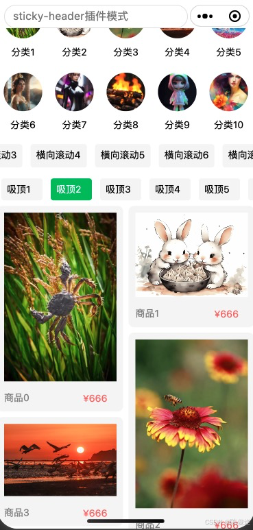 编辑
编辑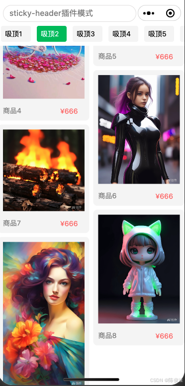
wxml