
CSS——基础知识点
一、CSS简介
如何学习
- CSS是什么
- CSS怎么用(快速入门)
- CSS选择器(重点+难点)
- 美化网页(文字,阴影,超链接,列表,渐变...)
- 盒子模型
- 浮动
- 定位
- 网页动画(特效效果,菜鸟教程)
1.1、什么是CSS
Cascading Style Sheet 层叠级联样式表
CSS:表现(美化网页)
字体,颜色,边距,高度,宽度,背景图片,网页定位,网页浮动
1.2、发展史
CSS1.0
CSS2.0 DIV(块)+ CSS,HTML与CSS结构分离的思想,网页变得简单,SEO
CSS2.1 浮动,定位
CSS3.0 圆角,阴影,动画...... 浏览器兼容性
1.3、快速入门
style
基本入门
<!DOCTYPE html>
<html lang="en">
<head>
    <meta charset="UTF-8">
    <title>Title</title>

    <!--规范,<style>可以编写css的代码,每一个声明,最好使用分号结尾
   语法:
        选择器{
            声明1;
            声明2;
            声明3;
        }
   -->

    <style>
        h1{
            color: red;
        }
    </style>
</head>

<body>

<h1>我是标题</h1>

</body>
</html>
-
建议使用这种规范
![image-20210806100822746]()
-
CSS的优势:
- 内容和表现分离
- 网页结构表现统一,可以实现复用
- 样式十分的丰富
- 建议使用独立于html的CSS文件
- 利用SEO,容易被搜索引擎收录!

1.4、CSS的3中导入方式
<!DOCTYPE html>
<html lang="en">
<head>
    <meta charset="UTF-8">
    <title>Title</title>

    <!--内部样式-->
    <style>
        h1{
           color: green;
        }
    </style>

	<!--外部样式-->
    <link rel="stylesheet" href="CSS/style.css">

</head>
<body>

<!--优先级:就近原则-->

<!--行内样式:在标签元素中,编写一个style属性,编写样式即可-->

<h1 style="color: red">我是标题</h1>

<h1>我是标题</h1>

</body>
</html>
拓展:外部样式两种写法
-
链接式:
html标签<!--外部样式--> <link rel="stylesheet" href="CSS/style.css"> -
导入式:
@import是CSS2.1特有的!<!--导入式--> <style> @import url(css/style.css); </style>
二、选择器
作用:选择页面上的某一个或者某一类元素
2.1、基本选择器
-
标签选择器:选择一类标签 标签
<!DOCTYPE html> <html lang="en"> <head> <meta charset="UTF-8"> <title>Title</title> <style> /*标签选择器,会选择到页面上所有的这个标签的元素*/ h1{ color: #77a265; background: #7f24a2; border-radius: 24px; } p{ font-size: 80px; } </style> </head> <body> <h1>学Java</h1> <p>听狂神说</p> </body> </html> -
类选择器 class:选择所有class属性一致的标签,跨标签 .类名
<!DOCTYPE html> <html lang="en"> <head> <meta charset="UTF-8"> <title>Title</title> <style> /*类选择器的格式 .class的名称{} 好处,可以多个标签归类,是同一个class,可以复用 */ .weiming{ color: aquamarine; } .kuangshen{ color: #7f24a2; } </style> </head> <body> <h1 class="weiming">标题1</h1> <h1 class="kuangshen">标题2</h1> <h1 class="weiming">标题3</h1> </body> </html> -
ID选择器:全局唯一! #id名
<!DOCTYPE html>
<html lang="en">
<head>
    <meta charset="UTF-8">
    <title>Title</title>

    <style>
        /* id选择器   :id必须保证全局唯一!
           #id名称{}
           优先级:
           不遵循就近原则,固定的
           id选择器 > class 选择器 > 标签选择器
        */
        #qinjiang{
            color: blue;
        }
        .style1{
            color: rgba(255, 192, 149, 0.82);
        }
        h1{
            color: red;
        }
    </style>

</head>
<body>

<h1 id="qinjiang" class="style1">标题1</h1>
<h1 class="style1">标题2</h1>
<h1 class="style1">标题3</h1>
<h1>标题4</h1>
<h1>标题5</h1>

</body>
</html>
- 优先级:
不遵循就近原则,固定的
id选择器 > class 选择器 > 标签选择器
2.2、层次选择器
-
后代选择器:在某个元素的后面 祖爷爷 爷爷 爸爸 你
/*后代选择器*/ body p{ background: red; } -
子选择器,一代,儿子
/*子选择器*/ body>p{ background: aqua; } -
相邻兄弟选择器 同辈
/*相邻弟选择器:只有一个,相邻(向下)*/ .active + p{ background: cornflowerblue; } -
通用选择器
/*通用兄弟选择器,当前选中元素向下的所有兄弟元素*/ .active~p{ background: #7f24a2; }
-
上面代码合集
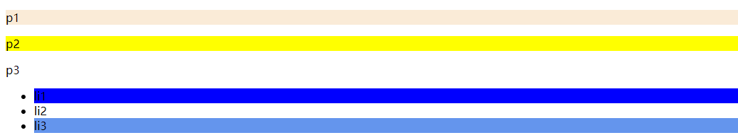
<!DOCTYPE html>
<html lang="en">
<head>
    <meta charset="UTF-8">
    <title>Title</title>

    <style>
        /*p{*/
        /*    background: #77a265;*/
        /*}*/

        /*后代选择器*/
        /*body p{*/
        /*    background: red;*/
        /*}*/

        /*子选择器*/
        /*body>p{*/
        /*    background: aqua;*/
        /*}*/

        /*相邻弟选择器:只有一个,相邻(向下)*/
        /*.active + p{*/
        /*    background: cornflowerblue;*/
        /*}*/

        /*通用兄弟选择器,当前选中元素向下的所有兄弟元素*/
        .active~p{
            background: #7f24a2;
        }
    </style>

</head>
<body>

    <p>p0</p>
    <p class="active">p1</p>
    <p>p2</p>
    <p>p3</p>

    <ul>
        <li>
            <p>p4</p>
        </li>
        <li>
            <p>p5</p>
        </li>
        <li>
            <p>p6</p>
        </li>
    </ul>

</body>
</html>
2.3、结构伪类选择器
伪类:
/*ul的第一个子元素*/ul li:first-child{ background: blue;}/*ul的最后一个子元素*/ul li:last-child{ background: cornflowerblue;}/*选中P1:定位到父元素,选择当前的第一个元素选择当前p元素的父级元素,选中父级元素的第一个子元素,并且是当前元素才生效,按顺序!*/p:nth-child(1){ background: antiquewhite;}/*选中父元素下的p元素的第二个,按类型*/p:nth-of-type(2){ background: yellow;}
2.4、属性选择器(常用)
id + class 结合
<!DOCTYPE html>
<html lang="en">
<head>
<meta charset="UTF-8">
<title>Title</title>
<style>
.demo a{
float: left;
display: block;
height: 50px;
width: 50px;
border-radius: 10px;
background: blue;
text-align: center;
color: gainsboro;
text-decoration: none;
margin-right: 5px;
font: bold 20px/50px Arial;
}
/*属性名,属性名 = 属性值(正则)
= 绝对等于
*= 包含这个元素
^=以这个开头
$=以这个结尾
*/
/*存在id属性的元素 a[]{}*/
/*a[id]{*/
/* background: yellow;*/
/*}*/
/*id=first的元素*/
/*a[id=first]{*/
/* background: green;*/
/*}*/
/*class中有links的元素*/
/*a[class*="links"]{*/
/* background: yellow;*/
/*}*/
/*选中href中以http开头的元素*/
/*a[href^=http]{*/
/* background: yellow;*/
/*}*/
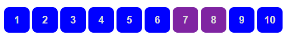
a[href$=pdf]{
background: #7f24a2;
}
</style>
</head>
<body>
<p class="demo">
<a href="http://www.baidu.com" class="links item first" id="first">1</a>
<a href="" class="links item active" target="_blank" title="test">2</a>
<a href="" class="links item">3</a>
<a href="" class="links item">4</a>
<a href="" class="links item">5</a>
<a href="abc" class="links item">6</a>
<a href="/a.pdf" class="links item">7</a>
<a href="/abc.pdf" class="links item">8</a>
<a href="abc.doc" class="links item">9</a>
<a href="abcd.doc" class="links item last">10</a>
</p>
</body>
</html>
三、美化网页元素
3.1、为什么要美化网页
- 有效的传递页面信息
- 美化网页,页面漂亮,才能吸引用户
- 凸显页面的主题
- 提高用户体验
-
span标签:重点要突出的字,使用span套起来
<!DOCTYPE html>
<html lang="en">
<head>
    <meta charset="UTF-8">
    <title>Title</title>

    <style>
        #title1{
            font-size: 50px;
        }
    </style>

</head>
<body>

欢迎学习<span id="title1">Java</span>

</body>
</html>
3.2、字体样式
/*依次为字体风格,粗细,大小 字体*/
    p{
        font: oblique bolder 16px "楷体";
    }
<!--
font-family:字体
font-size:字体大小
font-weight:字体粗细
color:字体颜色
-->

<style>

    body{
        font-family: "Arial Black",楷体;
        color: cornflowerblue;
    }
    h1{
        font-size: 50px;
    }
    .p1{
        font-weight: bold;
    }

</style>
3.3、文本样式
- 颜色 color RGB RGBA
- 文本对齐方式 text-align = center
- 首行缩进 text-indent: 2em
- 行高 line-height: 单行文字上下居中!line-height = height
- 装饰 text-decoration
- 文本图片水平对齐:vertical-align: middle
<!DOCTYPE html>
<html lang="en">
<head>
    <meta charset="UTF-8">
    <title>Title</title>

    <!--
    颜色:
        单词
        RGB 0~F
        RGBA A:0~1(透明度的值)
    text-align:排版,居中,
    text-indent: 2em; 段落首行缩进
    height: 100px;
    line-height: 100px;
        行高和块的高度一致就可以居中了
    -->
    <style>
        h1{
            color: rgba(0,255,255,0.9);
            text-align: center;
        }

        .p1{
            text-indent: 2em;
        }
        .p3{
            background: #7f24a2;
            height: 100px;
            line-height: 100px;
        }
        /*下划线*/
        .l1{
            text-decoration: underline;
        }
        /*中划线*/
        .l2{
            text-decoration: line-through;
        }
        /*上划线*/
        .l3{
            text-decoration: overline;
        }
        /*a标签去下划线*/
        a{
            text-decoration: none;
        }
        /*水平对齐~ 参照物, a,b*/
        img,span{
            vertical-align: middle;
        }
    </style>

</head>
<body>

<a href="">123</a>
<p class="l1">123123</p>
<p class="l2">123123</p>
<p class="l3">123123</p>

<h1>现场|苏炳添:我的身份是老师,我要回暨南大学报到了</h1>
<p class="p1">在6日晚的男子4×100米接力拿下第四后,苏炳添和队友都对今天的交接棒不太满意。</p>
<p>苏炳添表示,“今天交接棒只能打80分吧,我和谢震业接棒出现了问题,和吴智强的接棒也出现了点问题。”</p>

<p class="p3">
    When I wake up in the morning,You are all I see;
    When I think about you,And how happy you make me.
    You're everything I wanted; You're everything I need;
    I look at you and know;
    That you are all to me.
    Barry Fitzpatrick.
</p>

<p>
    <img src="images/1.jpg" alt="">
    <span>苏炳添</span>
</p>

</body>
</html>
3.4、阴影

/*text-shadow:阴影颜色,水平偏移,垂直偏移,阴影半径*/#price{ text-shadow: #09e7ff 10px 10px 3px;}
3.5、超链接伪类
正常情况下只需要记住:a,a:hover
/*默认的颜色*/
a{
    text-decoration: none;
    color: #000000;
}
/*鼠标悬浮的颜色(只需要记住:hover)*/
a:hover{
    color: orange;
    font-size: 50px;
}
/*鼠标按住为释放的状态*/
a:active{
    color: blue;
}
3.6、列表
#nav{
    width:300px;
    background: #e1e4e0;
}

.title{
    font-size: 18px;
    font-weight: bold;
    text-indent: 1em;
    line-height: 35px;
    background: red;
}
/*ul li*/
/*
list-style:
none; 去掉原点
circle; 空心圆
decimal; 数字
square; 正方形
*/
/*ul{*/
/*    background: #e1e4e0;*/
/*}*/
ul li{
    height: 30px;
    list-style: none;
    text-indent: 1em;

}
a{
   text-decoration: none;
    font-size: 14px;
    color: #000000;
}
a:hover{
    color: orange;
    text-decoration: underline;
}
3.7、背景
背景颜色
背景图片
div{ width: 1000px; height: 700px; border: 1px solid red; background-image:url("images/1.jpg") ; /*默认是全部平铺的*/}/*水平平铺*/.div1{ background-repeat:repeat-x;}/*竖直平铺*/.div2{ background-repeat: repeat-y;}/*不平铺*/.div3{ background-repeat: no-repeat;}
3.8、渐变
background-color: #4158D0;
background-image: linear-gradient(287deg, #4158D0 0%, #C850C0 46%, #FFCC70 100%);
找渐变色推荐的网站:https://www.grabient.com/
四、盒子模型
4.1、什么是盒子模型
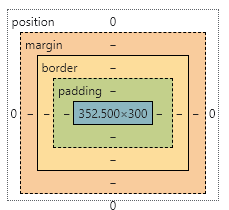
margin:外边距
padding:内边距
border:边框
4.2、边框
- 边框的粗细
- 边框的样式
- 边框的颜色
/*body总有一个默认的外边距,让margin:0*/
body{
    margin: 0;
}
/*border:粗细,样式,颜色*/
#app{
    width: 300px;
    border: 1px solid #808fa2;
}
h2{
    font-size: 16px;
    background-color: #8EC5FC;
    line-height: 30px;
    color: white;
}
form{
    background: #8EC5FC;
}
div:nth-of-type(1) input{
    border: 3px solid black;
}
div:nth-of-type(2) input{
    border: 2px dashed #E0C3FC;
}
4.3、内外边距
/*顺时针旋转margin: 0margin: 0 1pxmargin: 0 1px 2px 3px*/h2{ font-size: 16px; background-color: #8EC5FC; line-height: 30px; color: white; margin: 0 1px 2px 3px;}
盒子的计算方式:你这个元素到底多大?

margin+border+padding+内容宽度
4.4、圆角边框
border-radius: 50px 20px 10px 5px;
/*
	左上   右上   右下   左下,顺时针方向
	圆圈:圆角 = 半径!
*/
4.5、盒子阴影
<!DOCTYPE html>
<html lang="en">
<head>
    <meta charset="UTF-8">
    <title>Title</title>

    <!--margin:0 auto;居中
    要求:块元素,块元素有固定的宽度
    -->
    <style>
        div{
            width: 100px;
            height: 100px;
            margin: 0 auto;
        }
        img{
            border-radius: 50px;
            box-shadow: 10px 10px 100px yellow;
        }
    </style>

</head>
<body>

<div>
    <img src="images/1.jpg" alt="篮球">
</div>

</body>
</html>
五、浮动
5.1、标准文档流
块级元素:独占一行
h1~h6 p div 列表...
行内元素:不独占一行
span a img strong...
行内元素可以被包含在块级元素中,反之则不可以
5.2、display
<!--block 块元素inline 行内元素inline-block 是块元素,但是可以内联在一行!none.--><style> div{ width: 100px; height: 100px; border: 1px solid red; display:inline; } span{ width: 100px; height: 100px; border: 1px solid red; display: inline-block; }</style>
- 这个也是一种实现行内元素排列的方式,但是我们很多情况都是用float
5.3、float
- 左右浮动 float
div{
    margin: 10px;
    padding: 5px;
}
#father{
    border: 1px solid #000000;
}
.layer01{
    border: 1px dashed #ff0000;
    display: inline-block;
    float: left;
}
.layer02{
    border: 1px dashed #00f;
    display: inline-block;
    float: left;
}
.layer03{
    border: 1px dashed #006600;
    display: inline-block;
    float: left;
}
.layer04{
    border: 1px dashed #666;
    font-size: 50px;
    line-height: 70px;
    display: inline-block;
    float: left;
}
5.4、父级边框塌陷的问题
- clear
/*
clear:right; 右侧不允许有浮动元素
clear:left;  左侧不允许有浮动元素
clear:both;  两侧不允许有浮动元素
*/
-
解决方案:
-
增加父级元素的高度
#father{ border: 1px solid #000000; height: 800px; } -
增加一个空的div标签,清除浮动
<div class="clear"></div> .clear{ clear: both; margin: 0; padding: 0; } -
overflow
在父级元素中增加一个 overflow:hidden -
父类添加一个伪类:after
#father:after{
    content: '';
    display: block;
    clear: both;
}
-
小结:
-
浮动元素后面增加一个空的div
利弊:简单,代码中尽量避免空div -
设置父元素的高度
利弊:简单,元素假设有了固定的高度,就会塌陷
-
overflow
利弊:简单,下拉的一些场景避免使用 -
父类添加一个伪类:after(推荐)
利弊:写法稍微复杂一点,但是没有副作用,推荐使用!
5.5、对比
- display
方向不可以控制 - float
浮动起来的话会脱离标准文档流,所以要解决父级边框塌陷的问题
六、定位
6.1、相对定位
<!DOCTYPE html><html lang="en"><head> <meta charset="UTF-8"> <title>Title</title> <style> div{ margin: 0; padding: 5px; font-size: 12px; line-height: 25px; } #father{ border: 1px solid #8EC5FC; padding: 0px; margin: 20px; } #first{ background-color: #E0C3FC; border: 1px dashed #808fa2; position: relative;/*相对定位,上下左右*/ top: -20px; left: 20px; } #second{ background-color: #09e7ff; border: 1px dashed #7f24a2; } #third{ background-color: yellow; border: 1px dashed #fcdfa0; position: relative; bottom: 10px; right: 20px; } </style> </head><body><div id="father"> <div id="first">第一个盒子</div> <div id="second">第二个盒子</div> <div id="third">第三个盒子</div></div></body></html>
相对定位:position: relative;
相对于原来的位置,进行指定的偏移,相对定位的话,它仍然在标准文档流中!原来的位置会被保留;
top: -20px;
left: 20px;
bottom: 10px;
right: 20px;
-
练习
<!DOCTYPE html> <html lang="en"> <head> <meta charset="UTF-8"> <title>Title</title> <style> #box{ width: 300px; height: 300px; padding: 10px; border: 2px solid red; } a{ width: 100px; height: 100px; text-decoration: none; background-color: pink; line-height: 100px; text-align: center; color: white; display: block; } a:hover{ background: blue; } .a2,.a4{ position: relative; left: 200px; top: -100px; } .a5{ position: relative; left: 100px; top: -300px; } </style> </head> <body> <div id="box"> <a href="#" class="a1">链接1</a> <a href="#" class="a2">链接2</a> <a href="#" class="a3">链接3</a> <a href="#" class="a4">链接4</a> <a href="#" class="a5">链接5</a> </div> </body> </html>![image-20210810141547524]()

6.2、绝对定位
定位:基于xxx定位,上下左右
- 没有父级元素定位的前提下,相对于浏览器定位
- 假设父级元素存在定位,我们通常会相对于父级元素进行偏移
- 在父级元素范围内运动
相对于父级或浏览器的位置,进行指定的偏移,绝对定位的话,它不在标准文档流中!原来的位置不会被保留;
div{
    margin: 0;
    padding: 5px;
    font-size: 12px;
    line-height: 25px;
}
#father{
    border: 1px solid #8EC5FC;
    padding: 5px;
    margin: 20px;
    position: relative;
}
#first{
    background-color: #E0C3FC;
    border: 1px dashed #808fa2;
}
#second{
    background-color: #09e7ff;
    border: 1px dashed #7f24a2;
    position: absolute;
    right: 30px;
    top: 5px;

}
#third{
    background-color: yellow;
    border: 1px dashed #fcdfa0;
}
6.3、固定定位fixed
<!DOCTYPE html>
<html lang="en">
<head>
    <meta charset="UTF-8">
    <title>Title</title>

    <style>
        body{
            height: 1000px;
        }
        div:nth-of-type(1){/*绝对定位:相对于浏览器初始位置的*/
            width: 100px;
            height: 100px;
            background: red;
            position: absolute;
            right: 0;
            bottom: 0;
        }
        div:nth-of-type(2){/*fixed,固定定位,定死在固定位置*/
            width: 50px;
            height: 50px;
            background: yellow;
            position: fixed;
            right: 0;
            bottom: 0;
        }
    </style>

</head>
<body>

<div>div1</div>
<div>div2</div>

</body>
</html>
6.4、z-index
-
图层的概念
z-index:默认是0,最高无限
<!DOCTYPE html>
<html lang="en">
<head>
    <meta charset="UTF-8">
    <title>Title</title>
    <link rel="stylesheet" href="style.css">
</head>
<body>
<div id="content">
    <ul>
        <li><img src="images/1.jpg" alt=""></li>
        <li class="tipText">学习微服务,找狂神</li>
        <li class="tipBg"></li>
        <li>时间:2099-01-01</li>
        <li>地点:月球一号基地</li>
    </ul>
</div>

</body>
</html>
opacity: 0.3 ; 背景透明度
#content{
    width: 331px;
    padding: 0;
    margin: 0;
    overflow: hidden;
    font-size: 12px;
    line-height: 25px;
    border: 1px solid #8EC5FC;
}
ul,li{
    padding: 0;
    margin: 0;
    list-style: none;
}
/*父级元素相对定位*/
#content ul{
    position: relative;
}
.tipText{
    position: absolute;
    width: 331px;
    height: 25px;
    top: 210px;
    color: white;
    z-index: 1;
}

.tipBg{
    background: #000000;
    position: absolute;
    top: 210px;
    width: 331px;
    height: 25px;
    opacity: 0.3;/*背景透明度*/
}

 浙公网安备 33010602011771号