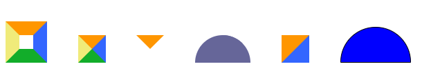
利用css绘制三角形,半圆等形状
效果如图所示:
<!DOCTYPE html>
<html>
	<head>
		<meta charset="utf-8">
		<title></title>
		<style type="text/css">
			div {
				margin-top: 20px;
				display: inline-block;
				margin-right: 40px;
			}

			#test1 {
				height: 20px;
				width: 20px;
				border-color: #FF9600 #3366ff #12ad2a #f0eb7a;
				border-style: solid;
				border-width: 20px;
			}

			#test2 {
				height: 0;
				width: 0;
				overflow: hidden;
				/* 这里设置overflow, font-size, line-height */
				font-size: 0;
				/*是因为, 虽然宽高度为0, 但在IE6下会具有默认的 */
				line-height: 0;
				/* 字体大小和行高, 导致盒子呈现被撑开的长矩形 */
				border-color: #FF9600 #3366ff #12ad2a #f0eb7a;
				border-style: solid;
				border-width: 20px;
			}

			#test3 {
				height: 0;
				width: 0;
				overflow: hidden;
				font-size: 0;
				line-height: 0;
				border-color: #FF9600 transparent transparent transparent;
				border-style: solid;
				border-width: 20px;
			}

			#test4 {
				width: 40px;
				height: 0px;
				border: 0 solid transparent;
				border-top: 40px solid #669;
				border-right: 40px solid #669;
				-moz-border-radius: 40px 40px 0 0;
				-webkit-border-radius: 40px 40px 0 0;
				border-radius: 40px 40px 0 0;
			}

			#test5 {
				height: 0;
				width: 0;
				overflow: hidden;
				font-size: 0;
				line-height: 0;
				border-color: #FF9600 #3366ff transparent transparent;
				border-style: solid solid dashed dashed;
				border-width: 40px 40px 0 0;
			}

			.circle {
				width: 100px;
				height: 50px;
				border: 1px solid black;
				background-color: blue;
				border-radius: 100px 100px 0 0;
			}

		</style>
	</head>
	<body>
		<div id="test1"></div>
		<div id="test2"></div>
		<div id="test3"></div>
		<div id="test4"></div>
		<div id="test5"></div>
		<div class="circle">

		</div>
     </body>
	<script >
        </script>
</html>
更多图形请参考https://www.cnblogs.com/pigtail/archive/2013/02/17/2914119.html

 浙公网安备 33010602011771号