css3文字渐变效果练习
css3部分:
.gradient1 span {
				  background: linear-gradient(to right, red, blue);
				        -webkit-background-clip: text;
				        color: transparent;
			}
			.text-gradient {
				position: relative;
				display: inline-block;
				font-family: '微软雅黑';
				font-size: 2em;
			}
			.text-gradient[data-text]::after {
				position: absolute;
				left: 0;
				z-index: 2;
				content: attr(data-text);
				color: green;
				-webkit-mask-image: -webkit-gradient(linear, 0 0, 0 bottom, from(#ff0000), to(rgba(0, 0, 255, 0)));
				}
			}
html5部分
<div class="gradient1">
			<span>幅度1-菜鸟工具</span>
</div>
<h2 class="text-gradient" data-text = "渐变2-菜鸟工具">渐变2-菜鸟工具</h2>
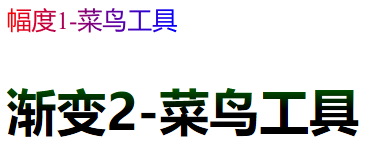
效果图:

 浙公网安备 33010602011771号