灵异bug排查 - 大屏展示
事情的起源是我给大屏系统添加了顶部栏,UI给了一个图片作为背景图

但是这个背景图我觉得不好看,因为里面的六边形动不了,效果不是很好
想要一个六边形随机闪烁的效果
所以我自己写了一个组件遍历生成了好多好多个六边形元素(5行 * 每行120个 共600个)
然后requestAnimationFrame更新动画,Math.random进行随机抽到就显示亮一点的背景颜色
效果实现了但是页面会变得很卡
初步排查是元素过多,dom操作频繁修改元素的类名导致卡顿,但是取消了动画也还是卡顿
最后发现是在元素里面写了transform:translateZ(0);导致的
这玩意网上讲可以将元素使用GPU加速,当时也不管那么多,想着元素多了操作起来会卡顿,就把能优化元素的属性全部写进去了
插一嘴,CSS中will-change属性只是指导浏览器,我这个元素在未来要变化,你最好分个层进行优化,等下卡住了别怪我没提醒你。但是具体是否开启分层是看浏览器内部的策略(内存使用/线程总数 - 猜测)来决定的。(浏览器:你在教我做事?!!)

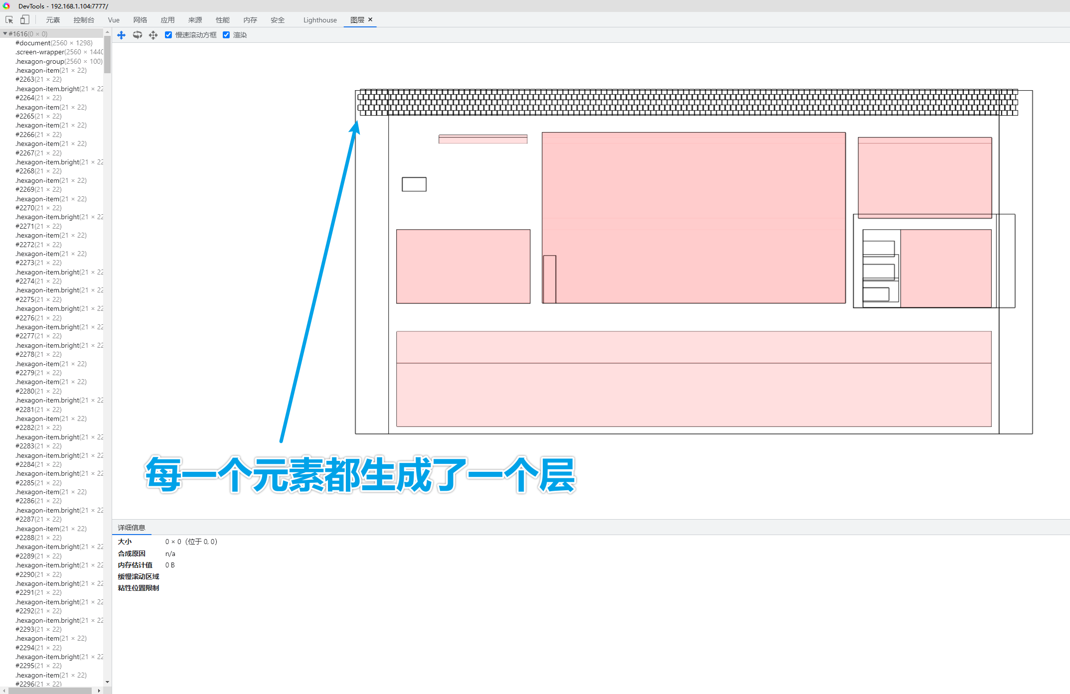
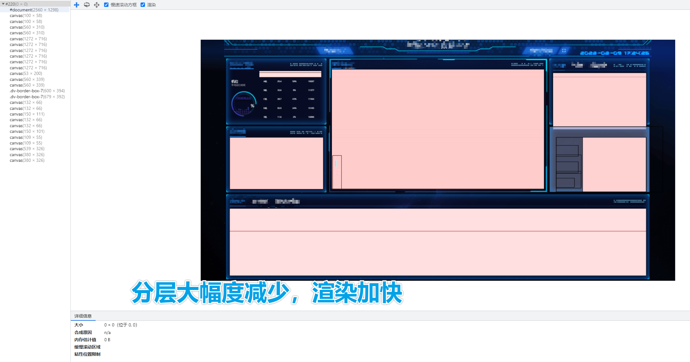
原因是:写了transform:translateZ(0)会导致浏览器渲染在分层(Layer)的阶段,把每一个六边形分成单独的一个层,而每一个层都会占用系统的资源,去除属性后浏览器就会把整个背景组件当成一个层进行渲染,效率大大提高。
优化前:
优化后:
完整代码附上:
<template>
  <div class="hexagon-group">
    <div class="hexagon-line" v-for="v in 5" :key="v">
      <div class="hexagon-item" v-for="i in 120" :key="i"></div>
    </div>
  </div>
</template>

<script>
let timer = null;
export default {
  data() {
    return {};
  },
  created() {},
  mounted() {
    this.generateGlitch();
    timer = setInterval(() => {
      this.generateGlitch();
    }, 2000);
  },
  computed: {},
  methods: {
    generateGlitch() {
      const LINE_LIST = [...document.querySelectorAll(".hexagon-line")];
      LINE_LIST.forEach((line) => {
        const CHILD_LIST = [...line.children];
        CHILD_LIST.forEach((child) => {
          if (Math.random() > 0.5) {
            child.classList.add("bright");
          } else {
            child.classList.remove("bright");
          }
        });
      });
    },
  },
  beforeDestroy() {
    clearInterval(timer);
  },
};
</script>

<style lang="less" scoped>
.hexagon-group {
  position: absolute;
  top: 0;
  left: 0;
  right: 0;
  bottom: 0;
  gap: 0px;
  padding: 20px;
  display: flex;
  flex-wrap: wrap;
  overflow: hidden;
  justify-content: center;
  align-content: space-around;
  content-visibility: auto;
  mask: -webkit-gradient(
    linear,
    right top,
    right bottom,
    from(rgba(0, 0, 0, 1)),
    to(rgba(0, 0, 0, 0))
  );

  .hexagon-line {
    gap: 3px;
    display: flex;
    flex-wrap: nowrap;
    content-visibility: auto;
    &:nth-child(even) {
      position: relative;
      left: -30px;
    }
    &:nth-child(odd) {
      position: relative;
      left: -20px;
    }
    .hexagon-item {
      width: 20px;
      height: 22px;
      flex: 0 0 auto;
      transition: all 0.5s;
      background-color: #0a284a;
      clip-path: polygon(50% 0%, 100% 25%, 100% 75%, 50% 100%, 0% 75%, 0% 25%);
      // will-change: contents; // 最后的优化手段,浏览器已经很尽力了QAQ from mdn
      &.bright {
        background-color: #0b3f7e;
      }
    }
  }
}
</style>

 浙公网安备 33010602011771号