1: Layout单布局(Align+Center+Padding+Container)
-
- 比较常用的单子布局组件有:
- Align、
- Center、
- Padding、
- Container。
-
1.1 Align
const Align({
  Key key,
  this.alignment: Alignment.center, // 对齐方式,默认居中对齐
  this.widthFactor, // 宽度因子,不设置的情况,会尽可能大
  this.heightFactor, // 高度因子,不设置的情况,会尽可能大
  Widget child // 要布局的子Widget
})

/*
这里我们特别解释一下widthFactor和heightFactor作用:
因为子组件在父组件中的对齐方式必须有一个前提,就是父组件得知道自己的范围(宽度和高度);
如果widthFactor和heightFactor不设置,那么默认Align会尽可能的大(尽可能占据自己所在的父组件);
我们也可以对他们进行设置,比如widthFactor设置为3,那么相对于Align的宽度是子组件跨度的3倍;
*/
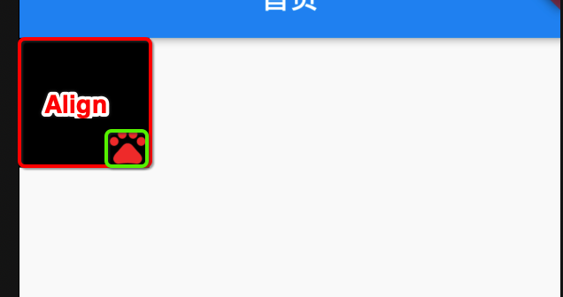
class AlignDemo extends StatelessWidget {
  @override
  Widget build(BuildContext context) {
    return Container(
      color: Colors.black,
      child: Align(
        alignment: Alignment.bottomRight,
        child: Icon(
          Icons.pets,
          size: 30,
          color: Colors.red,
        ),
        widthFactor: 3,
        heightFactor: 3,
      ),
    );
  }
}
![]()
-
1.2. Center
-
- Center 是 继承自Align
-
- Center 其实就是等于Align.alignment = Alignment.center
-
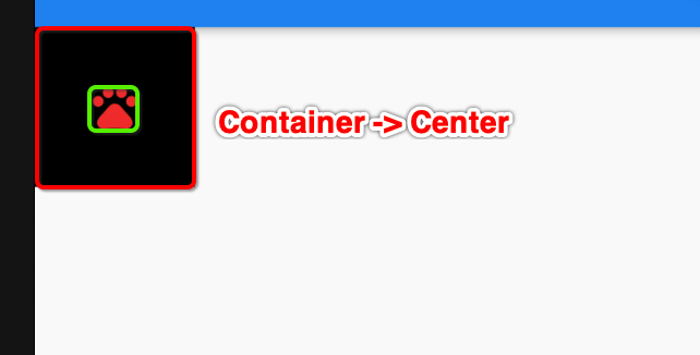
1.2.1 Center Demo
/* Center 单个布局

1: 如果widthFactor不设置,将会撑满父控件整个宽度
2: 如果heightFactor不设置,将会撑满父控件整个高度

设置widthFactor = 3, heightFactor = 3, 表示父控件的宽度和高度是子组件的三倍宽度和高度
*/
class CenterDemo extends StatelessWidget {
  @override
  Widget build(BuildContext context) {
    return Center(
      child: Icon(
        Icons.pets,
        size: 30,
        color: Colors.blue,
      ),
      widthFactor: 3,
      heightFactor: 3,
    );
  }
}
![]()
-
1.3. Padding
- Padding 也是一个Wieget
- Padding通常用来设置子Wieget 到 父Widget 的间距(你可以称之为是父组件的内边距或子Widget的外边距)
const Padding({
  Key key,
  @requiredthis.padding, /// EdgeInsetsGeometry类型(抽象类),使用EdgeInsets
  Widget child,
})
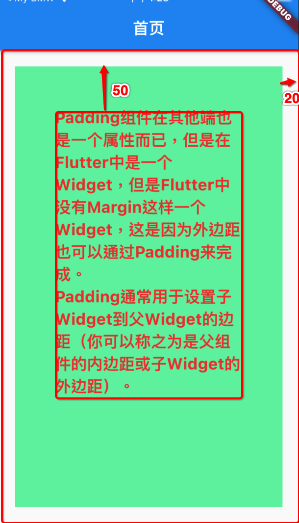
class PaddingDemo extends StatelessWidget {
  @override
  Widget build(BuildContext context) {
    return Container(
      margin: EdgeInsets.all(20), // 设置Container的外边距为20
      height: MediaQuery.of(context).size.height,
      padding: EdgeInsets.all(50), // 子组件的外边距,父组件的内边距 设置子内边距为50
      color: Colors.greenAccent,
      child: Text(
        'Padding组件在其他端也是一个属性而已,但是在Flutter中是一个Widget,但是Flutter中没有Margin这样一个Widget,这是因为外边距也可以通过Padding来完成。\n'
        'Padding通常用于设置子Widget到父Widget的边距(你可以称之为是父组件的内边距或子Widget的外边距)。',
        style: TextStyle(
          fontSize: 20,
          color: Colors.red,
          fontWeight: FontWeight.bold,
        ),
      ),
    );
  }
}
![]()
-
1.4. Container
- Container 相当于一个视图View。如果需要一个背景色、固定尺寸大小、圆角、边框等效果、则需要Container来包裹。
Container({
  this.alignment,
  this.padding, //容器内补白,属于decoration的装饰范围
  Color color, // 背景色
  Decoration decoration, // 背景装饰
  Decoration foregroundDecoration, //前景装饰
  double width,//容器的宽度
  double height, //容器的高度
  BoxConstraints constraints, //容器大小的限制条件
  this.margin,//容器外补白,不属于decoration的装饰范围
  this.transform, //变换
  this.child,
})

/*
大多数属性在介绍其它容器时都已经介绍过了,不再赘述,但有两点需要说明:
容器的大小可以通过width、height属性来指定,也可以通过constraints来指定,如果同时存在时,width、height优先。实际上Container内部会根据width、height来生成一个constraints;
color和decoration是互斥的,实际上,当指定color时,Container内会自动创建一个decoration;
decoration属性稍后我们详细学习;

*/
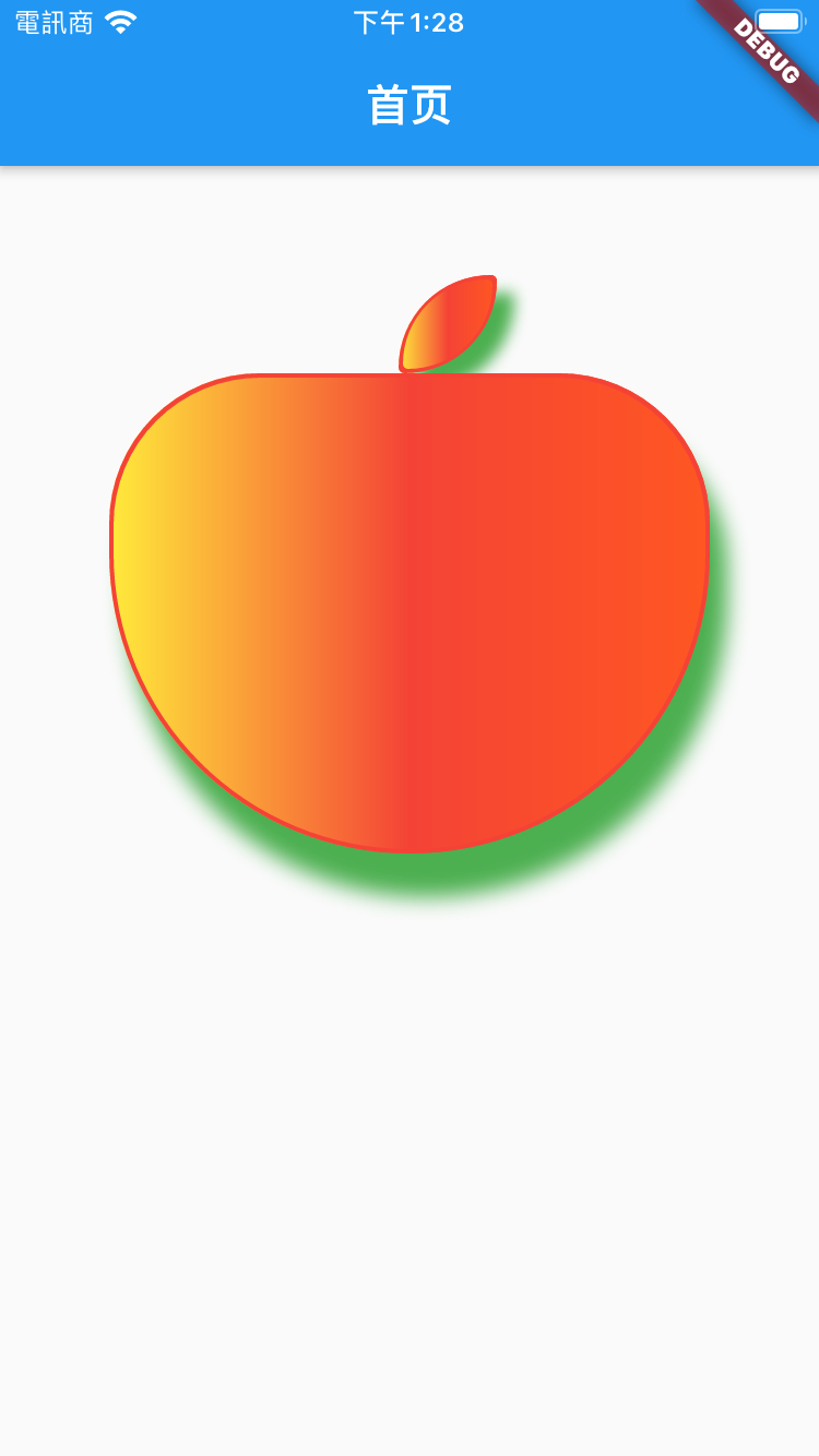
class ContainerDemo extends StatelessWidget {
  @override
  Widget build(BuildContext context) {
    return Center(
      child: Column(
        children: [
          AppleHeaderDemo(),
          AppleBodyDemo(),
        ],
      ),
    );
  }
}

class AppleHeaderDemo extends StatelessWidget {
  @override
  Widget build(BuildContext context) {
    return Container(
      decoration: BoxDecoration(
        color: Colors.red, //边框的颜色
        border: Border.all(
          // 边框设置
          color: Colors.red,
          width: 2,
          style: BorderStyle.solid,
        ),
        borderRadius: BorderRadius.only(
          // 圆角设置 或者BorderRadius.circular(20)
          topLeft: Radius.circular(800),
          topRight: Radius.circular(50),
          bottomRight: Radius.circular(800),
          bottomLeft: Radius.circular(50),
        ),
        boxShadow: [
          // 设置边框阴影
          BoxShadow(
            color: Colors.green,
            offset: Offset(8, 8),
            blurRadius: 5,
          ),
        ],
        gradient: LinearGradient(
          colors: [
            // 设置渐变色
            Colors.yellow,
            Colors.red,
            Colors.deepOrange,
          ],
        ),
      ),
      margin:
          EdgeInsets.only(left: 85, right: 50, top: 50, bottom: 0), // 外边框的间距设定
      // color: Colors.lightBlue, // 容器背景色 和 decoration.color 冲突,两个设置就会报错
      constraints: BoxConstraints(
        maxWidth: 45,
        maxHeight: 45,
      ), // 容器宽度高度限定
      // child: ,
      // ),
    );
  }
}

class AppleBodyDemo extends StatelessWidget {
  @override
  Widget build(BuildContext context) {
    return Container(
      decoration: BoxDecoration(
        shape: BoxShape.rectangle,
        color: Colors.red, //边框的颜色
        border: Border.all(
          // 边框设置
          color: Colors.red,
          width: 2,
          style: BorderStyle.solid,
        ),
        borderRadius: BorderRadius.only(
          // 圆角设置 或者BorderRadius.circular(20)
          topLeft: Radius.circular(150),
          topRight: Radius.circular(150),
          bottomRight: Radius.circular(300),
          bottomLeft: Radius.circular(300),
        ),
        boxShadow: [
          // 设置边框阴影
          BoxShadow(
            color: Colors.green,
            offset: Offset(8, 20),
            blurRadius: 8,
          ),
        ],
        gradient: LinearGradient(
          colors: [
            // 设置渐变色
            Colors.yellow,
            Colors.red,
            Colors.deepOrange,
          ],
        ),
      ),
      alignment: Alignment.center, // 对齐方式
      // padding: EdgeInsets.all(10), // 内部子视图的间距设定
      margin:
          EdgeInsets.only(left: 50, right: 50, top: 0, bottom: 0), // 外边框的间距设定
      // color: Colors.lightBlue, // 容器背景色 和 decoration.color 冲突,两个设置就会报错
      constraints: BoxConstraints(
        maxWidth: 300,
        maxHeight: 220,
      ), // 容器宽度高度限定
      // child: Text(
      //   '                 Container 功能真强大\n\n'
      //   '如果你需要一个视图,\n有一个背景颜色、\n图像、\n固定尺寸'
      //   '\n需要一个边框、\n圆角\n等功效,那么就可以使用Container组件。',
      //   style: TextStyle(
      //     color: Colors.white,
      //     fontWeight: FontWeight.bold,
      //     fontSize: 15,
      //   ),
      // ),
    );
  }
}
![]()
-
1.4.2 BoxDecoration
- Container有一个非常重要的属性 decoration
- 他对应的类型是Decoration类型,但是它是一个抽象类
- 在开发中,我们经常使用它的实现类BoxDecoration来进行实例化
const BoxDecoration({
    this.color, // 颜色,会和Container中的color属性冲突
    this.image, // 背景图片
    this.border, // 边框,对应类型是Border类型,里面每一个边框使用BorderSide
    this.borderRadius, // 圆角效果
    this.boxShadow, // 阴影效果
    this.gradient, // 渐变效果
    this.backgroundBlendMode, // 背景混合
    this.shape = BoxShape.rectangle, // 形变
  })
class MyHomeBody extends StatelessWidget {
  @override
  Widget build(BuildContext context) {
    return Center(
      child: Container(
//        color: Color.fromRGBO(3, 3, 255, .5),
        width: 150,
        height: 150,
        child: Icon(Icons.pets, size: 32, color: Colors.white),
        decoration: BoxDecoration(
          color: Colors.amber, // 背景颜色
          border: Border.all(
            color: Colors.redAccent,
            width: 3,
            style: BorderStyle.solid
          ), // 这里也可以使用Border.all统一设置
//            top: BorderSide(
//              color: Colors.redAccent,
//              width: 3,
//              style: BorderStyle.solid
//            ),
          borderRadius: BorderRadius.circular(20), // 这里也可以使用.only分别设置
          boxShadow: [
            BoxShadow(
              offset: Offset(5, 5),
              color: Colors.purple,
              blurRadius: 5
            )
          ],
//          shape: BoxShape.circle, // 会和borderRadius冲突
          gradient: LinearGradient(
            colors: [
              Colors.green,
              Colors.red
            ]
          )
        ),
      ),
    );
  }
}
-
1.4.3 Container + BoxDecoration 实现图像圆角
class ContainerCircleDemo extends StatelessWidget {
  @override
  Widget build(BuildContext context) {
    return Center(
      child: Container(
        // color: Colors.red, // 如果设置decoration,设置背景色就需要在decoration.color 设置. color 和 decoration冲突
        width: 200,
        height: 200,
        decoration: BoxDecoration(
          color: Colors.red,
          borderRadius: BorderRadius.circular(20),
          image: DecorationImage(
            image: NetworkImage(
                "https://tva1.sinaimg.cn/large/006y8mN6gy1g7aa03bmfpj3069069mx8.jpg"),
          ),
        ),
      ),
    );
  }
}

 浙公网安备 33010602011771号