纯CSS实现一些好看的动画效果
 1.1 流光按钮
1.2 爱心代码
1.1 流光按钮
1.2 爱心代码
1.1 流光按钮
>效果展示
>完整代码
<!DOCTYPE html>
<html>
    <head>
        <meta charset="utf-8">
        <title>流光按钮</title>
        <style>
            #demo1 * {
                margin: 0;
                padding: 0;
            }

            #demo1 a {
                text-decoration: none;
                position: absolute;
                left: 50%;
                top: 50%;
                /* 按钮居中 */
                transform: translate(-50%, -50%);
                font-size: 24px;
                /* 线性渐变 */
                background: linear-gradient(90deg, #00aaff, #ffaaff, #ffff00, #00aaff);
                /* 放大背景 */
                background-size: 400%;
                width: 400px;
                height: 100px;
                line-height: 100px;
                text-align: center;
                color: #fff;
                /* 内容始终大写 */
                text-transform: uppercase;
                border-radius: 50px;
                /* 设置层级关系,仅能在定位元素上奏效 */
                z-index: 1;
            }

            #demo1 a::before {
                content: "";
                position: absolute;
                left: -5px;
                right: -5px;
                top: -5px;
                bottom: -5px;
                /* 线性渐变 */
                background: linear-gradient(90deg, #00aaff, #ffaaff, #ffff00, #00aaff);
                /* 放大背景 */
                background-size: 400%;
                border-radius: 50px;
                /* 设置滤镜 */
                filter: blur(10px);
                /* 设置层级关系,仅能在定位元素上奏效 */
                z-index: -1;

            }

            #demo1 a:hover::before {
                /* 鼠标停留开始动画,无限循环 */
                animation: sum 8s infinite;
            }


            #demo1 a:hover {
                /* 鼠标停留开始动画,无限循环 */
                animation: sum 8s infinite;
            }

            @keyframes sum {

                /* 更改背景图片位置 Y轴不变 */
                100% {
                    background-position: -400% 0;
                }
        </style>
    </head>
    <body>
        <div id="demo1">
            <a href="#">button</a>
        </div>
    </body>
</html>
1.2 爱心代码
效果展示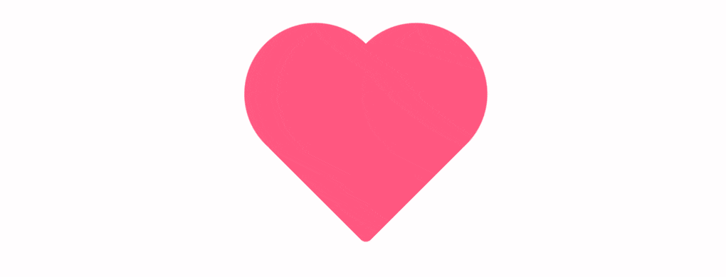
完整代码
<!DOCTYPE html>
<html>
    <head>
        <meta charset="utf-8">
        <title>小爱心</title>
        <style>
            * {
                margin: 0;
                padding: 0;
            }

            body {
                animation: body 4s ease infinite;
            }

            .heart {
                position: relative;
                width: 200px;
                height: 200px;
                margin: 200px auto;
                background-color: #ff557f;
                /* 顺时针旋转45度 */
                transform: rotate(45deg);
                animation: heart 4s ease infinite;
            }

            .heart::before {
                content: '';
                position: absolute;
                width: 200px;
                height: 200px;
                background-color: #ff557f;
                /* 变成圆形 */
                border-radius: 50%;
                top: -100px;
                left: 0;
                animation: left 4s ease infinite;
                transition: all 1s ease;
            }

            .heart::after {
                content: '';
                position: absolute;
                width: 200px;
                height: 200px;
                background-color: #ff557f;
                /* 变成圆形 */
                border-radius: 50%;
                top: 0;
                left: 100px;
                animation: right 4s ease infinite;
                transition: all 1s ease;
            }

            @keyframes body {
                0% {
                    background-color: #ff557f;
                }

                50% {
                    background-color: #fff;
                }

                100% {
                    background-color: #ff557f;
                }
            }

            @keyframes heart {
                0% {
                    transform: rotate(0deg);
                    border-radius: 200px;
                    background-color: #fff;
                }

                30% {
                    transform: rotate(45deg);
                    border-radius: 10px;
                }

                50% {
                    background-color: #ff557f;
                }

                70% {
                    transform: rotate(45deg);
                    border-radius: 10px;
                }

                100% {
                    transform: rotate(90deg);
                    border-radius: 200px;
                    background-color: #fff;
                }
            }

            @keyframes left {
                0% {
                    top: 0;
                    background-color: #fff;
                }

                30% {
                    top: -100px;
                }

                50% {
                    background-color: #ff557f;
                }

                70% {
                    top: -100px;
                }

                100% {
                    top: 0;
                    background-color: #fff;
                }
            }

            @keyframes right {
                0% {
                    left: 0;
                    background-color: #fff;
                }

                30% {
                    left: -100px;
                }

                50% {
                    background-color: #ff557f;
                }

                70% {
                    left: -100px;
                }

                100% {
                    left: 0;
                    background-color: #fff;
                }
            }
        </style>
    </head>
    <body>
        <div class="heart"></div>
    </body>
</html>
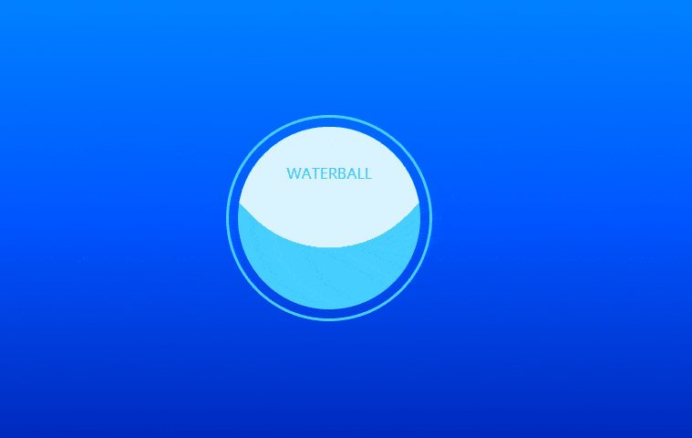
1.3 水球效果
效果展示
完整代码
<!DOCTYPE html>
<html>
    <head>
        <meta charset="utf-8">
        <title>水球效果</title>
        <style>
            * {
                margin: 0;
                padding: 0;
            }

            body {
                height: 100vh;
                /* 线性渐变,默认方向自上而下 */
                background: linear-gradient(#00aaff, #0055ff, #00007f);
            }

            .main,
            .water {
                position: absolute;
                width: 200px;
                height: 200px;
                /* 变成圆形 */
                border-radius: 50%;
                /* 水平垂直居中 */
                top: 50%;
                left: 50%;
                transform: translate(-50%, -50%);
            }

            .main {
                padding: 10px;
                border: 3px solid #45ceff;

            }

            .water {
                background: #45ceff;
                /* 隐藏多余部分 */
                overflow: hidden;
            }

            .water::before {
                content: "waterball";
                position: absolute;
                left: 50%;
                top: 0px;
                transform: translate(-50%, 40px);
                color: #45ceff;
                text-transform: uppercase;
                z-index: 99;
            }

            /* 水波纹实现 */
            .water::after {
                content: '';
                position: absolute;
                width: 300px;
                height: 300px;
                background: rgba(255, 255, 255, .8);
                border-radius: 40%;
                left: 50%;
                top: 0;
                transform: translate(-50%, -60%);
                animation: water 5s linear infinite;
            }

            @keyframes water {
                100% {
                    /* 360度旋转,位置不变*/
                    transform: translate(-50%, -60%) rotate(360deg);
                }
            }
        </style>
    </head>
    <body>
        <div class="main">
            <div class="water"></div>
        </div>
    </body>
</html>

 浙公网安备 33010602011771号