WPF入门指南(3) - 指南
资源与触发器
一、WPF资源基础
(一)什么是WPF资源、
:::color2
WPF资源系统就像一个**“对象仓库”,能存放画刷、样式、模板等各类对象,方便我们在多个地方重复使用**。比如我们可以把一个常用的绿色画刷存为资源,之后在按钮、标签等多个控件的背景设置中直接调用它
:::
分类:
- 局部资源(窗体/控件)
- 全局样式
- 资源字典
(二)资源的优点
- 高效性:一次定义,多处**复用**。例如,我们定义一个“标题字体”资源(微软雅黑,16号,加粗),整个窗口的所有标题文本都能直接使用这个资源,不用重复设置。
- 可维护性:修改资源一处,所有引用它的地方都会生效。假设前面提到的“标题字体”需要改成宋体,只需修改资源的字体设置,所有标题文本会自动更新。
- 适应性:支持动态修改。比如在程序运行时,通过代码改变资源中画刷的颜色,所有使用该画刷的控件会实时显示新颜色。
(三)资源可以写哪些东西
每个元素都有Resources属性,它就像一个“字典”(**ResourceDictionary**类实例),以字符串为“钥匙”(索引)来存储和查找资源。比如:
所有可定义为「资源对象」的内容,均可以写在独立资源字典中,核心包括:
- 各种画笔(
<font style="color:rgb(0, 0, 0);background-color:rgba(0, 0, 0, 0);">SolidColorBrush</font>/<font style="color:rgb(0, 0, 0);background-color:rgba(0, 0, 0, 0);">LinearGradientBrush</font>)、边距、字体、字号等基础视觉资源; - 核心复用对象:
<font style="color:rgb(0, 0, 0);background-color:rgba(0, 0, 0, 0);">Style</font>(样式)、<font style="color:rgb(0, 0, 0);background-color:rgba(0, 0, 0, 0);">ControlTemplate</font>(控件模板)、<font style="color:rgb(0, 0, 0);background-color:rgba(0, 0, 0, 0);">DataTemplate</font>(数据模板); - 其他资源:图片(
<font style="color:rgb(0, 0, 0);background-color:rgba(0, 0, 0, 0);">BitmapImage</font>)、字符串、自定义资源对象等; - 特殊用法:通过
<font style="color:rgb(0, 0, 0);background-color:rgba(0, 0, 0, 0);"><ResourceDictionary.MergedDictionaries></font>合并其他资源字典(实现资源字典的「嵌套 / 汇总」)。
二、WPF资源分类
(一)按范围分类
- 控件资源:定义在某个具体控件内,只能被该控件和子控件使用。
<Button>
  <Button.Resources>
    <SolidColorBrush x:Key="btnBrush" Color="Red"/>
  </Button.Resources>
  <Button.Background>
    <StaticResource ResourceKey="btnBrush"/>
  </Button.Background>
</Button>- 窗口资源:定义在窗口中,可被窗口内所有控件使用。
<Window.Resources>
  <!-- 定义一个名为"greenBrush"的绿色画刷资源 -->
    <SolidColorBrush x:Key="greenBrush" Color="Green"/>
      </Window.Resources>
        <Grid Backgrount="{StaticResource greenBrush}">
</Grid>- 应用程序资源:定义在App.xaml中,整个应用程序的所有窗口和控件都能使用,是推荐的全局资源定义方式。
<!-- App.xaml中 -->
  <Application.Resources>
  <FontFamily x:Key="appFont">微软雅黑</FontFamily>
</Application.Resources>- 系统资源:系统自带的资源,当应用程序中**找不到所需资源时,会自动查找系统资源**。相关的三个类:
- SystemColors:可访问**系统颜色**,如SystemColors.WindowColor(窗口背景色)。
- SystemFonts:可获取系统**字体设置**,如SystemFonts.CaptionFontSize(标题字体大小)。
- SystemParameters:包含**系统参数,**如SystemParameters.PrimaryScreenWidth(屏幕宽度)。
三、WPF资源的使用
(一)静态资源(StaticResource)
程序加载时一次性确定资源,之后不再访问资源。适合资源不会被修改的场景。
<Label Foreground="{StaticResource greenBrush}" Content="静态资源示例"/>比如一个固定的标题颜色,用静态资源加载效率更高。
(二)动态资源(DynamicResource)
程序**运行过程中会实时访问资源,适合资源可能被动态修改**的场景。
<Label Foreground="{DynamicResource greenBrush}" Content="动态资源示例"/>如果后面通过代码修改了“greenBrush”的颜色,使用动态资源的标签会立即显示新颜色,而静态资源不会。
四、资源的层次与查找顺序
:::color2
资源查找会在**元素树中递归进行,顺序为:元素内部资源→窗口级资源→应用程序级资源→系统资源。**
举个例子:如果一个按钮要使用 “btnBrush” 资源,会先看按钮自己的 Resources 里有没有,没有就找它所在窗口的 Resources,再没有就找 App.xaml 中的资源,最后找系统资源。
注意:同一资源集合中不能有相同的资源名,但不同集合中可以重复使用资源名。
:::
五、WPF资源字典
全局引用资源合并
将多个资源字典合并到应用程序级资源中,供整个应用使用。
<Application.Resources>
  <ResourceDictionary>
    <ResourceDictionary.MergedDictionaries>
      <!-- 合并两个资源字典 -->
        <ResourceDictionary Source="res/sysRes.xaml"/>
        <ResourceDictionary Source="res/btnRes.xaml"/>
      </ResourceDictionary.MergedDictionaries>
    </ResourceDictionary>
  </Application.Resources>
(二)外部资源引用
多个项目引用同一资源库的步骤:
- 添加资源库项目引用。
- 在App.xaml中合并资源字典:
<ResourceDictionary>
  <ResourceDictionary.MergedDictionaries>
    <ResourceDictionary Source="pack://application:,,,/WPFRes;component/Themes/Generic.xaml"/>
  </ResourceDictionary.MergedDictionaries>
</ResourceDictionary>- 在当前项目窗口中直接使用资源。
(三)外部资源案例
:::color2
假设场景:我们需要让 2 个 WPF 项目(<font style="color:rgba(0, 0, 0, 0.85);">ProjectA</font>和<font style="color:rgba(0, 0, 0, 0.85);">ProjectB</font>)共享一套按钮样式和颜色资源,避免重复编写代码。实现步骤如下:
:::
步骤1:创建资源库项目(封装通用资源)
- 新建一个类库项目(用于存放共享资源),命名为
SharedResourceLibrary(框架选择.NET Framework或.NET 5+,与目标项目一致)。 - 在项目中创建资源文件夹(如
Themes),并添加资源字典文件(右键项目→添加→新建项→WPF→资源字典,命名为Generic.xaml)。- 资源字典是存放共享资源的容器,仅包含资源定义,无其他逻辑。
步骤2:在资源库中定义通用资源
在SharedResourceLibrary/Themes/Generic.xaml中定义需要共享的资源(如画刷、样式等)。示例:
<!-- SharedResourceLibrary/Themes/Generic.xaml -->
  <ResourceDictionary
    xmlns="http://schemas.microsoft.com/winfx/2006/xaml/presentation"
    xmlns:x="http://schemas.microsoft.com/winfx/2006/xaml">
  <!-- 1. 共享颜色画刷 -->
    <SolidColorBrush x:Key="PrimaryColor" Color="#2C3E50"/> <!-- 深蓝色 -->
    <SolidColorBrush x:Key="SecondaryColor" Color="#3498DB"/> <!-- 浅蓝色 -->
    <!-- 2. 共享按钮样式 -->
        <Style x:Key="SharedButtonStyle" TargetType="Button">
        <Setter Property="Background" Value="{StaticResource PrimaryColor}"/>
        <Setter Property="Foreground" Value="White"/>
        <Setter Property="FontSize" Value="14"/>
        <Setter Property="Padding" Value="10,5"/>
        <Setter Property="Margin" Value="5"/>
        <!-- 鼠标悬停效果 -->
          <Style.Triggers>
            <Trigger Property="IsMouseOver" Value="True">
              <Setter Property="Background" Value="{StaticResource SecondaryColor}"/>
            </Trigger>
          </Style.Triggers>
        </Style>
      </ResourceDictionary>
步骤3:目标项目引用资源库
以ProjectA为例(ProjectB操作相同):
- 右键
**ProjectA**→添加→项目引用→勾选**SharedResourceLibrary**→确定(建立项目依赖)。 - 在
ProjectA的App.xaml中合并资源库的资源字典,使整个项目可访问共享资源。
格式:通过pack URI指定资源库中资源字典的路径(pack://application:,,,/资源库名称;component/资源路径)。
<!-- ProjectA/App.xaml -->
  <Application
    xmlns="http://schemas.microsoft.com/winfx/2006/xaml/presentation"
    xmlns:x="http://schemas.microsoft.com/winfx/2006/xaml"
    x:Class="ProjectA.App">
  <Application.Resources>
    <ResourceDictionary>
      <ResourceDictionary.MergedDictionaries>
        <!-- 合并资源库中的Generic.xaml -->
          <ResourceDictionary Source="pack://application:,,,/SharedResourceLibrary;component/Themes/Generic.xaml"/>
        </ResourceDictionary.MergedDictionaries>
      </ResourceDictionary>
    </Application.Resources>
  </Application>
步骤4:在目标项目中使用共享资源
在ProjectA的界面(如MainWindow.xaml)中直接引用资源库中的资源:
<!-- ProjectA/MainWindow.xaml -->
  <Window
    xmlns="http://schemas.microsoft.com/winfx/2006/xaml/presentation"
    xmlns:x="http://schemas.microsoft.com/winfx/2006/xaml"
    x:Class="ProjectA.MainWindow"
    Title="ProjectA" Height="300" Width="400">
  <StackPanel>
    <!-- 使用共享按钮样式 -->
      <Button Content="按钮1" Style="{StaticResource SharedButtonStyle}"/>
      <Button Content="按钮2" Style="{StaticResource SharedButtonStyle}"/>
      <!-- 直接使用共享颜色画刷 -->
        <Label Content="共享颜色示例" Foreground="{StaticResource SecondaryColor}"/>
      </StackPanel>
    </Window>
步骤5:验证共享效果
- 运行
ProjectA,按钮会应用SharedButtonStyle样式(深蓝色背景,鼠标悬停变浅蓝色),标签文字为浅蓝色。 - 对
ProjectB执行步骤3和4,会得到与ProjectA完全一致的样式。 - 若修改
SharedResourceLibrary中PrimaryColor的颜色(如改为#E74C3C红色),ProjectA和ProjectB中的按钮背景会自动同步更新,无需修改两个项目的代码。
二、外部资源的核心优势(结合案例说明)
- 集中管理:所有项目的样式/颜色定义在
SharedResourceLibrary中,避免每个项目重复编写相同代码。 - 全局一致性:
ProjectA和ProjectB的按钮样式完全统一,不会出现“同一产品不同项目样式混乱”的问题。 - 维护高效:若产品需要换主题(如从蓝色系改为绿色系),只需修改
SharedResourceLibrary中的资源,所有引用项目自动生效,无需逐个项目调整。 - 跨团队协作友好:UI团队只需维护资源库,业务团队直接引用,减少沟通成本。
七、WPF样式基础
(一)什么是样式
样式是属性值的集合,能封装控件的格式化选项(如边距、颜色、字体等),避免重复编写标记。
比如定义一个标签样式,之后所有引用该样式的标签都会应用相同的格式:
<Window.Resources>
    <Style x:Key="lblLabelStyle">
    <Setter Property="Control.Foreground" Value="Black"/>
    <Setter Property="Control.BorderBrush" Value="Green"/>
  </Style>
</Window.Resources>
<Label Content="用户名:" Style="{StaticResource lblLabelStyle}"/>
(二)样式中的嵌套元素
当属性值不能用简单字符设置时,可使用嵌套元素。比如设置背景为绿色画刷:
<Style x:Key="lblStyle">
  <Setter Property="Control.Background">
    <Setter.Value>
      <SolidColorBrush Color="Green"/>
    </Setter.Value>
  </Setter>
</Style>
八、高级样式用法
(一)特定元素类型的样式
为特定类型元素定义样式,不指定x:Key时会自动应用到该类型所有控件;指定x:Key时,需通过Key应用。
<!-- 自动应用到所有Button -->
    <Style TargetType="Button">
    <Setter Property="FontSize" Value="12"/>
  </Style>
  <!-- 需要通过Key应用 -->
      <Style x:Key="specialBtnStyle" TargetType="Button">
      <Setter Property="Width" Value="100"/>
    </Style>
<Button Style="{StaticResource specialBtnStyle}"/>如果某控件不想应用自动样式,可设置Style="{x:Null}"。
(二)多层样式(样式继承)
通过BasedOn特性实现样式继承,在父样式基础上扩展子样式,减少代码冗余。
<!-- 父样式 -->
    <Style x:Key="lblStyle01" TargetType="Label">
    <Setter Property="Width" Value="60"/>
    <Setter Property="Height" Value="30"/>
    <Setter Property="Foreground" Value="Green"/>
  </Style>
  <!-- 子样式,继承父样式并添加边框 -->
      <Style x:Key="lblStyle02" TargetType="Label" BasedOn="{StaticResource lblStyle01}">
      <Setter Property="BorderBrush" Value="LawnGreen"/>
      <Setter Property="BorderThickness" Value="1"/>
    </Style>
    <Label Content="生日" Style="{StaticResource lblStyle02}"/>
九、WPF触发器
触发器能自动改变样式,无需编写代码,分为以下几种:
(一)简单触发器(Trigger)
监测依赖项属性变化,当属性值符合条件时应用设置。
<Style x:Key="btnTriggerStyle" TargetType="Button">
  <Style.Triggers>
    <!-- 当按钮获得焦点时,前景色变为黑色 -->
      <Trigger Property="IsFocused" Value="true">
        <Setter Property="Foreground" Value="Black"/>
      </Trigger>
    </Style.Triggers>
  </Style>
(二)多条件触发器(MultiTrigger)
多个条件同时满足时才激活。
<Style x:Key="multiTriggerStyle" TargetType="Button">
  <Style.Triggers>
    <MultiTrigger>
      <!-- 同时满足获得焦点和鼠标悬停 -->
        <MultiTrigger.Conditions>
          <Condition Property="IsFocused" Value="true"/>
          <Condition Property="IsMouseOver" Value="true"/>
        </MultiTrigger.Conditions>
        <Setter Property="Foreground" Value="Red"/>
        <Setter Property="Background" Value="White"/>
      </MultiTrigger>
    </Style.Triggers>
  </Style>
(三)事件触发器(EventTrigger)
当特定事件发生时执行动作(常用于动画)。
<Style x:Key="eventTriggerStyle" TargetType="Button">
  <Style.Triggers>
    <!-- 鼠标进入时执行动画 -->
      <EventTrigger RoutedEvent="Mouse.MouseEnter">
        <EventTrigger.Actions>
          <BeginStoryboard>
            <Storyboard>
              <!-- 2秒内宽度变为100 -->
                <DoubleAnimation Duration="0:0:2" Storyboard.TargetProperty="Width" To="100"/>
                <!-- 3秒内字体变为20号 -->
                  <DoubleAnimation Duration="0:0:3" Storyboard.TargetProperty="FontSize" To="20"/>
                </Storyboard>
              </BeginStoryboard>
            </EventTrigger.Actions>
          </EventTrigger>
        </Style.Triggers>
      </Style>
两棵树
一、基础概念:WPF的“两棵树”
:::color2
在WPF中,有两个重要的“树”概念——逻辑树和视觉树。它们是WPF**渲染界面、处理事件**和属性继承的基础,运行时会被自动维护。
两棵树是元素底层的原理。
逻辑树:理解为你写的元素结构
视觉树—你可以理解为,排开元素现场看到元素的本质,在逻辑树基础上进行的扩展。可以看到控件的组成,例如:buton 有哪些组成
:::
1. 逻辑树(Logical Tree)
** 专业解释**:表示**UI的核心结构,与我们在XAML中定义的元素几乎一致(排除控件内部自动生成的渲染元素)。
** 通俗理解:逻辑树就像“骨架”,只包含我们手动编写的核心元素,比如窗口、面板、按钮等,不关心控件内部
的细节。** 作用**:WPF通过逻辑树处理****依赖属性继承、资源查找、**事件传递**的基础路径等。
** 案例**:
一段简单的XAML代码对应的逻辑树如下:
<Window>
  <StackPanel>
    <Button Content="点击我"/>
    <Label Content="标签"/>
  </StackPanel>
</Window>逻辑树的节点为:**<font style="color:#7E45E8;">Window → StackPanel → Button、Label</font>**(只包含我们写的元素,不涉及Button内部的边框、文本等细节)。
2. 视觉树(Visual Tree)
专业解释:界面上所有**实际渲染到屏幕的元素集合,包含控件内部的细节元素(如按钮的边框、文本容器等)。
通俗理解:视觉树是“完整的身体”,不仅包含逻辑树的核心元素,还会拆解开每个控件的内部组成部分——比 如按钮,逻辑树里只认“Button”,但视觉树里会显示“Button → Border → ContentPresenter → TextBlock”(这些是按钮能被看见的具体渲染元素)。
作用:负责界面渲染(让元素显示在屏幕上)、精细的事件路由**(比如鼠标点击按钮的边框时,能准确找到对应
的控件)、定位资源(当元素没有逻辑父元素时)等。
案例:
上面逻辑树中Button的视觉树节点为:Button → Border(边框) → ContentPresenter(内容容器) → TextBlock(显示“点击我”的文本块)。这些元素共同构成了按钮的视觉外观,都是视觉树的一部分。
3. 两棵树的关系与区别
- 逻辑树是“**简化版”,**专注于核心结构;视觉树是“详细版”,专注于渲染细节(控件内部的组成)。
- 视觉树是逻辑树的“扩展”:每个逻辑树的节点(如Button)在视觉树中会被拆分为更细的渲染元素(如Border、TextBlock)。
核心职责对比
| 功能 | 逻辑树 | 可视化树 |
|---|---|---|
| 依赖属性继承 | ✅ 值沿逻辑树传递(如**<font style="color:rgb(64, 64, 64);background-color:rgb(236, 236, 236);">DataContext</font>**) | ❌ 不参与属性继承 |
| 动态资源解析 | ✅ 资源按逻辑树查找 | ❌ 不直接处理资源 |
| 路由事件传递路径 | ❌ 事件不沿逻辑树传递 | ✅ 路由事件必经之路(如**<font style="color:rgb(64, 64, 64);background-color:rgb(236, 236, 236);">Button.Click</font>**沿可视化树冒泡)235 |
| 渲染与视觉控制 | ❌ 不负责渲染细节 | ✅ 管理透明度、变换、布局渲染48 |
| 命中测试(Hit Test) | ❌ 无法检测非控件区域 | ✅ 精确到像素级(如检测按钮边框的点击)4 |
4. 遍历两棵树的工具
WPF提供了专门的工具类来遍历这两棵树:
- LogicalTreeHelper:用于遍历逻辑树,方法为
LogicalTreeHelper.GetChildren()。
注意:可以在控件的构造函数中遍历(因为逻辑树在初始化时就已形成)。 - VisualTreeHelper:用于遍历视觉树,方法为
VisualTreeHelper.GetChild()。
注意:不能在构造函数中遍历,因为视觉树需要在界面布局完成后才形成(通常在OnContentRendered方法中遍历,该方法在布局完成后调用)。
逻辑树操作
使用**<font style="color:rgb(64, 64, 64);background-color:rgb(236, 236, 236);">LogicalTreeHelper</font>**类:
// 获取子元素
var children = LogicalTreeHelper.GetChildren(parent);
// 查找元素
var node = LogicalTreeHelper.FindLogicalNode(root, "ElementName"):cite[1]:cite[5]。
适用场景:动态加载控件、数据绑定查找。
可视化树操作
使用**<font style="color:rgb(64, 64, 64);background-color:rgb(236, 236, 236);">VisualTreeHelper</font>**类:
// 遍历子元素
for (int i=0; i < VisualTreeHelper.GetChildrenCount(obj); i++) {
var child = VisualTreeHelper.GetChild(obj, i);
}
// 查找父元素
var parent = VisualTreeHelper.GetParent(child):cite[1]:cite[4]:cite[6]。
5.递归遍历两棵树可视化显示
1.界面效果
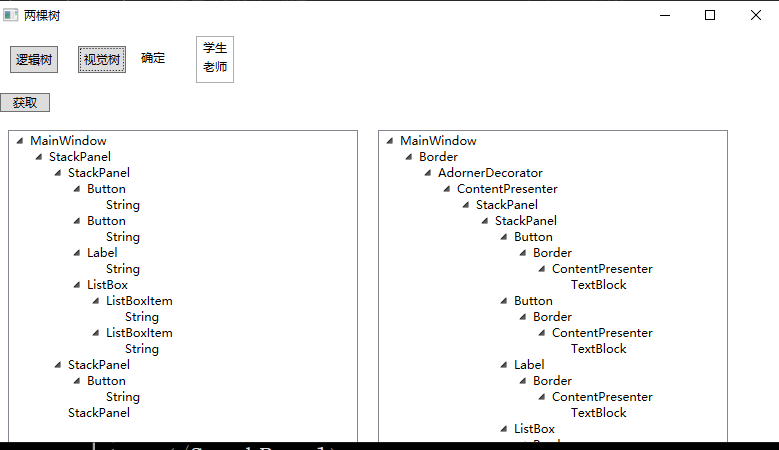
2.xml脚本实现
<Window x:Class="WPFTemplateStudy.MainWindow"
  xmlns="http://schemas.microsoft.com/winfx/2006/xaml/presentation"
  xmlns:x="http://schemas.microsoft.com/winfx/2006/xaml"
  xmlns:d="http://schemas.microsoft.com/expression/blend/2008"
  xmlns:mc="http://schemas.openxmlformats.org/markup-compatibility/2006"
  xmlns:local="clr-namespace:WPFTemplateStudy"
  mc:Ignorable="d"
  Title="两棵树" Height="450" Width="800" >
<StackPanel>
    <StackPanel Margin="5" Orientation="Horizontal">
  <Button Padding="5" Margin="10"  Click="ShowLogicTrees">逻辑树</Button>
  <Button Padding="5" Margin="10"  Click="ShowVisualTrees">视觉树</Button>
    <Label Content="确定" Width="60" Height="30"/>
    <ListBox>
      <ListBoxItem Name="lbStudent" Content="学生"/>
      <ListBoxItem Content="老师"/>
    </ListBox>
  </StackPanel>
    <StackPanel Margin="5">
    <Button Name="btnGet" Content="获取" Width="50" HorizontalAlignment="Left"   />
  </StackPanel>
    <StackPanel Orientation="Horizontal" Margin="3">
    <TreeView Name="tvLTrees" Margin="10"  Width="350" />
    <TreeView Name="tvVTrees" Margin="10"  Width="350" />
  </StackPanel>
</StackPanel>
</Window>
3.后台脚本
using System.Windows.Media;
using System.Windows;
using System.Windows.Controls;
namespace WPFTemplateStudy
{
public partial class MainWindow : Window
{
public MainWindow()
{
InitializeComponent();
}
/// <summary>
  /// 将对象转换为 TreeViewItem 并添加到 TreeView 中
/// </summary>
/// <param name="tv">目标 TreeView 控件</param>
/// <param name="obj">要添加的对象(通常是 WPF 元素)</param>
/// <param name="item">当前创建的 TreeViewItem</param>
/// <param name="parentItem">父 TreeViewItem(若为 null,则添加到 TreeView 根节点)</param>
private void AddTreeViewItem(TreeView tv, object obj, TreeViewItem item, TreeViewItem parentItem)
{
// 设置 TreeViewItem 的标题为对象的类型名称(例如:Button、StackPanel)
item.Header = obj.GetType().Name;
// 默认展开节点,方便用户查看完整结构
item.IsExpanded = true;
// 根据父节点是否存在,决定添加位置
if (parentItem == null)
{
// 若没有父节点,将当前节点添加到 TreeView 的根节点
tv.Items.Add(item);
}
else
{
// 若有父节点,将当前节点添加到父节点的子节点集合中
parentItem.Items.Add(item);
}
}
/// <summary>
  /// 递归遍历并打印逻辑树结构
/// </summary>
/// <param name="obj">当前遍历的对象</param>
/// <param name="parentItem">父 TreeViewItem(用于构建树状结构)</param>
private void PrintLogcTree(object obj, TreeViewItem parentItem)
{
// 1. 创建当前对象的 TreeViewItem 节点
TreeViewItem item = new TreeViewItem();
AddTreeViewItem(tvLTrees, obj, item, parentItem);
// 2. 终止条件:若对象不是 DependencyObject,无法继续遍历子元素
if (!(obj is DependencyObject))
{
return;
}
// 3. 获取当前对象的逻辑子元素集合
foreach (object child in LogicalTreeHelper.GetChildren(obj as DependencyObject))
{
// 4. 避免无限循环:跳过 TreeView 控件本身
if (child is TreeView)
return;
// 5. 递归遍历子元素
PrintLogcTree(child, item);
}
}
/// <summary>
  /// 递归遍历并打印WPF视觉树(Visual Tree)结构,将结果显示在右侧的TreeView控件中
  /// 视觉树包含WPF中所有参与渲染的元素,比逻辑树更详细(如布局容器的内部渲染元素)
/// </summary>
/// <param name="obj">当前遍历的依赖对象(视觉树中的元素,必须是DependencyObject类型)</param>
/// <param name="parentItem">父级TreeViewItem节点,用于构建树状结构的层级关系(若为根节点则为null)</param>
private void PrintVisualTree(DependencyObject obj, TreeViewItem parentItem)
{
// 创建当前元素对应的TreeViewItem节点,用于在TreeView中显示
TreeViewItem item = new TreeViewItem();
// 调用AddTreeViewItem方法,将当前节点添加到右侧视觉树的TreeView(tvVTrees)中
// 并关联其父节点parentItem,构建层级结构
AddTreeViewItem(tvVTrees, obj, item, parentItem);
// 通过VisualTreeHelper获取当前元素的视觉子元素数量,遍历所有子元素
for (int i = 0; i < VisualTreeHelper.GetChildrenCount(obj); i++)
{
// 避免无限循环:若当前元素是TreeView控件本身(tvVTrees),则终止递归
// 防止遍历到TreeView自身时继续递归其子元素,导致循环引用
if (obj is TreeView)
return;
// 递归遍历当前子元素,将当前item作为其父节点,继续构建视觉树结构
PrintVisualTree(VisualTreeHelper.GetChild(obj, i), item);
}
}
private void ShowLogicTrees(object sender, RoutedEventArgs e)
{
tvLTrees.Items.Clear();
PrintLogcTree(this, null);
}
private void ShowVisualTrees(object sender, RoutedEventArgs e)
{
tvVTrees.Items.Clear();
PrintVisualTree(this, null);
}
}
}
实际应用场景
- 逻辑树适用场景
- 数据绑定(
**<font style="color:rgb(64, 64, 64);background-color:rgb(236, 236, 236);">Binding</font>**)的路径解析 - 路由事件的
**<font style="color:rgb(64, 64, 64);background-color:rgb(236, 236, 236);">Source</font>**属性(事件原始触发点) - 动态资源(
**<font style="color:rgb(64, 64, 64);background-color:rgb(236, 236, 236);">DynamicResource</font>**)更新46。
- 数据绑定(
- 可视化树适用场景
- 控件模板定制:修改
**<font style="color:rgb(64, 64, 64);background-color:rgb(236, 236, 236);">Button</font>**的视觉结构(如添加动画效果)需操作可视化树18。
- 控件模板定制:修改
复杂事件处理:
- csharp// 在父容器监听所有按钮点击
事件从**<font style="color:rgb(64, 64, 64);background-color:rgb(236, 236, 236);">Button</font>**沿可视化树冒泡至**<font style="color:rgb(64, 64, 64);background-color:rgb(236, 236, 236);">Grid</font>**35。
- **视觉层特效**:如实现不规则点击区域(通过`**VisualTreeHelper.HitTest**`)。⚡ 5. 与路由事件的深度关联
路由事件(如**<font style="color:rgb(64, 64, 64);background-color:rgb(236, 236, 236);">MouseDown</font>**)的传递依赖可视化树,其三种策略:
- 冒泡(Bubble):从事件源向上传递至根元素(常用,如
**<font style="color:rgb(64, 64, 64);background-color:rgb(236, 236, 236);">Button.Click</font>**)。 - 隧道(Tunnel):从根元素向下传递至事件源(命名以
**<font style="color:rgb(64, 64, 64);background-color:rgb(236, 236, 236);">Preview</font>**开头,如**<font style="color:rgb(64, 64, 64);background-color:rgb(236, 236, 236);">PreviewKeyDown</font>**)。 - 直接(Direct):仅触发在事件源(类似传统事件)356。
关键属性:
**<font style="color:rgb(64, 64, 64);background-color:rgb(236, 236, 236);">e.Source</font>**:事件原始触发点(可视化树中最底层元素)。**<font style="color:rgb(64, 64, 64);background-color:rgb(236, 236, 236);">e.OriginalSource</font>**:事件最初来源(如点击按钮时可能是内部的**<font style="color:rgb(64, 64, 64);background-color:rgb(236, 236, 236);">Border</font>**)。**<font style="color:rgb(64, 64, 64);background-color:rgb(236, 236, 236);">e.Handled = true</font>**:终止事件传递(类似冒泡阻止)37。
总结:设计哲学与最佳实践
- 解耦原则:逻辑树定义“功能结构”,可视化树定义“视觉呈现”,二者分离使WPF支持灵活的样式与模板机制18。
- 开发建议:
- 优先操作逻辑树(业务逻辑相关)。
- 慎用可视化树(视觉层定制或高级事件处理时使用)。
- 调试工具:
使用第三方工具(如**<font style="color:rgb(64, 64, 64);background-color:rgb(236, 236, 236);">Snoop</font>**)实时查看两棵树的结构,辅助分析事件传递路径8。
三个模板入门
:::color2
在WPF中,“模板”是用来定制控件外观和行为的核心机制,其中最常用的三个模板是:ControlTemplate(控件模板)、DataTemplate(数据模板)、ItemsPanelTemplate(项容器模板)。它们各自负责不同的功能
:::
1. ControlTemplate(控件模板):“定义控件长什么样”
作用:决定一个控件(如按钮、文本框、按钮等)的“外观结构”。比如按钮默认是灰色矩形,点击会变浅,你可以用ControlTemplate把它改成圆形、带图片的样式,甚至是复杂的组合控件。
举个例子:
默认按钮是这样的:
<Button Content="点击我" />用ControlTemplate改成圆形按钮:
<Button Content="点击我">
  <!--修改Button的模板-->
    <Button.Template>
      <!-- 自定义按钮模板 -->
          <ControlTemplate TargetType="Button">
          <!-- 模板里放一个圆形边框和文本 -->
            <Border
              Background="LightBlue"
              BorderBrush="Blue"
              BorderThickness="2"
              CornerRadius="50"  <!-- 圆角设为50%变成圆形 -->
              Width="100" Height="100">
              <!-- 显示按钮的Content(绑定到模板的目标控件) -->
                <ContentPresenter
                  HorizontalAlignment="Center"
                  VerticalAlignment="Center"/>
              </Border>
            </ControlTemplate>
          </Button.Template>
</Button>核心点:
- 针对“控件本身”定制外观,比如按钮、复选框等。
- 模板里可以放任何元素(边框、图片、文本等),但通常需要用
ContentPresenter显示控件的Content属性(比如按钮上的文字)。 - ContentPresenter 是 ControlTemplate 中Content 内容的专属占位符,连接控件原始 Content 和自定义模板;
- 自动通过 TemplateBinding 绑定目标控件的 Content 属性,无需手动配置;
2. DataTemplate(数据模板):“定义数据怎么显示”
作用:决定“数据”在界面上的显示方式。比如你有一个Student类(包含Name和Age属性),想在列表中显示每个学生的信息,DataTemplate可以指定用“姓名:XXX,年龄:XX”这样的格式显示,而不是默认的类名(如WPFTemplateStudy.Student)。
举个例子:
假设后台有个学生列表:
public class Student {
public string Name { get; set; }
public int Age { get; set; }
}
// 列表数据
public List<Student> Students = new List<Student> {
  new Student { Name = "小明", Age = 18 },
  new Student { Name = "小红", Age = 17 }
};XAML中用ListBox显示,默认会显示类名,用DataTemplate定制显示:
<!-- 定义数据模板:指定Student类型的数据如何显示 -->
    <DataTemplate DataType="{x:Type local:Student}">
      <StackPanel Orientation="Horizontal">
      <TextBlock Text="姓名:" />
      <TextBlock Text="{Binding Name}" Margin="5,0" />
      <TextBlock Text="年龄:" />
      <TextBlock Text="{Binding Age}" />
    </StackPanel>
  </DataTemplate>
  <!-- 列表绑定学生数据,会自动使用上面的DataTemplate -->
<ListBox ItemsSource="{Binding Students}" />核心点:
- 针对“数据”(如对象、字符串、数字等)定制显示样式,和具体控件无关。
- 常用于列表类控件(
ListBox、ListView、ComboBox等),因为这些控件需要显示“一堆数据”。
3. ItemsPanelTemplate(项容器模板):“定义列表项怎么排列”
作用:决定ItemsControl(如ListBox、ComboBox、Menu等)内部的“子项布局容器”。比如ListBox默认用StackPanel垂直排列子项,你可以用ItemsPanelTemplate改成WrapPanel(自动换行)、Grid(网格布局)甚至Canvas(自由定位)。
举个例子:
默认ListBox的子项是垂直排列的:
<ListBox>
  <ListBoxItem Content="项1" />
  <ListBoxItem Content="项2" />
  <ListBoxItem Content="项3" />
</ListBox>用ItemsPanelTemplate改成水平换行排列:
<ListBox>
  <!-- 定义子项的布局容器为WrapPanel(自动换行) -->
    <ListBox.ItemsPanel>
      <ItemsPanelTemplate>
        <WrapPanel Orientation="Horizontal" />
      </ItemsPanelTemplate>
    </ListBox.ItemsPanel>
    <ListBoxItem Content="项1" Width="100" />
    <ListBoxItem Content="项2" Width="100" />
    <ListBoxItem Content="项3" Width="100" />
    <ListBoxItem Content="项4" Width="100" />
  </ListBox>
此时子项会水平排列,空间不够时自动换行。
核心点:
- 只针对
ItemsControl(带“子项”的控件),控制子项的“布局方式”(排列规则)。 - 模板里通常放一个布局容器(
StackPanel、WrapPanel、Grid等)。
模板分类
WPF中有三种常用模板,它们都**继承自**<font style="color:#7E45E8;">FrameworkTemplate</font>**基类,区别在于“作用对象”不**同:
| 模板类型 | 作用对象 | 作用描述 |
|---|---|---|
| 控件模板(ControlTemplate) | 控件本身 | 自定义控件的外观(比如让按钮从“矩形”变成“圆形”) |
| 数据模板(DataTemplate) | 绑定的数据 | 自定义数据的呈现方式(比如让列表中的“用户对象”显示为头像+名字,而不是默认的文本) |
| 面板模板(PanelTemplate) | 面板布局 | 自定义面板的布局逻辑(比如让列表项按圆形排列,而不是默认的垂直排列) |
**简单说: **
- 想改“控件长什么样” → 用
**ControlTemplate****; ** - 想改“数据怎么显示” → 用
**DataTemplate****; ** - 想改“列表项怎么排列” → 用
**ItemsPanelTemplate**。
控件模板
控件模板(ControlTemplate):定义控件长什么样子
:::color2
控件模板是最常用的模板,它决定了一个控件**“长什么样子”。每个控件都有**默认的控件模板(比如按钮默认是灰色背景、有边框),我们可以通过自定义模板改变它的外观。
ControlTemplate 从微观的角度:是属性:Template 的值。Template在Control类中,所以每隔控件都有Template
ControlTemplate 组成:
1:基础元素
2:资源 ControlTemplate.Resources
3:触发器 ControlTemplate .Triggers
:::
- 作用:修改元素的外观样式,自定义好看的元素,外观改变功能不变
- 核心:TemplateBinding 属性 将元素属性的值绑定到模板中属性上
- 用法:
- 资源中定义模板:
- 元素上绑定模板:
- 模板内部绑定元素上属性的值:TemplateBindging 属性名
控件模板的核心组成
每个**ControlTempl**ate包含两个关键部分:
- VisualTree(视觉树):定义控件的**外观组成**(比如由哪些元素构成,如矩形、文本框等)。
- Triggers(触发器):定义**外观的动态变化**(比如鼠标悬停时变色、点击时缩放等)。
案例:自定义Button的控件模板
下面是一个自定义按钮外观的模板,让按钮变成“圆角矩形”,并在鼠标悬停时改变颜色:
1. 定义控件模板
<Window.Resources>
  <!-- 定义一个Button的控件模板,Key为"btnCTemp" -->
      <ControlTemplate x:Key="btnCTemp" TargetType="Button">
      <!-- VisualTree:定义按钮的外观组成 -->
        <Grid>
          <!-- 用矩形作为按钮的背景,设置圆角 -->
            <Rectangle
              x:Name="br"  <!-- 给矩形起个名字,方便触发器调用 -->
              Width="{TemplateBinding Width}"  <!-- 绑定按钮的Width属性 -->
                Height="{TemplateBinding Height}"  <!-- 绑定按钮的Height属性 -->
                  Stroke="Red"  <!-- 边框颜色 -->
                    StrokeThickness="2"  <!-- 边框粗细 -->
                      Fill="LightBlue"  <!-- 背景色 -->
                        RadiusX="12" RadiusY="5"/>  <!-- 圆角大小 -->
                          <!-- 用于显示按钮内容(如文本“点击我”) -->
                            <ContentPresenter
                              HorizontalAlignment="Center"  <!-- 内容水平居中 -->
                              VerticalAlignment="Center"/>  <!-- 内容垂直居中 -->
                              </Grid>
                              <!-- Triggers:定义动态效果 -->
                                <ControlTemplate.Triggers>
                                  <!-- 鼠标悬停时,改变矩形背景色 -->
                                      <Trigger Property="IsMouseOver" Value="True">
                                      <Setter Property="Fill" TargetName="br" Value="LightGray"/>
                                    </Trigger>
                                  </ControlTemplate.Triggers>
                                </ControlTemplate>
                              </Window.Resources>
应用控件模板
在Button的**<font style="color:#7E45E8;">Template</font>****属性中引用定义好的模板: **
<Button
  Content="自定义按钮"
  Width="150"
  Height="40"
  Template="{StaticResource btnCTemp}"/>  <!-- 应用模板 -->
3.效果说明
- 正常状态:按钮是浅蓝色圆角矩形,红色边框,内容“自定义按钮”居中显示。
- 鼠标悬停时:矩形背景色变为浅灰色(通过触发器实现)。
4.关键说明
TargetType:指定模板应用的控件类型(如Button),确保模板中的属性绑定符合控件的特性。TemplateBinding:将模板内部元素的属性(如矩形的Width)与目标控件(Button)的属性绑定,保证模板随控件大小变化。ContentPresenter:- 1:用于显示控件的
Content属性(如Button的文本),确保模板不丢失控件的核心内容。 - 2:ContentPresenter 是 ControlTemplate 中Content 内容的专属占位符,连接控件原始 Content 和自定义模板,可以通过查看Button的模板看到效果
- 3:自动通过 TemplateBinding 绑定目标控件的 Content 属性,无需手动配置;
- 1:用于显示控件的
:::color2
模板是自定义外观的核心工具,其中控件模板可直接改变控件的样子,让界面更灵活
:::
练习题 1(入门必做,基础模板)
✅ 需求:自定义一个圆角 TextBox,
要求:1. 圆角 15;2. 边框 1px 灰色;3. 文字居中;4. 可外部修改背景色、字体大小
✅ 要求:模板写在窗口资源,TextBox 引用模板,测试可用
✅ 提示:TargetType=“TextBox”,绑定 Content→TextBox 用<font style="color:rgb(0, 0, 0);background-color:rgba(0, 0, 0, 0);">Text</font>,记得加 Padding 避免文字贴边
练习题 2(进阶必做,带触发器)
✅ 需求:自定义一个卡片式 Button,
要求:1. 圆角 8,默认背景白色、边框灰色;2. 鼠标悬浮:背景淡绿,边框深绿;3. 点击:背景深绿,文字白色;4. 文字居中,字号 14;5. 按钮宽 150 高 45
✅ 核心:必须加 2 个触发器(IsMouseOver、IsPressed),掌握模板触发器核心用法
练习题 3(综合必做,实用模板)
✅ 需求:自定义一个简约 Label,要求:1. 背景浅灰色,圆角 10,无边框;2. 文字居中,默认字号 15、颜色黑色;3. 鼠标悬浮:文字变红,背景变白;4. 全局可用(写在 App.xaml),窗口放 2 个 Label 引用测试✅ 核心:区分窗口资源和全局资源,掌握全局模板用法,巩固触发器 + 绑定
数据模版
为什么需要数据模板?
:::color2
想象一下你有一个 ListBox,它绑定到了一个 List 集合(Book 类有 Title, Author, CoverImage 等属性)。默认情况下,ListBox 会简单地对集合中的每个 Book 对象调用 .ToString() 方法来显示内容。结果通常是类似 “MyNamespace.Book” 这样毫无意义的信息,或者你重写了 ToString() 返回 Title,但也只能显示一个标题文本,无法展示作者、图片等
:::
数据模板 (DataTemplate) 就是解决这个问题的魔法!
:::color2
它的作用就是定义如何将你的数据对象(如 Book)转换成可视化的 UI 元素(如包含 TextBlock 和 Image 的 StackPanel)。它告诉 WPF:“当你需要在界面上显示一个 Book 类型的对象时,请使用 我定义的这组控件 来呈现它
:::
什么是数据模板
数据模板:让你写的CS中类或者集合,以什么样的Ui样式展示的?
基础使用
- 1:在资源中定义数据模板 注意:后台一定要有对应的类
- 2: 给元素绑定模板通过元素的属性 ** ContentTemplate ItemTemplate** 绑定模板
- 单一对象 用ContentControl 元素 通过属性 ContentTemplate 绑定模板
- 集合 用Listbox ListView ComBox 等,通过 ItemTemplate 绑定模板
- 3:模板中使用 **Binding **实现见该数据绑定到模板的控件上 (将后台类的属性绑定模板中元素的属性上)
- 4:给元素绑定实体数据
- ContentControl 通过Content
- listBox listView ComBox 通过 ItemSource
模板 = 元素结构 + 样式 + 触发器
一个实体对象绑定
需求:加载 class Student 的样式
1:准备后台数据
class Studnet{
public string Name{get;set;}
public int Age{get;set;}
public string Mojor{get;set;}
2:定义模板+ ContentControl 绑定模板顶
<Window x:Class="WpfDataTemplateDemo.MainWindow"
  xmlns="http://schemas.microsoft.com/winfx/2006/xaml/presentation"
  xmlns:x="http://schemas.microsoft.com/winfx/2006/xaml"
  xmlns:local="clr-namespace:WpfDataTemplateDemo"
  Title="单个对象数据模板" Height="200" Width="350">
<!-- 1. 定义数据模板:绑定Student的3个属性,自定义排版 -->
  <Window.Resources>
      <DataTemplate x:Key="StudentDataTemplate" DataType="{x:Type local:Student}">
      <!-- 用StackPanel横向排版,图文/文字组合都能搞 -->
          <StackPanel Orientation="Horizontal" Margin="10" Height="60">
          <!-- 静态图标占位,后续可换图片 -->
            <Ellipse Width="40" Height="40" Fill="LightBlue" Margin="0,0,10,0"/>
            <!-- 纵向排版显示文字,Binding 绑定实体属性(必须和后台属性名一致) -->
                <StackPanel Orientation="Vertical">
                <TextBlock Text="{Binding Name}" FontSize="16" FontWeight="Bold"/>
                <TextBlock Text="年龄:{Binding Age}" FontSize="12" Margin="0,3,0,0"/>
                <TextBlock Text="专业:{Binding Major}" FontSize="12"/>
              </StackPanel>
            </StackPanel>
          </DataTemplate>
        </Window.Resources>
        <!-- 2. 界面控件:ContentControl 承载单个Student对象,引用模板 -->
          <Grid>
            <ContentControl ContentTemplate="{StaticResource StudentDataTemplate}" x:Name="ccStudent"/>
          </Grid>
        </Window>
3: 给 ContentControl 绑定实体数据:通过 Content属性实现
using System.Windows;
namespace WpfDataTemplateDemo
{
public partial class MainWindow : Window
{
public MainWindow()
{
InitializeComponent();
// 给ContentControl赋值单个Student对象(数据来源)
ccStudent.Content = new Student()
{
Name = "张三",
Age = 20,
Major = "自动化(上位机方向)"
};
}
}
}
集合绑定
<!-- 直接复用上面的StudentDataTemplate模板,不用重新写 -->
    <Grid Margin="20">
    <!-- ListBox:展示数据列表,ItemTemplate引用数据模板 -->
      <ListBox ItemTemplate="{StaticResource StudentDataTemplate}" x:Name="lbStudentList" />
    </Grid>
using System.Collections.Generic;
using System.Windows;
namespace WpfDataTemplateDemo
{
public partial class MainWindow : Window
{
public MainWindow()
{
InitializeComponent();
// 准备List集合数据(模拟上位机的设备列表/参数列表)
List<Student> studentList = new List<Student>()
{
new Student(){Name="张三",Age=20,Major="自动化"},
new Student(){Name="李四",Age=21,Major="电气工程"},
new Student(){Name="王五",Age=19,Major="测控技术"}
};
// 核心:ListBox的ItemsSource绑定集合,自动批量展示
lbStudentList.ItemsSource = studentList;
}
}
}练习题
✅需求:基于 Student 类,用 ListBox 展示 5 个学生的集合数据,要求:
- 数据模板:横向排版,左边圆形背景(浅绿),右边纵向显示姓名 + 年龄 + 专业
- 加触发器:鼠标悬浮当前项,背景变浅蓝色,文字变黑色
- 后台 5 条测试数据(自己随便填,必须含姓名 / 年龄 / 专业)
- ListBox 宽度 300,每条数据高度 70
- ✅ 核心:练集合绑定(ItemsSource)+ 模板触发器,
✅ 需求:Student 类加头像属性(Avatar),用 ComboBox 做下拉学生列表,要求:
- 数据模板:横向排版,左边显示头像(本地图片 / 网络图片都行),右边显示姓名 + 专业
- ComboBox 宽度 280,下拉项高度 60,默认显示第一个学生
- 后台 3 条数据,头像路径自己填(本地图直接复制路径,网络图用 https 图片链接)
- 模板背景白色,鼠标悬浮背景变浅黄
- ✅ 核心:练图文数据模板 + ComboBox 用法
:::color4
注意:如果图片加载失败是可以使用一个图形作为占位符
:::
<Border Width="45" Height="45" CornerRadius="22.5" ClipToBounds="True" Background="LightGray">
  <!-- 头像图片:设置FallbackValue(加载失败时显示的占位符) -->
      <Image Source="{Binding Avatar, FallbackValue={StaticResource PlaceholderIcon}}"
      Stretch="UniformToFill"/>
  </Border>
  <!-- 提前在资源区定义占位符(可选:圆形/默认图片) -->
    <Window.Resources>
      <Ellipse x:Key="PlaceholderIcon" Width="45" Height="45" Fill="LightSkyBlue"/>
      <!-- 也可以用本地图片做占位符:<Image x:Key="PlaceholderIcon" Source="placeholder.png" Stretch="UniformToFill"/> -->
    </Window.Resources>
数据触发器
0:后台数据模板
// 先更新Student实体类,加Score属性
public class Student
{
    public string Name { get; set; }
    public int Age { get; set; }
    public string Major { get; set; }
    public string Avatar { get; set; }
    public int Score { get; set; } // 新增成绩属性
}
1:模板修改
<DataTemplate x:Key="StuDataTriggerTemplate" DataType="{x:Type local:Student}">
    <Border x:Name="itemBorder" Background="White" Margin="5" Padding="10" Height="70">
      <StackPanel Orientation="Horizontal">
      <Ellipse Width="50" Height="50" Fill="LightGreen" Margin="0,0,15,0"/>
        <StackPanel Orientation="Vertical" VerticalAlignment="Center">
        <TextBlock Text="{Binding Name}" FontSize="16" FontWeight="Bold"/>
        <TextBlock Text="年龄:{Binding Age}" FontSize="12"/>
        <TextBlock x:Name="tbScore" Text="成绩:{Binding Score}" FontSize="12" Margin="0,2,0,0"/>
      </StackPanel>
    </StackPanel>
  </Border>
  <DataTemplate.Triggers>
    <!-- 普通触发器:鼠标悬浮变背景 -->
        <Trigger Property="IsMouseOver" Value="True">
        <Setter TargetName="itemBorder" Property="Background" Value="LightBlue"/>
      </Trigger>
      <!-- 数据触发器:监听Score属性,<60时样式变化(核心) -->
          <DataTrigger Binding="{Binding Score}" Value="0">
          <DataTrigger.Conditions>
            <Condition Binding="{Binding Score}" Value="{x:Null}"/>
            <Condition Binding="{Binding Score}" Comparison="LessThan" Value="60"/>
          </DataTrigger.Conditions>
          <Setter TargetName="tbScore" Property="Foreground" Value="Red"/>
          <Setter TargetName="tbScore" Property="FontWeight" Value="Bold"/>
          <Setter TargetName="itemBorder" Property="Background" Value="#FFECE0E0"/>
        </DataTrigger>
      </DataTemplate.Triggers>
    </DataTemplate>
2: 模板绑定+ 数据绑定
Comparison 当前其他值说明
| 取值 | 中文含义 | 适用场景 |
|---|---|---|
<font style="color:rgb(0, 0, 0);background-color:rgba(0, 0, 0, 0);">Equal</font> | 等于 | 判断值是否完全一致 |
<font style="color:rgb(0, 0, 0);background-color:rgba(0, 0, 0, 0);">NotEqual</font> | 不等于 | 判断值是否不同 |
<font style="color:rgb(0, 0, 0);background-color:rgba(0, 0, 0, 0);">GreaterThan</font> | 大于 | 判断值是否超过阈值 |
<font style="color:rgb(0, 0, 0);background-color:rgba(0, 0, 0, 0);">GreaterThanEqual</font> | 大于等于 | 判断值是否≥阈值 |
<font style="color:rgb(0, 0, 0);background-color:rgba(0, 0, 0, 0);">LessThanEqual</font> | 小于等于 | 判断值是否≤阈值 |
内联模板
在元素的内部定义数据模板
<!-- ListBox内联DataTemplate,无需x:Key,仅当前ListBox可用 -->
    <ListBox x:Name="lbStu" Width="300">
    <ListBox.ItemTemplate>
        <DataTemplate DataType="{x:Type local:Student}">
          <StackPanel Orientation="Horizontal">
          <TextBlock Text="{Binding Name}" FontSize="16"/>
          <TextBlock Text="{Binding Age}" Margin="10,0,0,0"/>
        </StackPanel>
      </DataTemplate>
    </ListBox.ItemTemplate>
  </ListBox>
ListView+GridVIew+DataTemplate带有列头展示
1:后台数据转杯
using System;
using System.Windows.Media; // 用于Avatar的ImageSource类型
namespace WpfStuList
{
// 学生实体类,前台DataType="{x:Type local:Student}" 对应此类
public class Student
{
// 头像(ImageSource支持本地图片/网络图片,string也可,前台Image能自动转换)
public ImageSource Avatar { get; set; }
// 姓名
public string Name { get; set; }
// 年龄
public int Age { get; set; }
// 专业
public string Major { get; set; }
// 成绩
public double Score { get; set; } // 用double支持小数成绩,int也可
}
}
2: ScoreToColorConverter 的转换器(成绩颜色转换)功能:成绩小于60为红色
using System;
using System.Globalization;
using System.Windows.Data;
using System.Windows.Media;
namespace WpfStuList
{
// 成绩转颜色转换器,前台<local:ScoreToColorConverter/> 对应此类
public class ScoreToColorConverter : IValueConverter
{
// IValueConverter 是数据绑定转换器的标准接口
/// <summary>
  /// 前台→后台:将成绩(Score)转换为颜色(Foreground)
/// </summary>
/// <param name="value">绑定的成绩值(前台传过来的Score)</param>
/// <param name="targetType">目标类型(这里是Brush,颜色画刷)</param>
/// <param name="parameter">转换器参数(这里没用)</param>
/// <param name="culture">区域信息(这里没用)</param>
public object Convert(object value, Type targetType, object parameter, CultureInfo culture)
{
// 空值判断,避免报错
if (value == null || !double.TryParse(value.ToString(), out double score))
return Brushes.Black; // 非数字成绩默认黑色
// 成绩<60返回红色,否则黑色
return score < 60 ? Brushes.Red : Brushes.Black;
}
/// <summary>
  /// 后台→前台:反向转换(这里是单向绑定,无需实现,返回DoNothing)
/// </summary>
public object ConvertBack(object value, Type targetType, object parameter, CultureInfo culture)
{
return Binding.DoNothing;
}
}
}
3:定义模板+ 模板绑定
<Window.Resources>
    <DataTemplate x:Key="StuListViewTemplate" DataType="{x:Type local:Student}">
      <StackPanel Orientation="Horizontal" VerticalAlignment="Center" Height="40">
      <Image Source="{Binding Avatar, FallbackValue={StaticResource PlaceholderIcon}}" Width="30" Height="30" Stretch="UniformToFill" Margin="0,0,10,0"/>
      <TextBlock Text="{Binding Name}" Width="60"/>
      <TextBlock Text="{Binding Age}" Width="40"/>
      <TextBlock Text="{Binding Major}" Width="120"/>
      !--
      Converter
      -->
      <TextBlock Text="{Binding Score}" Width="50" Foreground="{Binding Score, Converter={StaticResource ScoreToColorConverter}}"/>
    </StackPanel>
  </DataTemplate>
  <!-- 简单转换器:成绩<60变红(可选,进阶) -->
    <local:ScoreToColorConverter x:Key="ScoreToColorConverter"/>
  </Window.Resources>
  <!-- ListView带表头核心代码 -->
      <ListView x:Name="lvStu" Margin="20" Width="400" ItemTemplate="{StaticResource StuListViewTemplate}">
      <ListView.View>
          <GridView ColumnHeaderStyle="{StaticResource GridViewHeaderStyle}">
          <GridViewColumn Header="头像" Width="40"/>
          <GridViewColumn Header="姓名" Width="60"/>
          <GridViewColumn Header="年龄" Width="40"/>
          <GridViewColumn Header="专业" Width="120"/>
          <GridViewColumn Header="成绩" Width="50"/>
        </GridView>
      </ListView.View>
    </ListView>
4:数据绑定
using System;
using System.Collections.Generic;
using System.Windows;
using System.Windows.Media.Imaging; // 用于本地头像图片
namespace WpfStuList
{
/// <summary>
  /// MainWindow.xaml 的交互逻辑
/// </summary>
public partial class MainWindow : Window
{
public MainWindow()
{
InitializeComponent(); // 初始化前台控件,必须第一行
// 1. 初始化学生集合(ListView的数据源,泛型List<Student>即可)
  List<Student> studentList = new List<Student>()
    {
    new Student()
    {
    Avatar = new BitmapImage(new Uri("Images/avatar1.png", UriKind.Relative)), // 本地头像(需项目建Images文件夹)
    Name = "张三",
    Age = 20,
    Major = "计算机科学与技术",
    Score = 85
    },
    new Student()
    {
    Avatar = null, // 为null时会显示前台FallbackValue的占位符图标
    Name = "李四",
    Age = 19,
    Major = "软件工程",
    Score = 58 // 成绩<60,前台会自动变红
    },
    new Student()
    {
    Avatar = new BitmapImage(new Uri("Images/avatar2.png", UriKind.Relative)),
    Name = "王五",
    Age = 21,
    Major = "人工智能",
    Score = 92
    }
    };
    // 2. 核心绑定:将学生集合赋值给ListView的ItemsSource
    // ListView会自动遍历集合,为每个Student生成一行DataTemplate模板
    lvStu.ItemsSource = studentList;
    }
    }
    }
三个模板综合案例
1:准备描述设备信息的类
using System;
// 设备实体:对应上位机真实设备参数,数据模板绑定这些属性
namespace Wpf3TemplateUpperDemo
{
public class Device
{
public string DeviceName { get; set; } // 设备名称
public string DeviceIp { get; set; }   // 设备IP
public string Status { get; set; }     // 设备状态(正常/故障)
public int RunTime { get; set; }       // 运行时长(小时)
}
}
2:定义模板:控件模板 数据模板 面板模板 绑定模板
<Window x:Class="Wpf3TemplateUpperDemo.MainWindow"
  xmlns="http://schemas.microsoft.com/winfx/2006/xaml/presentation"
  xmlns:x="http://schemas.microsoft.com/winfx/2006/xaml"
  xmlns:local="clr-namespace:Wpf3TemplateUpperDemo"
  Title="上位机3大模板联用Demo" Height="500" Width="700" WindowStartupLocation="CenterScreen">
<!-- =====================  1. 资源区:控件模板+数据模板  (核心!先定义后引用) ===================== -->
  <Window.Resources>
    <!--  控件模板(ControlTemplate):美化按钮+文本框,改外观不改功能 -->
      <!-- ① 自定义圆角查询按钮模板(上位机高频用) -->
          <ControlTemplate x:Key="MyBtnTemplate" TargetType="Button">
            <Border x:Name="btnBorder"
            Background="White" BorderBrush="#0066CC" BorderThickness="1"
            CornerRadius="8" Width="100" Height="35">
            <TextBlock Text="{TemplateBinding Content}"
            HorizontalAlignment="Center" VerticalAlignment="Center"
            FontSize="14" Foreground="#0066CC"/>
        </Border>
        <!-- 按钮触发器:悬浮/点击变色,提升交互 -->
          <ControlTemplate.Triggers>
              <Trigger Property="IsMouseOver" Value="True">
              <Setter TargetName="btnBorder" Property="Background" Value="#0066CC"/>
              <Setter Property="Foreground" Value="White"/>
            </Trigger>
              <Trigger Property="IsPressed" Value="True">
              <Setter TargetName="btnBorder" Property="Background" Value="#0055AA"/>
            </Trigger>
          </ControlTemplate.Triggers>
        </ControlTemplate>
        <!-- ② 自定义圆角文本框模板(美化输入控件) -->
            <ControlTemplate x:Key="MyTextBoxTemplate" TargetType="TextBox">
              <Border Background="White" BorderBrush="#E0E0E0" BorderThickness="1"
              CornerRadius="8" Padding="10">
            <ScrollViewer Text="{TemplateBinding Text}" VerticalAlignment="Center"/>
          </Border>
          <!-- 文本框触发器:获焦高亮边框 -->
            <ControlTemplate.Triggers>
                <Trigger Property="IsFocused" Value="True">
                <Setter Property="BorderBrush" Value="#0066CC"/>
              </Trigger>
            </ControlTemplate.Triggers>
          </ControlTemplate>
          <!--  数据模板(DataTemplate):美化设备数据展示,绑定Device实体属性 -->
              <DataTemplate x:Key="DeviceDataTemplate" DataType="{x:Type local:Device}">
                <Border x:Name="deviceBorder" Background="White" BorderBrush="#F0F0F0"
                BorderThickness="1" CornerRadius="8" Margin="5" Padding="15" Height="70">
              <!-- 面板模板嵌套(Grid):规整排版单条设备数据 -->
                  <Grid ColumnDefinitions="150,120,100,100" ColumnSpacing="15">
                  <!-- 绑定Device实体属性,核心:Binding + 属性名 -->
                    <TextBlock Grid.Column="0" Text="{Binding DeviceName, StringFormat='设备名称:{0}'}" FontSize="14" VerticalAlignment="Center"/>
                    <TextBlock Grid.Column="1" Text="{Binding DeviceIp, StringFormat='IP地址:{0}'}" FontSize="14" VerticalAlignment="Center"/>
                    <TextBlock Grid.Column="2" x:Name="tbStatus" Text="{Binding Status}" FontSize="14" VerticalAlignment="Center"/>
                    <TextBlock Grid.Column="3" Text="{Binding RunTime, StringFormat='运行时长:{0}h'}" FontSize="14" VerticalAlignment="Center"/>
                  </Grid>
                </Border>
                <!-- 数据触发器:按状态改颜色(上位机核心需求:故障标红) -->
                  <DataTemplate.Triggers>
                      <DataTrigger Binding="{Binding Status}" Value="正常">
                      <Setter TargetName="tbStatus" Property="Foreground" Value="Green"/>
                    </DataTrigger>
                      <DataTrigger Binding="{Binding Status}" Value="故障">
                      <Setter TargetName="tbStatus" Property="Foreground" Value="Red"/>
                      <Setter TargetName="tbStatus" Property="FontWeight" Value="Bold"/>
                      <Setter TargetName="deviceBorder" Property="Background" Value="#FFF5F5"/>
                    </DataTrigger>
                    <!-- 悬浮高亮 -->
                        <Trigger Property="IsMouseOver" Value="True">
                        <Setter TargetName="deviceBorder" Property="BorderBrush" Value="#0066CC"/>
                      </Trigger>
                    </DataTemplate.Triggers>
                  </DataTemplate>
                </Window.Resources>
                <!-- =====================  2. 界面布局:面板模板(Grid+StackPanel),管控件摆放 ===================== -->
                  <!-- 外层核心面板:Grid(上位机界面首选,划分3大区域),3行布局 -->
                      <Grid Background="#F8F9FA">
                      <!-- 定义3行:标题行(固定高)、查询行(自适应)、列表行(占满剩余) -->
                        <Grid.RowDefinitions>
                          <RowDefinition Height="60"/>
                          <RowDefinition Height="Auto"/>
                          <RowDefinition Height="*"/>
                        </Grid.RowDefinitions>
                        <!-- 第1行:顶部标题栏(StackPanel水平排版)【面板模板用法】 -->
                            <Border Grid.Row="0" Background="#0066CC">
                              <StackPanel Orientation="Horizontal" Margin="20,0,0,0" VerticalAlignment="Center">
                              <TextBlock Text="工业设备监控系统" FontSize="20" Foreground="White" FontWeight="Bold"/>
                              <TextBlock Text="(3大模板联用)" FontSize="14" Foreground="White" Margin="15,0,0,0" VerticalAlignment="Center"/>
                            </StackPanel>
                          </Border>
                          <!-- 第2行:参数查询区(Grid+StackPanel嵌套)【面板模板用法】 -->
                              <Grid Grid.Row="1" Margin="20,15,20,15">
                              <Grid.ColumnDefinitions>
                                <ColumnDefinition Width="Auto"/>
                                <ColumnDefinition Width="250"/>
                                <ColumnDefinition Width="Auto"/>
                                <ColumnDefinition Width="Auto"/>
                              </Grid.ColumnDefinitions>
                              <!-- 文本 -->
                                <TextBlock Grid.Column="0" Text="设备查询:" FontSize="14" VerticalAlignment="Center" Margin="0,0,10,0"/>
                                <!-- 引用【控件模板】:美化文本框 -->
                                  <TextBox Grid.Column="1" Template="{StaticResource MyTextBoxTemplate}" Height="35" Hint="输入设备名称/IP"/>
                                  <!-- 引用【控件模板】:美化按钮 -->
                                    <Button Grid.Column="2" Content="查询设备" Template="{StaticResource MyBtnTemplate}" Margin="10,0,10,0"/>
                                    <Button Grid.Column="3" Content="刷新列表" Template="{StaticResource MyBtnTemplate}"/>
                                  </Grid>
                                  <!-- 第3行:设备列表区(ListBox承载)【核心联用:面板+数据模板】 -->
                                      <ListBox Grid.Row="2" Margin="20,0,20,20"
                                      ItemTemplate="{StaticResource DeviceDataTemplate}" <!-- 引用【数据模板】 -->
                                      x:Name="lbDeviceList" Background="Transparent" BorderThickness="0"/>
                                    </Grid>
                                  </Window>
3:绑定数据
using System.Collections.Generic;
using System.Windows;
namespace Wpf3TemplateUpperDemo
{
public partial class MainWindow : Window
{
public MainWindow()
{
InitializeComponent();
// 初始化设备列表数据(模拟上位机真实设备数据)
InitDeviceData();
}
// 核心:准备List集合数据,给ListBox赋值(数据模板必须要数据)
private void InitDeviceData()
{
List<Device> deviceList = new List<Device>()
  {
  new Device(){DeviceName="PLC-1号机", DeviceIp="192.168.1.101", Status="正常", RunTime=120},
  new Device(){DeviceName="PLC-2号机", DeviceIp="192.168.1.102", Status="故障", RunTime=98},
  new Device(){DeviceName="传感器-温度", DeviceIp="192.168.1.103", Status="正常", RunTime=205},
  new Device(){DeviceName="传感器-压力", DeviceIp="192.168.1.104", Status="正常", RunTime=180},
  new Device(){DeviceName="伺服电机-01", DeviceIp="192.168.1.105", Status="故障", RunTime=86}
  };
  // 给ListBox赋值,数据模板自动渲染每条数据
  lbDeviceList.ItemsSource = deviceList;
  }
  }
  }
带样式和触发器的模板
模板选择器 DataTemplateSelector
- 准备多个模板:DatatTemplate
- 创建 “模板选择器” 规则
- 在界面上 “绑定” 这个规则
:::info
需求:以任务列表为例:任务三种状态:待办,进行中,完成,不同的状态显示不同的样式的。
我们用数据模板选择器实现
- 待办 :红色字体
- 已完成 绿色+对号
:::
写之前必须要掌握几个核心
- ** 模板选择器的必须写的规则**: 必须继承 WPF 自带的
<font style="color:rgb(0, 0, 0);background-color:rgba(0, 0, 0, 0);">DataTemplateSelector</font>,必须重写<font style="color:rgb(0, 0, 0);background-color:rgba(0, 0, 0, 0);">SelectTemplate</font>方法 —— 这是固定写法,所有模板选择器都要这么写,改的只是方法里的**判断规则**(比如按状态、按数字判断)。 - XAML中 不再写 ItemTemplate(那是指定单一模板),而是写 ItemTemplateSelector,绑定我们注册的选择器资源(示例里的
<font style="color:rgb(0, 0, 0);background-color:rgba(0, 0, 0, 0);">{StaticResource MySelector}</font>)—— 这是触发 “自动选模板” 的关键。
using System.Windows;
using System.Windows.Controls;
// 命名空间保持和项目一致即可
namespace SimpleTemplateSelector
{
// 1. 简单数据模型:只存任务标题和状态(待办/已完成)
public class Task
{
public string TaskName { get; set; } // 任务名
public string State { get; set; }    // 状态:只有「待办」「已完成」两种
}
// 2. 极简模板选择器(核心!必须继承DataTemplateSelector)
public class SimpleTaskSelector : DataTemplateSelector
{
// 定义两个模板属性,用来在XAML里绑定我们写的模板
public DataTemplate TodoTemp { get; set; }  // 待办模板
public DataTemplate DoneTemp { get; set; }  // 已完成模板
// 重写核心方法:程序自动给每个数据调用这个方法,选对应模板
public override DataTemplate SelectTemplate(object item, DependencyObject container)
{
// 把数据转成我们的Task类型(判空避免报错)
if (item is Task t)
{
// 核心规则:状态是「待办」用TodoTemp,「已完成」用DoneTemp
if (t.State == "待办") return TodoTemp;
if (t.State == "已完成") return DoneTemp;
}
return base.SelectTemplate(item, container); // 非Task类型用默认模板
}
}
// 3. 主窗口:初始化2条测试数据,给界面绑定
public partial class MainWindow : Window
{
public MainWindow()
{
InitializeComponent();
// 测试数据:1条待办、1条已完成
DataContext = new[]
{
new Task { TaskName = "学习模板选择器", State = "待办" },
new Task { TaskName = "写极简代码", State = "已完成" }
};
}
}
}<Window x:Class="SimpleTemplateSelector.MainWindow"
xmlns="http://schemas.microsoft.com/winfx/2006/xaml/presentation"
xmlns:x="http://schemas.microsoft.com/winfx/2006/xaml"
xmlns:local="clr-namespace:SimpleTemplateSelector"
Title="极简模板选择器" Height="200" Width="300">
<Window.Resources>
<!-- 1. 定义2个基础模板:外观不一样,用来区分状态 -->
<!-- 待办模板:红色文字(绑定任务名) -->
<DataTemplate x:Key="TodoTemp">
<TextBlock Text="{Binding TaskName}" Foreground="Red" FontSize="16" Margin="5"/>
</DataTemplate>
<!-- 已完成模板:绿色文字+带对勾(绑定任务名) -->
<DataTemplate x:Key="DoneTemp">
<TextBlock Text="{Binding TaskName, StringFormat='✓ {0}'}" Foreground="Green" FontSize="16" Margin="5"/>
</DataTemplate>
<!-- 2. 注册模板选择器为资源:把上面2个模板绑定到选择器的属性上 -->
<local:SimpleTaskSelector x:Key="MySelector"
TodoTemp="{StaticResource TodoTemp}"
DoneTemp="{StaticResource DoneTemp}"/>
</Window.Resources>
<!-- 3. 展示数据的列表:核心只写ItemTemplateSelector,绑定我们的选择器 -->
<Grid Padding="20">
<ListBox ItemsSource="{Binding}"
ItemTemplateSelector="{StaticResource MySelector}"/>
</Grid>
</Window>嵌套数据模板
带交互的模板
依赖属性
一、核心/概念
- 依赖属性:是WPF特有的属性类型,本身可以没有值,依赖其他数据源(如父元素、样式、绑定)获取值,是样式、数据绑定、动画的基础。
- 附加属性:特殊的依赖属性,用于给“本身没有该属性的对象”临时添加属性(如Grid的Row/Column属性,用于指定子元素的位置)。
:::info
** 不是所有属性都支持,有明确的规则 **
支持属性元素语法的条件
只有满足以下条件的属性,才能用 <控件.属性>…</控件.属性> 的标签写法:
- 该属性是依赖属性(WPF 大部分核心属性都是,比如 Width/Height/Background/Header/Content
- 属性的类型是「引用类型」(比如 object、UIElement、Brush等),或虽为值类型但支持类型转换(比如 string 转 Thickness)
2. 不支持的情况(只能用特性语法)
- 简单值类型且无类型转换器的属性(极少);
- XAML 编译器不识别的自定义属性(未注册依赖属性的普通 CLR 属性)。
:::
二、案例详解(帮你理解实际用法)
案例1:依赖属性的“属性继承”与“值变化通知”
假设我们做一个简单的文本显示界面,包含一个父容器StackPanel和两个子元素TextBlock:
<StackPanel FontSize="16"> <!-- 父元素设置FontSize -->
  <TextBlock Text="我继承了父元素的字体大小" />
  <TextBlock Text="我自己改了字体大小" FontSize="20" />
</StackPanel>- 属性继承:第一个
TextBlock没有单独设置FontSize,会自动继承父容器StackPanel的FontSize="16"(依赖属性的“属性继承”特性)。 - 值变化通知:如果用代码动态修改
StackPanel的FontSize,第一个TextBlock的字体大小会自动更新(依赖属性的“值变化通知”特性,无需手动写刷新代码)。
案例2:附加属性的“临时属性”作用
用Grid布局时,子元素本身没有“行”和“列”的属性,但通过附加属性可以指定:
<Grid>
  <Grid.RowDefinitions>
    <RowDefinition Height="50"/>
    <RowDefinition Height="50"/>
  </Grid.RowDefinitions>
  <!-- 子元素通过附加属性指定自己在第0行 -->
    <Button Grid.Row="0" Content="我在第1行" />
    <!-- 子元素通过附加属性指定自己在第1行 -->
      <Button Grid.Row="1" Content="我在第2行" />
</Grid>- 这里的
Grid.Row就是附加属性:按钮本身没有Row属性,但在Grid容器中,通过Grid.Row临时添加了“行位置”属性,实现了布局控制。
案例3:自定义依赖属性(实现一个“可自动提示的输入框”)
假设我们需要一个输入框,当输入内容超过10个字符时,自动显示提示文字。这可以通过自定义依赖属性实现:
- 让自定义输入框类继承
DependencyObject:
public class MyTextBox : TextBox, DependencyObject- 定义依赖属性
WarningText(用于存储提示文字):
// 声明依赖属性变量
public static readonly DependencyProperty WarningTextProperty;
// 静态构造函数中注册(指定元数据:值变化时触发回调)
static MyTextBox()
{
WarningTextProperty = DependencyProperty.Register(
"WarningText", // 属性名称
typeof(string), // 属性类型
typeof(MyTextBox), // 所属类
new PropertyMetadata("", OnWarningTextChanged) // 值变化回调
);
}
// 包装属性(供外部读写)
public string WarningText
{
get { return (string)GetValue(WarningTextProperty); }
set { SetValue(WarningTextProperty, value); }
}
// 值变化时的逻辑(显示提示)
private static void OnWarningTextChanged(DependencyObject d, DependencyPropertyChangedEventArgs e)
{
var textBox = d as MyTextBox;
textBox.ToolTip = e.NewValue; // 用ToolTip显示提示
}- 使用时,当输入长度超过10,通过绑定设置
WarningText,输入框会自动显示提示(依赖属性的“值变化通知”特性)。
三、经验总结(新手避坑指南)
- 依赖属性必须“静态+注册”:
新手常忘记在静态构造函数中用Register注册,导致属性无法生效。记住:DependencyProperty变量必须是public static readonly,且必须注册。 - 附加属性用
RegisterAttached,且需静态读写方法:
定义附加属性时,用RegisterAttached代替Register,并必须提供SetXxx和GetXxx静态方法(如SetRow和GetRow),否则无法在XAML中使用。 - 优先用依赖属性,而非普通属性:
当需要样式、绑定、动画时,必须用依赖属性。普通属性无法支持这些功能(比如普通属性不能直接绑定到数据,也不能被动画驱动)。 - 利用“内存优势”优化性能:
当界面有大量重复控件(如列表中的1000个按钮),用依赖属性可大幅减少内存占用(普通属性每个控件存一份初始值,依赖属性共享存储)。
四、总结
- 核心价值:依赖属性和附加属性是WPF灵活性的“基石”,让样式复用、数据绑定、动态布局变得简单。
- 关键区别:依赖属性是“对象自带的可依赖值的属性”,附加属性是“对象在特定场景下临时添加的属性”。
- 使用场景:
- 依赖属性:需要继承、绑定、动态变化的属性(如字体、颜色、内容)。
- 附加属性:布局控制(如Grid的Row/Column)、特殊场景临时属性(如DockPanel的Dock)。

 浙公网安备 33010602011771号