
css 水平垂直居中的方法总结
在项目中经常会遇到设置元素水平垂直居中的需求。而且具体的场景也不同,所以将个人总结的方法做个汇总,希望对浏览者有用。
以下所举的例子都以一个html为准,这里规定好一些公用样式。
body {
background-color: #efefef;
}
main {
background-color: #fff;
padding: 10px;
margin:10px 0px;
}
main div {
background-color: #aaf;
}
水平居中
1 相对块级父元素,可将子级设置成行内或者行内块元素,父元素设置text-align属性
举例如下:
.parent1 {
text-align:center;
}
.child1 {
display:inline|inline-block;
}
2 若父子都为块级元素,则给子元素宽度值之后,将margin:auto
我是孩子2,我要水平居中
.child2 {
width:60%;
margin:auto;
}
3 如果是多个子元素水平居中,则有两种方法
3.1 将子级设置成行内或者行内块元素,父元素设置text-align属性
3.2 将父元素设置display:flex
我是孩子4,我要水平居中
我是孩子4,我要水平居中
我是孩子4,我要水平居中
.parent4 {
display: flex;
justify-content: center;
}
.child4 {
margin:10px;
}
垂直居中
1 除了设置固定的padding值使其看起来垂直居中之外,还可用line-height
将line-height和height的值设置为相同值,
我是孩子5,我要垂直居中
.child5 {
height:50px;
line-height: 50px;
}
2 如果是多行的,可以像table那样,按照table cell 模式显示,配合vertical-align
我是孩子6,我要垂直居中
我是孩子6,我要垂直居中
我是孩子6,我要垂直居中
.parent6 {
display: table;
}
.child6 {
display: table-cell;
border:2px solid #000;
vertical-align: middle;
}
3 通过绝对定位
我是孩子7,我要垂直居中
/如果知道子元素宽高/
.parent7 {
position: relative;
height: 100px;
}
.child7 {
position: absolute;
top:50%;
height:60px;
margin-top:-30px;
}
/如果不知道子元素宽高/
.parent7 {
position: relative;
height: 100px;
}
.child7 {
position: absolute;
top:50%;
transform: translateY(-50%);
}
4 使用flex
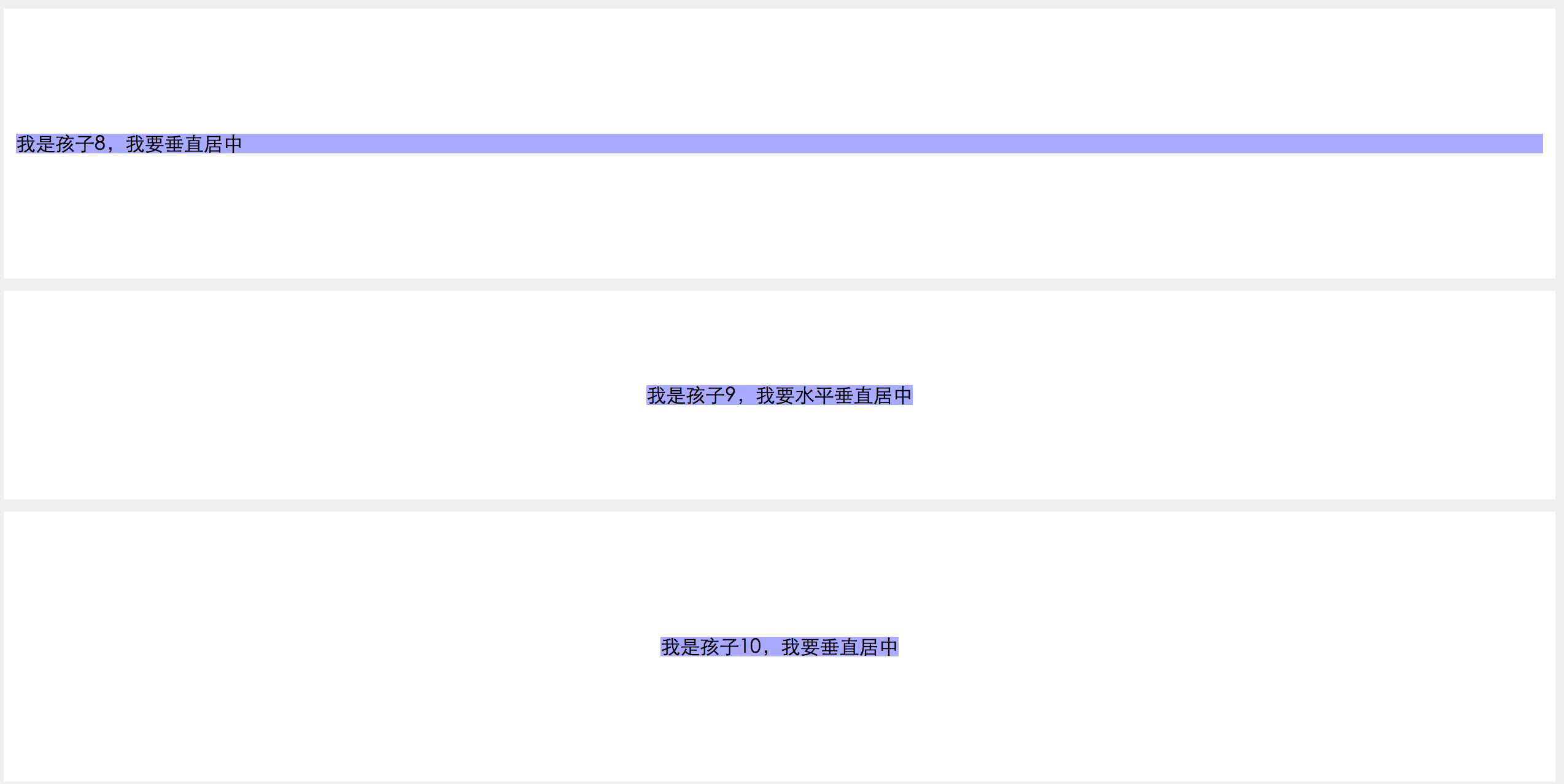
我是孩子8,我要垂直居中
.parent8 {
height: 200px;
display: flex;
flex-direction: column;
justify-content: center;
}
水平和垂直都居中
1 使用绝对定位
我是孩子9,我要水平垂直居中
/如果不知道子元素宽高/
.parent9 {
position: relative;
height: 150px;
}
.child9 {
position: absolute;
top:50%;
left:50%;
transform: translate(-50%,-50%);
}
/如果知道子元素宽高/
.parent9 {
position: relative;
height: 150px;
}
.child9 {
position: absolute;
top:50%;
left:50%;
height:60px;
width:100px;
margin-left:-50px;
margin-top:-30px;
}
2 使用flex
.parent10 {
height: 200px;
display: flex;
flex-direction: column;
justify-content: center;
}
.child10 {
margin: auto;
}
3 除此之外,还可以将上述的水平和垂直分别居中的方法,尝试着搭配。当然,应该还有其它方法,待发现。
上述结果输出截图

######如果对你有帮助,记得帮忙点个赞,支持我哦^o^。
######尊重原创,转载请注明。
######尊重原创,转载请注明。

 浙公网安备 33010602011771号