css3--animation动画
1、@keyframes 定义关键帧动画
2、animation-name 动画名称
3、animation-duration 动画时间
4、animation-timing-function 动画曲线
- linear 匀速
- ease 开始和结束慢速
- ease-in 开始是慢速
- ease-out 结束时慢速
- ease-in-out 开始和结束时慢速
- steps 动画步数
5、animation-delay 动画延迟
6、animation-iteration-count 动画播放次数 n|infinite
7、animation-direction
- normal 默认动画结束不返回
- Alternate 动画结束后返回
8、animation-play-state 动画状态
- paused 停止
- running 运动
9、animation-fill-mode 动画前后的状态
- none 不改变默认行为
- forwards 当动画完成后,保持最后一个属性值(在最后一个关键帧中定义)
- backwards 在 animation-delay 所指定的一段时间内,在动画显示之前,应用开始属性值(在第一个关键帧中定义)
- both 向前和向后填充模式都被应用
10、animation:name duration timing-function delay iteration-count direction;同时设置多个属性
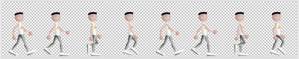
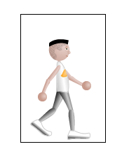
  1 <!doctype html>
  2 <html lang="en">
  3 <head>
  4     <meta charset="UTF-8">
  5     <meta name="viewport"
  6           content="width=device-width, user-scalable=no, initial-scale=1.0, maximum-scale=1.0, minimum-scale=1.0">
  7     <meta http-equiv="X-UA-Compatible" content="ie=edge">
  8     <title>animation动画</title>
  9
 10     <style type="text/css">
 11         .box{
 12             width:100px;
 13             height:100px;
 14             background-color:gold;
 15             /* animation:moving 1s ease 500ms 5 alternate;     alternate 动画结束后返回  */
 16             /* animation:moving 1s ease 500ms infinite;        infinite 动画播放次数无限循环  */
 17             animation:moving 1s ease 1s 5 forwards;        /* forwards 当动画完成后,保持最后一个属性值(在最后一个关键帧中定义)  */
 18             animation-play-state:paused;  /*停止动画*/
 19         }
 20
 21         .box:hover{
 22             animation-play-state:running;  /*运行动画*/
 23         }
 24
 25         @keyframes moving{
 26             from{
 27                 width:200px;
 28             }
 29
 30             to{
 31                 width:500px;
 32             }
 33         }
 34
 35
 36         /* ----------------------人物走路动画------------------ */
 37         /* 方法一:使用img图片 */
 38
 39         .box1{
 40             width:120px;
 41             height:182px;
 42             border:1px solid #000;
 43             margin:50px auto 0;
 44             overflow:hidden;  /* 隐藏超出盒子宽高的图片部分 */
 45             position:relative;
 46         }
 47
 48         .box1 img{
 49             position:absolute;
 50             left:0;
 51             top:0;
 52             animation:walking 1s steps(8) infinite;  /* 注意:这里是图片在动,.box1盒子不动*/
 53         }
 54
 55         @keyframes walking{
 56             from{
 57                 left:0px;
 58             }
 59
 60             to{
 61                 left:-960px;
 62             }
 63         }
 64
 65         /* 方法二:使用background背景图 */
 66         /*
 67         .box1{
 68             width:120px;
 69             height:182px;
 70             border:1px solid #000;
 71             margin:50px auto 0;
 72             background:url(../images/walking.png) left top no-repeat;
 73             animation:walking 1s steps(8) infinite;
 74         }
 75
 76         @keyframes walking{
 77             from{
 78                 background-position:0px;
 79             }
 80
 81             to{
 82                 background-position:-960px;
 83             }
 84         } */
 85
 86
 87         /* ----------------------多帧动画------------------ */
 88         .box2{
 89             width:100px;
 90             height:100px;
 91             background-color:gold;
 92             margin:50px auto 0;
 93             animation:katon 1s ease 500ms both;
 94
 95         }
 96
 97         @keyframes katon{
 98             0%{
 99                 transform:translateY(0px);
100             }
101
102             20%{
103                 transform:translateY(0px);
104             }
105
106             50%{
107                 transform:translateY(300px);
108                 background-color:red;
109             }
110
111             100%{   /*100%加载完整个动画*/
112                 transform:translateY(0px);
113                 background-color:green;
114             }
115         }
116
117     </style>
118 </head>
119 <body>
120
121 <div class="box"></div>
122 <div class="box1"><img src="../images/walking.png" alt="pic"></div>
123 <div class="box2"></div>
124 </body>
125 </html>
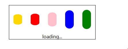
 1 <!doctype html>
 2 <html lang="en">
 3 <head>
 4     <meta charset="UTF-8">
 5     <meta name="viewport"
 6           content="width=device-width, user-scalable=no, initial-scale=1.0, maximum-scale=1.0, minimum-scale=1.0">
 7     <meta http-equiv="X-UA-Compatible" content="ie=edge">
 8     <title>loading</title>
 9
10     <style type="text/css">
11         .box{
12             width:300px;
13             height:120px;
14             border:1px solid #000;
15             margin:100px auto 0;
16         }
17
18         .box div{
19             width:30px;
20             height:70px;
21             float:left;
22             margin:15px;
23             border-radius:15px; /*圆角*/
24         }
25
26         .box p{
27             margin:0;
28             padding;0;
29             float:left;
30             text-align:center;
31             width:100%;
32         }
33
34         .box div:nth-child(1){
35             background-color:gold;
36             animation:loading 500ms ease 0s infinite alternate;
37         }
38
39         .box div:nth-child(2){
40             background-color:red;
41             animation:loading 500ms ease 100ms infinite alternate;
42         }
43
44         .box div:nth-child(3){
45             background-color:pink;
46             animation:loading 500ms ease 200ms infinite alternate;
47         }
48
49         .box div:nth-child(4){
50             background-color:blue;
51             animation:loading 500ms ease 300ms infinite alternate;
52         }
53
54         .box div:nth-child(5){
55             background-color:green;
56             animation:loading 500ms ease 400ms infinite alternate;
57         }
58
59         @keyframes loading{
60             from{
61                 transform:scaleY(1);
62             }
63
64             to{
65                 transform:scaleY(0.5); /*将Y轴压缩*/
66             }
67         }
68
69
70     </style>
71 </head>
72 <body>
73
74 <div class="box">
75     <div></div>
76     <div></div>
77     <div></div>
78     <div></div>
79     <div></div>
80     <p>loading...</p>
81 </div>
82 </body>
83 </html>
 1 <!doctype html>
 2 <html lang="en">
 3 <head>
 4     <meta charset="UTF-8">
 5     <meta name="viewport"
 6           content="width=device-width, user-scalable=no, initial-scale=1.0, maximum-scale=1.0, minimum-scale=1.0">
 7     <meta http-equiv="X-UA-Compatible" content="ie=edge">
 8     <title>风车旋转</title>
 9
10     <style type="text/css">
11         .box{
12             width:400px;
13             height:400px;
14             margin:50px auto 0;
15             background:url(../images/fengche.png) left center no-repeat;
16
17             animation:fengche 500ms linear 500ms infinite;  /* linear匀速;infinite一直运动 */
18         }
19
20         @keyframes fengche{
21             from{
22                 transform:rotate(0deg);
23             }
24
25             to{
26                 transform:rotate(180deg); /*旋转180度*/
27             }
28         }
29     </style>
30 </head>
31 <body>
32
33 <div class="box"></div>
34
35 </body>
36 </html>

posted on 2019-11-30 14:13 cherry_ning 阅读(211) 评论(0) 收藏 举报


 浙公网安备 33010602011771号