
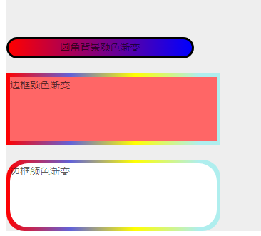
圆角和渐变
<p className='radusCircle'>圆角背景色渐变</p><br/>

<p className='borderCircle'>边框颜色渐变</p><br/>

<p className='bCircle'>
       <div className='box'>圆角边框颜色渐变</div>
</p>
背景色渐变
.radusCircle{
        border: 3px solid #000;
        border-radius: 20px;
        text-align: center;
        height:30px;
        width: 30%;
        background: linear-gradient(to right,red, blue);
    }
边框颜色渐变
.borderCircle{
        background: #f66;
        width: 300px;
        height:100px;
        border: 5px solid;
        box-sizing: border-box;
        border-image: -webkit-linear-gradient(left, red 0%, rgb(98, 98, 216) 30%, yellow 60%, paleturquoise 90%) 5;
        border-radius: 5px;//此时没起作用
    }
圆角边框颜色渐变(此时通过padding来实现想要的“模拟边框”的效果。
需要注意的是.box也要添加一个跟父级一样的border-radius)
.bCircle{
        width: 300px;
        height: 100px;
        box-sizing: border-box;
        padding: 5px;
        border-radius: 25px;
        background-image:-webkit-linear-gradient(left, red 0%, rgb(98, 98, 216) 30%, yellow 60%, paleturquoise 90%);
        .box {
            width: 100%;
            height: 100%;
            border-radius: 25px;
            background: #fff;
        }
    }
效果图:
posted on 2019-03-04 16:20 Cherish_Now 阅读(150) 评论(0) 收藏 举报

 浙公网安备 33010602011771号