

06--Web前端之HTML5+CSS3
HTML5+CSS3综合概述
什么是HTML5和CSS3?
HTML5和CSS3是在1.0和CSS之后推出的一种技术。主要面向移动端的开发。
推出HTML5和CSS3的目的是什么?
HTML5和CSS3推出的目的就比较有野心了,它的目的是要取代目前主流的两大移动平台上的APP应用程序。
HTML5和CSS3的野心具体是什么?
大家都知道,苹果的IOS平和我们经常使用的安卓平台完全不一样。因此,你要开发一个在苹果手机IOS平台上运行的一个APP,需要专门的IOS程序员,但是这个IOS的程序员只能开发苹果平台的,安卓平台的他不会开发。同样的,你要开发一个在安卓手机上运行的一个APP,就需要一个安卓程序员。那么问题来了,一个公司要开发一款APP,因为现在是苹果和安卓的天下,所以需要一款苹果端的APP,安卓端的呢,也需要一个。这样的话公司要开发出这款手机软件需要聘请两个团队,这无疑就大大增加了公司的运营成本。
HTML5和CSS3就是想要成为一款跨平台的APP开发技术,无论是苹果的IOS平台,还是谷歌的安卓平台,我都有能力搞定,我呢,只需要开发一次就能同时拥有两个平台的APP应用程序,要是能做到这种程度的话,IOS和安卓程序开发人员就不需要了!!
HTML5和CSS3的应用场景有哪些?
1. 应用程序可以使用HTML5和CSS3的页面。
2.主流浏览器里可以看HTML5和CSS3的页面。
3.微信平台里可以看HTML5和CSS3的页面。
4.原生IOS和安卓应用程序里面也可以嵌入HTML5和CSS3的页面。(就相当于程序员只是做了外面的一个壳,里面呢还是HTML5和CSS3的东西。)
CSS权重
CSS权重
CSS权重指的是样式的优先级,有两条或多条样式作用于一个元素,权重高的那条样式对元素起作用,权重相同的,后写的样式会覆盖前面写的样式。
权重的等级
可以把样式的应用方式分为几个等级,按照等级来计算权重
1、!important,加在样式属性值后,权重值为 10000
2、内联样式,如:style=””,权重值为1000
3、ID选择器,如:#content,权重值为100
4、类,伪类和属性选择器,如: .content、:hover 权重值为10
5、标签选择器和伪元素选择器,如:div、p、权重值为1
6、通用选择器(*)、子选择器(>)、相邻选择器(+)、同胞选择器(~)、权重值为0
权重案例:


 1 <!DOCTYPE html>
 2 <html lang="en">
 3 <head>
 4     <meta charset="UTF-8">
 5     <title>Document</title>
 6     <style>
 7      div{
 8          width: 100px;
 9          height: 100px;
10          background-color: red !important;
11      }
12
13         div{
14          width: 100px;
15          height: 100px;
16          background-color: blue;
17      }
18
19
20     </style>
21 </head>
22 <body>
23     <div></div>
24 </body>
25 </html>
 1 <!DOCTYPE html>
 2 <html lang="en">
 3 <head>
 4     <meta charset="UTF-8">
 5     <title>Document</title>
 6     <style>
 7      .red{
 8          width: 100px;
 9          height: 100px;
10          background-color: red;
11      }
12
13         div{
14          width: 100px;
15          height: 100px;
16          background-color: blue;
17      }
18
19
20     </style>
21 </head>
22 <body>
23     <div class="red"></div>
24 </body>
25 </html>
 1 <!DOCTYPE html>
 2 <html lang="en">
 3 <head>
 4     <meta charset="UTF-8">
 5     <title>Document</title>
 6     <style>
 7      #lan{
 8          width: 100px;
 9          height: 100px;
10          background-color: blue;
11      }
12
13      .red{
14          width: 100px;
15          height: 100px;
16          background-color: red;
17      }
18
19
20
21
22     </style>
23 </head>
24 <body>
25     <div class="red" id="lan"></div>
26 </body>
27 </html>
 1 <!DOCTYPE html>
 2 <html lang="en">
 3 <head>
 4     <meta charset="UTF-8">
 5     <title>Document</title>
 6     <style>
 7      #lan{
 8          width: 100px;
 9          height: 100px;
10          background-color: blue;
11      }
12
13
14     </style>
15 </head>
16 <body>
17     <div id="lan" style="width:400px;height:400px;background:red"></div>
18 </body>
19 </html>
<!DOCTYPE html>
<html lang="en">
<head>
    <meta charset="UTF-8">
    <title>Document</title>
    <style>
     #lan{
         width: 100px;
         height: 100px;
         background-color: blue !important;
     }


    </style>
</head>
<body>
    <div id="lan" style="width:400px;height:400px;background:red"></div>
</body>
</html>
CSS3新增选择器
1、E:nth-child(n):匹配元素类型为E且是父元素的第n个子元素
 1 <!DOCTYPE html>
 2 <html lang="en">
 3 <head>
 4     <meta charset="UTF-8">
 5     <title>Document</title>
 6     <style>
 7       li{
 8           background-color: yellow;
 9           margin-bottom: 10px;
10       }
11
12       li:nth-child(2){
13           background-color: red;
14       }
15
16     </style>
17 </head>
18 <body>
19     <ul>
20         <li>1</li>
21         <li>2</li>
22         <li>3</li>
23         <li>4</li>
24         <li>5</li>
25         <li>6</li>
26         <li>7</li>
27         <li>8</li>
28         <li>9</li>
29
30     </ul>
31 </body>
32 </html>
 1 <!DOCTYPE html>
 2 <html lang="en">
 3 <head>
 4     <meta charset="UTF-8">
 5     <title>Document</title>
 6     <style>
 7      .box div{
 8          background-color: gold;
 9          margin-bottom: 10px;
10      }
11
12      .box div:nth-child(5){
13          background-color: red;
14      }
15
16     </style>
17 </head>
18 <body>
19     <div class="box">
20         <div>1</div>
21         <div>2</div>
22         <div>3</div>
23         <div>4</div>
24         <div>5</div>
25         <div>6</div>
26         <div>7</div>
27         <div>8</div>
28         <div>9</div>
29     </div>
30 </body>
31 </html>
 1 <!DOCTYPE html>
 2 <html lang="en">
 3 <head>
 4     <meta charset="UTF-8">
 5     <title>Document</title>
 6     <style>
 7      .box div{
 8          background-color: gold;
 9          margin-bottom: 10px;
10      }
11
12      .box div:nth-child(2n){
13          background-color: red;
14      }
15
16     </style>
17 </head>
18 <body>
19     <div class="box">
20         <div>1</div>
21         <div>2</div>
22         <div>3</div>
23         <div>4</div>
24         <div>5</div>
25         <div>6</div>
26         <div>7</div>
27         <div>8</div>
28         <div>9</div>
29     </div>
30 </body>
31 </html>
 1 <!DOCTYPE html>
 2 <html lang="en">
 3 <head>
 4     <meta charset="UTF-8">
 5     <title>Document</title>
 6     <style>
 7      .box div{
 8          background-color: gold;
 9          margin-bottom: 10px;
10      }
11
12      .box div:nth-child(2n+1){
13          background-color: red;
14      }
15
16     </style>
17 </head>
18 <body>
19     <div class="box">
20         <div>1</div>
21         <div>2</div>
22         <div>3</div>
23         <div>4</div>
24         <div>5</div>
25         <div>6</div>
26         <div>7</div>
27         <div>8</div>
28         <div>9</div>
29     </div>
30 </body>
31 </html>
 1 <!DOCTYPE html>
 2 <html lang="en">
 3 <head>
 4     <meta charset="UTF-8">
 5     <title>Document</title>
 6     <style>
 7      .box div{
 8          background-color: gold;
 9          margin-bottom: 10px;
10      }
11
12      .box div:nth-child(5){
13          background-color: red;
14      }
15
16     </style>
17 </head>
18 <body>
19     <div class="box">
20         <div>1</div>
21         <div>2</div>
22         <div>3</div>
23         <div>4</div>
24         <p>宝宝今天很开心</p>
25         <div>5</div>
26         <div>6</div>
27         <div>7</div>
28         <div>8</div>
29         <div>9</div>
30     </div>
31 </body>
32 </html>
匹配原则:
E:nth-child(n)会先寻找选择范围内的第n个孩子,找到后再比较是不是元素E,如果是,则匹配成功增加样式;若不是,则匹配失败效果无法显示。
(与E:nth-of-type(n)对比学习)
2、E:nth-last-child(n):匹配元素类型为E且是父元素的倒数第n个子元素(与上一项顺序相反)
 1 <!DOCTYPE html>
 2 <html lang="en">
 3 <head>
 4     <meta charset="UTF-8">
 5     <title>Document</title>
 6     <style>
 7      .box div{
 8          background-color: gold;
 9          margin-bottom: 10px;
10      }
11
12      .box div:nth-last-child(3){
13          background-color: red;
14      }
15
16     </style>
17 </head>
18 <body>
19     <div class="box">
20         <div>1</div>
21         <div>2</div>
22         <div>3</div>
23         <div>4</div>
24         <div>5</div>
25         <div>6</div>
26         <div>7</div>
27         <div>8</div>
28         <div>9</div>
29     </div>
30 </body>
31 </html>
3、E:first-child:匹配元素类型为E且是父元素的第一个子元素
4、E:last-child:匹配元素类型为E且是父元素的最后一个子元素
5、E:nth-of-type(n):匹配父元素的第n个类型为E的子元素
 1 <!DOCTYPE html>
 2 <html lang="en">
 3 <head>
 4     <meta charset="UTF-8">
 5     <title>Document</title>
 6     <style>
 7      .box div{
 8          background-color: gold;
 9          margin-bottom: 10px;
10      }
11
12      .box div:nth-of-type(5){
13          background-color: red;
14      }
15
16     </style>
17 </head>
18 <body>
19     <div class="box">
20         <div>1</div>
21         <div>2</div>
22         <div>3</div>
23         <div>4</div>
24         <p>宝宝今天很开心</p>
25         <p>宝宝今天很开心</p>
26         <p>宝宝今天很开心</p>
27         <div>5</div>
28         <div>6</div>
29         <div>7</div>
30         <div>8</div>
31         <div>9</div>
32     </div>
33 </body>
34 </html>
匹配原则:
E:nth-of-type(n)会直接寻找第n个E标签,如果前面有其他非E标签,则直接跳过,继续寻找。
注意:
如果子元素的标签都相同,则E:nth-child(n)与 E:nth-of-type(n)效果相同,如子元素内掺杂了其它多余元素,则会体现不同种效果。
6、E:nth-last-of-type(n):匹配父元素的倒数第n个类型为E的子元素(与上一项顺序相反)
7、E:first-of-type:匹配父元素的第一个类型为E的子元素
8、E:last-of-type:匹配父元素的最后一个类型为E的子元素
CSS3圆角、阴影、rgba
CSS3圆角
设置某一个角的圆角,比如设置左上角的圆角:
border-top-left-radius:30px 60px;
同时分别设置四个角:
border-radius:30px 60px 120px 150px;
设置四个圆角相同:
border-radius:50%;
阴影
box-shadow:h-shadow v-shadow blur spread color inset;
分别设置阴影:水平偏移 垂直偏移 羽化大小 阴影大小 颜色 是否内阴影
 1 <style type="text/css">
 2     .box{
 3         width:200px;
 4         height:50px;
 5         background-color:gold;
 6         /* box-shadow:10px 10px 5px 2px pink inset; */
 7         box-shadow:10px 10px 5px 2px pink;
 8     }
 9 </style>
10 ......
11
12
13 <div class="box"></div>
rgba(新的颜色值表示法)
1、盒子透明度表示法:opacity:0.1;filter:alpha(opacity=10)(兼容IE);
 1 <!DOCTYPE html>
 2 <html lang="en">
 3 <head>
 4     <meta charset="UTF-8">
 5     <title>Document</title>
 6     <style>
 7       div{
 8           width: 200px;
 9           height: 200px;
10           background-color: gold;
11           opacity:0.1;
12
13       }
14
15
16     </style>
17 </head>
18 <body>
19     <div>你好</div>
20 </body>
21 </html>
2、rgba(0,0,0,0.1) 前三个数值表示颜色,第四个数值表示颜色的透明度
 1 <!DOCTYPE html>
 2 <html lang="en">
 3 <head>
 4     <meta charset="UTF-8">
 5     <title>Document</title>
 6     <style>
 7       div{
 8           width: 200px;
 9           height: 200px;
10           background-color: gold;
11           background-color: rgba(255,215,0,0.4);
12
13       }
14
15
16     </style>
17 </head>
18 <body>
19     <div>你好</div>
20 </body>
21 </html>
CSS3 transition动画
1、transition-property 设置过渡的属性,比如:width height background-color
2、transition-duration 设置过渡的时间,比如:1s 500ms
3、transition-timing-function 设置过渡的运动方式
- linear 匀速
- ease 开始和结束慢速
- ease-in 开始是慢速
- ease-out 结束时慢速
- ease-in-out 开始和结束时慢速
4、transition-delay 设置动画的延迟
5、transition: property duration timing-function delay 同时设置四个属性
举例:
 1 <!DOCTYPE html>
 2 <html lang="en">
 3 <head>
 4     <meta charset="UTF-8">
 5     <title>Document</title>
 6     <style>
 7        .box{
 8            width: 100px;
 9            height: 100px;
10            background-color: gold;
11            transition:width 10s ease-in;
12        }
13
14        .box:hover{
15           width: 500px;
16        }
17
18
19
20     </style>
21 </head>
22 <body>
23     <div class="box"></div>
24 </body>
25 </html>
 1 <!DOCTYPE html>
 2 <html lang="en">
 3 <head>
 4     <meta charset="UTF-8">
 5     <title>Document</title>
 6     <style>
 7        .box{
 8            width: 100px;
 9            height: 100px;
10            background-color: gold;
11            transition:height 10s ease-in;
12        }
13
14        .box:hover{
15           height: 500px;
16        }
17
18
19
20     </style>
21 </head>
22 <body>
23     <div class="box"></div>
24 </body>
25 </html>
 1 <!DOCTYPE html>
 2 <html lang="en">
 3 <head>
 4     <meta charset="UTF-8">
 5     <title>Document</title>
 6     <style>
 7        .box{
 8            width: 100px;
 9            height: 100px;
10            background-color: gold;
11            transition:width 10s ease-in,height 10s ease-in;
12        }
13
14        .box:hover{
15           width: 500px;
16           height: 500px;
17        }
18
19
20
21     </style>
22 </head>
23 <body>
24     <div class="box"></div>
25 </body>
26 </html>
 1 <!DOCTYPE html>
 2 <html lang="en">
 3 <head>
 4     <meta charset="UTF-8">
 5     <title>Document</title>
 6     <style>
 7        .box{
 8            width: 100px;
 9            height: 100px;
10            background-color: gold;
11            transition:width 10s ease-in,height 10s ease-in,background-color 10s;
12        }
13
14        .box:hover{
15           width: 500px;
16           height: 500px;
17           background-color: red;
18        }
19
20
21
22     </style>
23 </head>
24 <body>
25     <div class="box"></div>
26 </body>
27 </html>
 1 <!DOCTYPE html>
 2 <html lang="en">
 3 <head>
 4     <meta charset="UTF-8">
 5     <title>Document</title>
 6     <style>
 7        .box{
 8            width: 100px;
 9            height: 100px;
10            background-color: gold;
11            transition:width 10s ease-in,height 10s ease-in,background-color 10s ease-in ,border-radius 10s ease;
12        }
13
14        .box:hover{
15           width: 500px;
16           height: 500px;
17           background-color: red;
18           border-radius: 50%;
19        }
20
21
22
23     </style>
24 </head>
25 <body>
26     <div class="box"></div>
27 </body>
28 </html>
HTML5新结构标签
h5新增的主要语义化标签如下:
1、header 页面头部、页眉
2、nav 页面导航
3、article 一篇文章
4、section 文章中的章节
5、aside 侧边栏
6、footer 页面底部、页脚
页面使用标签布局示意图: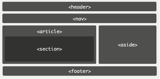
PC端兼容h5的新标签的方法,在页面中引入以下js文件:
<script type="text/javascript" src="//cdn.bootcss.com/html5shiv/r29/html5.js"></script>
HTML5 新增表单控件
新增类型:网址 邮箱 日期 时间 星期 数量 范围 电话 颜色 搜索
 1  <!DOCTYPE html>
 2  <html lang="en">
 3  <head>
 4      <meta charset="UTF-8">
 5      <title>Document</title>
 6  </head>
 7  <body>
 8   <form>
 9  <label>网址:</label><input type="url" name="" required><br><br>
10  <label>邮箱:</label><input type="email" name="" required><br><br>
11  <label>日期:</label><input type="date" name=""><br><br>
12  <label>时间:</label><input type="time" name=""><br><br>
13  <label>星期:</label><input type="week" name=""><br><br>
14  <label>数量:</label><input type="number" name=""> <br><br>
15  <label>范围:</label><input type="range" name=""><br><br>
16  <label>电话:</label><input type="tel" name=""><br><br>
17  <label>颜色:</label><input type="color" name=""><br><br>
18  <label>搜索:</label><input type="search" name=""><br><br>
19  <input type="submit" value="提交">
20  </form>
21  </body>
22  </htm
新增常用表单控件属性:
1、placeholder 设置文本框默认提示文字
1 <input type="text" placeholder="请输入用户名">
2、autofocus 自动获得焦点
1 <input type="text" placeholder="请输入用户名" autofocus="">
3、autocomplete 联想关键词
案例查看百度搜索框
HTML5 音频和视频
html5增加了audio和video标签,提供了在页面上插入音频和视频的标准方法。
audio标签
支持格式:ogg、wav、mp3
对应属性:
1、autoplay 自动播放
2、controls 显示播放器
3、loop 循环播放
4、preload 预加载
5、muted 静音
 1 <!DOCTYPE html>
 2 <html lang="en">
 3 <head>
 4     <meta charset="UTF-8">
 5     <title>Document</title>
 6 </head>
 7 <body>
 8     <audio src="beishui.mp3" controls autoplay loop preload muted></audio>
 9 </body>
10 </html>
video标签
支持格式:ogg、mp4、webM
属性:
1、width
2、height
3、Poster
 1 <!DOCTYPE html>
 2 <html lang="en">
 3 <head>
 4     <meta charset="UTF-8">
 5     <title>Document</title>
 6     <style>
 7
 8          video{
 9              width: 800px;
10              height: 800px;
11          }
12
13
14     </style>
15 </head>
16 <body>
17     <video src="lunhui.mp4" controls loop preload poster="lunhui.jpg"></video>
18 </body>
19 </html>
移动端页面布局
移动端app分类
1、Native App 原生app手机应用程序
使用原生的语言开发的手机应用,Android系统用的是java,iOS系统用的是object-C
2、Hybrid App 混合型app手机应用程序
混合使用原生的程序和html5页面开发的手机应用
3、Web App 基于Web的app手机应用程序
完全使用html5页面加前端js框架开发的手机应用
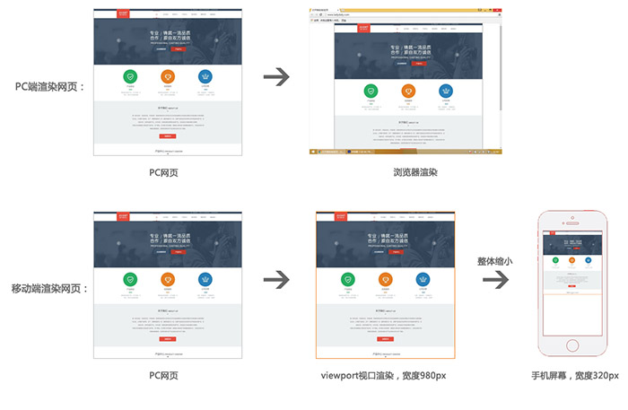
Viewport 视口
视口是移动设备上用来显示网页的区域,一般会比移动设备可视区域大,宽度可能是980px或者1024px,目的是为了显示下整个为PC端设计的网页,这样带来的后果是移动端会出现横向滚动条,为了避免这种情况,移动端会将视口缩放到移动端窗口的大小。这样会让网页不容易观看,可以用 meta 标签,name=“viewport ” 来设置视口的大小,将视口的大小设置为和移动设备可视区一样的大小。
pc端与移动端渲染网页过程:
设置方法如下:
<meta name="viewport" content="width=device-width, user-scalable=no, initial-scale=1.0, maximum-scale=1.0, minimum-scale=1.0">


快捷键为:meta:vp
 1 <!DOCTYPE html>
 2 <html lang="en">
 3 <head>
 4     <meta charset="UTF-8">
 5     <meta name="viewport" content="width=device-width, user-scalable=no, initial-scale=1.0, maximum-scale=1.0, minimum-scale=1.0">
 6     <title>Document</title>
 7     <style>
 8       *{
 9           padding: 0;
10           margin: 0;
11       }
12       div{
13
14           height: 30px;
15           background-color: pink;
16           font-size: 20px;
17           text-align: center;
18           line-height: 30px;
19
20       }
21
22     </style>
23 </head>
24 <body>
25     <div>大家好</div>
26
27 </body>
28 </html>
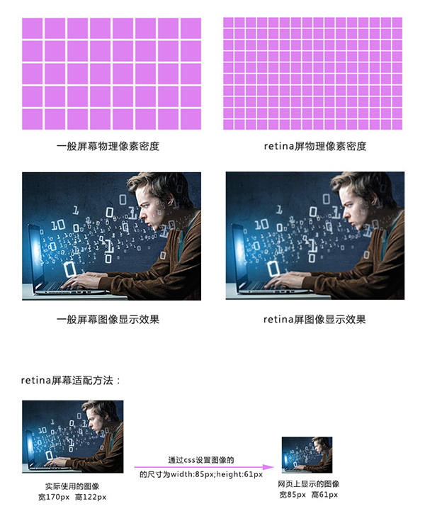
视网膜屏幕(retina屏幕)清晰度解决方案
视网膜屏幕指的是屏幕的物理像素密度更高的屏幕,物理像素可以理解为屏幕上的一个发光点,无数发光的点组成的屏幕,视网膜屏幕比一般屏幕的物理像素点更小,常见有2倍的视网膜屏幕和3倍的视网膜屏幕,2倍的视网膜屏幕,它的物理像素点大小是一般屏幕的1/4,3倍的视网膜屏幕,它的物理像素点大小是一般屏幕的1/9。
图像在视网膜屏幕上显示的大小和在一般屏幕上显示的大小一样,但是由于视网膜屏幕的物理像素点比一般的屏幕小,图像在上面好像是被放大了,图像会变得模糊,为了解决这个问题,可以使用比原来大一倍的图像,然后用css样式强制把图像的尺寸设为原来图像尺寸的大小,就可以解决模糊的问题。
清晰度解决过程示意图:
背景图强制改变大小,可以使用background新属性
background新属性
background-size:
- length:用长度值指定背景图像大小。不允许负值。(:value value;第一个值为背景图片的宽,第二个值为背景图片的高,单位px)
- percentage:用百分比指定背景图像大小。不允许负值。(:value value;第一个值为背景图片的宽,第二个值为背景图片的高,单位%)
- auto:背景图像的真实大小。
- cover:将背景图像等比缩放到完全覆盖容器,背景图像有可能超出容器。
- contain:将背景图像等比缩放到宽度或高度与容器的宽度或高度相等,背景图像始终被包含在容器内。
PC及移动端页面适配方法
设备屏幕有多种不同的分辨率,页面适配方案有如下几种:
1、全适配:流体布局+响应式布局
2、移动端适配:
- 流体布局+少量响应式
- 基于rem的布局
- 弹性盒模型
流体布局
流体布局,就是使用百分比来设置元素的宽度,元素的高度按实际高度写固定值,流体布局中,元素的边线无法用百分比,使用 box-sizing 属性将盒子设置为从边线计算盒子尺寸。
 1 <!DOCTYPE html>
 2 <html lang="en">
 3 <head>
 4     <meta charset="UTF-8">
 5     <meta name="viewport" content="width=device-width, user-scalable=no, initial-scale=1.0, maximum-scale=1.0, minimum-scale=1.0">
 6     <title>Document</title>
 7
 8     <style>
 9     *{
10         padding: 0;
11         margin: 0;
12     }
13        ul{
14            height: 50px;
15            background-color: gold;
16        }
17
18        li{
19            width: 25%;
20            height: 50px;
21            float: left;
22            text-align: center;
23            line-height: 50px;
24            list-style: none;
25        }
26
27     </style>
28 </head>
29 <body>
30     <ul>
31         <li>新闻</li>
32         <li>新闻</li>
33         <li>新闻</li>
34         <li>新闻</li>
35     </ul>
36 </body>
37 </html>
box-sizing
1、content-box 默认的盒子尺寸计算方式
2、border-box 置盒子的尺寸计算方式为从边框开始,盒子的尺寸,边框和内填充算在盒子尺寸内
 1 <!DOCTYPE html>
 2 <html lang="en">
 3 <head>
 4     <meta charset="UTF-8">
 5     <meta name="viewport" content="width=device-width, user-scalable=no, initial-scale=1.0, maximum-scale=1.0, minimum-scale=1.0">
 6     <title>Document</title>
 7
 8     <style>
 9     *{
10         padding: 0;
11         margin: 0;
12     }
13        ul{
14            height: 50px;
15            background-color: gold;
16        }
17
18        li{
19            width: 25%;
20            height: 50px;
21            float: left;
22            text-align: center;
23            line-height: 50px;
24            list-style: none;
25            border: 2px solid red;
26        }
27
28     </style>
29 </head>
30 <body>
31     <ul>
32         <li>新闻</li>
33         <li>新闻</li>
34         <li>新闻</li>
35         <li>新闻</li>
36     </ul>
37 </body>
38 </html>
 1 <!DOCTYPE html>
 2 <html lang="en">
 3 <head>
 4     <meta charset="UTF-8">
 5     <meta name="viewport" content="width=device-width, user-scalable=no, initial-scale=1.0, maximum-scale=1.0, minimum-scale=1.0">
 6     <title>Document</title>
 7
 8     <style>
 9     *{
10         padding: 0;
11         margin: 0;
12     }
13        ul{
14            height: 50px;
15            background-color: gold;
16        }
17
18        li{
19            width:25%;
20            height: 50px;
21            float: left;
22            text-align: center;
23            line-height: 50px;
24            list-style: none;
25            border: 2px solid red;
26            box-sizing:border-box;/*盒子的边框从边框开始算起  */     }
27
28     </style>
29 </head>
30 <body>
31     <ul>
32         <li>新闻</li>
33         <li>新闻</li>
34         <li>新闻</li>
35         <li>新闻</li>
36     </ul>
37 </body>
38 </html>
响应式布局
响应式布局就是使用媒体查询的方式,通过查询浏览器宽度,不同的宽度应用不同的样式块,每个样式块对应的是该宽度下的布局方式,从而实现响应式布局。响应式布局的页面可以适配多种终端屏幕(pc、平板、手机)。
相应布局的伪代码如下:
<!DOCTYPE html>
<html lang="en">
<head>
    <meta charset="UTF-8">
    <title>Document</title>
    <style>
       *{
           padding: 0;
           margin: 0;
       }

       li{
           width: 23%;
           height: 209px;
           background-color: gold;
           float: left;
           margin-left: 2%;
           list-style: none;
       }

       @media(max-width: 800px){

              li{
                  width: 46%;
             height: 209px;
             margin-bottom: 20px;
              }
       }


          @media(max-width: 400px){

              li{
                  width: 96%;
             height: 209px;
             margin-bottom: 20px;
              }
       }


    </style>
</head>
<body>
    <ul>
        <li>1</li>
        <li>2</li>
        <li>3</li>
        <li>4</li>
    </ul>
</body>
</html>

 浙公网安备 33010602011771号