Html5+Css3 Banner Animation 多方位移动特效
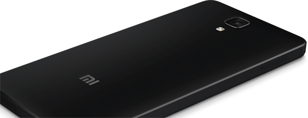
背景:朋友问我小米官网的mi4的特效会做吗,可能新接的一个小网站需要用到。一直有打算研究H5C3的一些效果,趁此机会,赶紧学习一下!
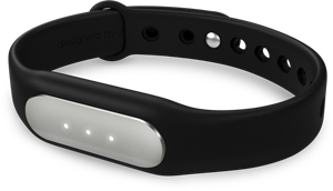
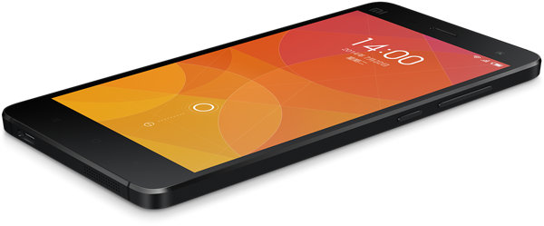
效果:如图 素材


HTML:
<div class="banner">
<div class="fea one ">
<div class="fea1 left-to-right"></div>
</div>
<div class="fea two hide">
<div class="fea2 top-to-bottom"></div>
</div>
<div class="fea three hide">
<div class="fea3 bottom-to-top"></div>
</div>
<div class="fea four hide">
<div class="fea4 right-to-left"></div>
</div>
<div class="btnwrap"><b class="cur"></b><b></b><b></b><b></b></div>
</div>
STYLE:
<style type="text/css">
@keyframes fea1{ 0% { left:-600px; } 100% { left:0; } }
@-webkit-keyframes fea1{ 0% { left:-600px; } 100% { left:0; } }
@-moz-keyframes fea1{ 0% { left:-600px; } 100% { left:0; } }
@-o-keyframes fea1{ 0% { left:-600px; } 100% { left:0; } }
.left-to-right{
animation: 1.5s cubic-bezier(0.86, 0, 0.07, 1) 0s normal none 1 running fea1;
-webkit-animation: 1.5s cubic-bezier(0.86, 0, 0.07, 1) 0s normal none 1 running fea1;
-moz-animation: 1.5s cubic-bezier(0.86, 0, 0.07, 1) 0s normal none 1 running fea1;
-o-animation: 1.5s cubic-bezier(0.86, 0, 0.07, 1) 0s normal none 1 running fea1;
}
@keyframes fea2{ 0% { top:-600px; } 100% { top:-40px; } }
@-webkit-keyframes fea2{ 0% { top:-600px; } 100% { top:-40px; } }
@-moz-keyframes fea2{ 0% { top:-600px; } 100% { top:-40px; } }
@-o-keyframes fea2{ 0% { top:-600px; } 100% { top:-40px; } }
.top-to-bottom{
animation: 1.5s cubic-bezier(0.86, 0, 0.07, 1) 0s normal none 1 running fea2;
-webkit-animation: 1.5s cubic-bezier(0.86, 0, 0.07, 1) 0s normal none 1 running fea2;
-moz-animation: 1.5s cubic-bezier(0.86, 0, 0.07, 1) 0s normal none 1 running fea2;
-o-animation: 1.5s cubic-bezier(0.86, 0, 0.07, 1) 0s normal none 1 running fea2;
}
@keyframes fea3{ 0% { bottom:-200px; } 100% { bottom:70px; } }
@-webkit-keyframes fea3{ 0% { bottom:-200px; } 100% { bottom:70px; } }
@-moz-keyframes fea3{ 0% { bottom:-200px; } 100% { bottom:70px; } }
@-o-keyframes fea3{ 0% { bottom:-200px; } 100% { bottom:70px; } }
.bottom-to-top{
animation: 1.5s cubic-bezier(0.86, 0, 0.07, 1) 0s normal none 1 running fea3;
-webkit-animation: 1.5s cubic-bezier(0.86, 0, 0.07, 1) 0s normal none 1 running fea3;
-moz-animation: 1.5s cubic-bezier(0.86, 0, 0.07, 1) 0s normal none 1 running fea3;
-o-animation: 1.5s cubic-bezier(0.86, 0, 0.07, 1) 0s normal none 1 running fea3;
}
@keyframes fea4{ 0% { left:1400px; } 100% { left:100px; } }
@-webkit-keyframes fea4{ 0% { left:1400px; } 100% { left:100px; } }
@-moz-keyframes fea4{ 0% { left:1400px; } 100% { left:100px; } }
@-o-keyframes fea4{ 0% { left:1400px; } 100% { left:100px; } }
.right-to-left{
animation: 1.5s cubic-bezier(0.86, 0, 0.07, 1) 0s normal none 1 running fea4;
-webkit-animation: 1.5s cubic-bezier(0.86, 0, 0.07, 1) 0s normal none 1 running fea4;
-moz-animation: 1.5s cubic-bezier(0.86, 0, 0.07, 1) 0s normal none 1 running fea4;
-o-animation: 1.5s cubic-bezier(0.86, 0, 0.07, 1) 0s normal none 1 running fea4;
}
*{ margin:0; padding:0; }
.banner{ width:800px; margin:0 auto; overflow:hidden; }
.fea { width:800px; height:320px; position:relative; }
.fea.hide { display:none; }
.one{ background:#099999; }
.fea1{ width:600px; height:231px; background:url(images/fea-1.png) center center; z-index:1; position:absolute; bottom:0; }
.two{ background:#ff8400; }
.fea2{ width:600px; height:339px; background:url(images/fea-2.png) center center; z-index:1; position:absolute; top:-40px; left:100px; }
.three{ background:#f10000; }
.fea3{ width:300px; height:172px; background:url(images/fea-3.png) center center; z-index:1; position:absolute; left:250px; bottom:70px; }
.four{ background:#f9f9f9; }
.fea4{ width:600px; height:249px; background:url(images/fea-4.png) center center; z-index:1; position:absolute; left:100px; top:40px; }
.btnwrap{ z-index:40; position:absolute; top:280px; margin-left:320px; }
.btnwrap b{ display:inline-block; background:#cccccc; width:30px; height:14px; cursor:pointer; margin:10px; }
.btnwrap b.cur{ background:#62CFEE; }
</style>
JAVASCRIPT:
<script type="text/javascript" src="js/jquery.min.js"></script>
<script type="text/javascript">
$(function(){
var bannerwrap = function(o){
$(".btnwrap b").removeClass("cur");
$(".btnwrap b:eq("+o+")").addClass("cur");
$(".banner .fea").hide();
$(".banner .fea:eq("+o+")").fadeIn(800);
}
var i=0;
$(".btnwrap b").click(function(){
i=$(this).index();
bannerwrap(i);
});
var sid = setInterval(function(){ i++; if(i==4) i=0; bannerwrap(i); },4000);
$(".banner").hover(function(){
clearInterval(sid);
},function(){
sid = setInterval(function(){ i++; if(i==4) i=0; bannerwrap(i); },4000);
});
});
</script>
总结:Html5、Css3在近几年使用已经非常广泛了,特别在移动端,应用场景层出不穷,抓紧学习一下,不要凹凸曼啦!

 浙公网安备 33010602011771号