
.triangle{
  border-top: 50px solid #ff0000;
  border-bottom: 50px solid #00a000;
  border-left: 50px solid #ff7f50;
  border-right: 50px solid #436eee;
}

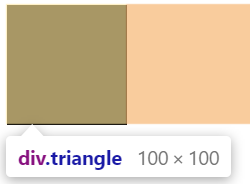
因为此处div是块级元素,所以会撑满一行。接下来我们会将宽和高设置为0,看看效果又是什么样的呢?
.triangle{
   width: 0;
   height: 0;
   border: 50px solid black;
}
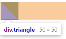
把元素的宽度、高度设为0。此时,显示的是一个边长为100px的正方形。
.triangle{
   width: 0;
   height: 0;
   border-top: 50px solid black;
   border-left: 50px solid blue;
}
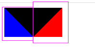
把上边框额话左边框设置成50px,可以得到对角划分正方形。
.triangle{
   width: 0;
   height: 0;
   border-top: 50px solid black;
   border-right: 50px solid red;
   border-left: 50px solid blue;
}
保留三边,得到如下所示图:
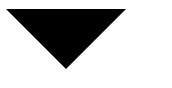
所以,要得到三角形,只需要将两边的隐藏起来,即使用“transient”属性:
.triangle{
	    width: 0;
	    height: 0;
	    border-top: 50px solid black;
	    border-right: 50px solid transparent;
	    border-left: 50px solid transparent;
}
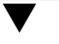
向下:
.triangle{
	    width: 0;
	    height: 0;
	    border-top: 50px solid transparent;
	    border-right: 50px solid black;
	    border-left: 50px solid transparent;
}
直角:
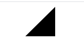
.triangle{
	    width: 0;
	    height: 0;
	    border-top: 40px solid black;
	    border-right: 23px solid transparent;
	    border-left: 23px solid transparent;
}
等边:
三角形的角度只需要通过调节边框的长度即可控制,具体多少就是简单的数学问题了(三角函数,勾股定理。。)
上述例中长度大概按 1 : 2 : 1.732 来就是正三角形了,如果看着不舒服或者要求需要可以用 transform:rotate(指定角度);旋转即可。
等边三角形还可以用5个div实现,见:https://blog.csdn.net/zsy_snake/article/details/80259124
 posted on

 浙公网安备 33010602011771号