
html - 气泡角标
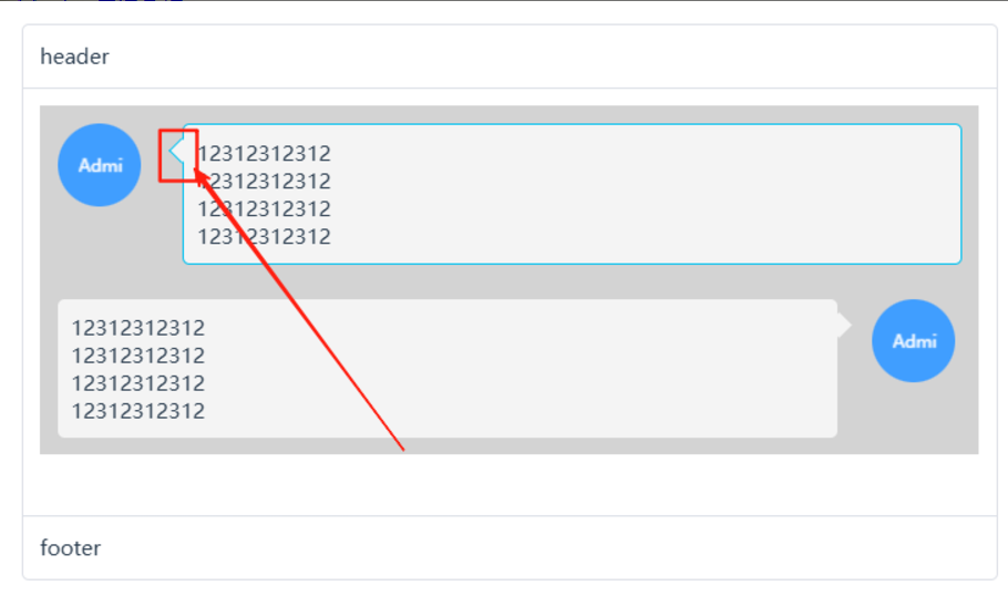
气泡窗口的角标,代码语法为 scss,可以通过 AI 转为其它语法。
方案 1:通过 border 实现
所见即所得,角标真的是个三角形,控制好角标的位置,就能得到想要的效果。
/**
 * 气泡弹窗配套的角标 V1
 * -------------------------------------------------------
 * 场景:给组件添加一个角标
 *
 * 缺点:
 * - 逻辑上偏复杂
 * - 要求组件布局必须是:position: relative,可能会破坏布局
 * - 背景色跟随父组件的 border-color,逻辑上有点不合常理。
 *
 * 优势:
 * - 可以依附于容器内的任意一个元素,角标的背景色可以变通地调整
 *
 * @example
 * <i style="border-color: lightgreen" class="sea-arrow-after-right"></i>
 */

$arrow-size: 8px; // 控制箭头大小
$arrow-width: 12px; // 控制箭头宽度(三角形的底边宽度)
$arrow-offset: -6px; //控制箭头偏移量,相对于边框的位置
$arrow-position: 10px; // 位置,相对于组件坐标(left, top)的位置
$arrow-position-h: 20px; // 位置,相对于组件坐标(left, top)的位置
$arrow-bg-color: inherit; // 箭头颜色,跟随父元素,如果未设置会被隐藏
$arrow-offset: -12px; //控制箭头偏移量,相对于边框的位置


// 箭头方向由内向外
// 箭头混合 $direction - 方向 $color - 色值
@mixin arrow-before($direction) {
  content: "";
  position: absolute;
  width: 0;
  height: 0;

  @if $direction == left {
    top: $arrow-position;
    left: $arrow-offset;
    border-top: $arrow-size solid transparent;
    border-right-width: $arrow-width;
    border-right-style: solid;
    border-right-color: inherit;
    border-bottom: $arrow-size solid transparent;
    filter: drop-shadow(0 -1px -1px rgba(0, 0, 0, 0.1));
  } @else if $direction == right {
    top: $arrow-position;
    right: $arrow-offset;
    border-top: $arrow-size solid transparent;
    border-left-width: $arrow-width;
    border-left-style: solid;
    border-left-color: inherit;
    border-bottom: $arrow-size solid transparent;
    filter: drop-shadow(0 -1px -1px rgba(0, 0, 0, 0.1));
  } @else if $direction == top {
    left: $arrow-position;
    top: $arrow-offset;
    border-left: $arrow-size solid transparent;
    border-bottom-width: $arrow-width;
    border-bottom-style: solid;
    border-bottom-color: inherit;
    border-right: $arrow-size solid transparent;
    filter: drop-shadow(0 -1px -1px rgba(0, 0, 0, 0.1));
  } @else if $direction == bottom {
    left: $arrow-position;
    bottom: $arrow-offset;
    border-left: $arrow-size solid transparent;
    border-top-width: $arrow-width;
    border-top-style: solid;
    border-top-color: inherit;
    border-right: $arrow-size solid transparent;
    filter: drop-shadow(0 1px 1px rgba(0, 0, 0, 0.1));
  }
}

// 箭头方向由外向内
// 有些场景下,不方便确定箭头位置,反转箭头更有利于布局。
.sea-arrow-before-left::before {
  position: absolute;
  top: $arrow-position;
  left: $arrow-offset;
  @include arrow-before(right);
}

.sea-arrow-before-right::before {
  position: absolute;
  top: $arrow-position;
  right: $arrow-offset;
  @include arrow-before(left);
}

.sea-arrow-before-top::before {
  position: absolute;
  left: $arrow-position;
  top: $arrow-offset;
  @include arrow-before(bottom);
}

.sea-arrow-before-bottom::before {
  position: absolute;
  left: $arrow-position;
  bottom: $arrow-offset;
  @include arrow-before(top);
}

/** 将角标作为 icon 展示 **/
.sea-arrow-bottom {
  display: inline-block;
  @include arrow-before(bottom);
}
方案2:矩形块旋转 45 度实现
将正方形旋转45度,将菱形伪装成角标,除了它不是真的三角形之外,没什么明显缺点,
/**
 * 气泡弹窗配套的角标 V2
 * 设计思路:矩形块旋转 45度实现,实际是个菱形
 * -------------------------------------------------------
 * 场景:给组件添加一个角标
 * 优势:逻辑简单,自动跟随容器的边框、背景色
 * 缺陷:要求组件布局必须是:position: relative,可能会破坏布局
 */
$arrow-size: 8px; // 控制箭头大小
$arrow-width: 12px; // 控制箭头宽度(三角形的底边宽度)
$arrow-offset: -6px; //控制箭头偏移量,相对于边框的位置
$arrow-position: 10px; // 位置,相对于组件坐标(left, top)的位置
$arrow-position-h: 20px; // 位置,相对于组件坐标(left, top)的位置
$arrow-bg-color: inherit; // 箭头颜色,跟随父元素,如果未设置会被隐藏

// 箭头方向由内向外
// 箭头混合 $direction - 方向 $color - 色值
@mixin arrow-after($direction, $color: $arrow-bg-color) {
  position: absolute;
  content: "";
  width: 10px;
  height: 10px;
  transform: rotate(45deg);
  background-color: $color;
  box-sizing: border-box;
}

// 使用混合生成样式
.sea-arrow-after-left::after {
  top: $arrow-position;
  left: $arrow-offset;
  border-left: inherit;
  border-bottom: inherit;
  @include arrow-after(left);
}

.sea-arrow-after-right::after {
  top: $arrow-position;
  right: $arrow-offset;
  border-top: inherit;
  border-right: inherit;
  @include arrow-after(right);
}

.sea-arrow-after-top::after {
  top: $arrow-offset;
  left: $arrow-position;
  border-top: inherit;
  border-left: inherit;
  @include arrow-after(top);
}

.sea-arrow-after-bottom::after {
  left: $arrow-position;
  bottom: $arrow-offset;
  border-right: inherit;
  border-bottom: inherit;
  @include arrow-after(bottom);
}
疯狂的妞妞 :每一天,做什么都好,不要什么都不做!

 浙公网安备 33010602011771号