移动端fixed的元素抖动的问题之原理解决方法

试了好多网上的方法,后来找到原因,撑大的原因,布局的问题
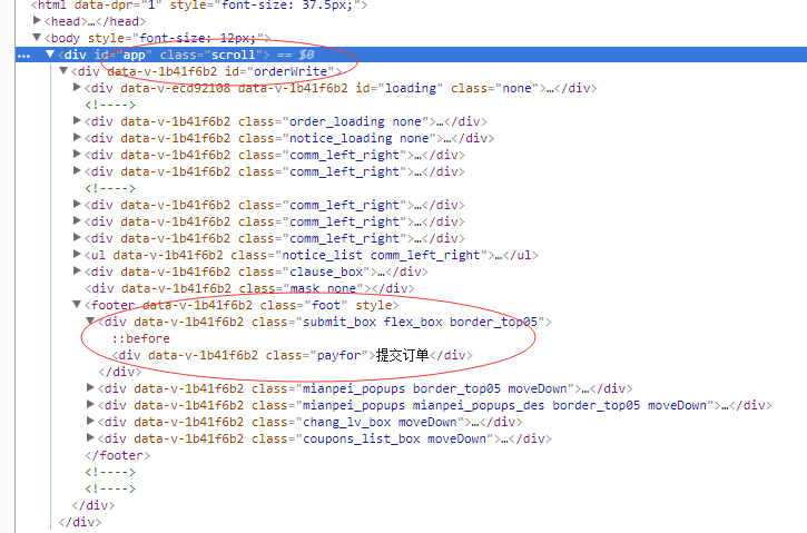
原来错误的html结构:
#app的css
#app {
/* font-family: 'Avenir', Helvetica, Arial, sans-serif; */
-webkit-font-smoothing: antialiased;
-moz-osx-font-smoothing: grayscale;
height: 100%;
width: 100%;
position: absolute;
overflow-y: auto;
overflow-x: hidden;
-webkit-overflow-scrolling: touch;
top: 0;
left: 0;
bottom: 0;
right: 0;
}
#orderWrite[data-v-1b41f6b2] {
padding-bottom: 60px;
position: absolute;
left: 0;
top: 0;
z-index: 3;
width: 100%;
}
.foot {
position: fixed;
bottom: 0;
left: 0;
right: 0;
z-index: 9;
width: 100%;
}
以上是错误的代码,我己用红色标注
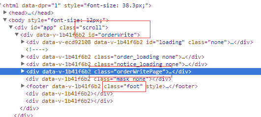
修改之后的html结构
#app {
-webkit-font-smoothing: antialiased;
-moz-osx-font-smoothing: grayscale;
height: 100%;
width: 100%;
overflow: hidden;
-webkit-overflow-scrolling: touch;
}
#orderWrite {
padding-bottom: 60px;
height: 100%;
overflow: hidden;
width: 100%;
}
.orderWritePage { //最主要的是加了这个样式,然后把所有内容页的东西放到这个元素下
height: 100%;
overflow: auto;
}
.foot {
position: absolute;
bottom: 0;
left: 0;
right: 0;
z-index: 9;
width: 100%;
}
这里的foot和orderWritePage是并列的,这样orderWriteaPage里的内容过长就会滚动,而foot不在内,就不会滚动
页面的滚动使用普通元素替代,此时滚动元素之外的的其他内容自然就有了“固定定位"的效果了。
之前还遇到一个弹出的层的内容下面的一层会有滚动穿透的问题,也是这个布局造成的。
其核心的部分:
<html>
<body>
<div class="page"></div>
<div class="fixed"></div>
</body>
</html>
html,body{
width:100%;
overflow:hidden;
}
.page{
width:100%;
overflow:auto;
}
.fixed{
position:absolute;
}

 浙公网安备 33010602011771号